
We may earn revenue from the products available on this page and participate in affiliate programs.
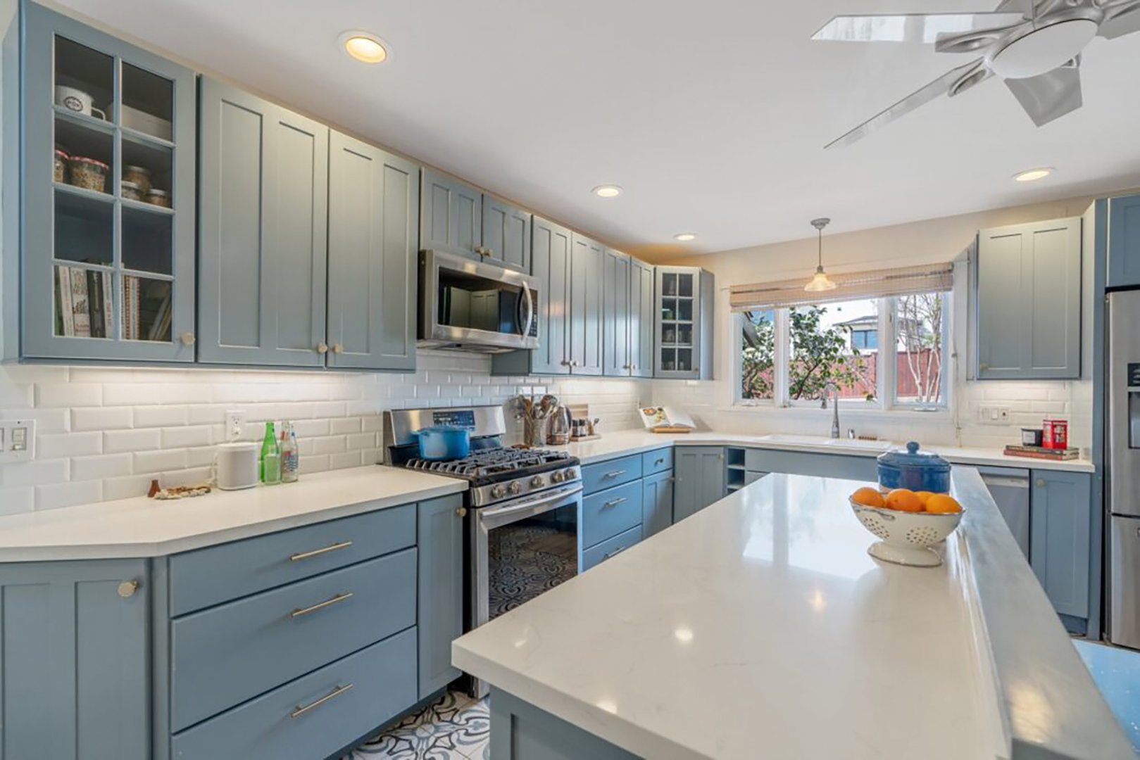
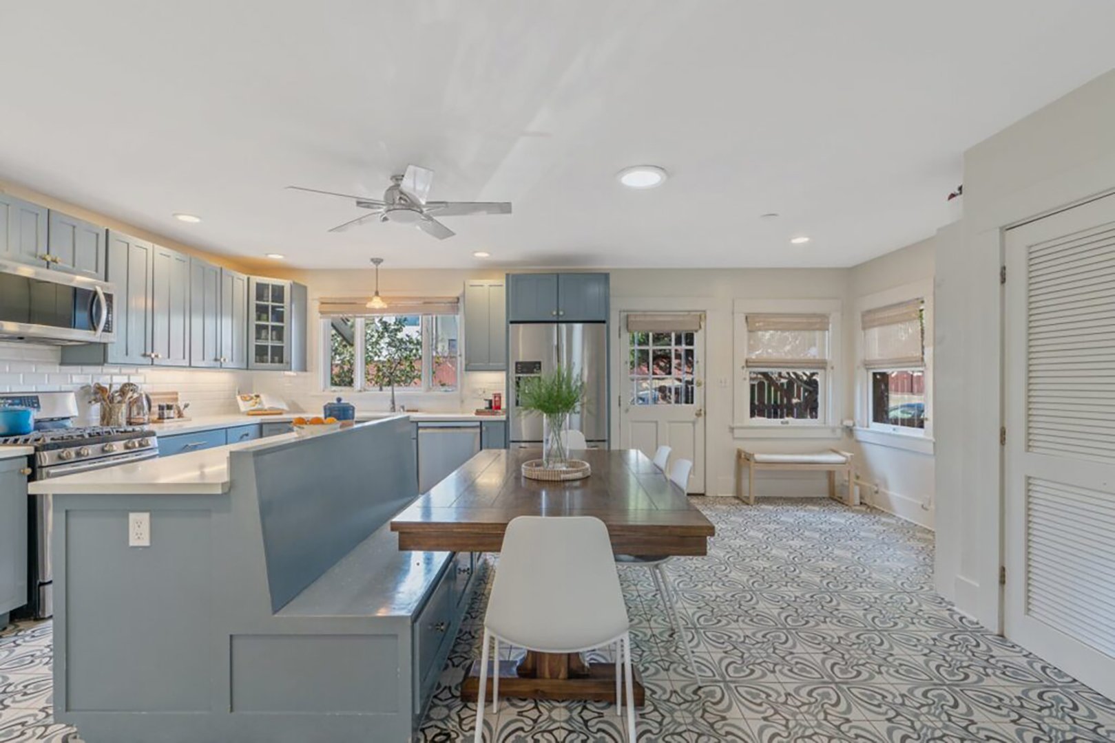
Sometimes a renovation ends up being more of a downgrade than an upgrade. When creative director Kirsten Blazek was hired by two educators to rethink their L.A. kitchen, it had already undergone a somewhat recent transformation. “It was a pretty tragic representation of the 2010s,” recalls Blazek, who founded the design firm a1000xbetter. The kitchen was sorely out of place. The Craftsman bungalow was built in 1927, and it still retained classic details like warm-wood paneling and sturdy built-ins, but the kitchen was a jarring contrast of baby blue cabinetry and patterned floor tiles.
“These clients came to me hating their kitchen,” she says. It was easy to see where things had gone awry: Instead of embracing the home’s lack of natural light, the past owners tried to fight it with a bright palette. This time around, everyone was down to lean into the darkness. Here’s how the designer gave this home the redo it deserved.
Stay Timeless with a Tonal Palette
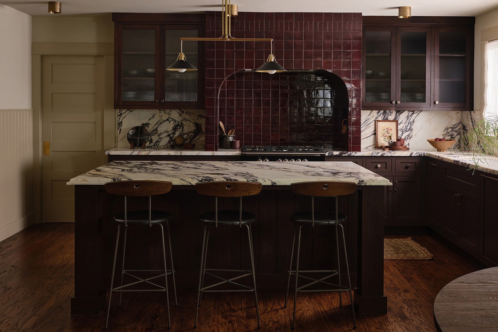
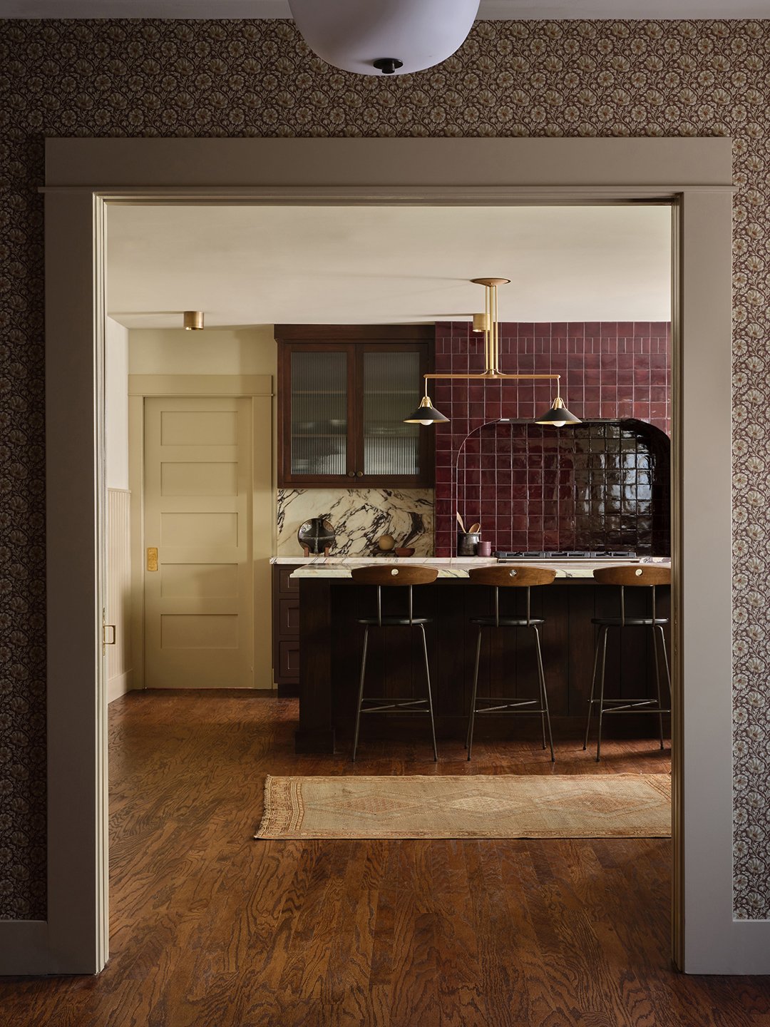
Blazek and the owners didn’t want to touch the existing cherry-wood paneling in the dining room, which was visible from the kitchen. Knowing that dark tones were key, Blazek sought to find shades that would build cohesion between the past and present. Cue the range alcove’s burgundy tile and the two-tone brown cabinets (psst: the bottoms are painted in Dunn-Edwards’s Nomad and the tops are stained to match, letting the grain show through).
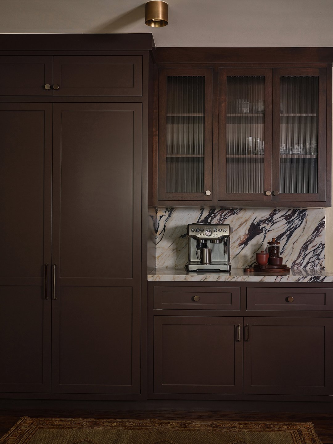
“The fewer the components, the bigger the impact,” Blazek says of rarely opting for stark contrast. “If there is a contrast, it’s the slab,” she adds. While the swirls in the Calacatta Viola Italia honed marble are loud, they match the wall and cabinet colors nicely.
Break From the Past Where It Counts
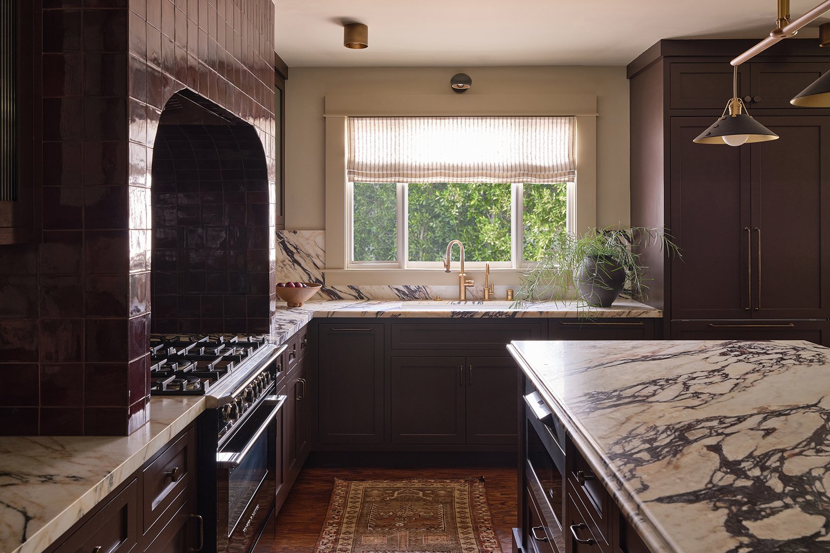
Blazek wanted the kitchen to reflect its century-old surroundings, but picked out the brass-and-leather island chandelier and metal dining pendant knowing that no one wants to hang out in a museum. “I try not to be too referential with lighting,” she says. “If they have clean lines, they’ll work anywhere.” The brass spotlights offer practical lighting without detracting from the overall look.
Get Cozy in the Corner
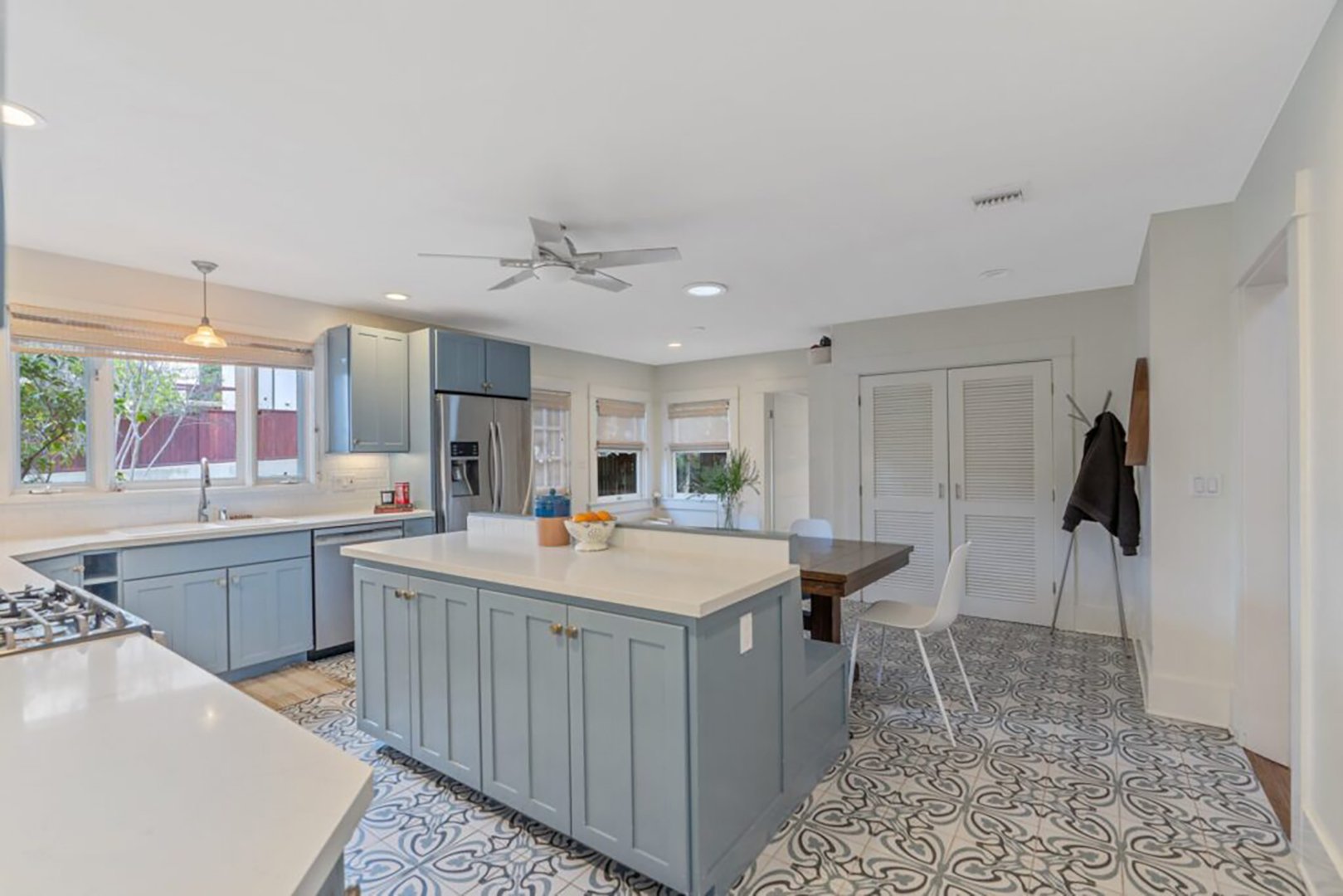
The washer and dryer used to be tucked in the closet behind the island, but Blazek nixed that set-up by making space for a mudroom. With those bulky appliances out of the picture, she added banquette seating and a pantry complete with a coffee station.
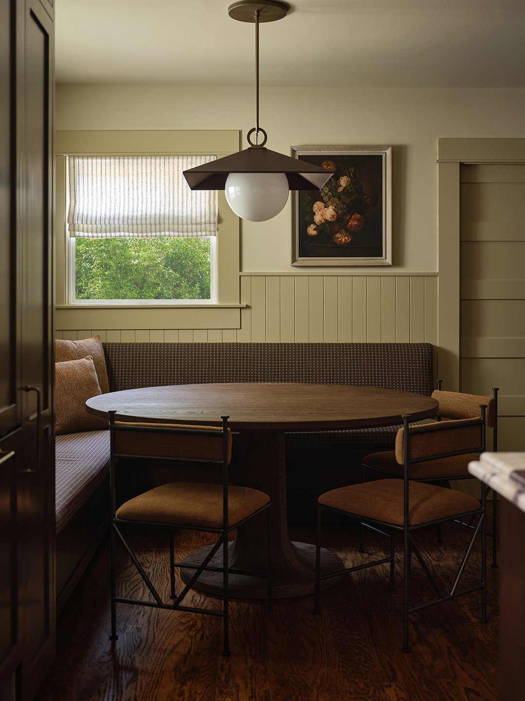
Relegating the new dining zone to the most sun-drenched corner of the kitchen made sense on many levels. For starters, you can see while you’re eating. And also, “The two existing windows above the banquette were in good condition, so it didn’t make sense to remove them for more cabinets,” Blazek says. “This configuration gives them the extra space they need for everyday items and casual seating, without sacrificing natural light.”
The designer held on to the original wide trim around the windows, but added character to the surrounding walls with new beadboard paneling. Both elements feel true to the Craftsman aesthetic, even if it is a few decades late. “The beadboard adds depth, too, instead of just being one-dimensional drywall,” she says. The last thing anyone would want is something new that didn’t quite fit in.