
We may earn revenue from the products available on this page and participate in affiliate programs.
When Jess and Jonathan Nahon of Sugarhouse toured the 1850s Greek Revival that would become the 2026 Brooklyn Heights Designer Showhouse, they made a beeline for the kitchen. “It was the room we responded to—the one we felt needed us most,” Jess says. The Brooklyn Heights Association handed them the adjoining dining room, too, and what started as a kitchen intervention became a chance to give the back of the parlor floor a new personality.
There was, however, a very un-showhouse-y catch: The homeowner had just finished her own renovation and still had to approve any permanent changes. So no, the duo couldn’t simply rip out the kitchen and start fresh. They had roughly 15 days to make the case for new walls, beams, and kitchen alterations before a 25-day build kicked off.
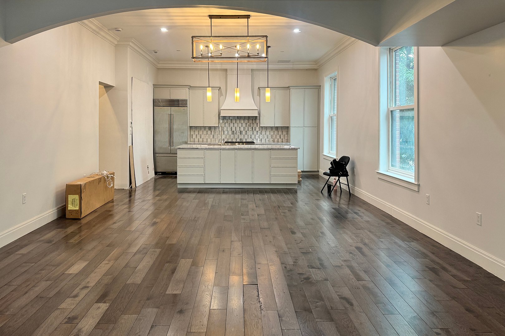
Luckily, that constraint turned out to be the fun part. The designers wrapped, disguised, layered, and edited their way around what had to stay, adding enough history and attitude that now it’s hard to tell where the old house ends and their work begins.
When You Can’t Fix the Ceiling, Reframe It
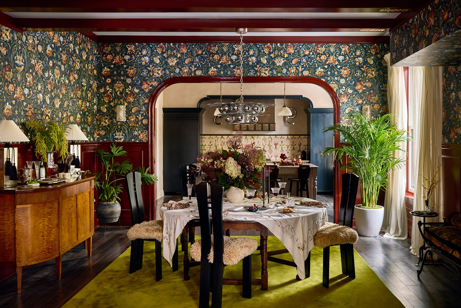
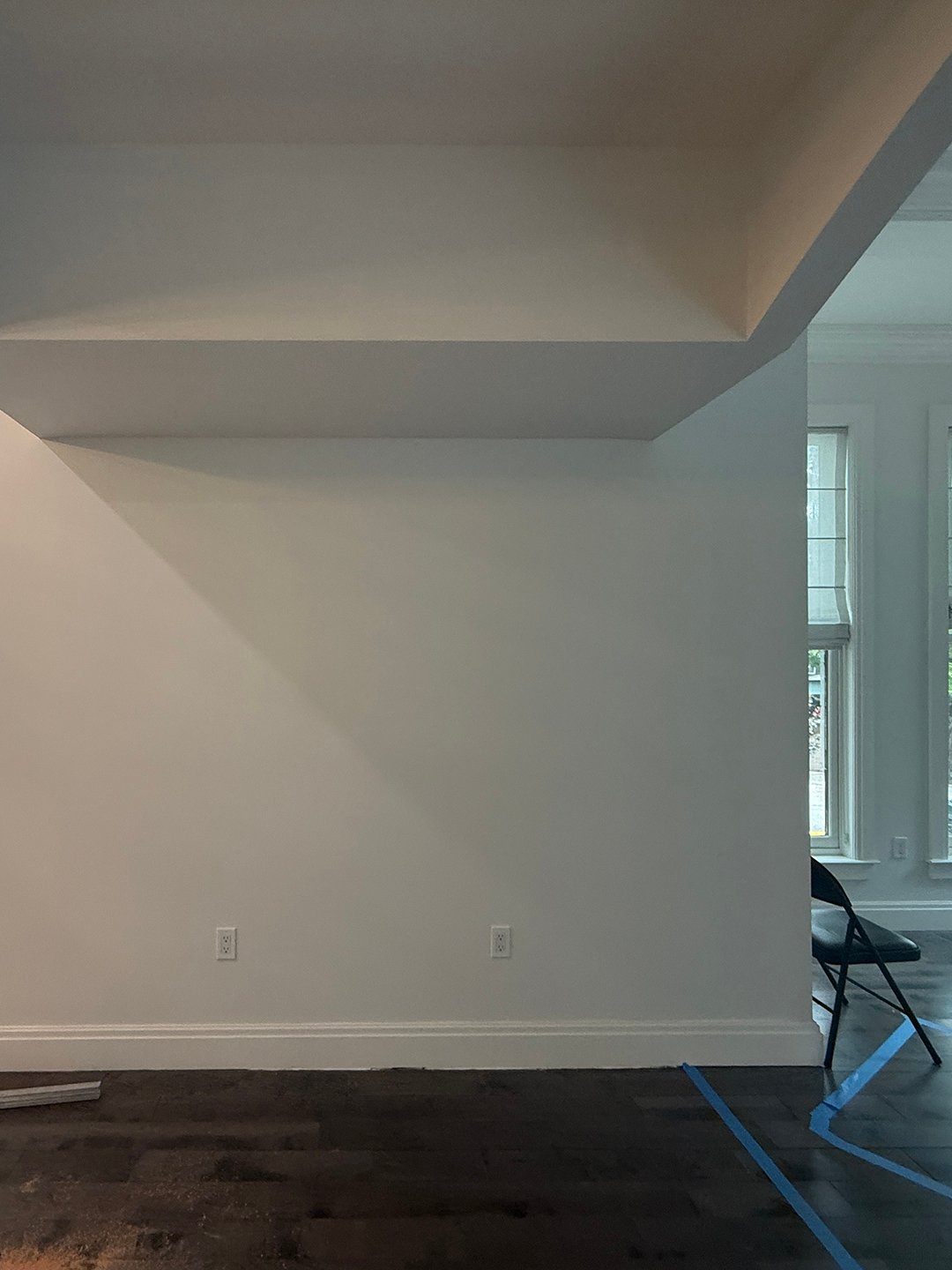
Initially, the dining room had three different ceiling heights, thanks to a soffit concealing mechanicals. Sugarhouse’s fix? Camouflage. A large-scale House of Hackney wallpaper keeps the eye moving, so the ceiling’s transitions fade into the background, while faux beams span the different heights and make the soffit feel like part of the architecture.
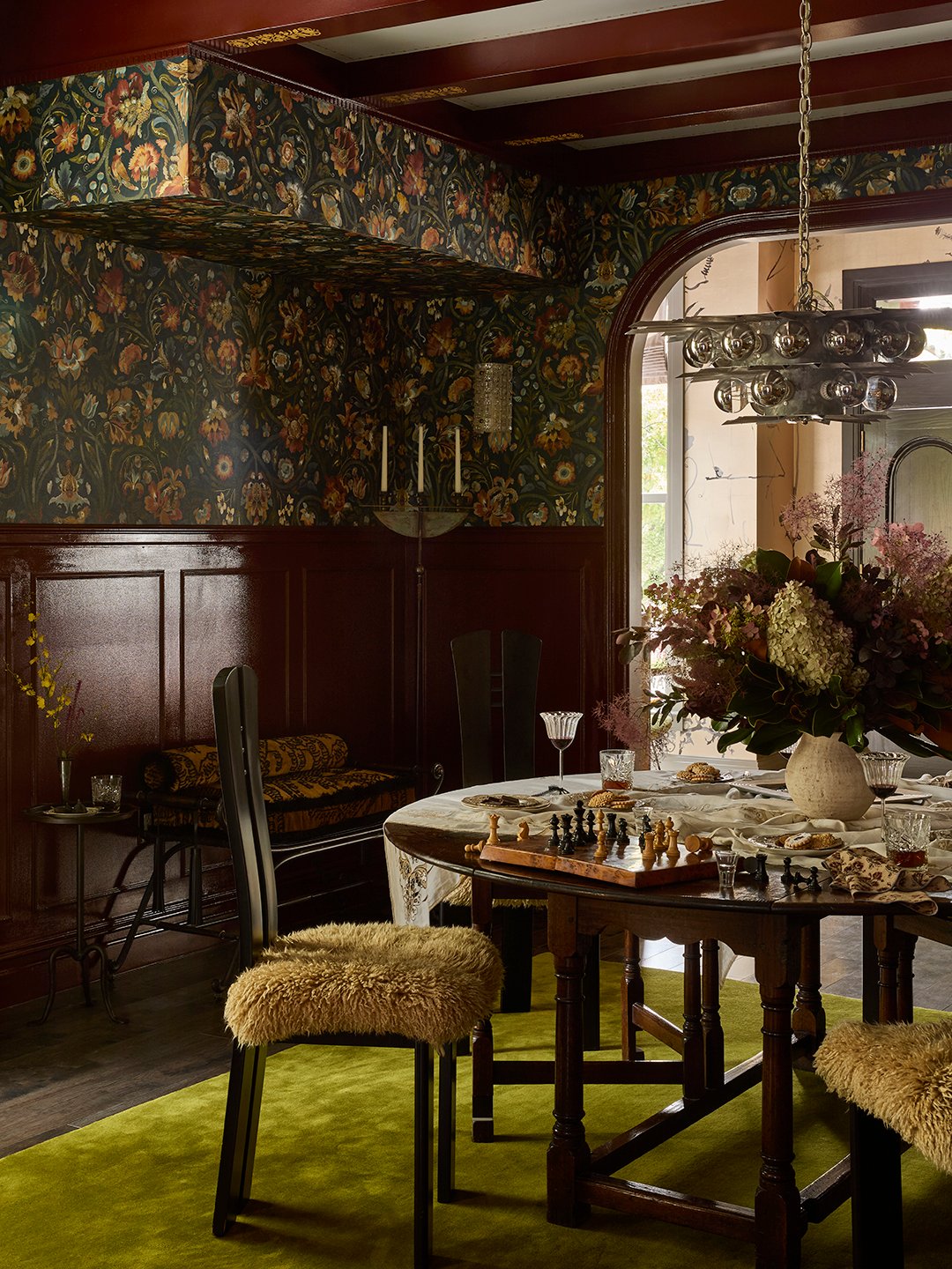
Because the ceiling was already low, the designers decided to keep the new wainscoting short. Instead of going matte with the millwork in Farrow & Ball’s Deep Reddish Brown, the pair chose a high-gloss finish, which kicks light around the room and keeps a moody palette from feeling cave-like.
Give a Pass-Through Room a Stronger Perimeter
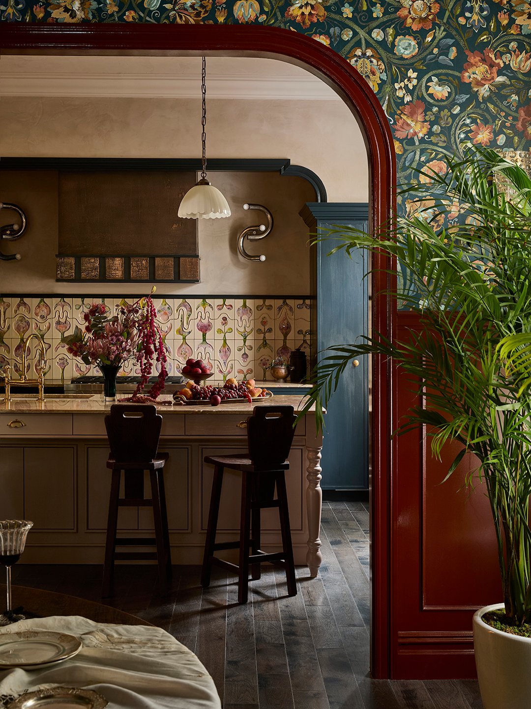
Before Jess and Jonathan got anywhere near the wallpaper and wainscoting, they had to convince the dining room to act like one. “Honestly, the space felt like a hallway,” she says. Sitting directly on the route to the kitchen and central staircase, it had very little definition.
The designers added a partial wall with a broad arched opening to separate the dining room without cutting it off from the kitchen. The intervention gives the wallpaper and wainscoting a logical stopping point and the furniture somewhere to land—one of several choices made by Sugarhouse to give the design a “it’s been here all along” feel.
Don’t Gut What You Can Rework
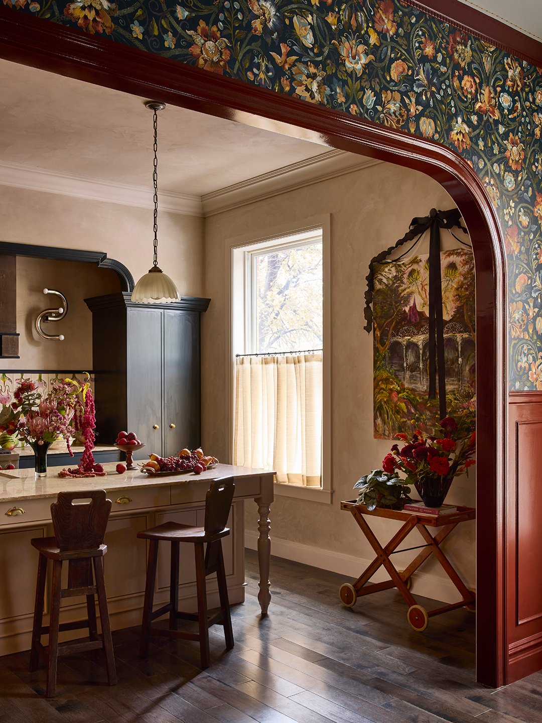
The kitchen had plenty of cabinetry, but nowhere to linger. “Maximizing the storage prevented people from really congregating,” Jess says of the central island.
Rather than replan the room, Sugarhouse focused on what could be edited in place. At the island, their millworker wrapped the existing base in new wood, added legs and a new countertop, and opened up one side for stools, which allowed the same footprint to feel more social.
To make the back wall feel less broken up, the team replaced the pantry doors with cleaner fronts and removed the upper cabinets to create an arched range alcove. They kept that streamlined look going at the refrigerator. A panel-ready swap wasn’t practical, so the stainless front was covered in a color-matched printed vinyl wrap. “It’s a giant sticker!” Jess explains.
Let the Statement Stone Set the Palette
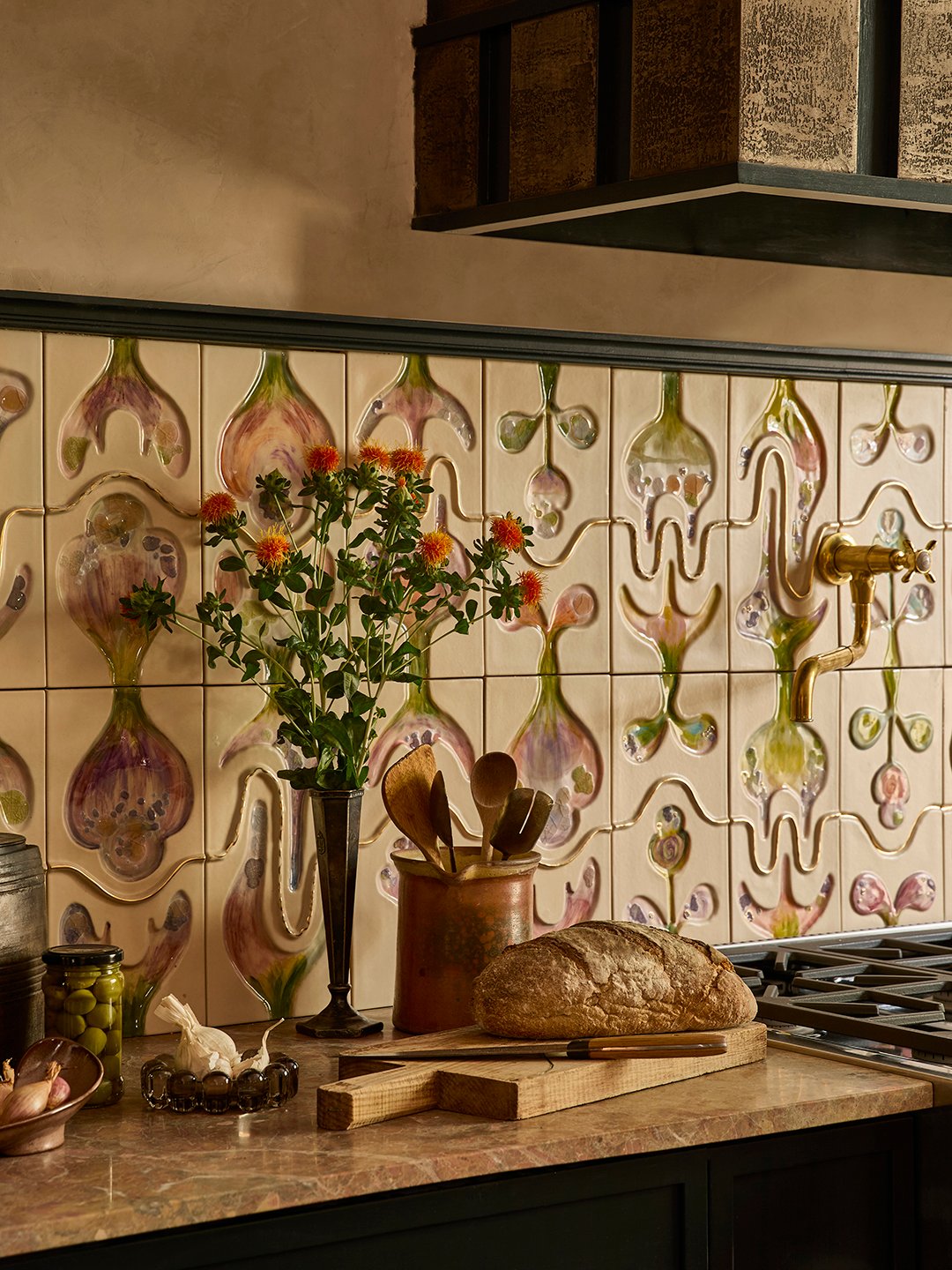
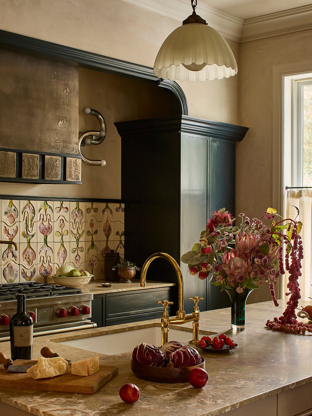
The original kitchen counters were a fairly nondescript gray marble. Sugarhouse swapped them for Artistic Tile’s Melange, a much warmer, more animated stone. Its pinks, creams, and muddy greens hold their own against cabinetry painted Farrow & Ball’s Black Blue, an island in Farrow & Ball’s Dead Salmon, and walls finished in JH Wall Paints’s lime plaster.
Instead of introducing a polite neutral for the backsplash, they commissioned Riwal Manufaktura to create a dramatic dimensional botanical tile. “Because that marble has such personality, we had to find something that matched that level of theatrics,” Jess says.
Keep the Hood, Change the Finish
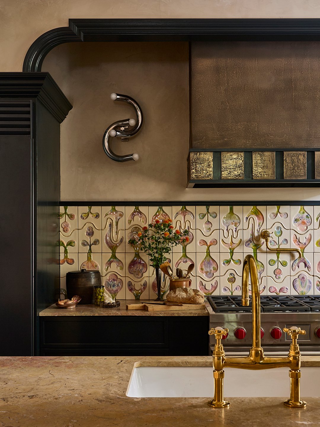
The existing hood stayed, but you’d never know it. Sugarhouse boxed in the original structure, then finished the new surface with Midas Metall, a powdered-metal coating that goes on wet and is sanded and polished until it reads like the real thing. The small squares along the lower edge help sell the illusion, making the hood feel more like a custom architectural feature than an insert. It’s a good reminder that the expensive part doesn’t always need replacing.
The Floors Might Not Be the Problem
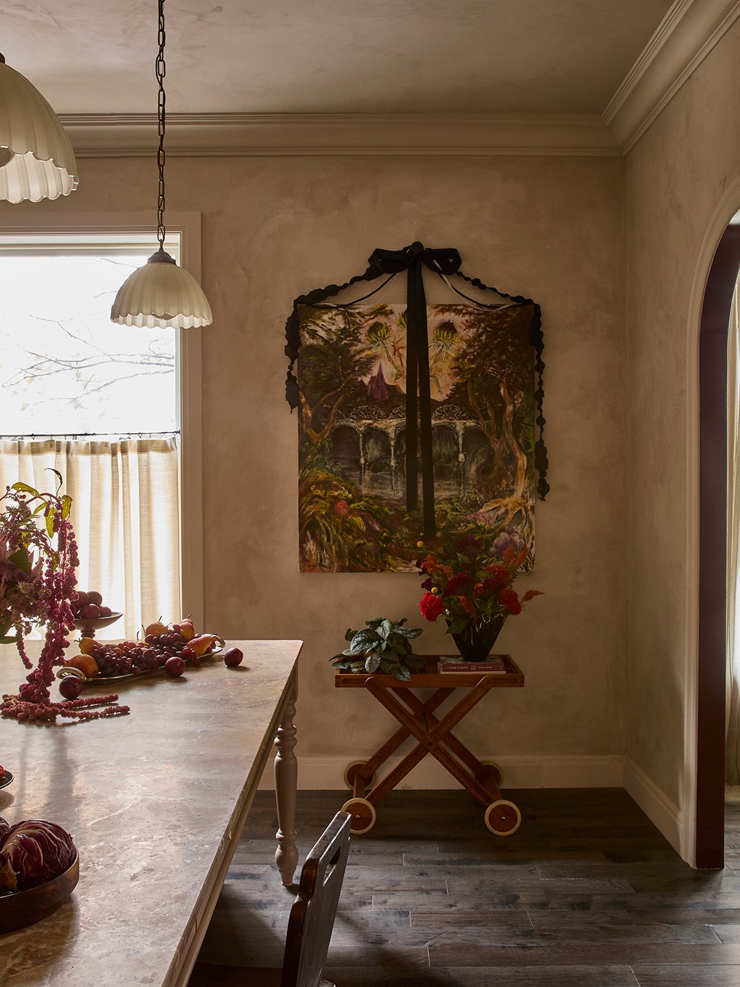
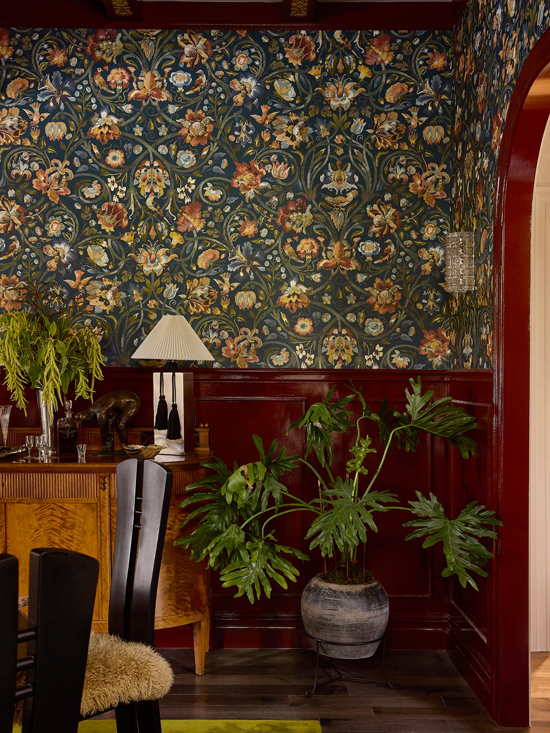
The design firm originally wanted to replace the wood floors, but the homeowner nixed the idea. In hindsight, that may have been a blessing. Once the dining room got its chartreuse-green Nordic Knots rug, darker wall colors, and warmer lighting, the floors read differently. “Everybody thought we swapped out the floors anyway,” Jess says.
Shifting the lighting did a lot of the heavy lifting. The designers disconnected the cool recessed fixtures and instead relied on sconces and vintage pendants set lower in the room, which softened the space and warmed up the wood underfoot.
Mix Metals—and Eras—Without Making It a Whole Thing
There are at least three metal personalities at play in the kitchen: unlacquered brass Waterworks plumbing, vintage lighting with its own patina, and the darker metal finish on the hood. “It is such a common fear of clients. ‘Oh, everything has to match,’” Jess says. “We are not so precious about that.”
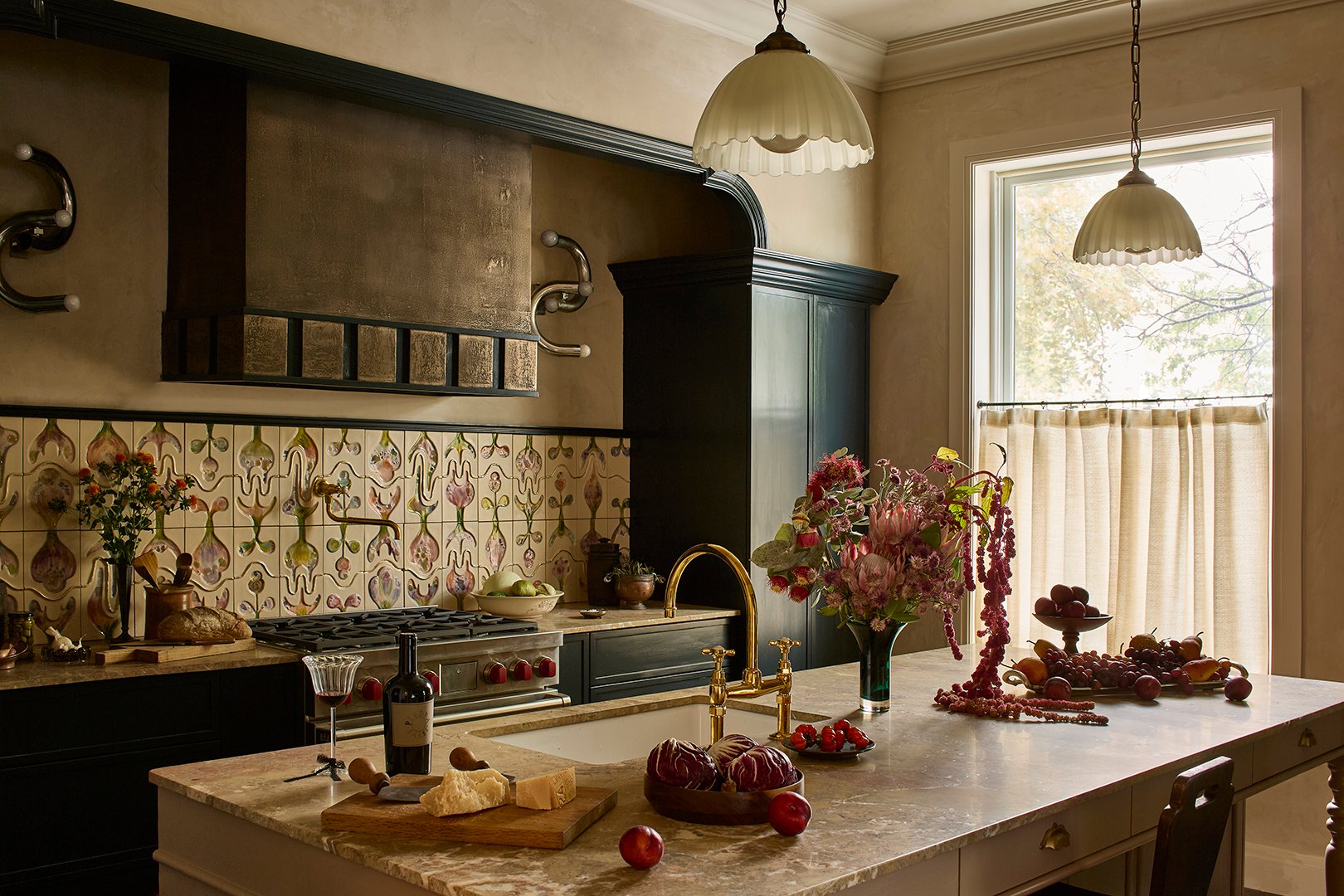
What ties the metals together is the fact that they aren’t meant to stay pristine. The brass will darken, the vintage fixtures already show their age, and the hood has built-in texture. That’s a more useful way to approach mixed metals than counting how many finishes are in the room: Choose ones that get better with time.
The dining room follows the same logic, but with furniture. Jonathan’s childhood table sits alongside sculptural 1970s chairs covered in extra-long Mongolian shearling, a burl credenza, and lighting from yet another era. None of it is trying to prove it belongs to the same decade. The mix works because it feels accumulated, not assembled.