
We may earn revenue from the products available on this page and participate in affiliate programs.
Brooklyn-based designer Danielle Herman has been updating Kathryn Vlakic’s Bay Ridge townhouse room-by-room for nearly a decade, since Vlakic’s third son was a newborn. As the list of completed projects grew, so did Vlakic’s trust in Herman; their shared design language; and most notably, Vlakic’s three sons, now 9, 13, and 16 years old. The latter is what prompted the latest—and last—renovation.
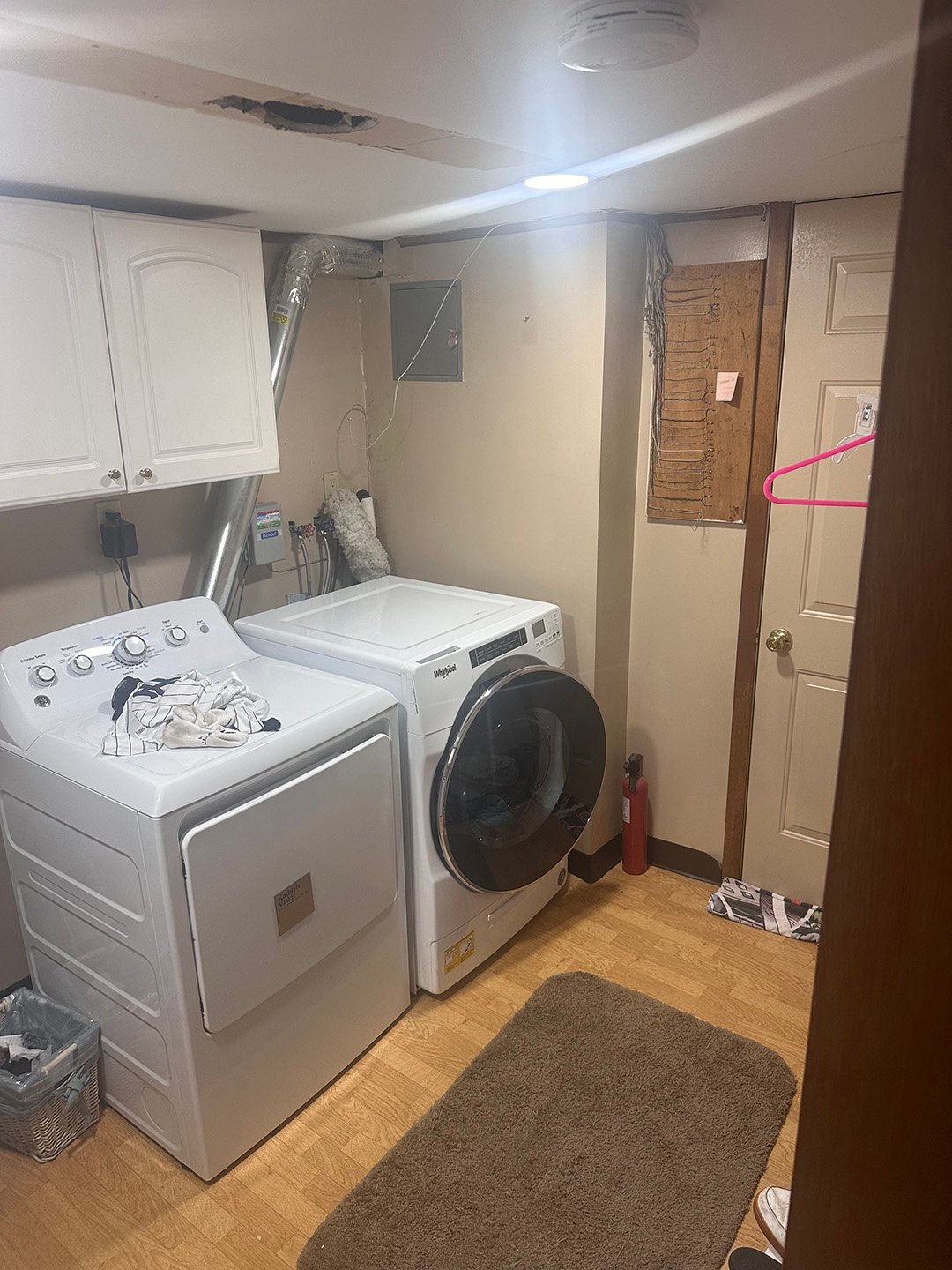
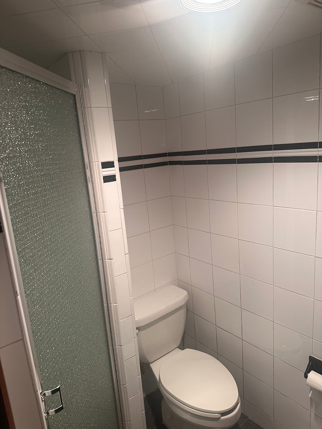
After 15 years of living in the home, Vlakic and her husband were finally ready to tackle the basement, home to a Frankensteined patchwork of mismatched wood floors, tile, and carpet along with a narrow hallway leading to a cramped ‘90s-era bathroom, a functioning but not functional laundry room, and oddly configured closets. Here’s how Herman pulled off her most dramatic transformation for the family yet.
Nail the Layout and the Rest Will Follow
Why have a small bathroom and a small laundry room when you can have a big bathroom-meets-laundry room? That’s the question Herman asked as she toyed around with potential layouts, with the ultimate goal of optimizing the area for daily use. The space functions as the boys’ primary bathroom—it’s just one of two full baths in the house—while Vlakic logs the most hours in the laundry room. Instead of minimizing one for the sake of the other, an open floor plan was conceived that would create one 120-square-foot space. “It’s what I’m most proud of,” says Herman of the new layout.
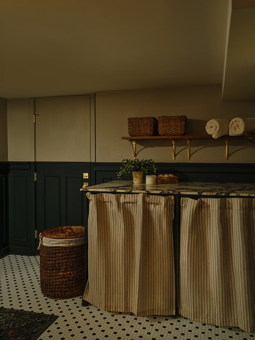
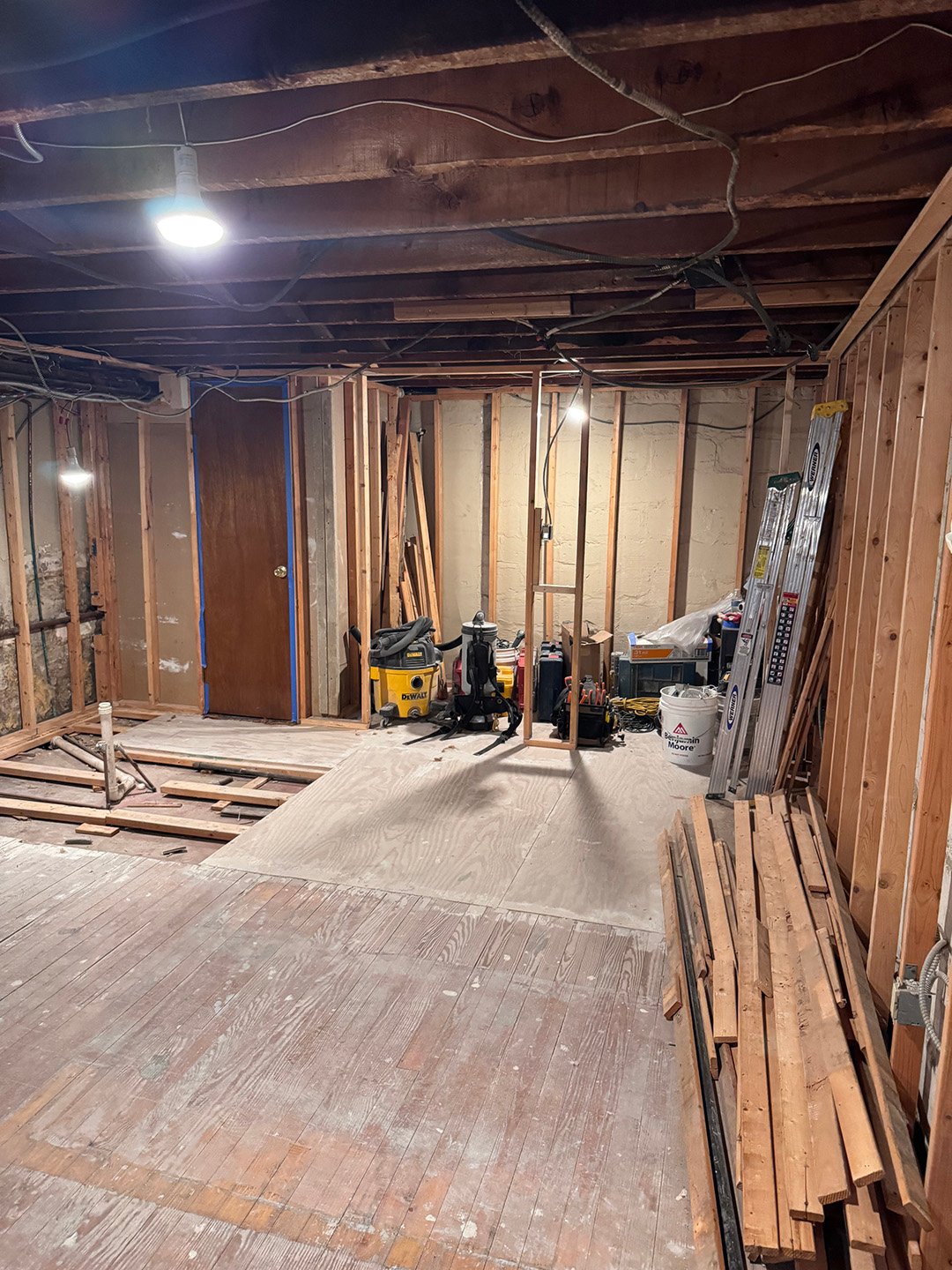
The pair favored a specific floor plan going into the contractor walkthrough, but they had to see what was hiding behind the walls first. Nervous anticipation that plumbing and electrical placements would restrict their options turned into an overwhelming sense of luck—the setup was in their favor. Opening up the space, refinishing the floors and walls, and moving the vent for the dryer quickly followed, along with plans to hide the ductwork in a new soffit, combine two storage spaces to create a walk-in closet, and add a wardrobe underneath the staircase.
Get the Light Just Right
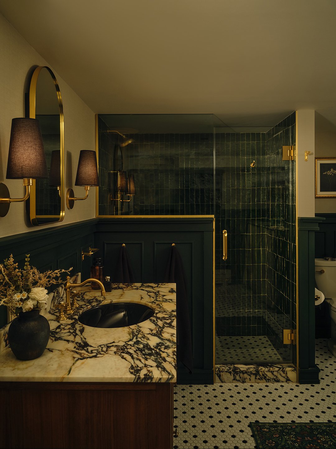
Initially, Herman thought a tiny casement window previously located in the hallway would emit a few rays of natural light. But after they opened the walls she made the discovery: “There was no light.” The obstacle turned into another creative constraint. How would you design a space knowing the light will always be the same, day and night?
Her solution was to add four recessed ceiling lights and two sconces that were dimmable and rigged with 3000 Kelvin bulbs for a warm but not yellow temperature. All six were intentionally installed at the start of the project, not the end, to ensure the right paint selections were made. “It’s not meant to look like a brightly lit bathroom,” she says. “In my home, as the sun goes down, the lights go down. That’s just kind of how it works. If it’s dark out, you will not see bright lights on in my home.” Now, the same goes for the Vlakic’s basement.
Put Your Materials in Conversation

It was important to Herman that the materials not be in competition with each other. “It’s a single conversation because it’s a small space. Everything has to be balanced and everything has to work perfectly together.”
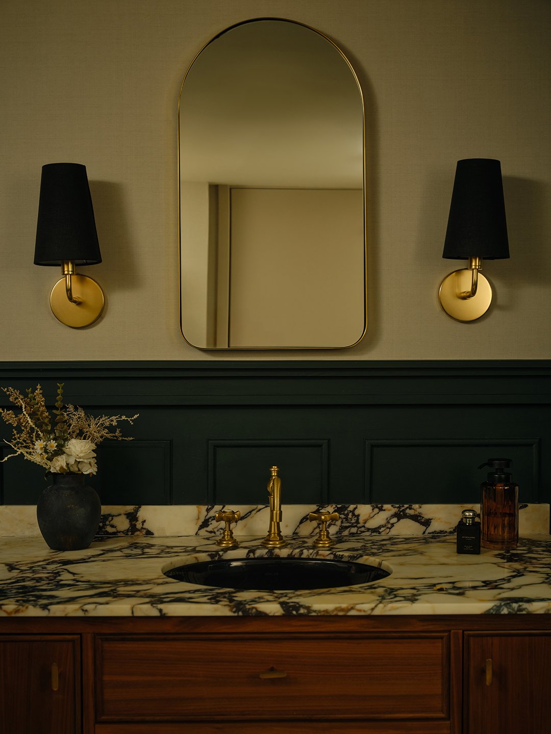
The walnut vanity adds warmth, while the dramatic veining in the marble introduces movement, much like the evocative gloss of the shower tiles that catches the warm light. Herman treats the practice like she’s creating a collage-style piece of art with paint, millwork, tiles and other details that come together on a single canvas.
Not Every Space Needs to Feel Expansive
With ceilings coming in at only six-foot, nine-inches high with no natural light in sight, this basement was never going to act like an airy, open loft—but it wasn’t doomed to be a cave, either. Herman made it her mission to elongate the walls using four-foot high wainscotting drenched in a grounding green hue.
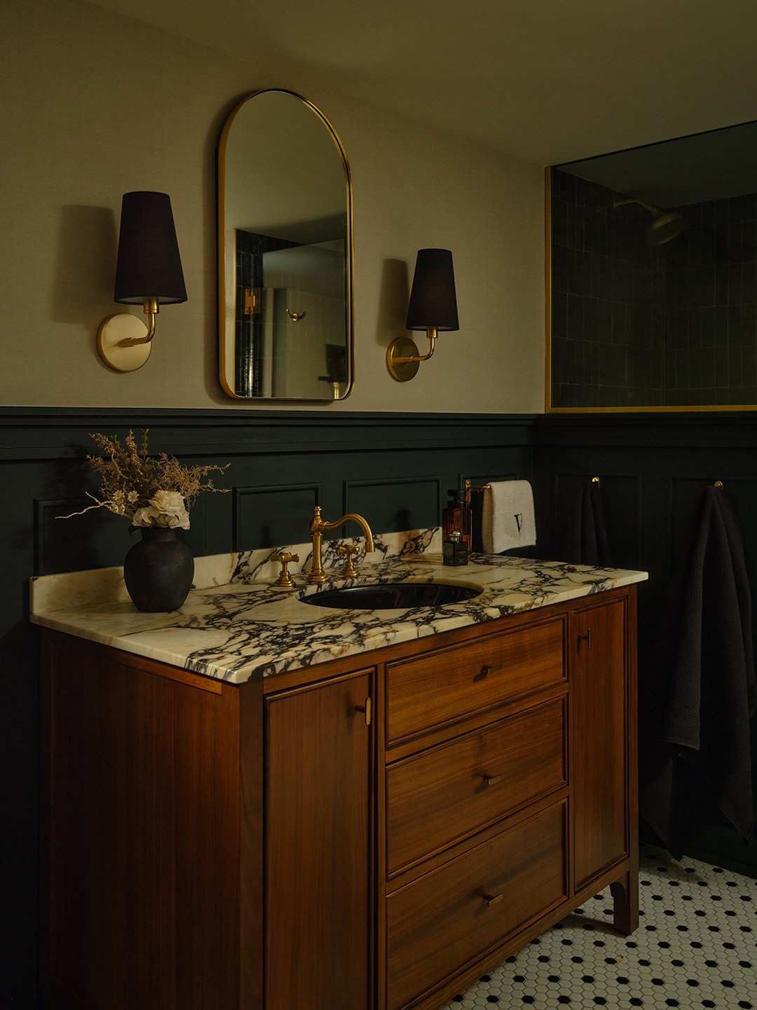
The paint color was the only convincing Herman had to do in the project. “Clients never want anything to feel small,” remembers Herman of the paint color conversations. Thankfully, Kathryn’s husband Steve could see the vision and helped select Benjamin Moore’s Essex Green for the millwork. “I wanted it to feel deep. I wanted it to have a depth and a richness. I wanted there to be cohesiveness,” she says of the winner and darkest of the five swatches that were on the table—er, walls. “It’s dramatic. It has a drama to it, where a light color wouldn’t achieve that.” Wainscotting was even added to an exterior door that seamlessly blends into the wall.
Create Mini Rooms Within a Room
The wainscotting wasn’t only used as a tool to lengthen the walls. It also helped create privacy in the open rectangle of a space. Adding partition walls along the shower created a natural nook for the toilet and framed the vanity (Vlakic’s favorite piece in the space), though that wasn’t part of the initial plan.
“The whole shower was glass. As I kept doing different layouts, I said if you’re in this glass shower, you’re going to look out and see the vanity. Who wants that? Not me. So I changed it,” says Herman. “And it worked out so wonderfully—every area of function is integrated, yet distinctive.”
Now, Vlakic describes the basement as the perfect balance for her family. “It feels like you can breathe,” she says. And Herman has a new hybrid room configuration under her belt. “Bathrooms and laundry rooms have very different visual languages,” she remembers. “ It was a very happy moment when I was standing in the finished space. Because you can design something, but in order to really experience a space, you have to be in it.”