We may earn revenue from the products available on this page and participate in affiliate programs.
When a young couple preparing to start a family purchased this 1,100-square-foot semi-detached house in downtown Toronto, they weren’t looking to add to its footprint. Instead of adhering to the “bigger is better” adage, they wanted to make the most of what was already there. The catch? The circa-1920s home hadn’t been meaningfully updated in more than half a century.
Designer Denise Roy came on board before the sale even closed, helping the homeowners assess whether the house could support their vision and budget. Rather than gutting the structure and starting over, she focused on a series of targeted renovations that would improve flow, increase functionality, and preserve the home’s original character. Ahead, Roy shares how she achieved a personal, layered space that’s still rooted in historic architecture.
Take Stock of What You Have


Since every inch mattered, the design process began with an inventory of how the homeowners actually lived. Roy cataloged everything from kitchen tools to household routines so that storage solutions could be tailored precisely to their needs. Sustainability was equally important, leading to an all-electric renovation, upgraded windows and doors, and a palette of durable natural materials including hardwood floors, stone countertops, and porcelain tile.
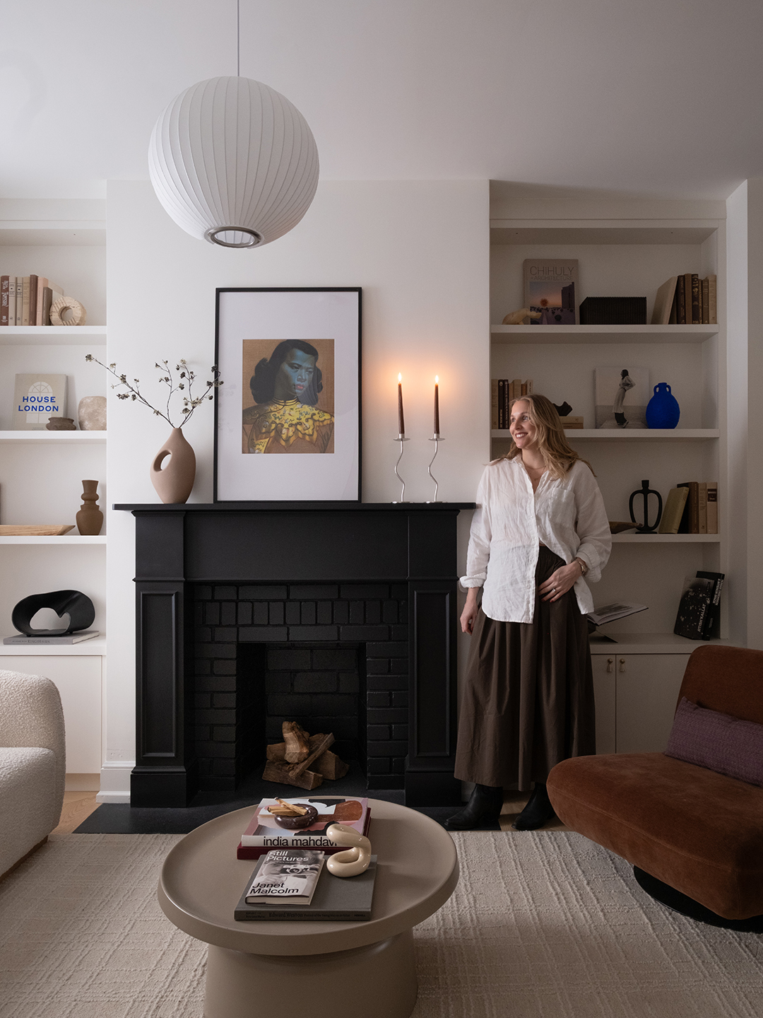
Roy also wanted to ensure future residents would appreciate the renovation rather than immediately tear it apart. That perspective inspired the restoration of period details like oversized baseboards, traditional millwork profiles, and a Victorian-inspired fireplace mantel.
Remove the Right Walls, Not All of Them


“We wanted the home to feel lighter, calmer, and more functional without erasing its original character or rebuilding unnecessarily,” Roy says. Rather than completely reworking the structure, she focused on strategic interventions that would have the biggest impact. Select walls were removed to improve circulation between the living room, dining room, and kitchen, creating a more connected main floor.
At the rear of the house, an awkward enclosed mudroom addition was demolished and replaced with oversized custom French doors. Suddenly, natural light poured into the kitchen, and the interior felt connected to a new outdoor patio.
Borrow Square Footage From Adjacent Rooms


The smallest room—the second-story bathroom—in the house ended up requiring the most creative design gymnastics. It was so cramped that the area couldn’t comfortably accommodate a shower, storage, and proper circulation. After demolition began, Roy realized the only solution was to subtly shift two walls and borrow a few inches from neighboring bedrooms. Those seemingly minor adjustments made space for it all.


Now, the room is wrapped in blue tile and anchored by a custom walnut vanity, but what Roy loves most is what it represents. “It became a real exercise in precision—every dimension mattered,” she says. “Ironically, it’s now one of my favorite spaces in the house because it proves how transformative thoughtful design can be, even within major constraints.”
Let One Material Lead the Way


Photography by Linya Studios
For Roy, the project’s turning point arrived with a slab of pale green quartzite destined for the kitchen countertops. “They were one of the biggest investments in the project and one of the earliest decisions we made,” she says. “The moment I saw the slab, the entire kitchen came together in my mind.” The stone’s soft green undertones and dramatic movement informed many of the surrounding material choices, including natural walnut cabinetry and warm metallic finishes.


The homeowners themselves also shaped the aesthetic direction. “My clients were actually the biggest source of inspiration for this project,” Roy says. “They’re open-minded and have a quiet confidence in their taste that made the project especially fun to design.”
Drawing inspiration from the couple’s Japanese and Spanish roots, she layered saturated color, warm wood tones, natural stone, aged brass, and texture throughout the home.
Take One Big Color Risk


Every memorable renovation needs a leap of faith. Here, it came in the form of saturated maroon millwork in the primary bedroom. The finish was ordered based on little more than a tiny sample, and there would be no opportunity to repaint if things went wrong. Even the supplier questioned the decision.


Thankfully, the gamble paid off. “It gives the room this moody, cocoon-like warmth that feels both dramatic and incredibly calming,” Roy says. Alongside a red-painted staircase, checkerboard foyer tile, black fireplace, and carefully selected hardware, the bold choice helps give the compact home an outsized sense of personality.
Sometimes the House Tells You What to Do
One of Roy’s favorite discoveries came during demolition, when the team uncovered a hidden window above the kitchen sink that had been covered up. “We restored it, and suddenly the entire kitchen felt brighter and more alive,” she says. “It completely changed the feeling of the space.”
There was another revelation that stopped everyone in their tracks. When workers removed layers of old vinyl flooring, they found newspaper tucked beneath the subfloor, likely used as insulation nearly a century ago. Curious, they checked the date printed on the page. It was exactly 100 years old—to the day.
“Even the toughest guys on the job site got goosebumps,” Roy recalls. “We all just stood there in disbelief for a moment. It felt strangely meaningful, like the house was giving us its blessing before we began bringing it back to life.” For Roy, the project is proof that a renovation doesn’t need a massive addition to feel transformative.

