We may earn revenue from the products available on this page and participate in affiliate programs.
Tucked behind mature landscaping in Los Angeles’s Brentwood neighborhood is a Spanish-style home that doesn’t announce itself with sweeping additions or flashy architectural gestures. Instead, the house reveals its power through restraint—or “a highly surgical renovation,” as architects Harper Halprin and Aaron Leshtz of AAHA Studio call it. Sometimes, the smartest way to transform a place is by rethinking every inch of what’s already there.
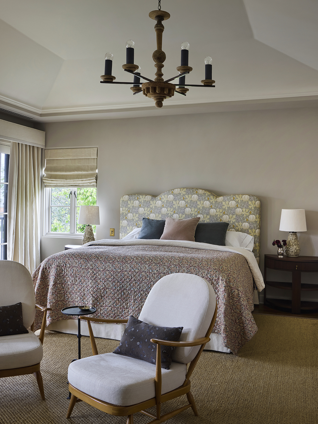
The homeowners, who had lived in the house for more than a decade, weren’t interested in chasing trends or expanding the footprint. Instead, the two-year project, a collaboration with Nickey Kehoe and Ray Kinner Builders, centered on restoring the spirit of the home’s original architecture while maximizing the current square footage. The team focused on circulation, proportions, and flow—read on for a closer look.
A Multipurpose “Mudler”
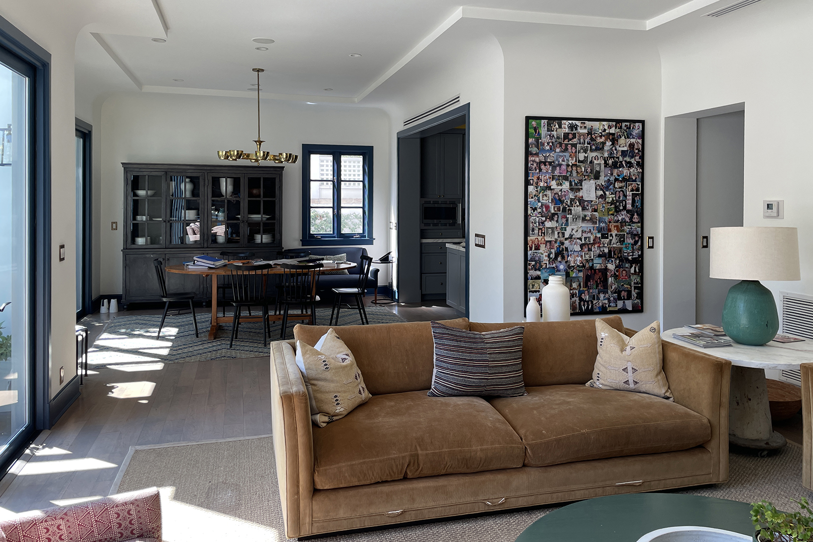
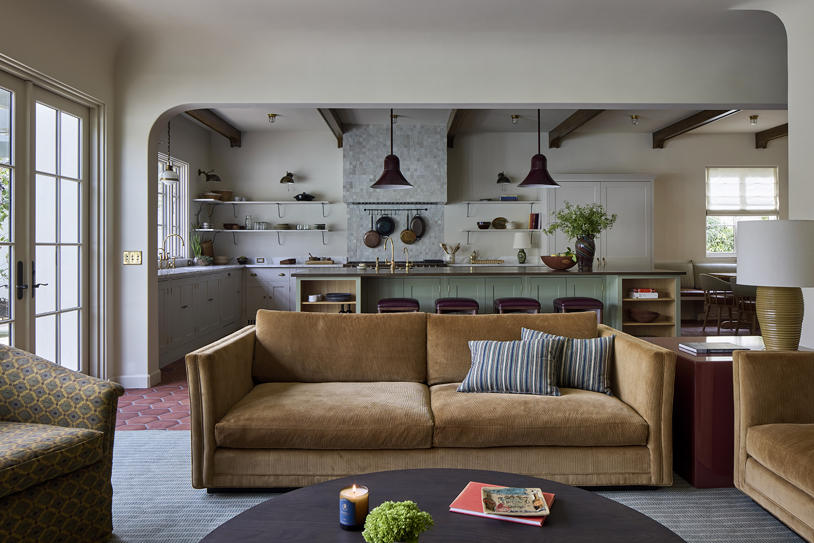
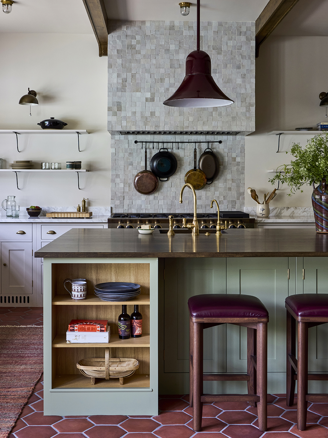
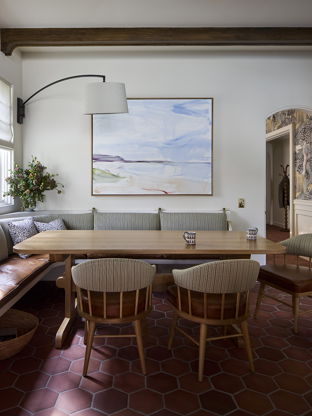
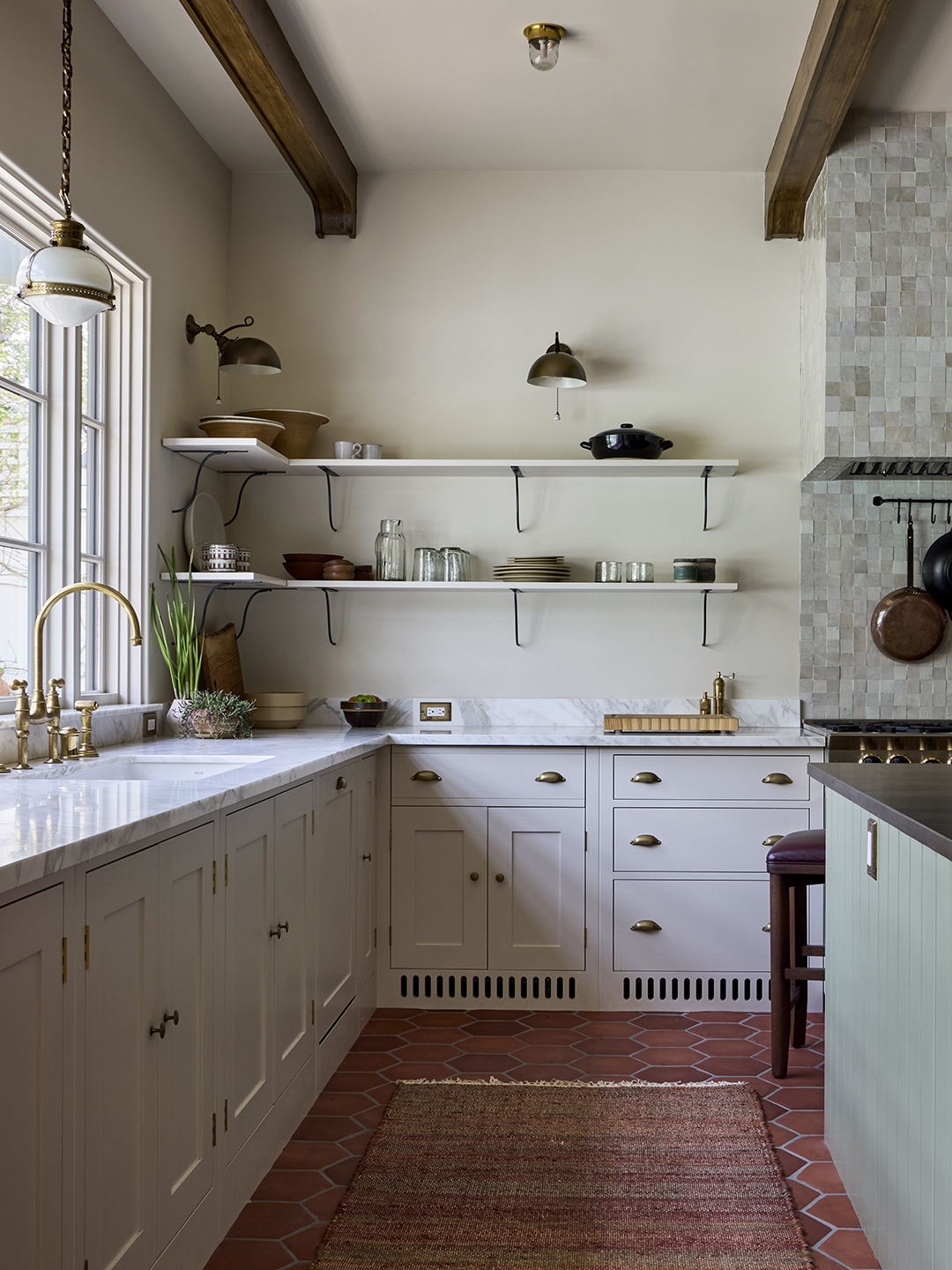
One of the biggest priorities for the homeowners was creating a kitchen that truly functioned as the center of family life. “They wanted an island where everyone could comfortably gather,” explain Todd Nickey and Amy Kehoe of Nickey Kehoe, and the Plain English cabinetry ended up informing much of the home’s material palette and atmosphere moving forward. Adjacent living and dining rooms, once compartmentalized, are now one seamless space, balanced by an integrated breakfast nook to add back a sense of intimacy.
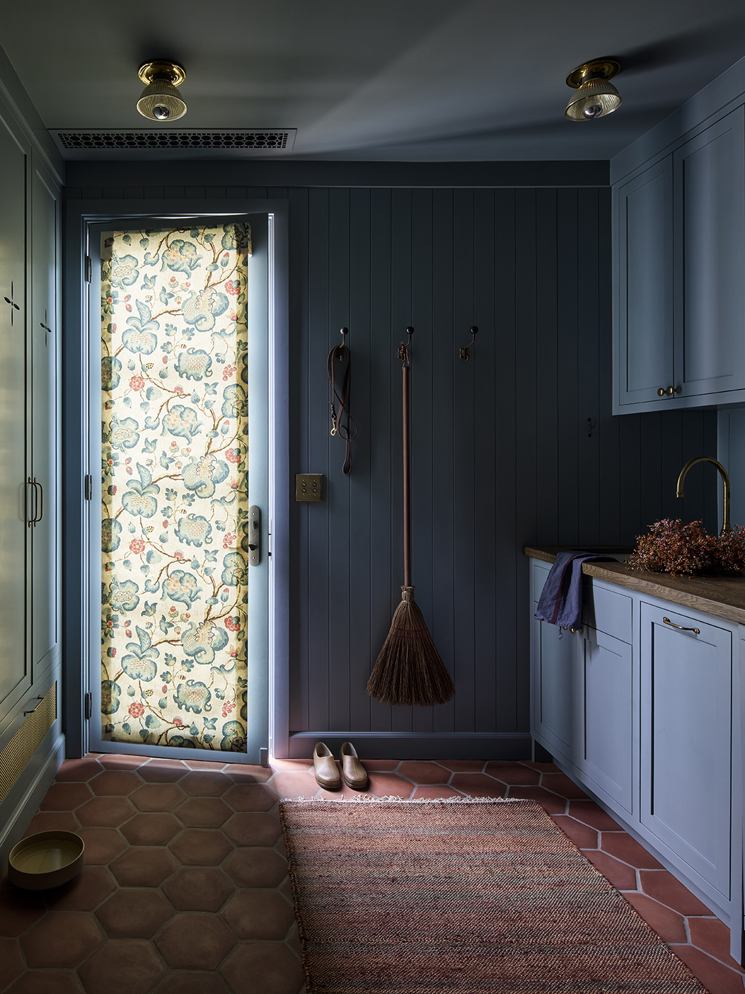
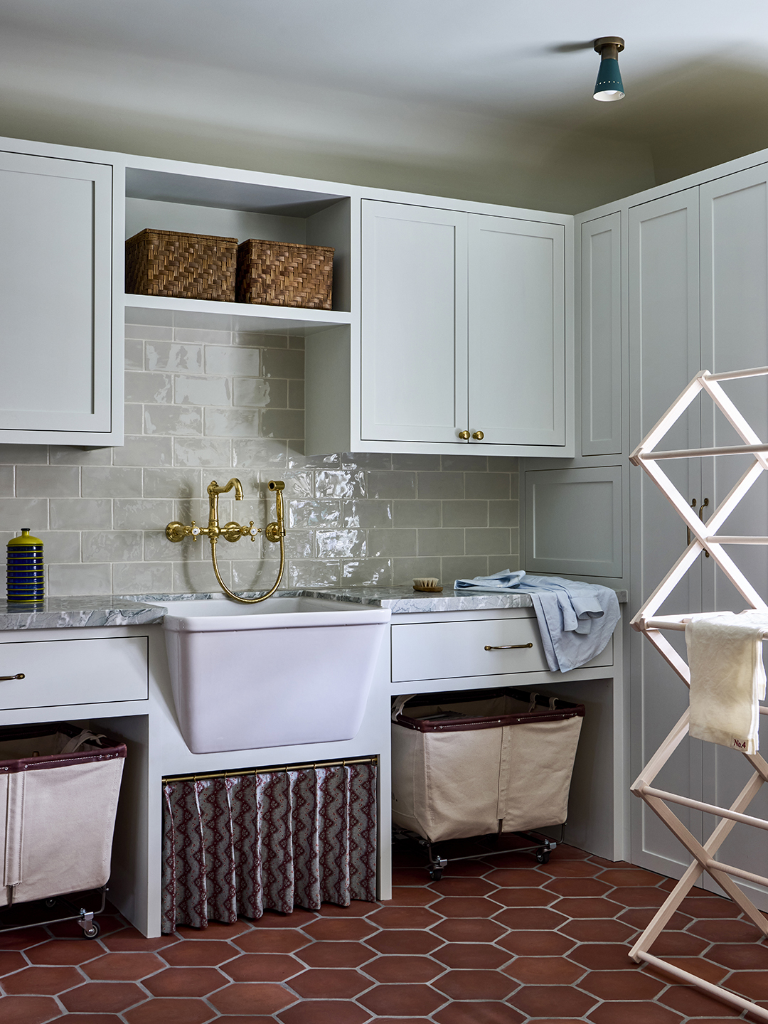
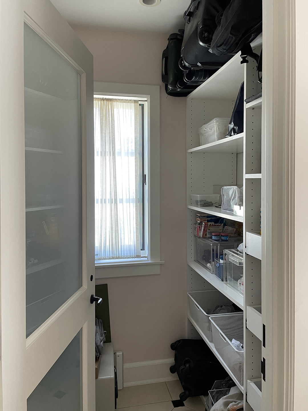
However, the existing footprint didn’t allow for both a dedicated mudroom and butler’s pantry. The team created what they affectionately call the “mudler,” a hybrid utility area that combines concealed storage, prep space, and an entryway drop zone. No wasted square footage, no unnecessary additions, just smarter planning.
Saving and Subtracting Arches
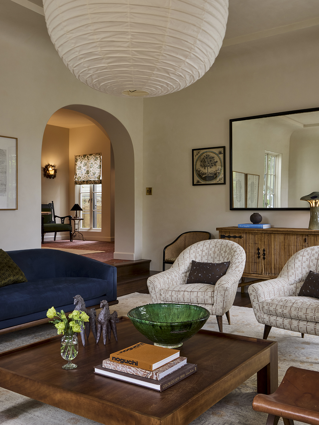
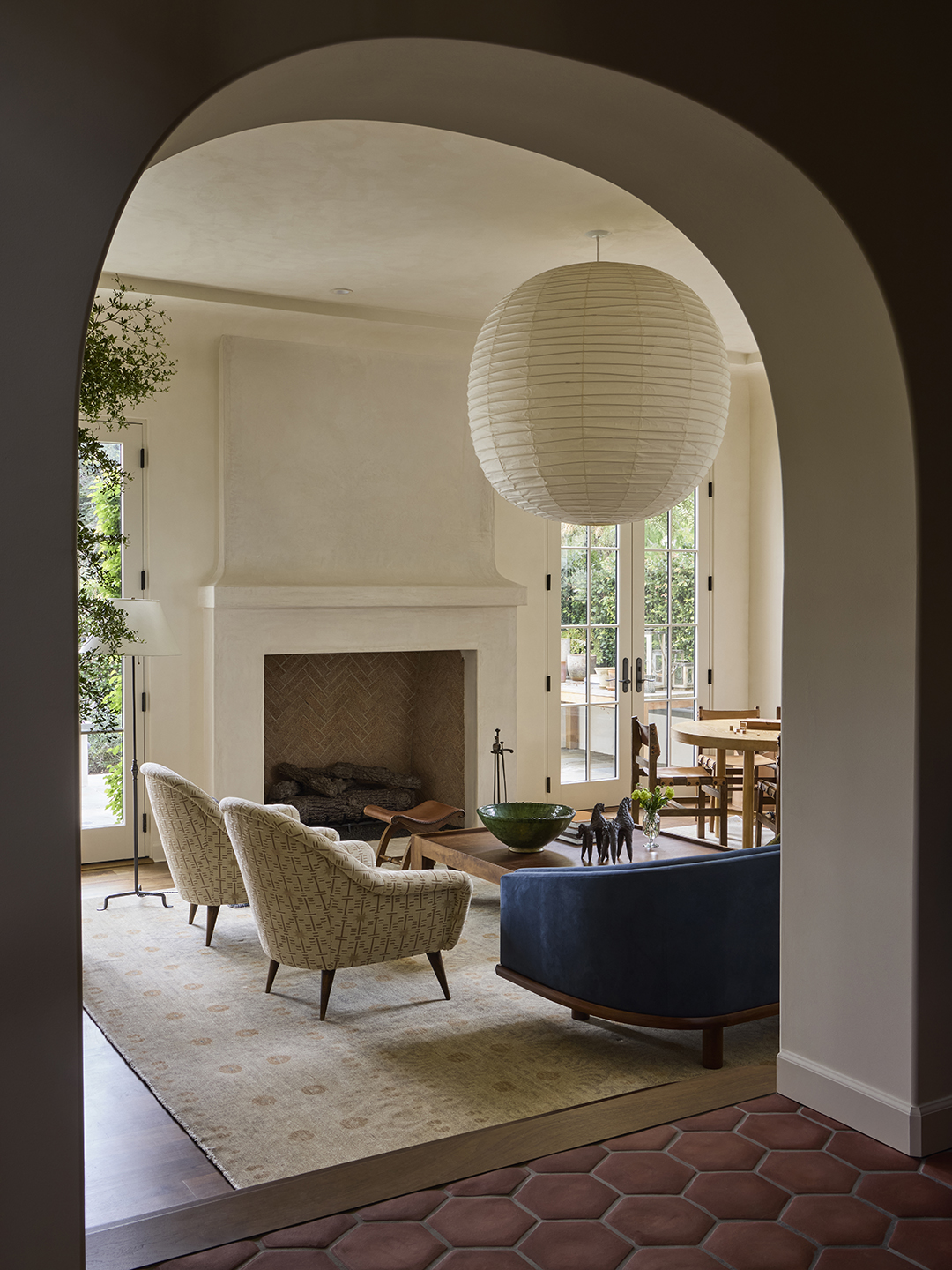
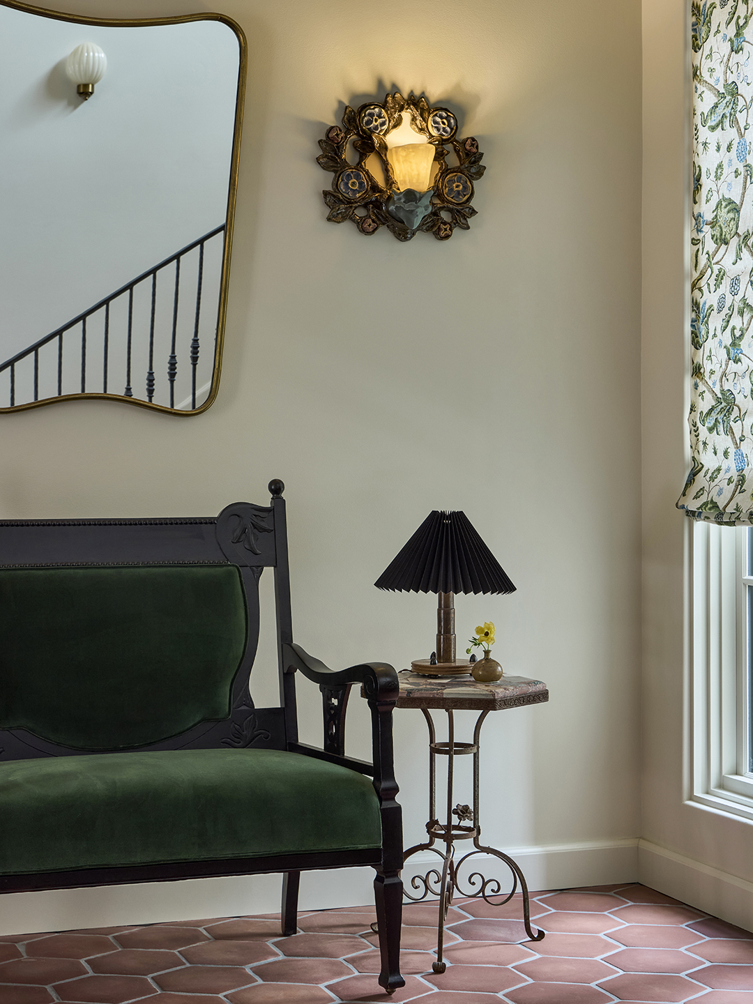
Terracotta tile, subtle ceiling vaults, and custom millwork all reference the home’s Spanish roots without veering into imitation. “We love that the home doesn’t feel brand new,” the architects explain. “It feels like it has a built-in patina.” While arches appear throughout the home, the team was intentional about where they felt meaningful and where they didn’t. “They felt earned rather than overdone,” say Halprin and Leshtz. In one particularly smart design save, the architects squared off several original arched windows and doors rather than replacing them with costly custom curved units.
The Jewel Box Under the Stairs
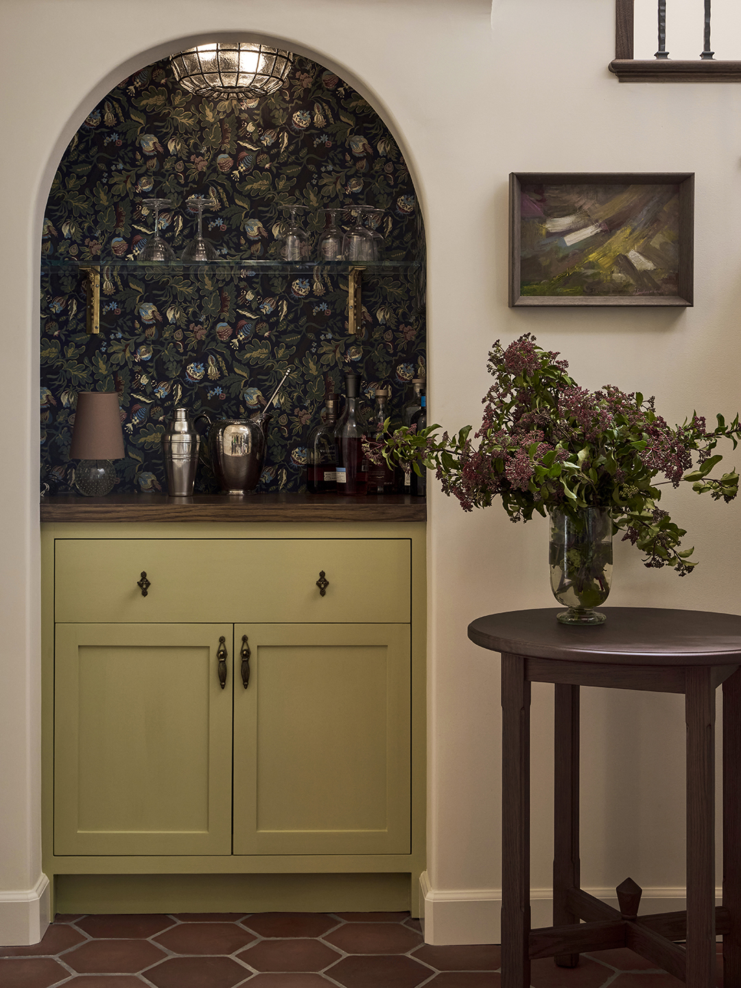
Originally conceived as a hidden bar, the petite nook under the staircase near the entry started to evolve once installation began. “We loved seeing it so much that we decided to eliminate the doors entirely,” say Nickey and Kehoe.
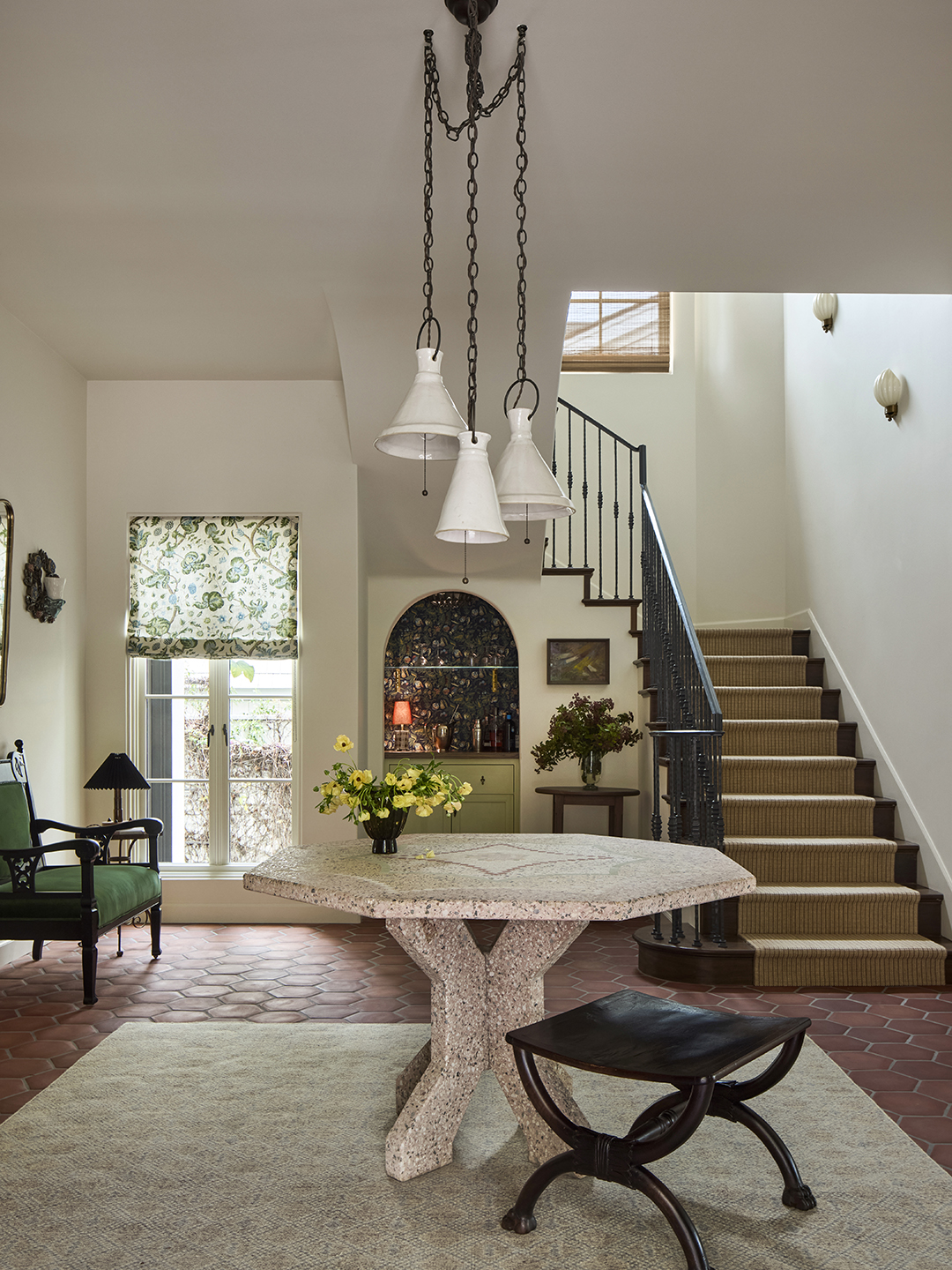
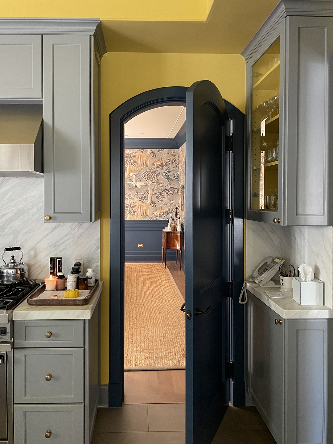
The tiny, jewel-box space packs in an outsized amount of personality: citron-painted cabinetry, a glimpse of moody floral wallpaper, and hardware with old-world glamour. Architecturally, it’s also the pivot point between the dining room and formal living area—rather than treating the area as a pass-through corridor, the designers transformed it into an active entertaining zone.
Bold Tile and Saturated Color in Small Doses
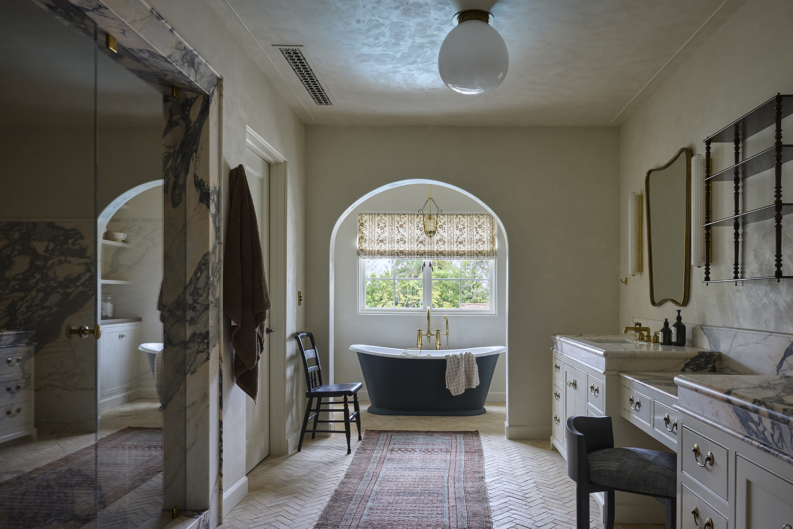
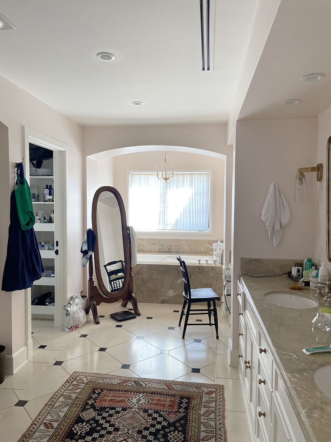
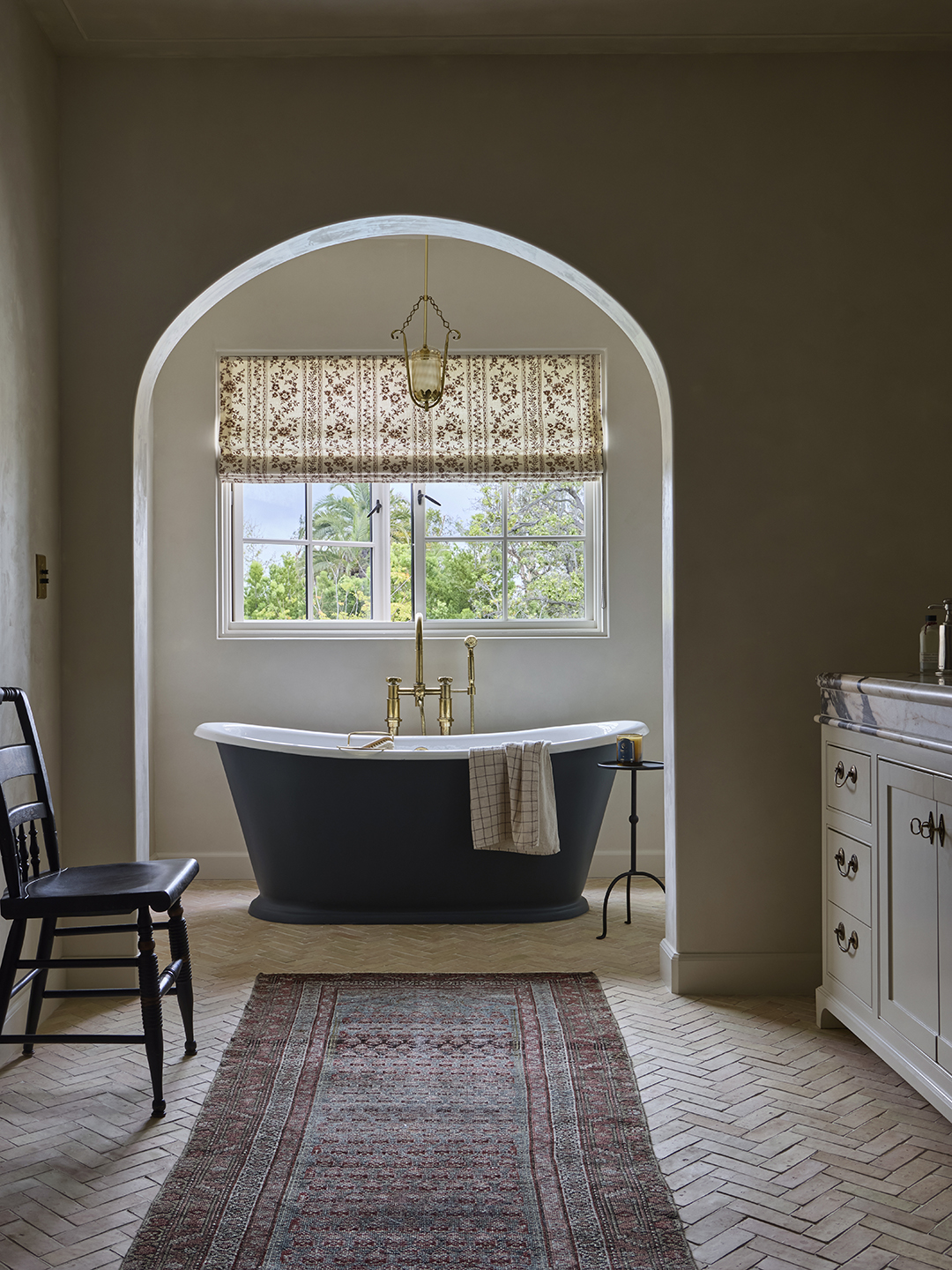
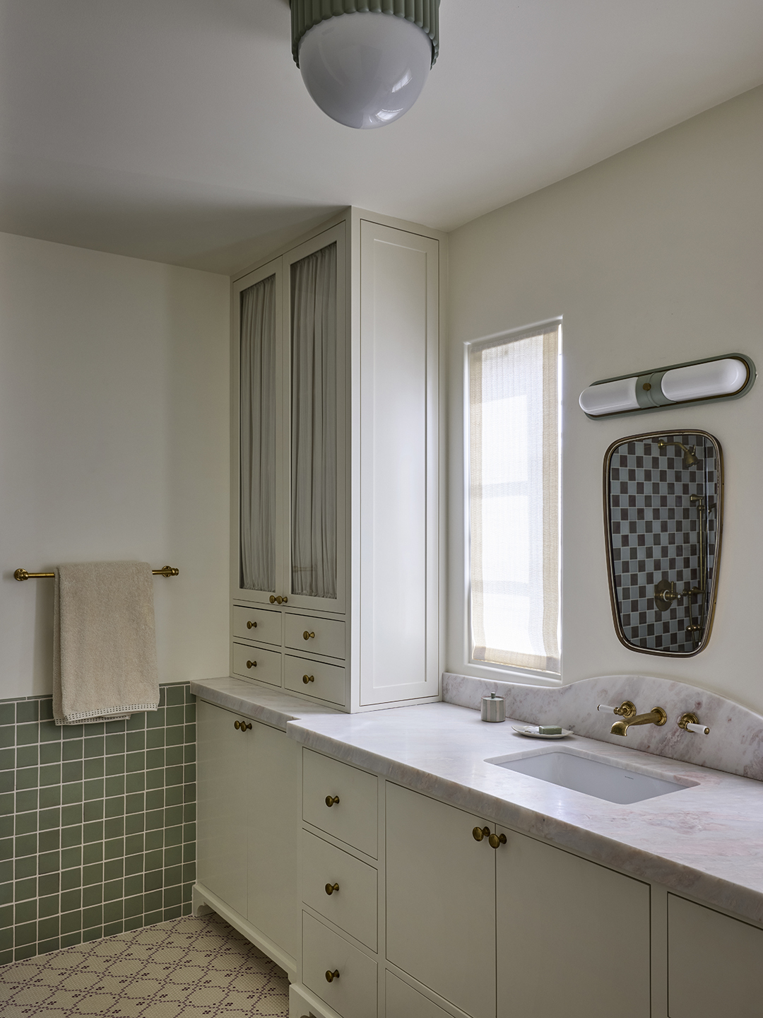
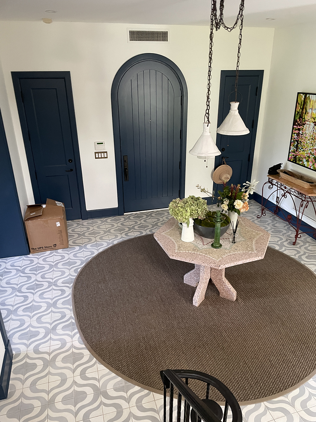
The designers used secondary spaces as places to experiment and immerse, a contrast to the home’s more restrained communal areas. “There’s a time and place for these bolder patterns and mixed surfaces,” Nickey and Kehoe point out. “It was important that these accents felt contained within vestibules, bathrooms, and niches.”
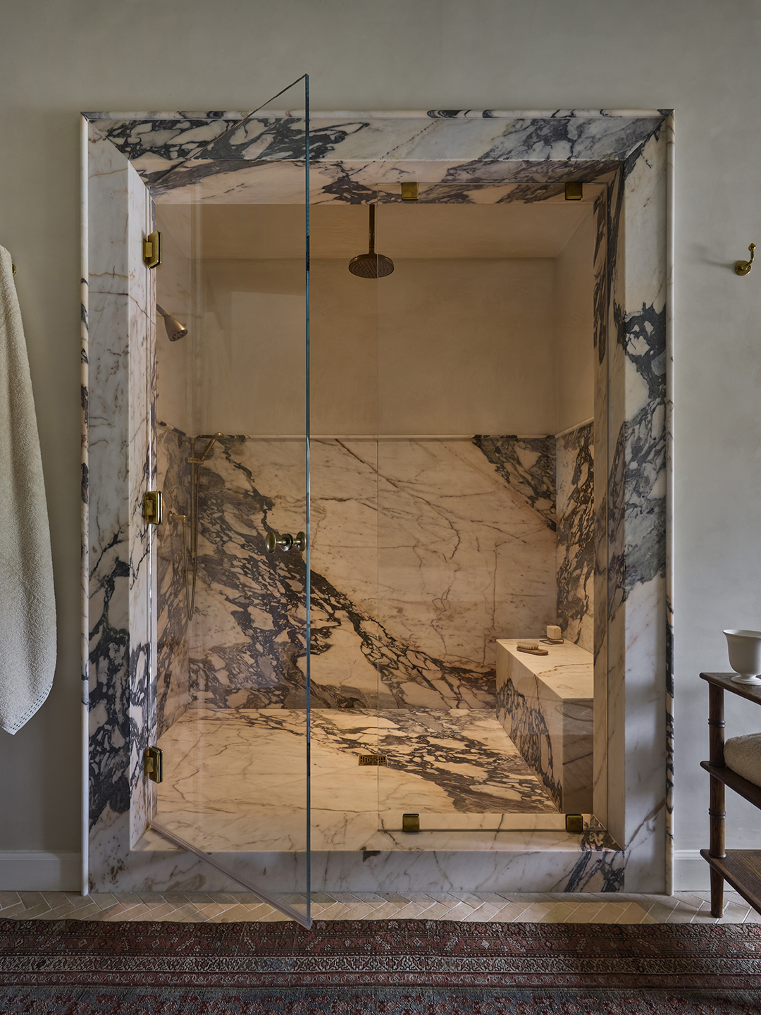
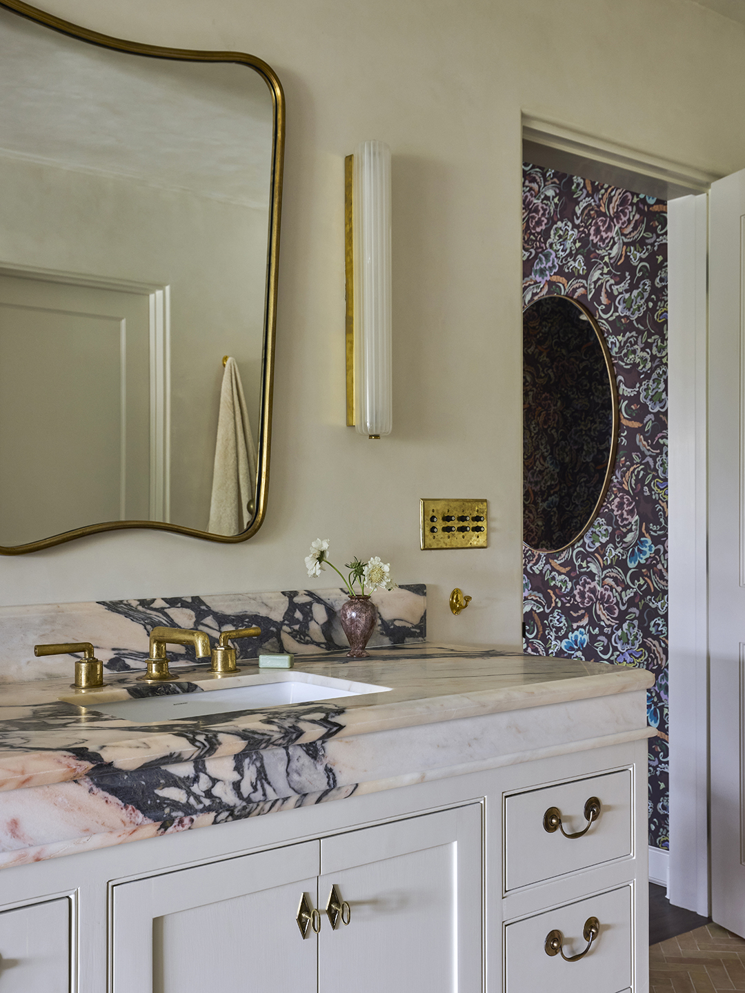
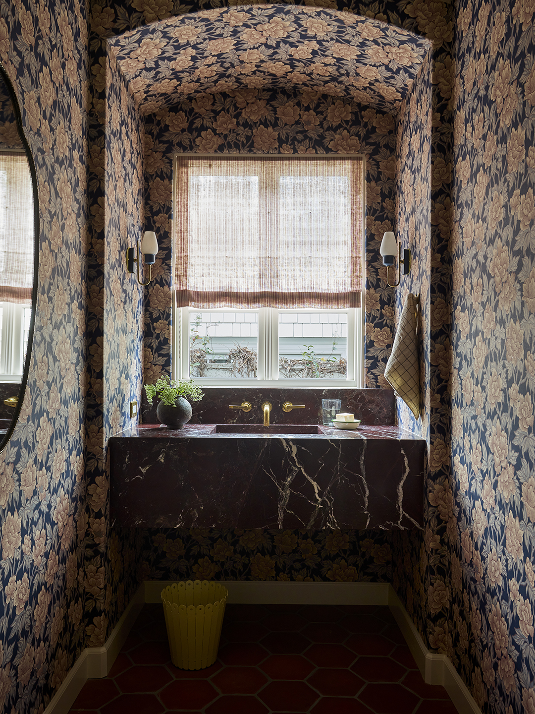
One standout? The vaulted powder room ceiling, which emerged as both a structural solution and a decorative flourish. Rich wallpaper and dramatically-veined marble only add to the cocoon-like tone.
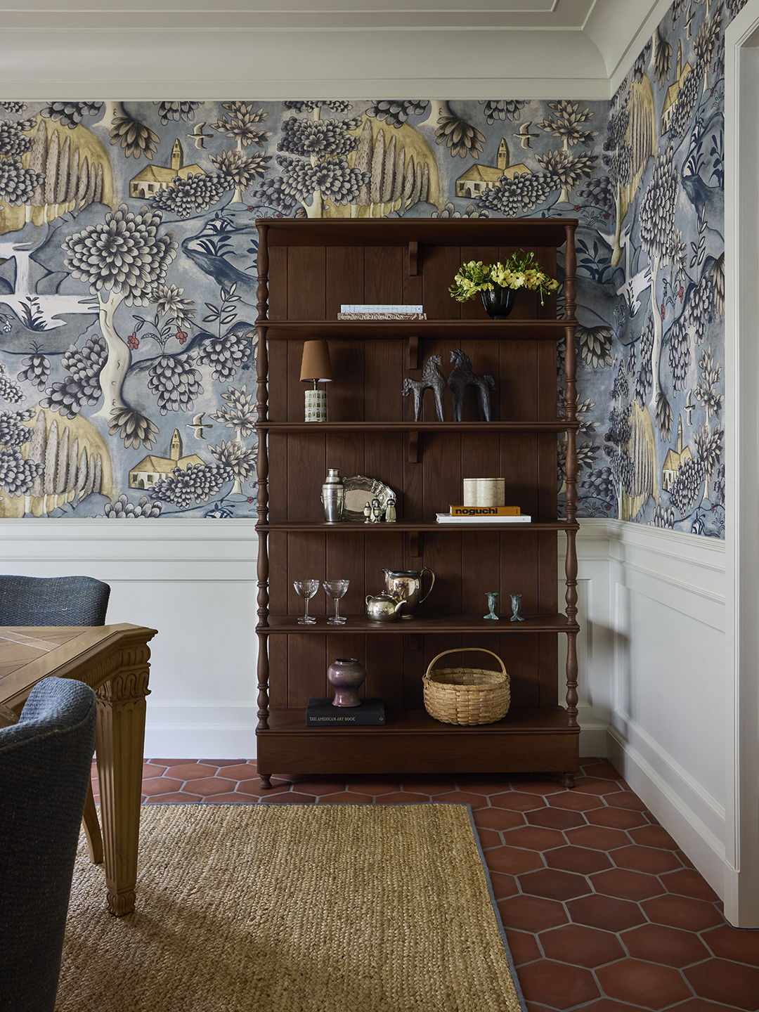
“The house now feels entirely renewed,” say Nickey and Kehoe, “while still retaining the comfort and familiarity of the home they’ve loved for more than a decade.” And the owners use it exactly as intended, piling into the kitchen with family and hosting friends with ease.