
We may earn revenue from the products available on this page and participate in affiliate programs.
Tenlie Mourning’s home office never looks messy, even when it is. Her secret? Everything—the walls, the desk, the shelves, the ceiling, the radiator—is painted the same shade of green. “It’s a little bit of a hack in that it makes the space feel really finished and polished, even though oftentimes we have multiple computers, books, and papers out,” says Mourning, a New York City–based design strategist who founded the vintage decor site Dendwell. Instead of dunking the workspace that she and her partner, Antoine, share in a calming shade of sage, Mourning went with an unexpected and somewhat polarizing tone: lime. “Most people [who visit us] love it, but I think there are probably a few people in our life who think it’s intense. My parents were like, ‘No way,’” she says with a laugh.
You’d never know looking at the room now that Mourning almost always steers clear of bold hues. “Color isn’t something that I really understand at all. My style is minimal,” she admits. But Antoine was clear from the get-go that he didn’t want everything in their Upper West Side apartment to be white. “I knew that I needed to not make this space just my own,” she adds. Ahead, Mourning reveals her top tips for going bold when you just aren’t used to it.
Make Your Sample Swatches as Big as Possible

While the office does double as a guest bedroom, Mourning wanted the color of the space to feel energizing and uplifting, not put visitors to sleep. So she steered clear of shades that were too dark or too soft and stuck to pulling samples with undertones of yellow. She took home around 10 options to test out, painting large swatches on all four walls to get a good sense of how each color looked as the light in the space changed throughout the day.
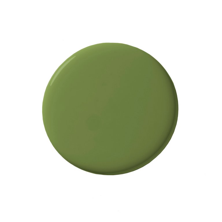
Two samples she ruled out: Sun Valley by Behr and Arugula by Sherwin-Williams. “I was looking for a color that was equally limey and neutral, one that would almost feel neutral when in the room but a statement when looking at it,” says Mourning. The winning hue? Behr’s Healing Plant.
Healing Plant Flat Exterior Paint u0026 Primer (1 gallon), The Home Depot ($44)
Shop NowGet Rid of Floor Drips in a Flash

The room surprisingly didn’t require a lot of prep. Because the paint product already has a primer mixed into it, the couple focused on moving the furniture out of the area and taping off the little bits they didn’t want to paint, like door hinges and knobs. While they did lay large plastic tarps down to protect the floors, when drips happened to seep through, Mourning used a latex paint–removal product by Krud Kutter to wipe them off the hardwood. “I became obsessed with it,” she says.
Stay Away From Flimsy Sprayers


Purchasing a paint sprayer through Amazon seemed like the most efficient way to swath the office in color, or so Mourning thought. “That ended up being a complete disaster,” she recalls. “I couldn’t get an even coat; it was just kind of going anywhere.” While she suspects using a cheap tool was part of the problem, she still stands by switching to a wide roller (she recommends one that is larger than 10 inches for flat walls) with an extension pole. In areas that required attention to detail (like around the door trim), she used a brush and Frog Tape to achieve crisp edges.
Give Worktops and Shelves Special Treatment


The desk and the floating shelf above it are made out of simple plywood boards the pair picked up at a hardware store. Antoine used a Swiss Army knife to carve the cutouts in the planks so they would fit neatly around the pesky radiator poles. After painting them with Healing Plant, they treated the surfaces with a polyurethane sealant to ensure they’d stay waterproof and polished-looking.
The two IKEA Lack shelves that are now mounted next to the sofa required an extra-special treatment. Because the varnish was so slick, Mourning doused them with liquid sandpaper in order to strip off the glossy finish before—you guessed it!—painting them green.