We may earn revenue from the products available on this page and participate in affiliate programs.
On paper, a large, square dining room clad in striped wallpaper sounds dizzying. In reality—or at least in this Washington, D.C., home designed by Zoe Feldman—the bold pattern is soothing. But that’s not even the whole picture. The space looks into a floral-covered foyer, which looks into a chartreuse-colored living room where various animal prints coexist. Astonishingly, “it actually feels quite neutral when you’re in it,” admits Feldman.

The designer considers this house—owned by a young, fashion-forward couple with an appreciation for British style (the wife is obsessed with House of Hackney)—maximalist but with a heavy dose of restraint. When juggling different furniture styles, prints, and colors at once, Feldman likes to refer back to Coco Chanel’s motto: “Before you leave the house, take one thing off.” “Everything can’t be the star,” she says. The home is a balance of quirky and traditional. In one corner you’ll find a vintage landscape tapestry; in another, a catchall for keys shaped like a human hand (Feldman’s signature touch in every project). “We didn’t just throw everything but the kitchen sink at the walls,” she says. “There has to be a natural relationship.”

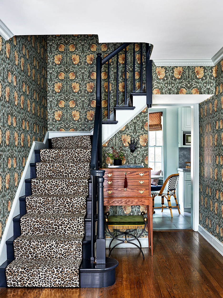
The striped Farrow & Ball wallpaper used in the dining room is actually a natural fit for the William Morris Pimpernel print that runs up the walls of the stairwell, the designer points out. The color palettes are tame and neither one lets you know you’re about to walk into a chartreuse room.
The only giveaway that someone modern and funky lives in the home is the leopard stair runner, although Feldman considers the feature more organic than maximalist. “Animal prints, no pun intended, are neutral by nature,” she explains. “They’re a part of our world and can hang out in basically any space together.”

Feldman continued the personality into the living room with nude sketches (created by one of the designers on her team), antique glass mirror panels, and a tiger-print daybed from the 1970s. The ultra-bright yellow-green walls and window trim look like lacquer, but they’re actually a Benjamin Moore hue that has been matched by Fine Paints of Europe in its Hollandlac finish, a high-performance alkyd enamel that gives it a shine but without the cost and labor that the real deal involves.

The kitchen is a palette cleanser of sorts: Feldman gave the kitchen’s existing cabinets a gradient facelift by using a variety of blue paints (the walls are Pale Powder, the medium door fronts are Light Blue, and the pantry cupboards are De Nimes, all by Farrow & Ball). “When you squint your eyes, it kind of smudges together,” says the designer. “It’s very calming.” The Donatello marble used for the countertops, integrated sink, and backsplash also has hints of blue in it that help complete the optical illusion.

The adjacent family room (or the “heartbeat of the house,” as Feldman calls it) is meant to serve the couple as much as it is their two young children. A TV is situated behind bifold cabinet doors, painted in Farrow & Ball’s Stone Blue—the same shade as the walls and baseboards. “It creates a multipurpose experience,” says the designer. The doors can be left open during the day when the kids are hanging out in the space eating lunch (the linen-velvet sofa is meant to wear beautifully over time) or closed at night when the adults want to zen out. The antique brass grilling used to hide what’s behind the lower cabinet panels is a go-to move of Feldman’s (although in most projects she uses the decorative plates to disguise radiators and air conditioner returns).

All-white bedding would have been a safe choice for the primary bedroom, given the busy upholstered bed frame, but Feldman decided to play up the pattern rather than mute it. The speckled pillows and duvet (Matouk’s Margot print) play nicely with the blue Pierre Frey fabric. “A small-scale print is complementary to a larger one in a way that a solid can’t always be,” says Feldman.

In the children’s bedroom, the pink dinosaur wallpaper (a House of Hackney find) packs a playful punch, so Feldman made sure the paint in the space measured up. “There’s so much opportunity to transform a room with trim, doors, and ceiling colors,” she says. To get the full impact out of the paper, she and her team painted the border an icy blue-green (a tone present in the motif). “A bright white would have looked out of place,” she explains. “It’s better to really take the time to think about what the paper needs and let it be its best self.”
Our Fall Style issue has arrived! Subscribe now to get an exclusive first look at Ayesha Curry’s Bay Area home—and discover how design can shape our world.