We may earn revenue from the products available on this page and participate in affiliate programs.

When we walk into a room, our eyes naturally gravitate toward color. Unlike other essential elements within a well-designed space, color is our reason for connection; our visual starting point, if you will, for understanding the inner workings of a space. But before you begin decorating under the popular presumption the bolder, the better, know that not all colors are created equal.
For the daring color-fiends among us, an exclusively fuchsia living room or an allover red bedroom might seem like a good idea at first, but those types of power moves rarely pay off. In search of rich hues with timeless appeal, we asked a handful of our favorite interior designers to share the bold paint colors they stand by. Interestingly enough, their selects fell into three major color categories. Read on for the winning hues worth trying.

The Blues
You’ve heard it before and you’ll hear it again: People LOVE blue. Respected for its versatility and ability to complement almost any style or existing color scheme, this reliable pick is, of course, widely approved by the pros. That said, their favorites grace a dynamic range of strong shades.
The inky blue
When you’re looking to add depth or dish up an extra dose of drama, a deeper, darker blue will unquestionably do the trick. For Natalie Myers of Veneer Designs, Farrow & Ball’s Stiffkey Blue is “the perfect rich and sophisticated hue.” While her go-to swatch strikes a more traditional note, Shea McGee’s preferred hue, Hague Blue, leans toward the sublime.
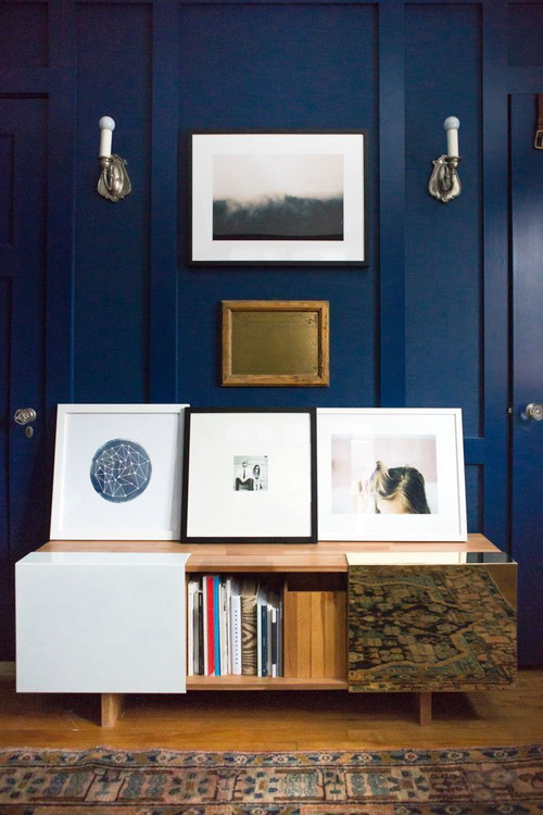
The true navy
It’s hard to go wrong with a classic. Whether paired down with rustic wood accents or dressed up alongside a chic gallery wall, navy blue can extend a soothing mood to a busy space. Joanna Hawley of Jojotastic and SoCal-based blogger Anita Yokota, who recommends trying Stunning by Benjamin Moore, are both big navy fans.

The deep teal
“It’s such a powerful color found throughout nature,” says designer Tavia Forbes of Forbes + Masters. Though it goes without saying, she’s not talking about the gaudy teal that once charmed your college dorm room. What we have in mind is a more modern, sophisticated iteration of this youthful blue; one that pairs perfectly with fiery red accents and chartreuse rugs.

The purple blue
There’s something exciting about a color you can’t immediately put your finger on. Existing somewhere between a bluish violet and a purple-ish blue, we love this cryptic shade—and all its exciting variations—for its sheer ambiguity. For the low-committal type, Nashville-based designer Andria Fromm suggests using Sherwin Williams’s Frank Blue SW6967 on vanities and furniture for “a serious indigo look.”

The Greens
In case you haven’t already noticed, green is currently everywhere. And trust us, mint green cookware, green marble accessories, and PPG’s Night Watch—a deep, luxurious shade of green paint that was recently dubbed the color of 2019—, are just the beginning of this major color obsession. Here are two renditions the pros recommend you bring home.
The earthy green
“I like to stick to colors that aren’t super bright or saturated—they have a more timeless feeling,” writes Utah-based designer and award-winning blogger, Sarah Gibson, in her guide to picking the perfect shade of green. Not wanting to overwhelm her living room, Gibson looks for greens with a slightly muted and muddy quality to them.

The emerald green
A surefire way to bring a room back to life, this vivacious shade deserves to make an appearance (or two) in your home. While bohemian queen and creator of The Jungalow, Justina Blakeney, loves the idea of emerald green all over (her favorite shade right now is Emerald Isle by Benjamin Moore), one can also introduce this bright and happy into their space in waves. In cookbook author and television food critic Katie Lee’s Hamptons retreat, this full-bodied tone takes centerstage in the form of an entryway table.

The Blacks
Let’s be real: Painting a room black is intimidating. But when done right, black walls can act as a solid visual anchor for a space. “Black can be used anywhere, in any room. It’s a strong dramatic neutral and can always be lightened up with accessories,” explains Kahi Lee, one of the designers on TLC’s “Trading Spaces.”
The barely there black “I am really into painting at lease one room black,” designer Dee Murphy tells Domino. “I painted my own bedroom in Farrow & Ball’s Off Black and I have received an amazing response. Clients tend to be a bit timid when going so dark, but absolutely fall in love with how it makes them feel!”
Milder in tone and softer on the eyes, Murphy’s pick for the bedroom actually helps strengthen the light pinks and bright blues within the space.

The matte black
Although matte black is often relegated kitchen, the same flat paint sheen can be used to achieve the same luxe look in other areas and surfaces of the home. Obsidian from Benjamin Moore’s Century Paint Line (a small batch collection of 75 rich, pre-mixed colors) is interior designer Becki Owens‘s swatch of choice.
Want more paint advice?
Why You Should Paint Your Bedroom a Dark Color 4 Paint Colors That’ll Make Your Tiny Apartment Feel Huge The Only 9 White Paints Worth Considering
Isn’t it time you got the news you actually want? Sign up for your daily Domino email here.