We may earn revenue from the products available on this page and participate in affiliate programs.

Maybe it’s that winter is upon us—the days are getting shorter and the nights longer—or perhaps it’s the more saturated tones that dominate our wardrobes this time of year. Whatever the cause, one thing’s for sure: Dark colors are casting a spell over us (and our sleeping quarters), and we’re downright obsessed.
“When it comes to the bedroom, there’s nothing better than somewhere cozy and comfortable, where you can relax and get that much-needed shut eye. And for that, I love moody hues,” says interior designer Brady Tolbert.
And there are so many to choose from. There’s something so undeniably chic about a wash of navy blue, and jewel tones evoke visions of opulently clad European castles. In addition, charcoal works in both traditional and more contemporary settings.
Ready to take the plunge with ultra-pigmented paint? Get inspired by these dreamy bedrooms. But heed a word of warning: Once you journey to the dark side, you won’t soon return.
Indigo Batik by Sherwin-Williams
Marie Flanigan Interiors delivers seaside exuberance in this Galveston beach bungalow. The high-energy combination of indigo paint with bright white accents produces a striking statement. “Extending the bold blue to the ceiling encourages eyes to travel up, while crisp white trim, decor, and linens offer a sense of visual relief,” says Flanigan.

Kendall Charcoal by Benjamin Moore
This sophisticated space is a prime example of how to use a
to introduce depth, dimension, and interest. “The color story is built upon grays. Charcoal walls blend effortlessly with a zinc headboard, fog-inspired drapes, and coordinating bedding,” explains Flanigan.

Stiffkey Blue by Farrow & Ball
Still intimidated by the idea of painting your entire room a moody hue? Brooke Wagner of Brooke Wagner Designs suggests starting small. “Try an inky blue accent wall and watch how it brings a little drama,” she says.
Find patterned accessories—a throw blanket, some pillows—that are neutral (aside from a hint of the chosen shade) to really pull the look together.
French Beret by Benjamin Moore
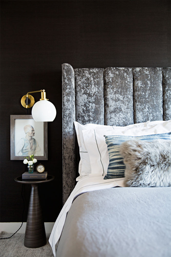
A twilight blue-gray room is definitely dark, but it doesn’t have to feel like a cave. Case in point? This urban retreat designed by Jenny J Norris. Sumptuous textures—a velvet headboard and fur throw pillow—exude richness, and heighten the sensorial experience.

Studio Green by Farrow and Ball
“High contrasts beget a dynamic experience,” says designer Susan Ferrier. The creamy pale tones reflect—rather than absorb—light, and when set against the nearly black background, they almost appear to glow. “Isolating these points of lightness highlights their forms.”

Deep Caviar by Benjamin Moore
A spacious master suite is a brilliant place to embrace a “more is more” approach. By marrying the paint and upholstery—and popping in moments of graceful opposition through surrounding colors and textures—Flanigan composes a space that’s both daring and delightfully unexpected.

Raccoon Fur by Benjamin Moore
Most people don’t realize that dark colors can actually make a space seem larger and cozier at the same time, but this loft from designer Tamara Magel proves just that. The soot gray accent wall creates an illusion of width, making the 11-foot ceiling appear less imposing, and the room more proportionate.

Naval by Sherwin-Williams
Decor that packs a punch and conscious styling are the keys to preventing a
from feeling drab. Pulp Design Studios relies on vibrant accessories, clean lines, and geometric prints to enliven the atmosphere, without losing the drama of the abyssal navy walls.

Witching Hour by Benjamin Moore
This deep and mysterious gray is a gorgeous backdrop for texture-rich materials and finishes. “Balance out the drama with nature-inspired elements, fresh white bedding, and luxurious fabrics in subtle colorways to expertly complement it without adding heaviness,” says Flanigan.

Narragansett Green by Benjamin Moore
“Going dark in your boudoir can be scary, but the reality is that it builds a sophisticated foundation when the right shades are used,” explains Brynn Olson of Brynn Olson Design Group. Saturated green walls paired with white hotel bedding, a light rug, and soaring ivory window treatments yield a refined and surprisingly refreshing result.
See more color guides: Chip and Joanna Gaines on How to Use Bold Paint Colors in Your Home THIS is Pantone’s 2018 Color of the Year The Best Paint Color Combinations
Get all the news you never knew you needed when you sign up here.
