We may earn revenue from the products available on this page and participate in affiliate programs.
We’ve done our fair share of reporting on paint trends and the colors you should be decorating with, and for those who find themselves inclined to revamp their space, the process usually begins with the selection of a single hue. Decoratively speaking, it’s relatively easy to go from there, especially if you’re working with a minimalist or traditional scheme. But, for those feeling up to the challenge of embracing a medley of new colors, we’re here with some sage advice.
When it comes to pairing colors with one another, there are a handful of ways to go around it: You have the classic combos (pink and blue), high-contrast (black and white), and the unexpected (yellow and purple). So how does one exactly make it work? That’s where we come in. We set out to unearth the duos (and trios) that will instill a major refresh within your home. From the bold and the avant-garde to the classic-yet-statement-worthy neutrals, take a peek at the hues we’ll be bringing home this year.

Blue + Blue
Settling on one particular shade of blue can be a challenge in itself, but finding two tonal variations of it is a different story. Lately, we’ve seen a number of spaces that have been pairing two seemingly similar shades of blue together, which offer up the ever-so-slightest element of contrast, much like that of the entry of this Parisian apartment.
Paint
Cook’s Blue, Farrow & Ball Lulworth Blue, Farrow & Ball Parma Gray, Farrow & Ball

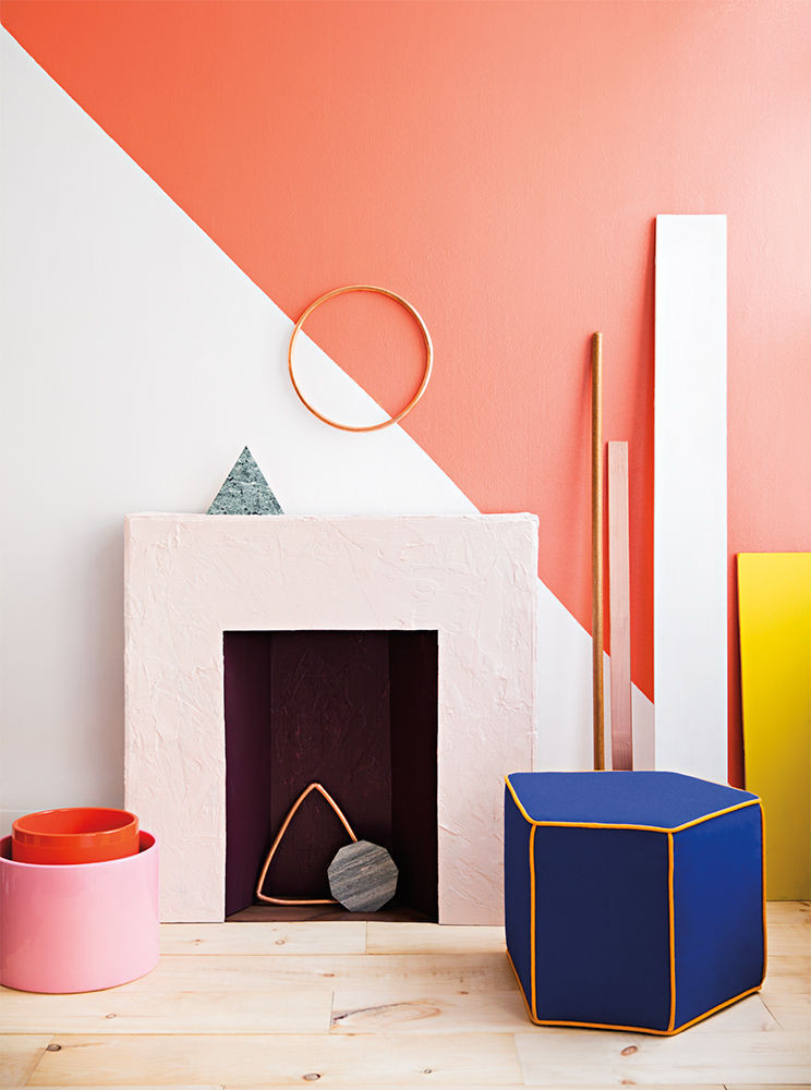
White + Terracotta
The key to making an almost exclusively whitewashed space feel fresh and exciting? Designating a contrasting color detail in an unexpected way: think floors, ceilings, or even a bold color block. We’re taking a page from Georgia O’Keefe’s New Mexico hacienda, where the bare white walls are beautifully complemented by the rich, earthy tone of the mud-plaster flooring.
Paint
White Wool, Behr Western Pink, Valspar

Blue + Cream
Consider this the new way to do neutrals: Pale, creamy walls uplifted by a dynamic blue ceiling. Take cues from this Brooklyn apartment, where the ceilings are clad in a deeply saturated blue, complementing the modern-meets-industrialized aesthetic and inviting a welcome pop of personality.
Paint
Hague Blue, Farrow & Ball Ammonite, Farrow & Ball

Green + White
Aside from being one of the most Instagrammable bathrooms in NYC, Verde’s geometrically-charged paint job proves that there is no such thing as too many shades of green. Take a tonal approach to your space—implementing this in the powder room or laundry is highly encouraged—by opting for a curated palette of greens (think 3-4 variations) and balance the mix with a high-contrast hue.
Paint
Hunter Green, Benjamin Moore Garden Green, Benjamin Moore Meadowlands Green, Benjamin Moore Surf Green, Benjamin Moore Blanched Pine, Valspar

Black + Yellow + White
Paint
Pitch Black, Farrow & Ball Golden Yellow, Valspar Whisper White, Behr

Pink + Pink
We love this one for the powder room especially if you’ll be pairing the combo with retro pink tiles. Haven’t you heard? They’re making a comeback. Take note from this Parisian shop, where an influx of the hues in varying tones establish an atmospheric finish that’s both inspired and on-trend.
Paint
Harmonious Rose, Valspar Pink Cadillac, Benjamin Moore

Earthy Tones
Dubbed as one of the trending colors of the year, earthy tones have been making their mark in the world of design. While the spectrum of hues that are incorporated into this trend is rather broad, there are a handful of clear and underlying details that remain constant throughout: An element of contrast as well as a combination of colors that inspire a visually broad aesthetic.
Paint
Card Room Green, Farrow & Ball Raucous Orange, Sherwin-Williams Setting Plaster, Farrow & Ball

Blue + Yellow
We’re all for channeling a sun-drenched locale with this invigorating combo. Fresh, bright, and incomparably enlivening, pair soothing blues with a vibrant yellow to really make your space stand out. Bonus points for bringing in an added hint of warmth by way of a blush accent or saturated pink.
Paint
Wind Speed, Behr Sunny Jonquil, Valspar

Pink + Purple + Orange
One would be hardpressed to pair these saturated hues together, and we’ll be the first to admit it: it can be pretty intimidating. That said, we can’t deny the stunning finish that results from utilizing the hues in a vibrant color block with a geometrically-inspired design, as seen in this lively bedroom.
Paint
Middleton Pink, Farrow & Ball Cerise, Sherwin-Williams Electric Orange, Benjamin Moore

Red + White + Blue(ish)
This fresh combo vibrates with energy thanks to the invigorating depth of the red. Softened by the blue-lilac tint and balanced out with a sliver of white, the key to bringing this classic trio home is by going beyond the standard tonal variations of each shade.
Paint
Salsa, Benjamin Moore High Reflective White, Sherwin-Williams Surrender, Valspar

Yellow + Purple
A naturally complementary pairing, one would be hard-pressed to bring this untraditional duo into their home—by way of wall paints, of course. That said, we’re seriously into this chic color block where an even split between the two dynamic hues establishes a bold yet comforting detail to the space.
Paint
Gold Sand, Dunn Edwards Gentle Violet, Benjamin Moore

Pink + Blue
There’s a reason this power combo was selected as Pantone’s 2016 Colors of the Year. Often earmarked for the nursery, we’re all for rethinking this quintessential tonal pairing for the bedroom with a slightly untraditional take: designating one of the hues for the walls while letting the other steal the show via the ceilings.
Paint
Ribbon Pink, Benjamin Moore Ballroom Blue, Behr
Discover more ways to decorate with color:
THIS is Pantone’s 2018 Color of the Year 9 Cool Ways to Decorate with Pantone’s Color of the Year The Best Uses of Pantone’s COY from the Last Decade
Learn to love your inbox again—sign up for Domino’s daily email.