We may earn revenue from the products available on this page and participate in affiliate programs.
Update
The news is in! Early this morning, Pantone announced their 2018 Color of the Year: Purple. The appropriately dubbed shade, specifically known as Ultra Violet will undoubtedly grace the creative realms of fashion, design, and interiors.Earlier this year, the global color giant dropped a few clues upon the release of a similar hue as a color tribute to Prince. While it’s no secret that lilac is rapidly climbing the ranks in trends—not to mention the fact that it was one of our predictions for 2018’s color—the bolder and more saturated take on the shade is quite the surprise.
Pantone isn’t the only paint brand to go bold with their 2018 Color of the Year: Benjamin Moore chose bright red, while PPG, Glidden, and Olympic Paints all chose varying shades of black.
Here’s how we’ll be decorating with purple in the coming year.
This story was originally published December, 6, 2017.
As we look to the year ahead, there were a handful of details we took in for consideration as we formed predictions for Pantone’s Color of the Year. From the sweeping obsession that followed the announcement of 2016’s Rose Quartz and Blue Serenity—just in time to contribute to the inevitable rise of millennial pink—to the uncertainty we were met with upon the unexpected choice of Greenery for 2017, we’ve been through it all.
Maximalism is a trend on the hike, and with that comes an unrestrained approach to design fueled by an abundance of colors and prints, layered with effortless ease. In suit, designers (be it professionals or not) have begun to embrace a heavy-handed method when decorating with color. As for the colors that we have in the running for Pantone’s top pick? Read on to take a look.

THE FRONT-RUNNERS
Will yellow finally get the love it deserves? A bright citrus version of the color was a major contender for 2017, consequently overlooked in favor of Greenery. In September, Pantone released their Spring 2018 Fashion Week reports for both London and New York—the overview highlights the most popular hues used by designers in their upcoming collections—and within the extensive lists, Meadowlark took the lead with a dominating presence.
“Pantone’s Meadowlark is the lively shade we need for an optimistic, hopeful 2018. Yellow often symbolizes illumination, so we’ll look for this shade to light the way (and lighten the mood) in the year ahead,” says Olivia Rassow, design editor at AllModern.
We must mention that we did call it earlier this year…

Almost Mauve
The defined and moody shade has already been earmarked as the new millennial pink, taking both the fashion and interior world by storm. Wavering between a light mauve and a dusty lilac, the hue inspires a calming essence, while also bearing a surprisingly versatile characteristic. Consider it a fresh take on the “new neutrals” and leave the creams and beiges in 2017.
“It’s a soft and balancing neutral, which feels on-point right now—everyone’s craving calm, but no one wants to be bored. It’s one of those gentle hues you might paint a ceiling, and it’ll cast a dreamy aura on everything in the space,” says Donna Garlough, design director at Joss & Main.

THE RUNNER-UPS
We wouldn’t be surprised if the global color giant threw us all for a loop by selecting a hue that would pose as a departure from all preconceived trends. Enter this saturated red, which true to its namesake, imparts a vibrant detail that is simply unparalleled. We can see this one taking interiors by storm in a myriad of ways, from wall paints to decorative accents, and so much more!
Is it just us or are we getting serious Handmaid’s Tale vibes from this one?

Harbor Mist
Insert a 50 shades of gray reference here. When implemented correctly, the timeless color exudes pure elegance, conforming itself across a wide array of decorative aesthetics. While it may not be the most exciting pick, we’re looking to the shade with hints of cooler tones. In early August, Sherwin Williams gave us Stardew—the antithesis, of sorts, to millennial pink—proving that the blue-meets-gray shade was about to take over. We’re all for embracing the gray by imparting it with a high contrast detail through bold red pieces.See the rest of this stunning Williamsburg flat.

From the statement teals to the softer blues, this classic shade has had its fair share of love in the past year—hence why it has earned a spot on our list of contenders for 2018’s Color of the Year. A solid shade of blue never disappoints, especially when it comes to interior design. Consider it the new neutral. We’ve seen an array of interiors decked with shades of navy blue, each casting an inspired and refreshing perspective.
“This shade can go preppy and nautical, bohemian and funky, or straight-up traditional. It’s a building block for a wardrobe or a room,” says Donna Garlough, design director at Joss & Main.
Navy kitchens may have had their moment but we’re not seeing this trend die down anytime soon.

THE TEAM DOMINO FAVORITE
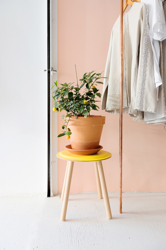
Unexpected and blissfully warm, the depth of this hue remains refined yet inviting. When it comes to interiors, we’d utilize the shade in the form of an accent piece, namely a bright sofa or lounge chair. Reminiscent of a bohemian-inspired palette, the aptly named color makes for the ideal complement to a plant-filled space, lending a dreamy contrast against bright potted greens.
Discover more ways to decorate with color:
Paint Trends We’re Loving for 2018 Pastel Wall Paints Are Back—Here’s What You Should Know How to Use One of the Trickiest Paint Colors in Your HomeLearn to love your inbox again—sign up for Domino’s daily email.