We may earn revenue from the products available on this page and participate in affiliate programs.
Drumroll, please: The design world’s equivalent to a Beyoncé album drop is officially here. Pantone just announced its 2020 color of the year…and it’s Classic Blue, a bold hue that somehow feels both timeless and totally fresh. Leave it to the people behind 2018’s eggplant purple and last year’s bright coral to come up with another electrifying pick.
This choice is especially poignant because it sets the tone for a whole new decade. “We are living in a time that requires trust and faith,” said Leatrice Eiseman, executive director of the Pantone Color Institute, in a statement. “It’s this kind of constancy and confidence that is expressed by Classic Blue.” We can’t help but notice that it also bears a striking resemblance to a trend that has been building momentum—Yves Klein Blue, a similarly vibrant tone that we’ve seen used everywhere from the ICFF design fair to Camille Walala’s London Design Week installation. Everything’s come full circle.
A few of our favorite designers seem to think so, too. We asked them to share their tips on how to decorate with this vivid shade; their responses will have you wanting to give your entire home a fresh lick of paint.
Bring Drama to a Dining Room
“I love using a moody royal blue in intimate spaces,” says Night Palm Studio’s Tiffany Howell. She coats the walls in the rich hue and balances it out with rust table linens to make a dining room feel really lush. Kick it up a notch by peppering in a few terracotta, wood, and brass accents. “They work really well against blue and can give your home an organic richness,” she explains.
Make a Small Space Sing
“The color always reminds me of the Majorelle Gardens in Marrakech,” says Hawkins New York cofounder Nick Blaine. “I love that particular shade of blue for an entryway, kitchen cabinets, or bathroom walls—but not with white trim.” Instead, go for the same shade of blue or a slightly darker tone for the molding, and embrace the monochromatic look in the face of limited square footage (after all, even a powder room deserves a splashy statement).
If you’re truly pressed for room, Blaine recommends taking your artistic talents to a fireplace or even the ductwork in your apartment. “I’d use it to highlight any architectural element to make what can be an eyesore more fun,” he says.
Play Up ’70s Vibes
Sally Breer’s take involves giving the classic color a retro spin: “I often think we’re used to seeing it in a traditional space, but when paired with an orangey coral, it gets a jolt of ’70s modern,” says Breer. (A prime example is the custom bed bolster in Firehouse Hotel’s Blue Room.) Go wild with the contrasting palette and bring in furniture with chunky, oversize silhouettes to pay homage to that decade.
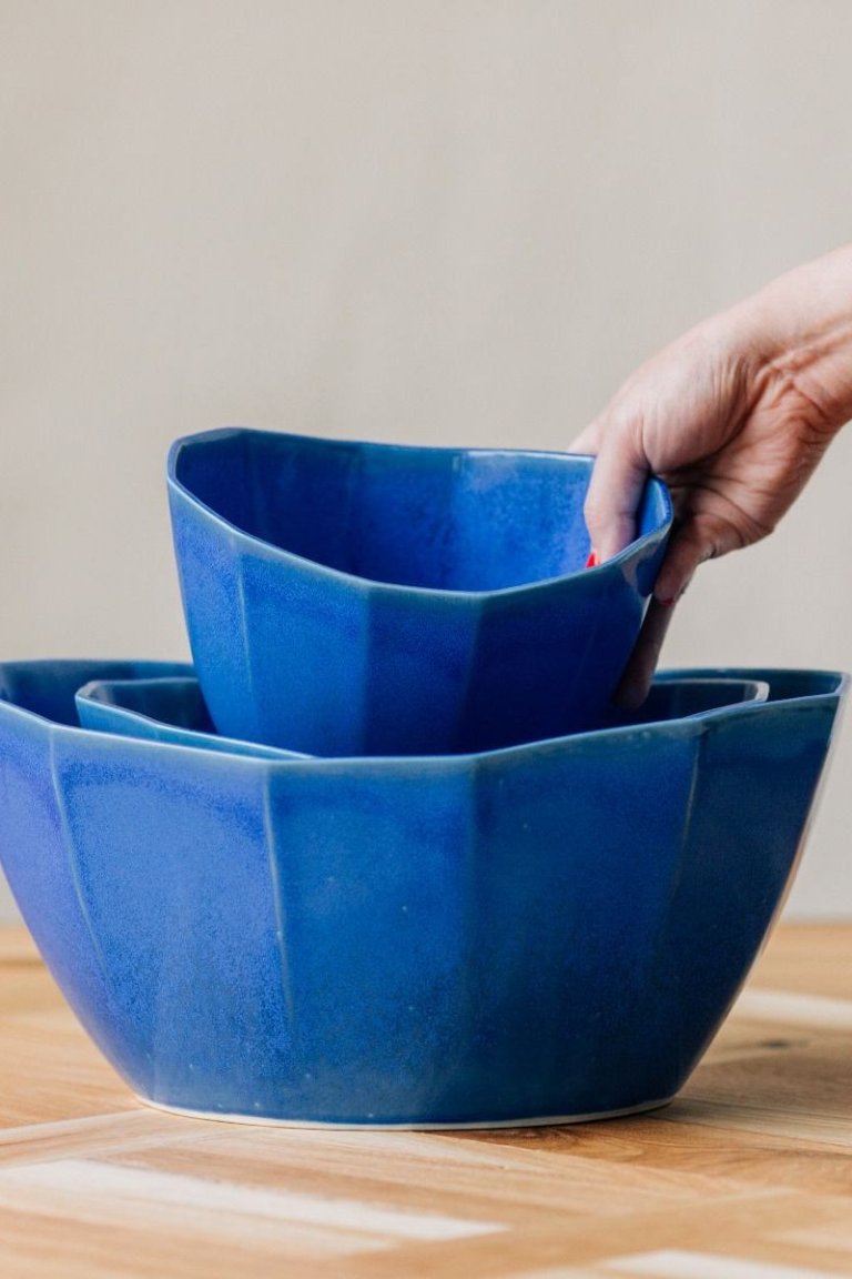
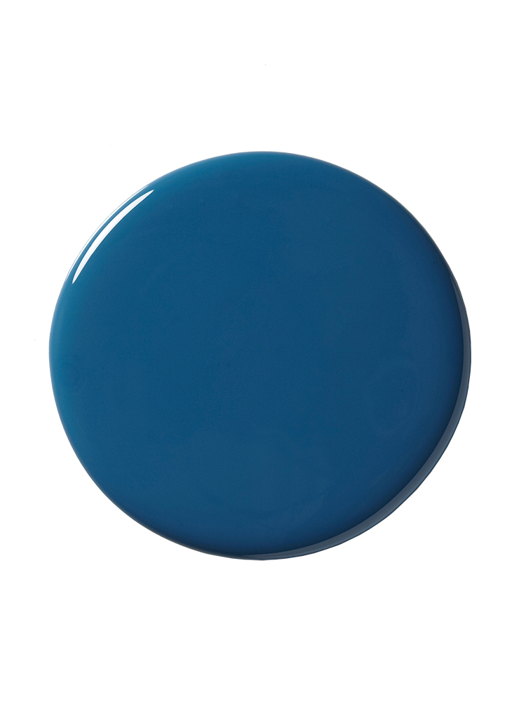
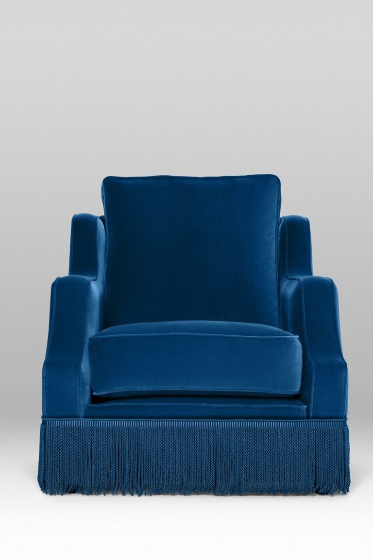
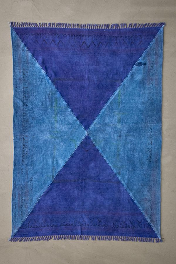
Shop more of our favorite ways to get in on this color trend:
See more color trends we love: Spring’s Hottest Color Trend Casually Dates Back to 3000 B.C. A Grown-Up Alternative to Gen Z Yellow We Already Know the First Color Trend of 2020