We may earn revenue from the products available on this page and participate in affiliate programs.
The arrival of September seems to be the universal signal to all flora that it’s time to turn burnt orange. The falling leaves can’t help it, we suppose. But between retailers decorating their windows in the autumnal shade and the prevalence of sunset-toned sweaters and throw pillows, the hue feels a little tired—and the season is only just beginning. We’re craving some new color trends, so we asked the best people for the job to weigh in: the designers, photographers, and makers who constantly have their ear to the ground for the latest and greatest in decor.
Here, seven industry insiders predict the season’s trendiest hues, and there’s not a pumpkin shade in sight.
Eggplant Purple

Leah Ring is one of the coolest furniture designers in the game—so we’re taking the Another Human founder’s rec seriously. “I’ve been loving ultraviolet lately, and as we move into fall, I want to see its more conservative friend, eggplant, make appearances in interiors,” she shares.
Pairs well with: Rust, navy, moss green, and taupe. “Mix eggplant with them and you’ve got yourself a cornucopia of moody, saturated beauty,” says Ring.
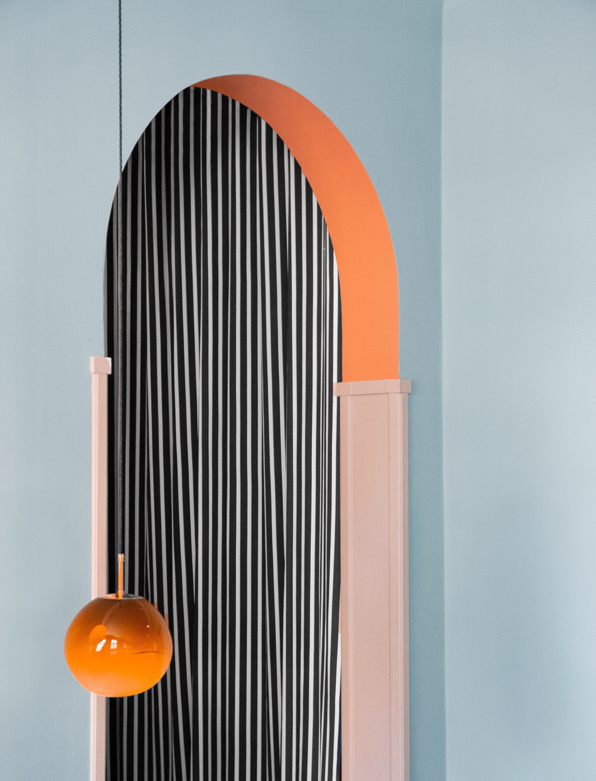
Sky Blue
Alternatively, go the opposite route with a light, breezy shade that defies the darker days of the season. “I’ll use it in my studio room this autumn,” says Swedish photographer Tekla Severin of her icy pick.
Pairs well with: Pale yellow, ochre, peach, rusty orange, and even some Yves Klein Blue for contrast. “A great color combination always includes ‘something dirty and something flirty’, as my friend Iwa Herdensjö says,” adds Severin.
Light Umber

Orange may be a given for autumn, but that doesn’t mandate going the pumpkin-spiced-everything route. Black Lacquer Design’s Caitlin Murray is a fan of this fresher, golden tone, which reminds us of already ubiquitous ochre (hey, you won’t have to worry about finding decor to bring home!). “I love the idea of coating the walls of a sterile, small space with the shade—it would add so much velvety warmth,” says Murray.
Pairs well with: Almost anything; the big plus about this earthy color is the fact that it reads as a neutral. Murray recommends combining it with complex, cooler shades that live on the opposite side of the color wheel, like a dusty lilac or deep teal.
Dusky Green

“Dark, nuanced colors can add a lot of depth to a room and look amazing with lighter hues,” says Backdrop Paint founder Natalie Ebel. This season, ditch the expected forest shades for a tone with gray and blue undertones.
Pairs well with: A pure crisp white, muted pink, or light beige with yellow tones, says Ebel. Nail that light-dark balance at home by going green on the walls and paler with your furniture.
Yves Klein Blue

Designer Camille Walala has a thing for Majorelle blue. “I’ve seen it a lot lately, [both] at Milan Design Week and the Toulon Design Parade,” she says. “It makes me ecstatic!” It’s definitely not for the faint of heart, but if you aren’t afraid of making a splash in your space, it’s the ultimate unexpected color for fall.
Pairs well with: Warm tones. Walala loves it pitted against apricot and terracotta specifically.
Terracotta

“Matte terracotta walls naturally feel like fall,” says Domino’s executive creative director, Kate Berry. Go for the full rustic effect by opting for a limewash finish or a painting technique with texture.
Pairs well with: Dusty lilac velvets and linens. “They’ll brighten the room and make it an evergreen palette,” suggests Berry.
Pistachio

Hopie and Lily Stockman were inspired by Albert Hall in Jaipur for their pick: “It’s the perfect shade of melted pistachio kulfi—it has always inspired us.” The Block Shop cofounders see the soft, creamy color as a lighter alternative to the rich jewel tones that are usually everywhere this time of year.
Pairs well with: Grounding earth hues, like ochre or rust.
Summer, we’ll miss you, but these ideas have us finally feeling ready for fall.
See more color stories: What Paint Color to Choose Based on Your Myers-Briggs Personality Type The #StickofButter Trend Applies to Your Home, Too 4 Tricks to Making Classic Navy Feel Fresh Again