We may earn revenue from the products available on this page and participate in affiliate programs.
For a while, trendy interiors were dominated by a slew of dusty pastel hues—Millennial Pink, soft mint, light periwinkle, baby blue. It’s almost as if we collectively entered into an episode of The Care Bears. But 2019 has promised a resurgence of bold primary colors: think mustard yellow, fire truck red, and Klein blue. While those bright hues might be a little overwhelming on their own (or even more when combined together like in a Mondrian painting), they actually fare really well when combined with the softer hues of years past.
The most obvious instance of this is the popular pink and red combo, which we find in a lineup of cool interiors such as the Glossier showroom in New York City and the many locations of The Wing. But more and more interiors are displaying even bolder examples of this trend—combining blush pink with emerald hues or fire truck red with mint or yellow.
The great news is: there is a way to salvage all your Millennial Pink paraphernalia—just combine it with a few accents of bold primary colors. If you need a dose of inspiration, we corralled a few of our favorite examples of this daring new color trend.

Mix Bright Orange With Barely There Blush and Mint
In this bold Barcelona apartment, architecture firm Colombo and Serboli highlighted a small powder room adjacent to the kitchen in a daring bright orange hue—creating a bold statement in a mostly blush pink–toned room with accents of gray and mint green. The result is a playful and colorful space that feels unexpected and yet perfectly pulled together.

Combine Forest Green and Red With Light Pink
Blush pink is at the heart of most of these daring color combinations—perhaps a symptomatic result of the Millennial Pink craze that happened in the past couple of years. If you, too, own a few too many pieces in the light pink shade, try offsetting it with a dark forest green, cherry red, or even shades of yellow and orange.

Go Bold With a Monochrome Pink-and-Red Combo
Pink and red is a dominant combo in this growing trend. Cult-brand Glossier’s showroom is, in fact, covered in the two contrasting tone-on-tone hues. The Wing also makes this color dichotomy a part of the vernacular of its multiple workspaces for women, a sign that brands are already capitalizing on this popular color combo.
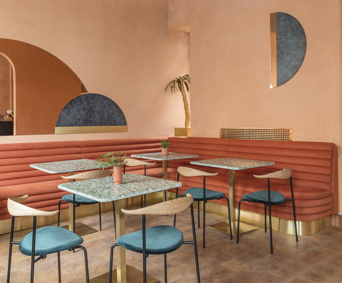
Offset Peach Tones With Emerald Green
London tapas restaurant Omar’s Place goes a step further with the combo in its new space, combining varying peach hues with emerald-colored chairs and verdigris wall art—a palette meant to evoke the warm sunshine of the Mediterranean coast. The space is finished with reflective brass surfaces, terra-cotta ceramics, and warm lighting to further enhance the mood.

Mix Navy With Mint and Pink
Not all pastel and primary colors have to be really bold, though. In this dark navy living room, a royal blue velvet sofa is outfitted with blush pink pillows. The patterned rug boasts a mint-and-red motif that is at once colorful and bold but also classic and elegant. This proves that though this trend is a little on the fringe—especially for the color-averse—it can be executed in a classic and lasting way.
See more 2019 colors we love:
This Color Will Be Everywhere in 2019