We may earn revenue from the products available on this page and participate in affiliate programs.
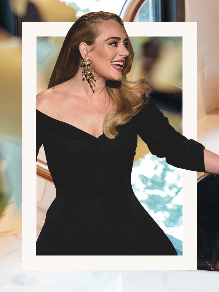
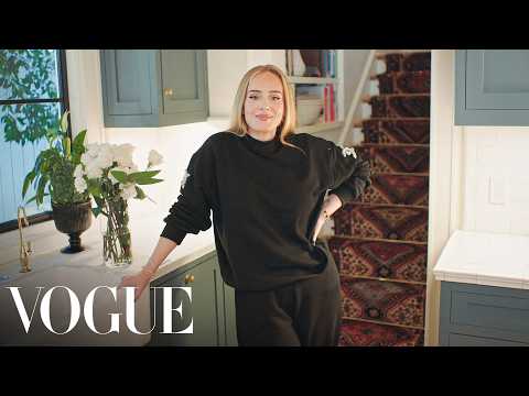
It’s clear Adele doesn’t do anything without putting a lot of thought into it. After all, it took the British singer six years to gift us with her latest album. It’s also apparent from the sensation’s “73 Questions” video with Vogue that she’s just as intentional about the color of her kitchen cabinets. During the interview, which accompanied Adele’s cover shoot, she walked viewers through her Los Angeles space, and the cupboards caught our attention right away. Why? It seems as though the star was ahead of the biggest trend to hit kitchens the past year: blue-green cabinets.
From Behr’s Breezeway to Benjamin Moore’s October Mist, the paint swatches that had been dubbed colors of the year for 2022 featured soothing hits of sage mixed with a touch of sky and a hint of silver. And there’s no indication that this calm-inducing hue will be going anywhere soon: We continue to see it in new renovations today (more on that in a moment).
The trick to nailing a zen look like hers is finding a swatch with the perfect balance and getting inventive with your paint job. Take inspiration from these freshly redesigned spaces that use the It color, and you’re bound to create an Adele-approved kitchen.
Include the Knobs in on the Fun

Time to give your hardware some love. This verdant hue (Backdrop’s Drive-Thru Safari) was one step Sarabeth Hurst and her husband, Payton, took in transforming their 31-foot Airstream into a full-time home. The uniform look keeps things distraction-free, which is key to making any tiny space feel bigger than it really is.
Get Moody

Not convinced by a poppy sage? You can always go darker. This Los Angeles kitchen, designed by Sally Breer, takes a clear stance on turquoise (the ceilings and doors didn’t go untouched either), but thanks to the enormous skylight overhead flooding the room with sunshine, it doesn’t feel overbearing.
Lay Low

Farrow & Ball’s Chapell Green is easy on the eyes, especially when paired with white upper cupboards. “It’s weird—with my clients I always use a lot of blue,” says Emma Ainscough, the owner of this London apartment. “But it wasn’t what the flat needed.”
Bring the Beach to You

Since her clients are located in the Outer Sunset neighborhood of San Francisco, designer Katie Monkhouse wanted to bring hints of the beach into their home. Farrow & Ball’s Pigeon is a versatile hue that “reads differently in every space we use it in,” notes Monkhouse, who chose to pair it with terrazzo countertops from Concrete Collaborative that feature flecks of navy, gold, and pink. We can smell the salt in the air from here.
Get the Look
This story was originally published in October 2021. It has since been updated.