
We may earn revenue from the products available on this page and participate in affiliate programs.
It’s undeniable that this has been the year of green, from kelly to hunter and back around to sage. Looking ahead to 2022, it seems the hype will only continue. Almost every major paint brand has announced their respective Colors of the Year this month, including Benjamin Moore on Wednesday, and one thing is clear: paler verdant shades aren’t going anywhere.
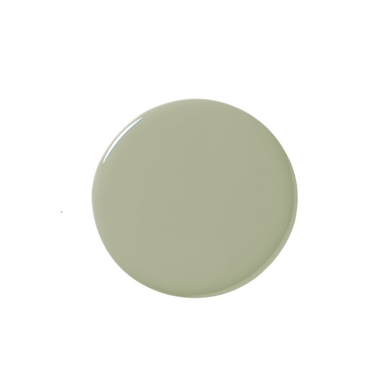
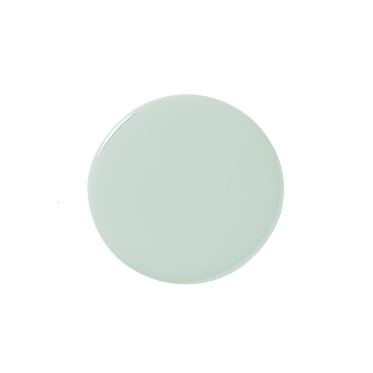
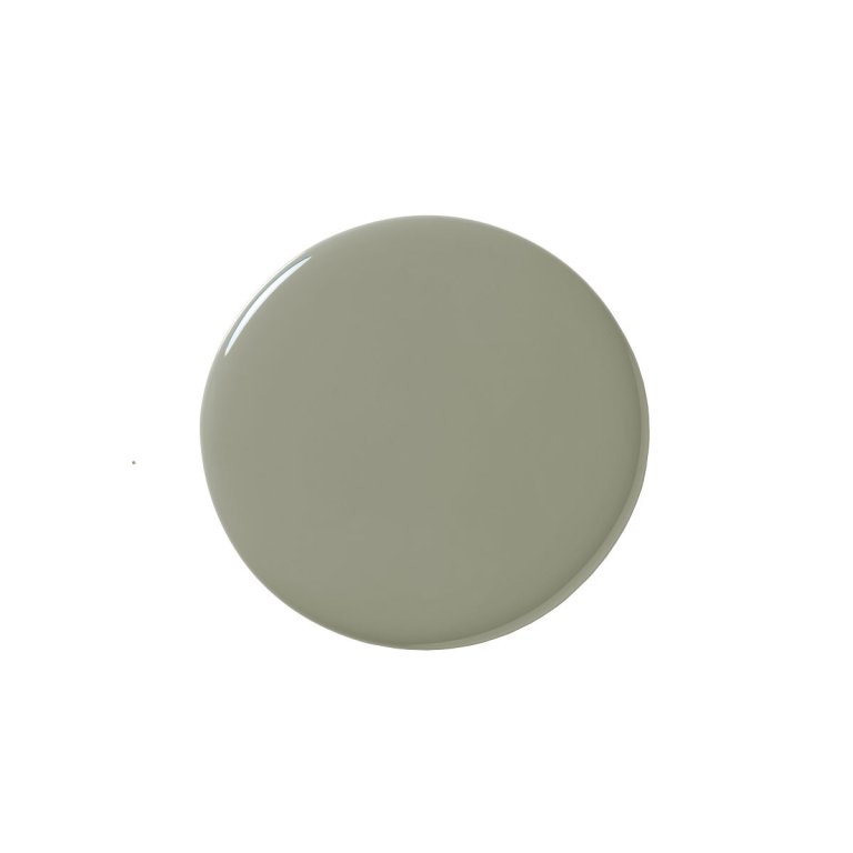
All of the green hues—Breezeway, Olive Sprig, October Mist, and Evergreen Fog—were influenced by the soothing quality of nature (essential in our uncertain world) and how we are looking outward after our lives have been pushed indoors. Behr’s Breezeway is a silvery hue reminiscent of sea glass, while Sherwin Williams’s Evergreen Fog reminds us of the Pacific Northwest’s signature weather patterns. Benjamin Moore’s October Mist specifically looks to flower stems, while PPG’s Olive Sprig, a slightly darker, and more pure version of the shade, takes inspiration from its namesake.
We asked seven designers to give us their thoughts on how to use these greens in real life. These are colors made to relax, and after this year, we could all use a breath of fresh air.

A Little Goes A Long Way
I love Evergreen Fog as an accent color. Brilliant for a bookcase in a satin finish. Or why not paint the wood floor of your mudroom or maybe your exterior shutters? The list is endless. —Kimille Taylor, Interior Designer
Back to Bed
Both PPG and Behr’s colors are not only beautiful but invoke a serene feeling that’s destined for the walls of a bedroom. This calming effect would allow you to start decompressing the minute you walk into the space. —Andi Morse, founder, Morse Design
Feeling Light
October Mist has an intriguing undertone that evokes both winter and spring at the same time. I see utilizing this palette in open, loft-like spaces; there’s an optimistic and lightweight quality to this color.—Robert Highsmith, Co-founder Workstead
Time to Wash Up
I’m definitely a fan of Behr’s Breezeway. With its soothing aesthetic, I would use it in a bathroom to complement white tile and marble. —Michelle Lisac, founder, Michelle Lisac Interior Design
Take It Outside
With such a variety of undertones, Behr’s Breezeway showcases its range differently in every light, making it the perfect blue-green for a porch ceiling.—Maggie Griffin, founder, Maggie Griffin Design
Anchors Away
These colors are soothing and natural—gray to calm the soul, a touch of green to connect to nature. Pale green is almost a neutral, so it can be used in most spaces in the home, especially those where we rest, reflect, and recharge. It’s also a great base that can anchor pops of color. —Nina Blair, founder, Nina B. Design
Layer Upon Layer
I would layer in textural fabrics, gentle patterns, and crisp white bedding to give a sense of ease and repose in a primary bedroom. —Young Huh, founder, Young Huh Interior Design