We may earn revenue from the products available on this page and participate in affiliate programs.
An atrium can add a ton of character and sunshine to a home, but as designer Katie Monkhouse recently learned, it can also take a lot away. A large, open-air courtyard previously stood in the center of her client’s San Francisco house, and while it brought in loads of natural light and glimpses of plant life, everyone agreed it was a waste of precious square footage. The nearby kitchen was smooshed into a corner and only had three upper cabinets, while the dining room barely fit a four-person table. The single perk? “There was a funny little drawer in the kitchen with vent holes that backed up to the courtyard so you could cool your pies,” says the designer.


During the gut renovation, Monkhouse, along with architect Mark English and general contracting company C.H. Burnham, focused on absorbing the outdoor box into the interior so they could gain an extra 50 square feet and create a modern, spacious kitchen. The only real setback was waiting on the appliances—and in one instance, re-waiting: The original Wolf range was stolen out of the house during construction. Luckily, the piece was insured, and whomever took it was at least careful enough not to ding the newly painted cabinets or scratch up the floors. “The second range we ordered ended up being a steam oven, and the client loves to bake, so we thought of it as a blessing in disguise,” says Monkhouse. Ahead, the designer takes us behind the scenes of the transformation, revealing that sometimes there is much to be gained from giving up an indoor-outdoor moment.
Bring the Ocean Breeze to the Kitchen


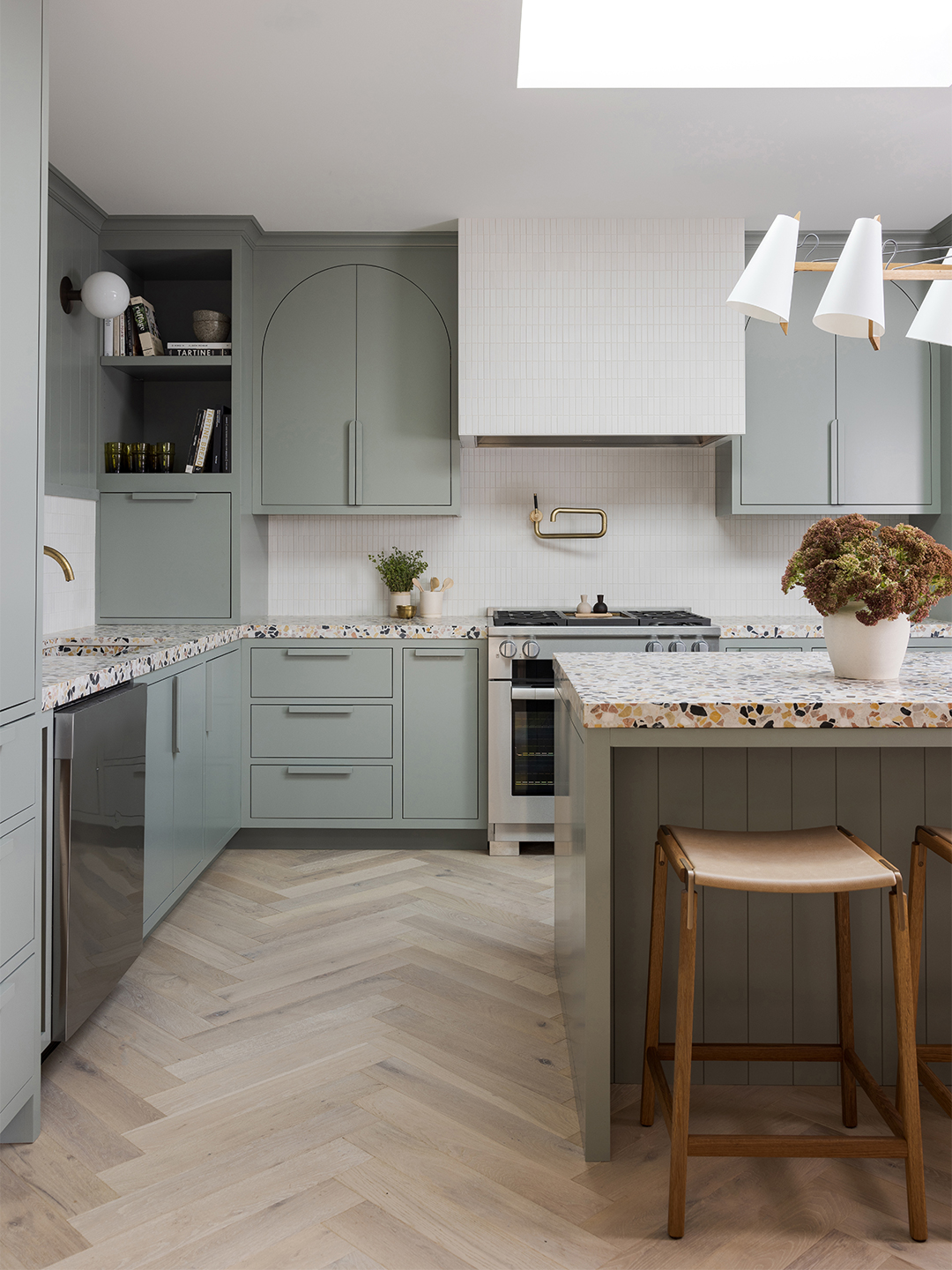
The owner’s first design request: terrazzo counters. Being in the Outer Sunset neighborhood, they wanted to pull in hints of the beach, be it with bluish-greenish-gray cabinets (they’re painted in Farrow & Ball’s Pigeon, which the designer notes is a versatile hue that “reads differently in every space we use it in”) or stone from Concrete Collaborative that features flecks of navy, gold, and pink. In order to draw on the home’s existing archways, Monkhouse mimicked the shape on some of the cabinet doors and handles with a swooping wall light by Allied Maker.
Leave No Wall Left Behind


After mapping out the new cupboards—including a cubby for the client’s treasured espresso machine—Monkhouse noticed there was an awkward gap in one corner of the kitchen. To make the spot functional without breaking the bank, she wedged a small piece of countertop into the nook, creating a built-in desk. And to more than double the seating available at the island, the designer made way for a proper dining zone by mounting a custom bench swathed in “bomb-proof” Perennials fabric. The “floating” setup was the only way to ensure there was plenty of room between the back of the dining chairs and the stools.


In the primary bedroom, the designer once more capitalized on a wall—this time a sloping one. While her original plan was to make the entire surface behind the bed flush by essentially building a new wall in front of it, she ended up adding a bump-out to hide the imperfection. The adjustment was a win-win: It serves as both a headboard and a perch for art and plants.
Keep It All in the (Color) Family


“I always like when spaces talk to each other,” says the designer. The tile in the bathrooms was chosen based on its accompanying bedroom designs. In the primary suite, the gold-green velvet headboard fabric by Schumacher and mossy-hued bedding is reflected in the glistening stripes of the Heath tile that covers the floor and tub wall. In the daughter’s space, Monkhouse paired green and white scallops with pink zellige laid in a brick pattern—a nod to Farrow & Ball’s Dead Salmon paint color that envelops her homework station. Incorporating an arch into the alcove shower-tub design was another way to keep the home’s bones consistent throughout, and because the ceilings are so tall, there was enough room left over for a transom window.
Consolidate Your Curtains


The goal with the living room was to streamline the details. Monkhouse resurfaced the fireplace with leftover marble tiles from the main bathroom reno, and coated the mantel and all of the walls in Benjamin Moore’s Simply White. “It’s the only white I ever use,” she notes. The designer kept the clean look going by hanging drapes on ceiling tracks instead of traditional rods. “I love the drama of the height, plus it makes it possible to stack the fabric on one side,” she shares, adding that it’s ideal for rooms like this with asymmetrical windows and walls. The atrium views may be no more, but this fresh vantage point isn’t half bad.
