
We may earn revenue from the products available on this page and participate in affiliate programs.
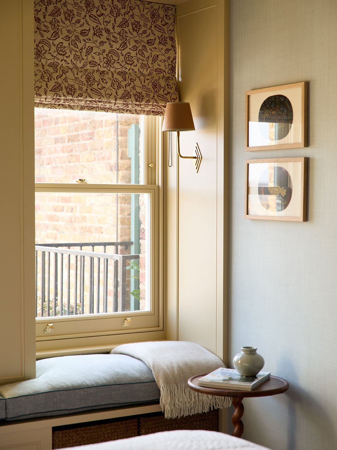
For a fashion executive who breezes in and out of London for work, a two-bedroom apartment in Notting Hill offered the perfect base. Its Mary Poppins-style view out to the rooftops and well-balanced layout were an irresistible draw. But after 30 years in the same hands, the space’s finishes were tired and required a complete overhaul.
Cue Claire Sa, co-founder of interior design studio, De Rosee Sa, who was brought into craft the ultimate pied-a-terre. Instinctively, she felt that the 730-square-foot apartment should be richly decorated rather than sparing and white. “The key with small spaces, perhaps contrary to what people often think, is to make them feel more intense and filled with books and pictures on the wall,” she explains.
Sa’s goal was to create a hotel-worthy level of comfort for the jet-setting owner, woven with thoughtful details. She wanted it to look textured and layered, “but without it feeling twee or too Old World English cottage,” she says. Key to striking this delicate balance are the linen wallcoverings in the living room and primary bedroom, as they lend a subtle grain effect that paint can’t match. There are plenty more clever details to mine from this petite apartment; ahead, Sa generously shares her tips.
The Peekaboo Partition
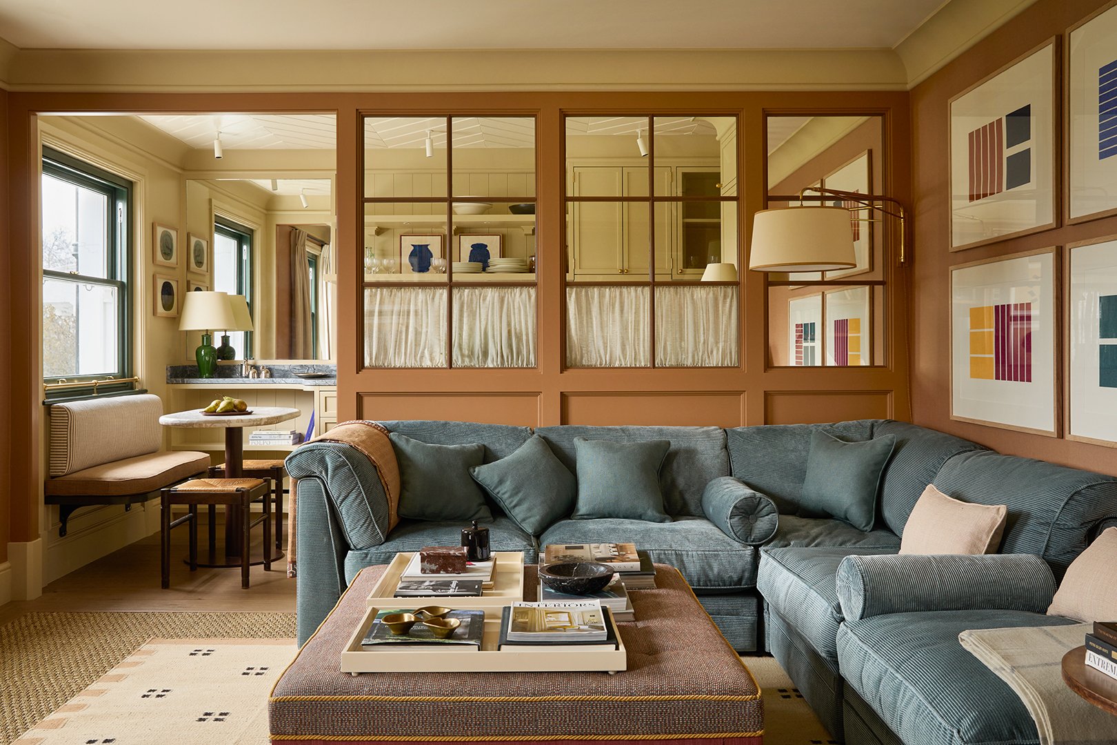
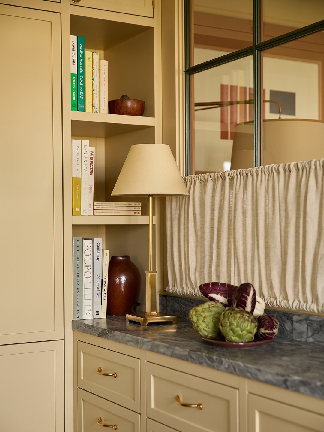
A key move in reconfiguring the apartment was taking down the wall between the living room and kitchen and replacing it with a glazed screen. “Rather than go fully open-plan, it hints at the volume of the whole space, and means you can’t see things like pots and pans,” says Sa of the windows, which are partly dressed with cafe curtains. The sectional was designed to line up neatly with the new partition. A less obvious optical illusion? The panel in the corner is actually a mirror. “This is something we do quite often because you can hide stuff behind it; in this case, it’s the fridge,” says Sa of what’s on the other side.
The Groovy Ceiling
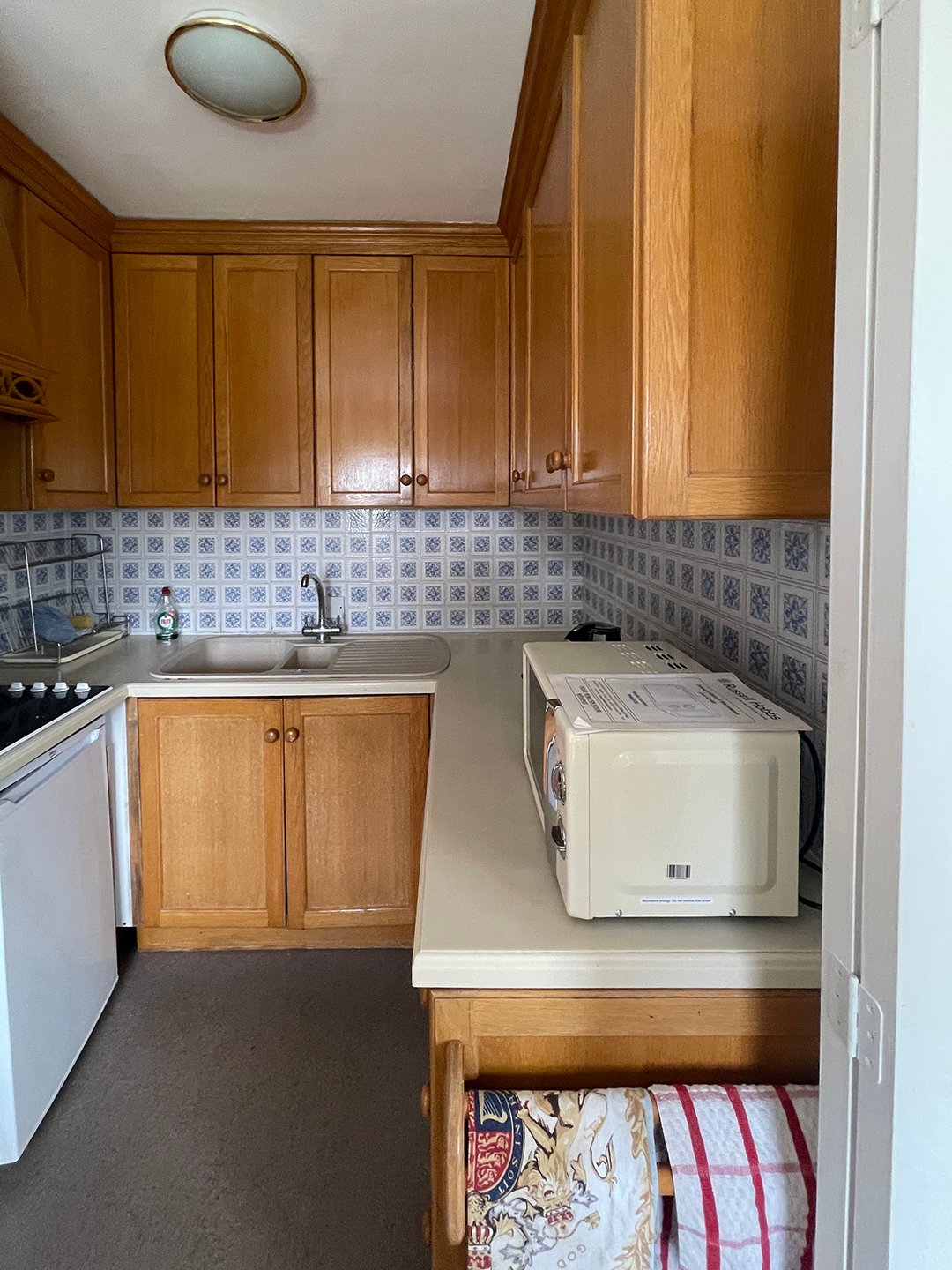
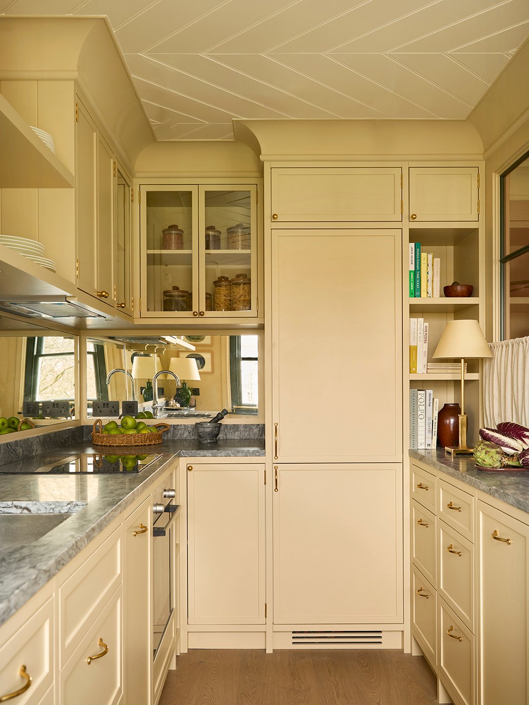
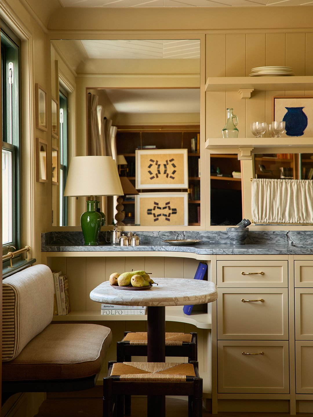
“People easily forget about ceilings,” says Sa, who made a feature out of the sliver in the kitchen by covering it in tongue-and-groove paneling. A smart way to add interest overhead, this was the first time Sa experimented with it laid in a chevron pattern.
The Carpet Compromise
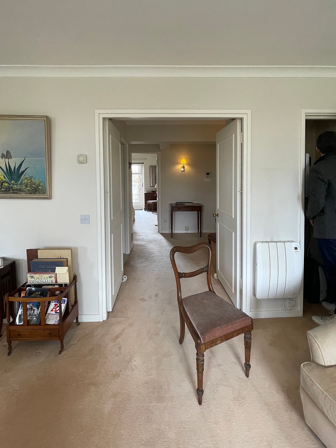
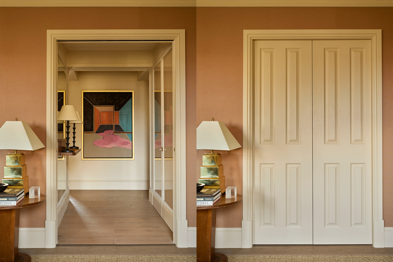
When the apartment building’s management stated that carpet had to be laid in the living room for acoustic reasons, Sa got around installing it wall-to-wall by opting for over-sized, chunky sisal carpeting. Its size spans nearly the whole room, satisfying the complex’s requirements, but it’s neutral, allowing the designer to layer a rug on top.
The Clever Paintwork
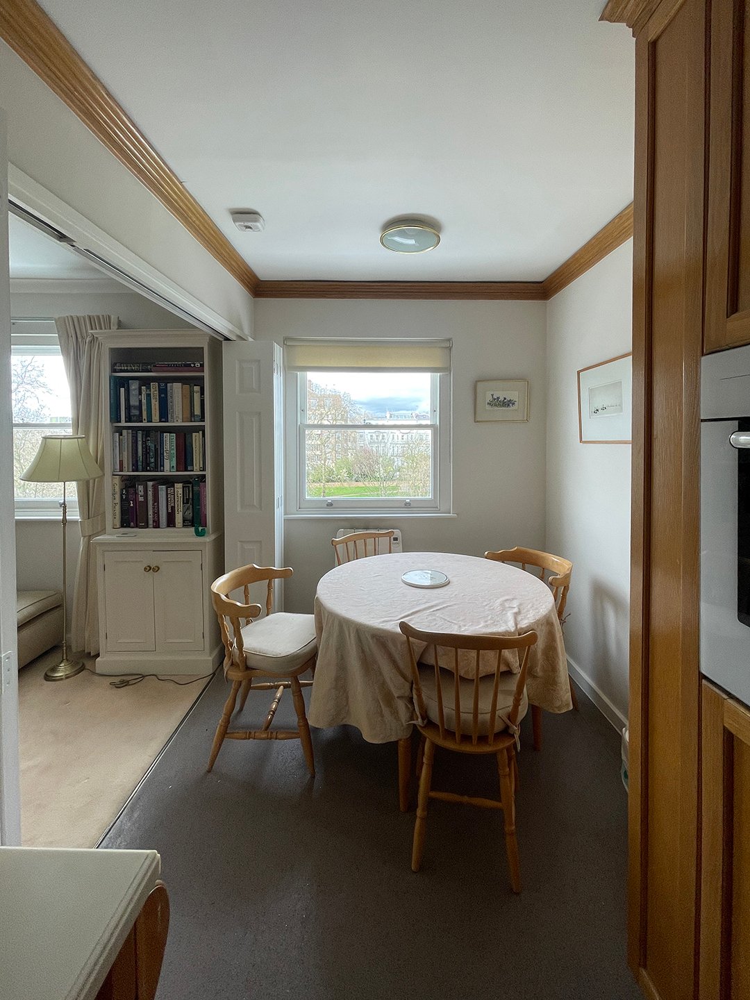
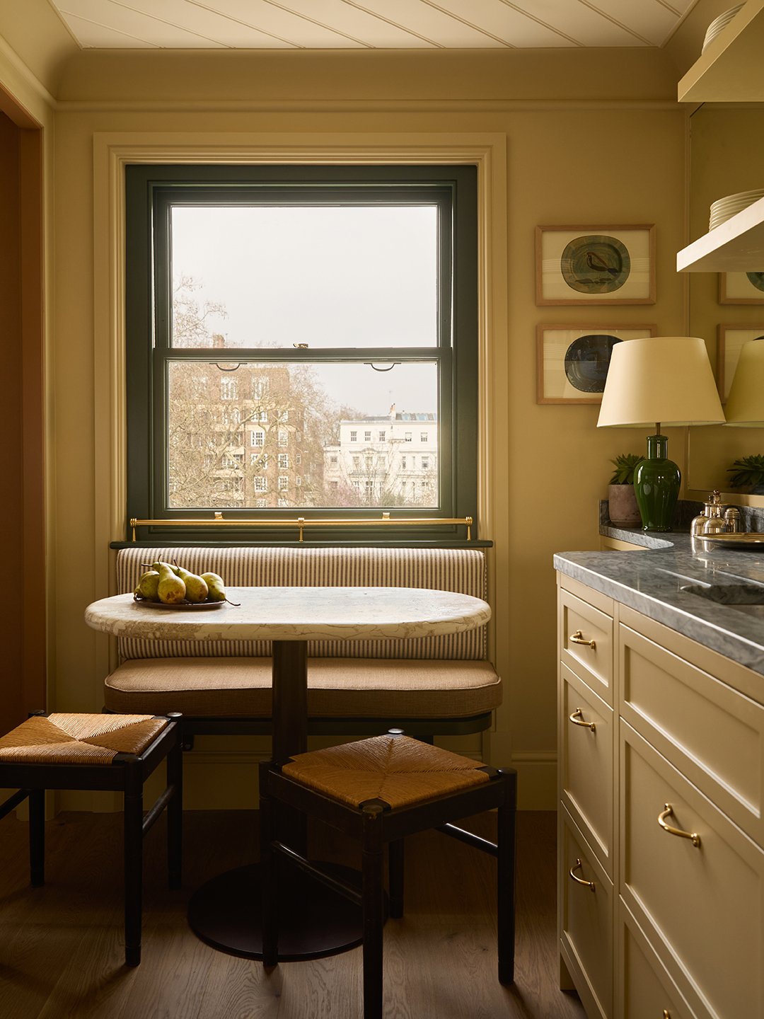
Notting Hill is renowned for its lush garden squares, so to maximize the views of the tree canopies, Sa painted the window frames bottle green. “It’s funny how if you have white windows the outside isn’t pulled in so much. Yet when they are dark, it just pops,” she explains. Another subtle but clever detail was painting the inside of the living room’s shelving unit a touch darker than the frame. “Objects and books look better on a darker base,” notes Sa. Case in point: the TV monitor almost blends into the background.
The Free-Moving Art
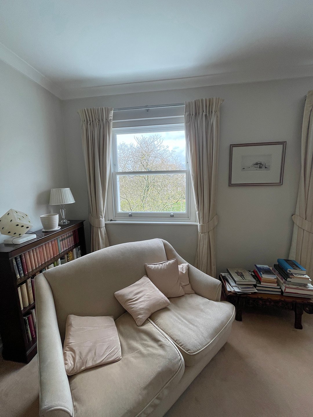
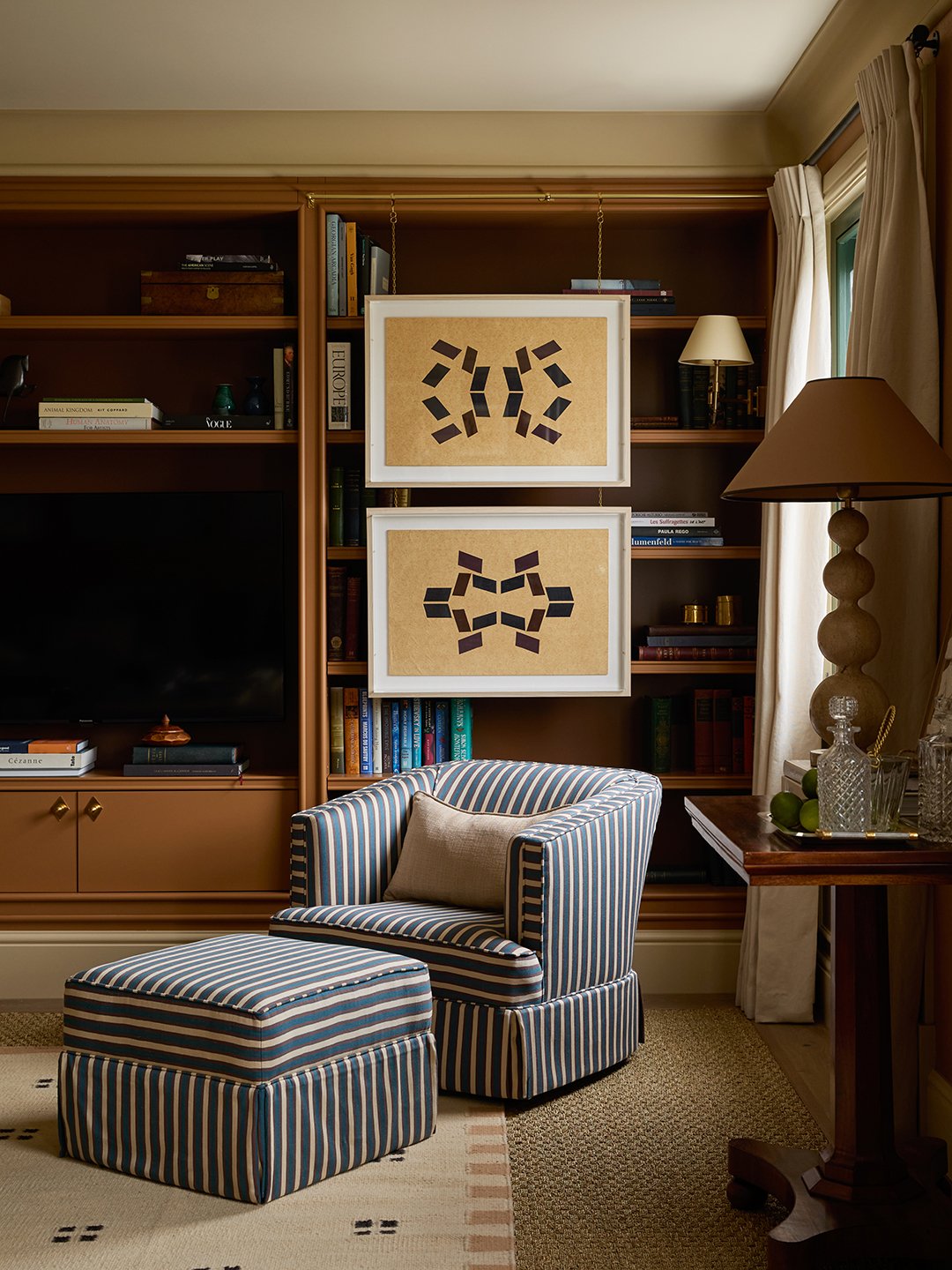
Hanging art over shelves is a bonafide thing, but Sa’s brass rails above the living room shelves make moving pieces seamless. “I like mixing artworks up,” she says. In the bedroom, frames rest on the mirror, adding another layer to the unique wall treatment.
The Constant Reflection
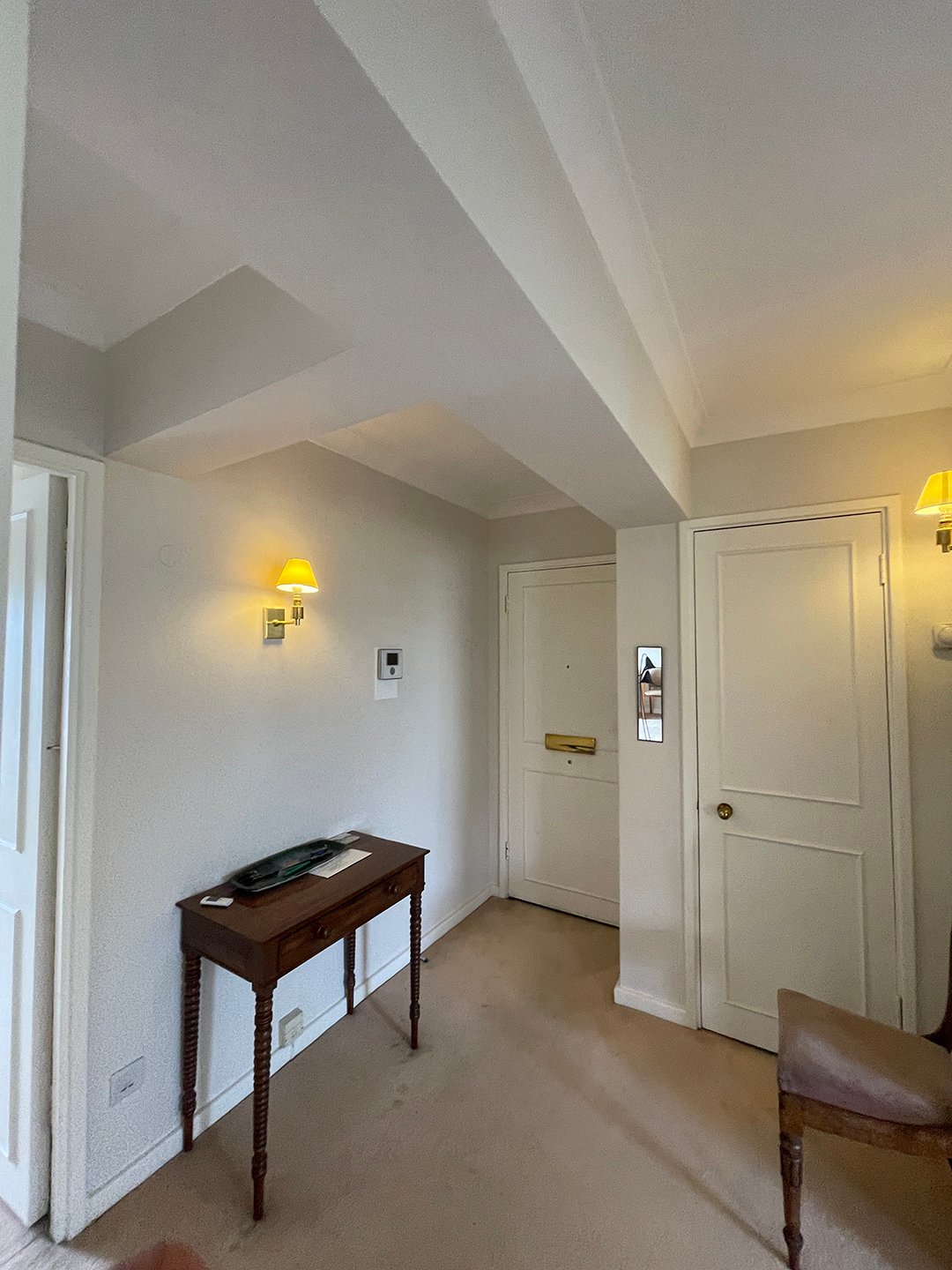
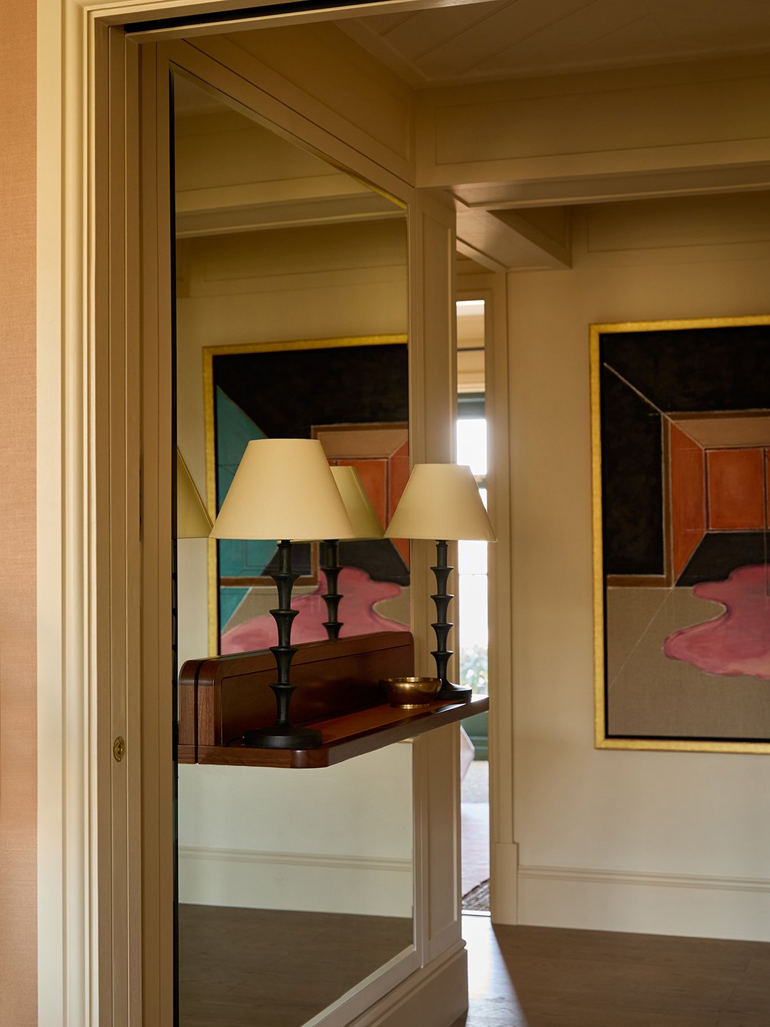
Using mirrors to bounce light and give a space “more stretch” is the oldest trick in the book, admits Sa. She didn’t hold back: a full wall in the entry opens up the darkest part of the apartment. In the kitchen, mirror doubles as the backsplash and amplifies light coming in from the window.
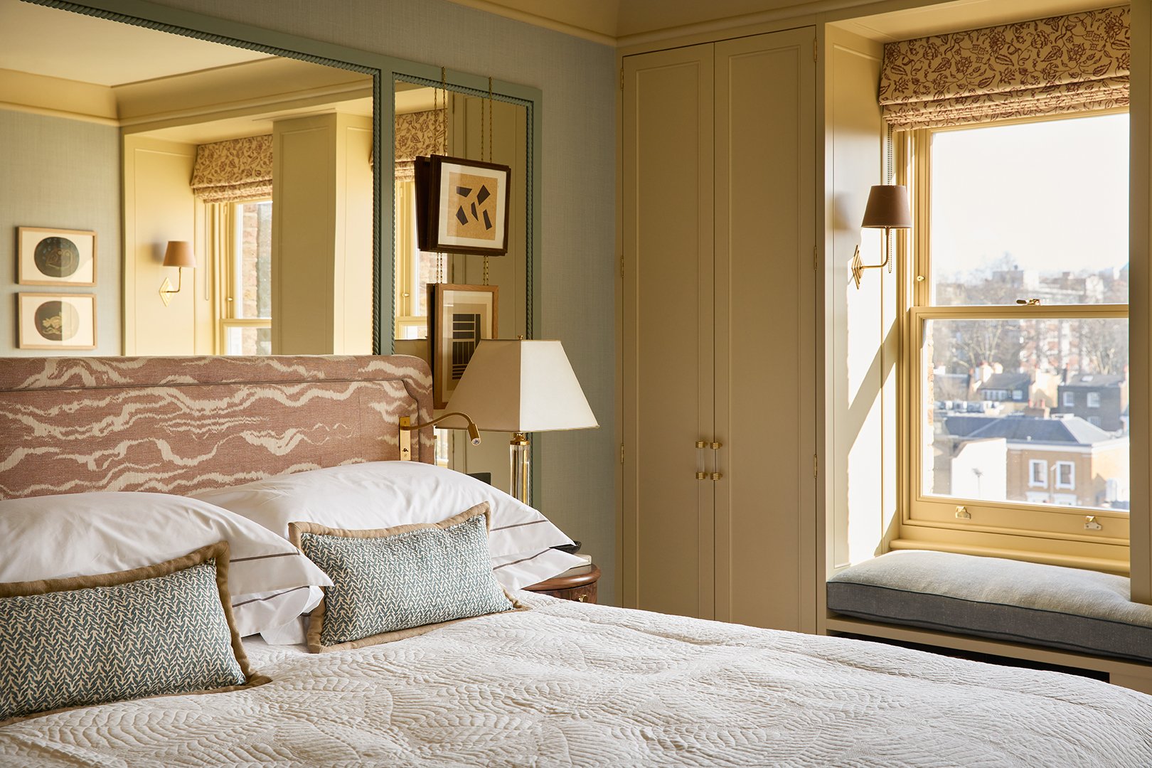
More unusually, the primary bedroom boasts mirrored panels behind the bed. “With the lights on at night, it gives such a warm glow,” she says.
The Curves That Conceal
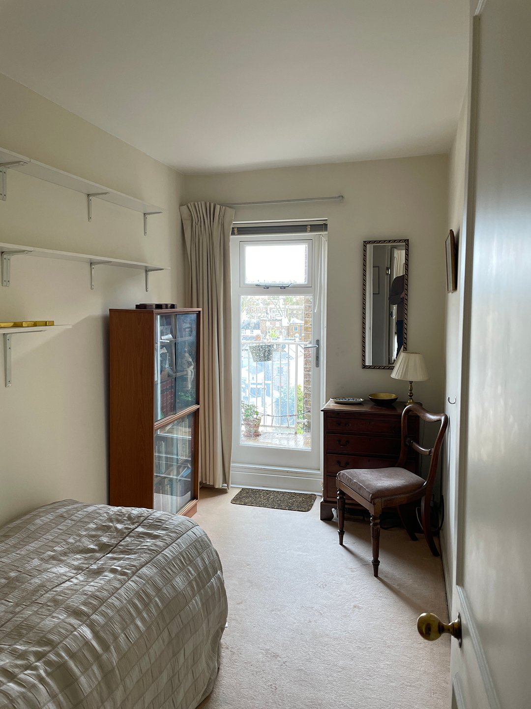
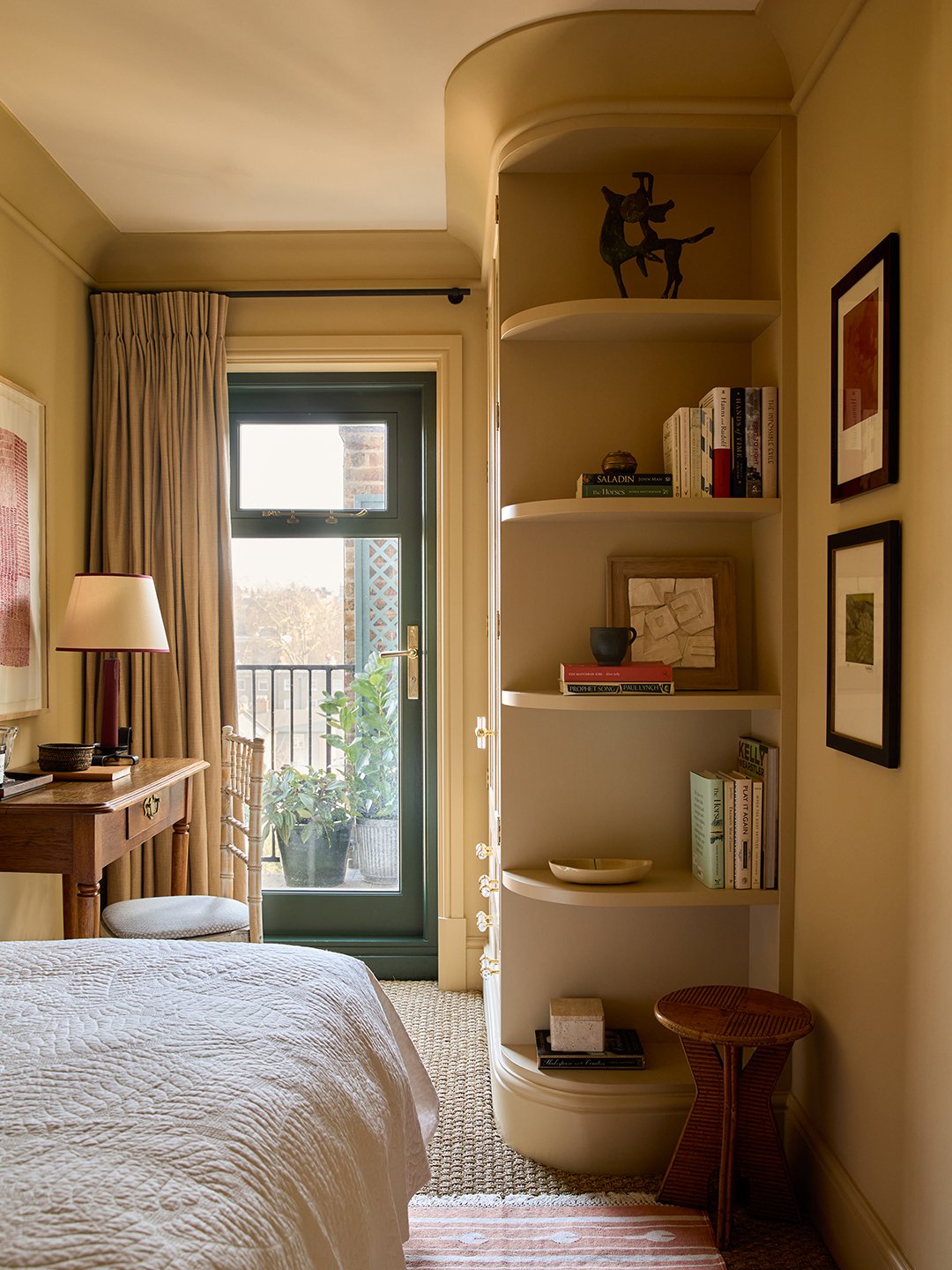
The apartment was crying out for more storage. Curving the edges on a new closet in the single bedroom and finishing the edge with shelves “means you’re not just looking at the end of a wardrobe when you walk in,” explains Sa.
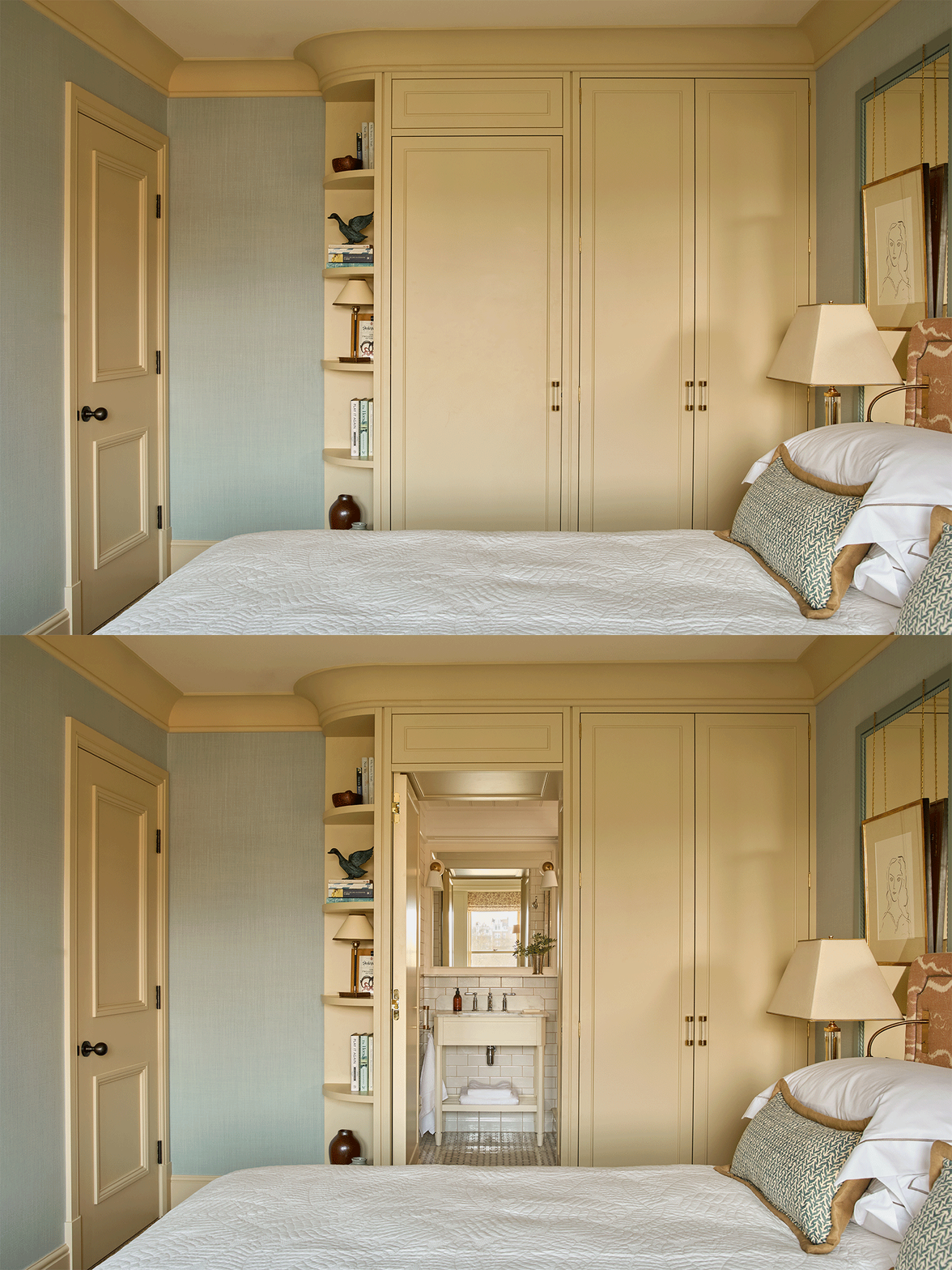
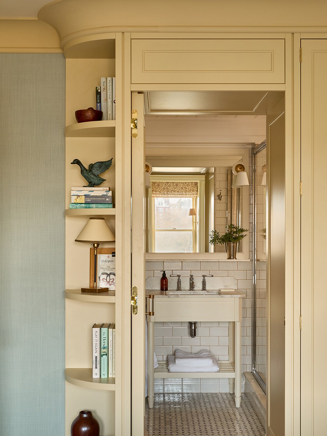
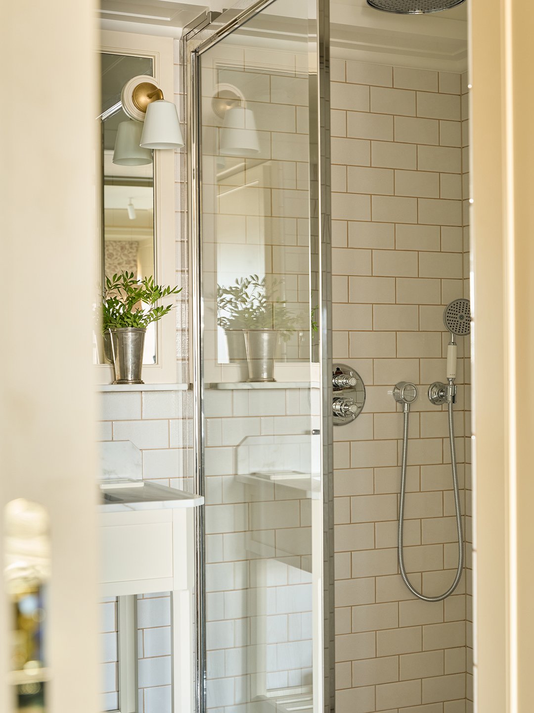
She did the same in the primary bedroom where— drumroll, please—a closet door opens up to an en-suite bathroom. Formerly a storage cupboard with a sink, it’s now home to a toilet and a shower. A pair of window seats finishes the space, and provides the perfect spot to contemplate where Mary Poppins might have floated off to next.