We may earn revenue from the products available on this page and participate in affiliate programs.
Old buildings come with quirks that are both charming and confounding, and this dilapidated apartment near the heart of Lisbon was a textbook example. The long corridor, string of small pass-through rooms, and compact layout that designer Svetlana Vakhtina encountered would be challenging to work with, particularly because it all couldn’t be wiped clean with a renovation. The location, within a historic district, meant there were preservation restrictions. Certain openings couldn’t move, and much of the existing structure had to remain.
Instead of viewing those limitations as obstacles, Vakhtina and her client treated them as a framework for the 646 square-foot home, which was destined to become a long-term rental. But they weren’t interested in creating another neutral investment property. They wanted somewhere a tenant might actually settle into, with two proper bedrooms, plenty of storage, and enough personality to hold its own before anyone moved in.
Then, demolition started uncovering wonderful things. Beneath old carpet was the apartment’s original parquet. Under the kitchen linoleum was checkerboard tile. Old wooden shutters were still salvageable, as were portions of the plaster molding. Even a stone countertop eventually found a new place in the bathroom. Rather than scrubbing the apartment of these details, Vakhtina let the discoveries dictate what came next—here’s how she made it happen.
Before You Replace Floors, See What’s Underneath
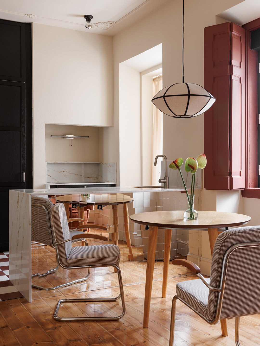
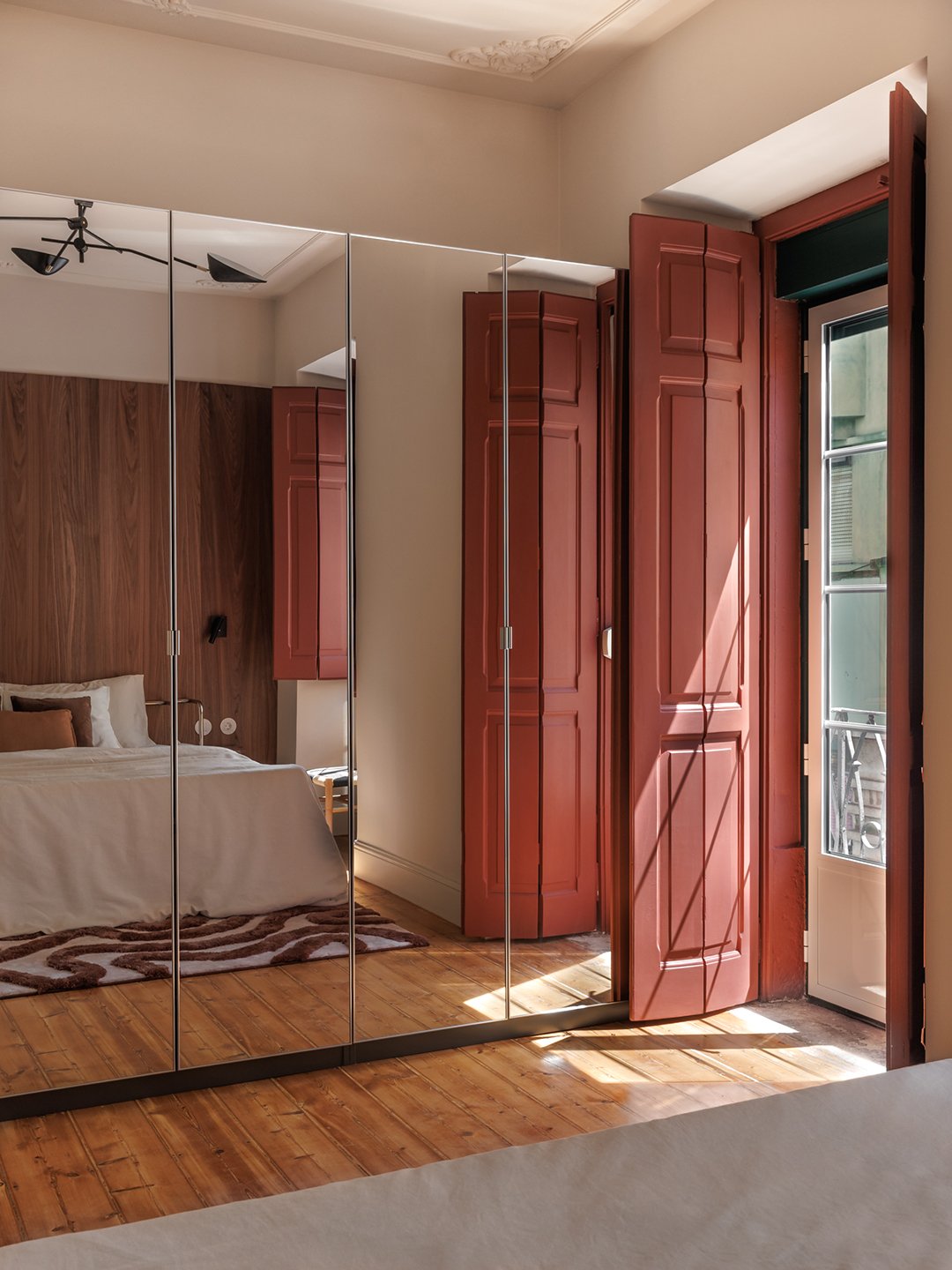
One of the biggest changes in the apartment required adding very little. Once the carpet came up, Vakhtina discovered those wood floors underneath, which were then stripped and restored rather than replaced. The surviving sections of decorative molding were photographed so craftspeople could reconstruct the missing portions; existing shutters received similar treatment. After repairs, they were painted a deep terracotta, inspired by neighboring rooftops, turning an original architectural feature into one of the home’s defining color moments.
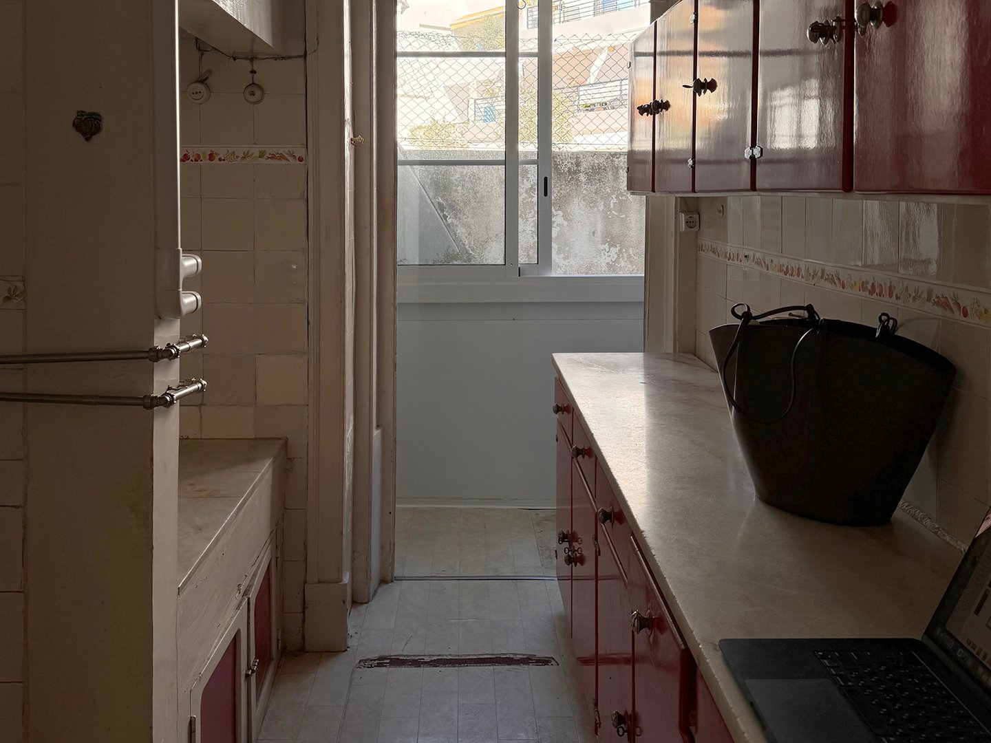
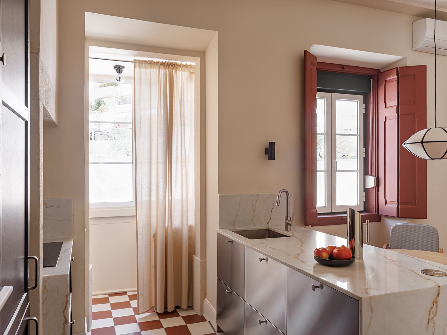
The kitchen offered a covetable reno surprise. Vakhtina had envisioned a checkerboard floor during the design phase, and, when workers pulled up the old linoleum, they discovered an almost identical historic tile underneath. The original was too damaged to save, but it became the blueprint: Vakhtina sourced the closest possible match and recreated the pattern.
Use Mirrors To Expand a Room
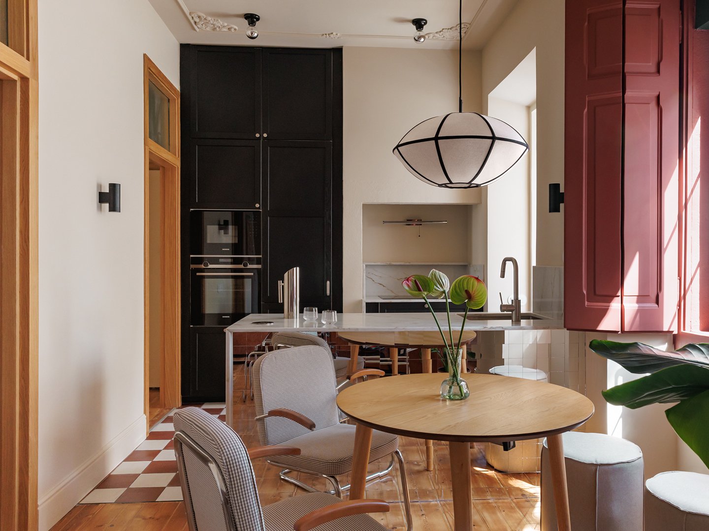
With such a compact floorplan, the kitchen, dining room, and living room all had to coexist in one shared area. An island provided much-needed prep space and storage while creating a subtle boundary, but its size risked making an already tiny footprint feel even smaller. Vakhtina’s solution was to cover one side in a mirrored surface so it reflects the wood floors, furniture, and light around it. And, instead of surrounding the table with four bulky chairs, Vakhtina paired two vintage-inspired armchairs with two poufs that can be tucked beneath the window when they aren’t needed.
Spend on Materials That Do the Heavy Lifting
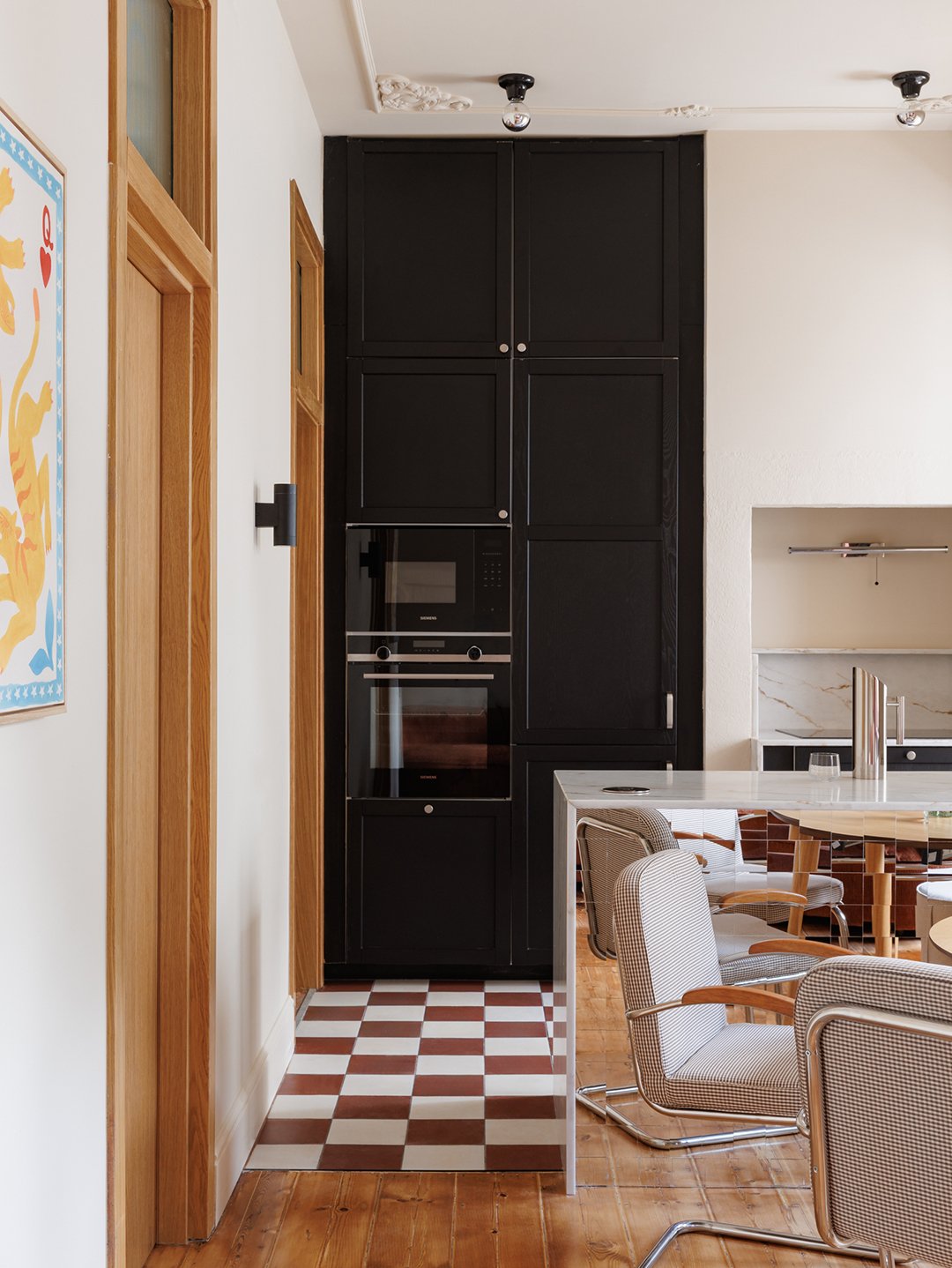
The apartment might look highly custom, but Vakhtina didn’t approach the rental with an everything-must-be-expensive mentality. IKEA pieces sit alongside vintage finds and furniture from other accessible European retailers. In the kitchen, that restraint left room in the budget for natural Portuguese stone sourced from local quarries.
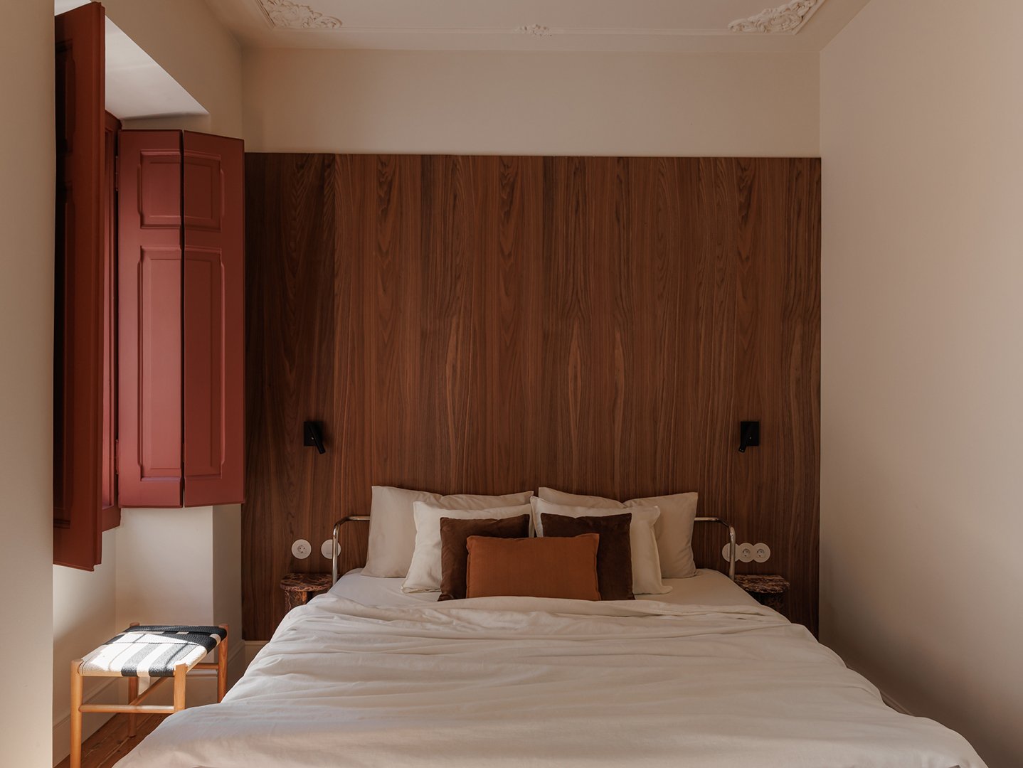
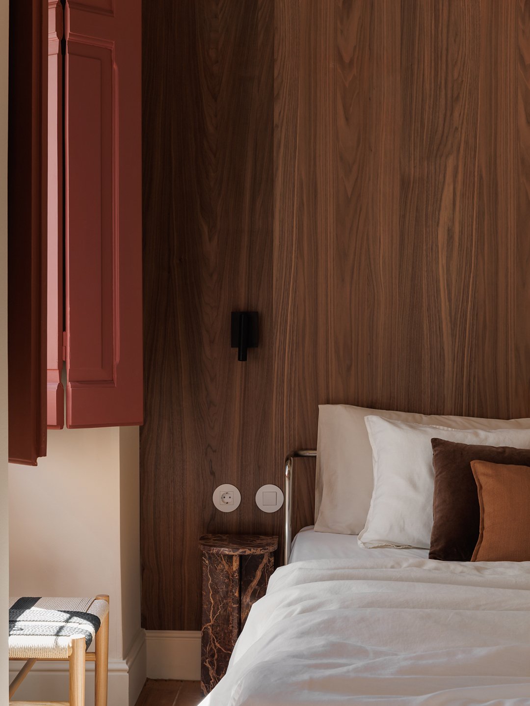
The mix continues into the bedrooms, where IKEA wardrobes are paired with sculptural marble nightstands and walnut veneer. In the primary suite, mirrored fronts help a substantial storage piece reflect the windows and light rather than visually crowd the room. Vakhtina also leaned into one large gesture instead of smaller decorative moments: A broad walnut-veneer panel stretches behind the bed, functioning as both headboard and focal point.
When There’s No Room for a Door, Try Fabric
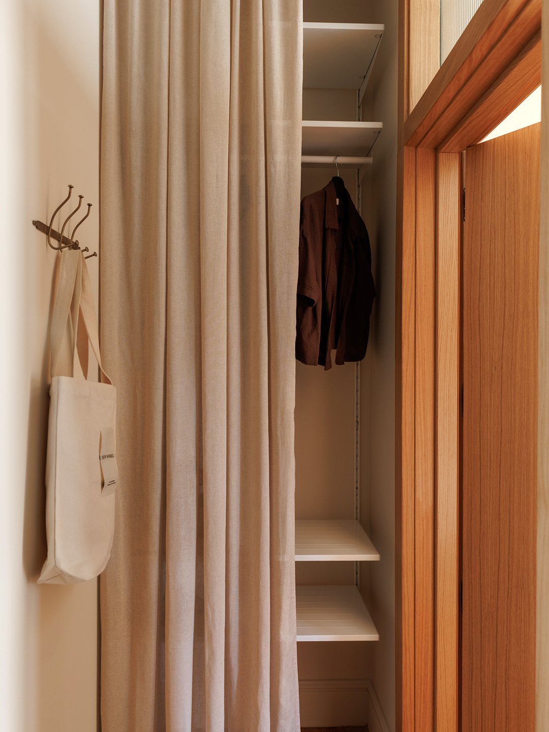
In the entry, Vakhtina concealed shelving, a hanging rail, shoes, utility panels, and technical connections behind a long linen curtain. She repeated the trick at the entrance to a small balcony that houses the washer (as seen in the first set of images)—the linen conceals the machine while still allowing light to filter through.
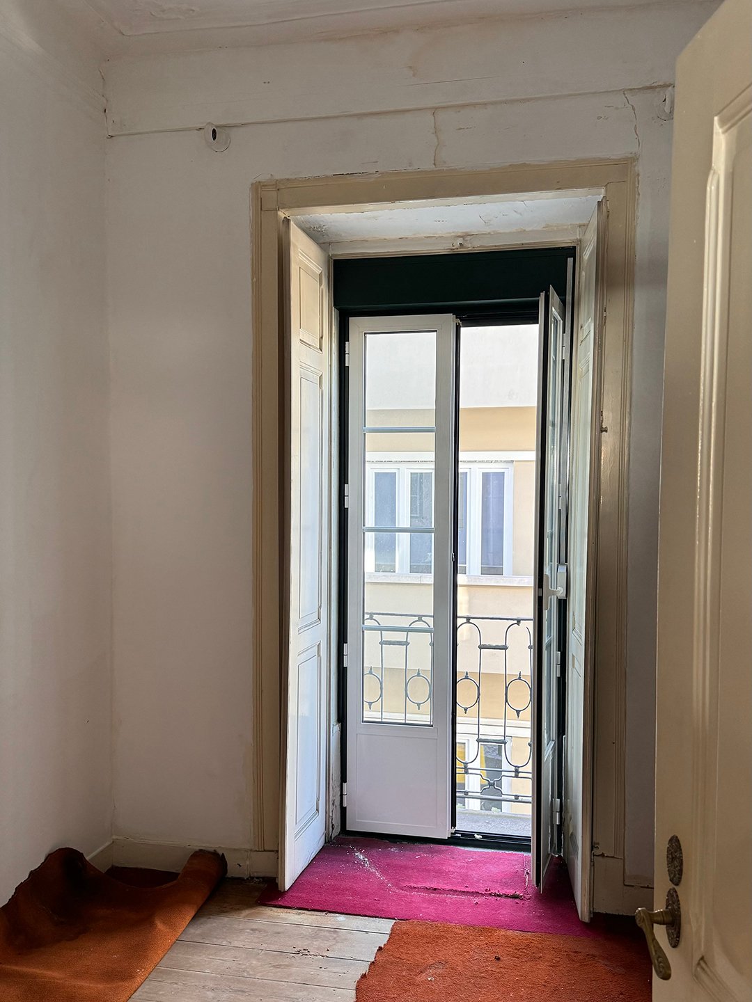
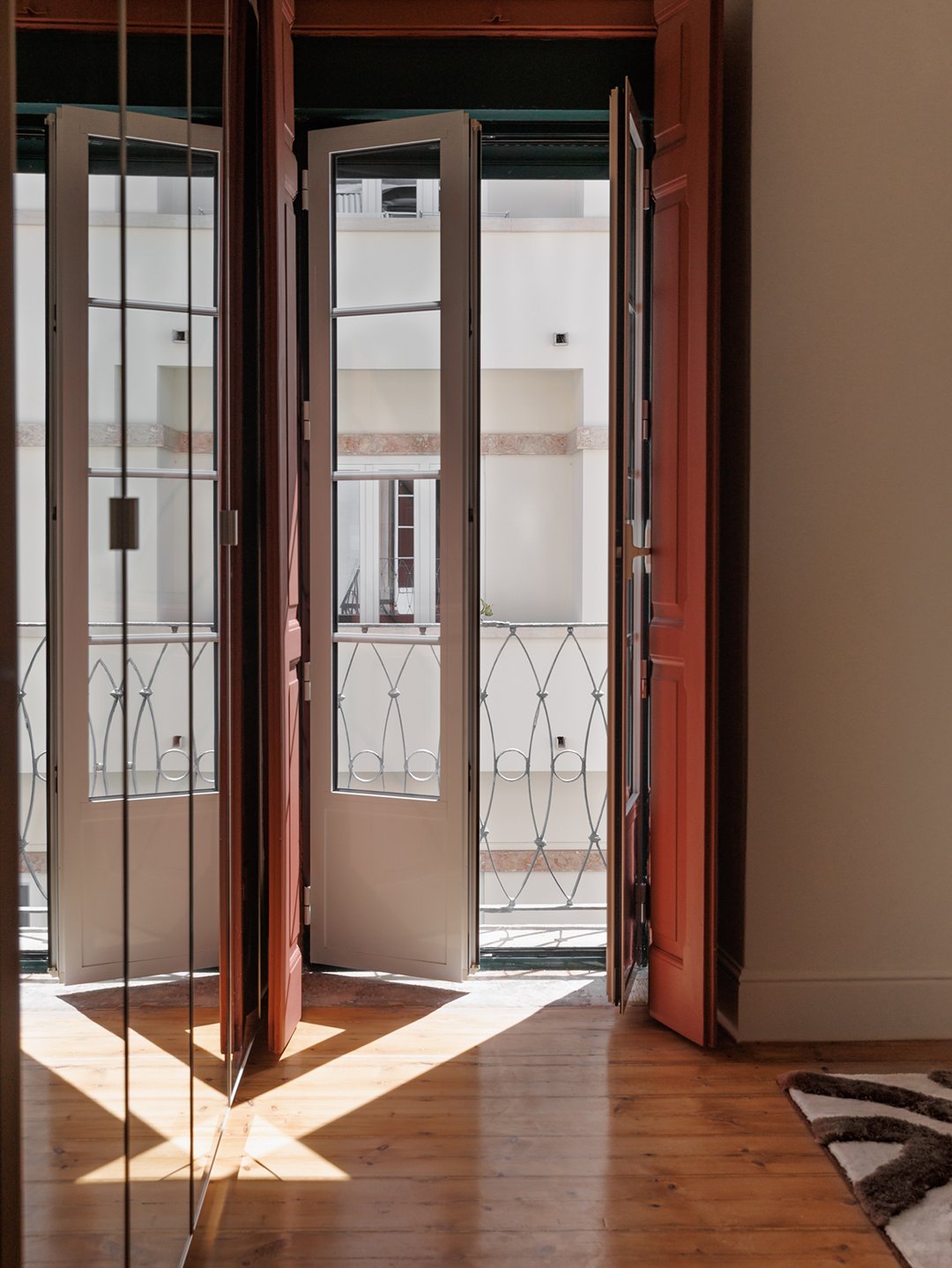
Not everything old could be saved so easily. The apartment’s tall doors, with transom windows above, weren’t in a condition to reuse. Rather than reproducing them exactly, Vakhtina borrowed their proportions for new oak versions with textured glass. That way, they nod to the building’s history without pretending to have been there all along.
Reuse Materials, Even If They Have to Switch Rooms
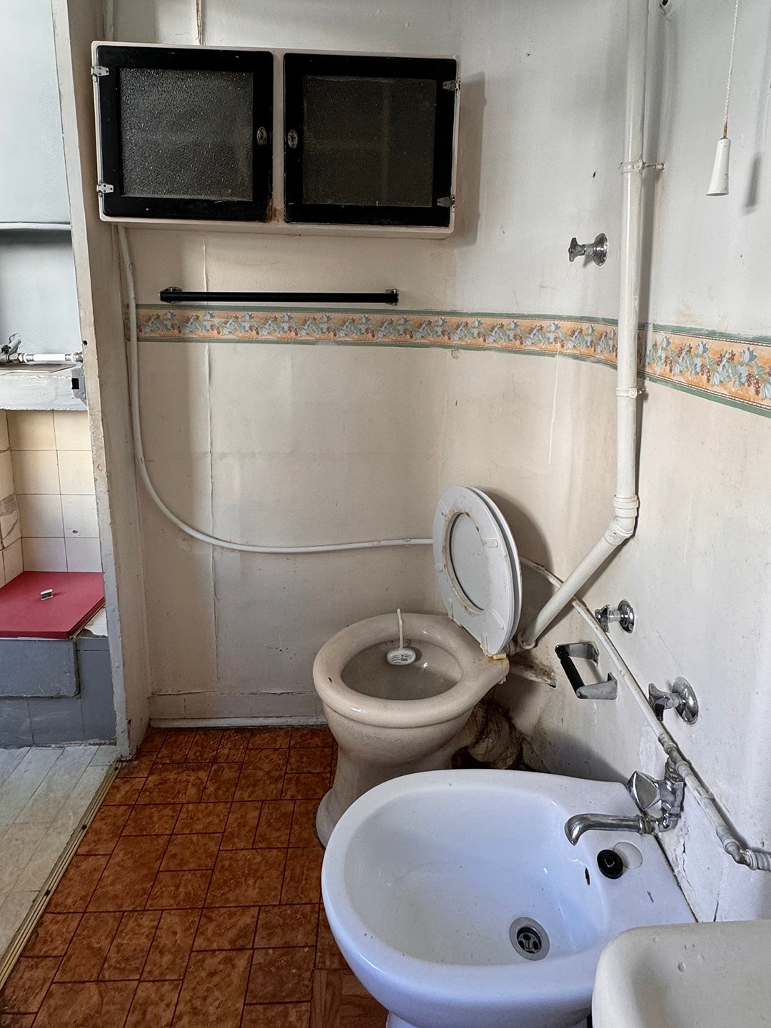
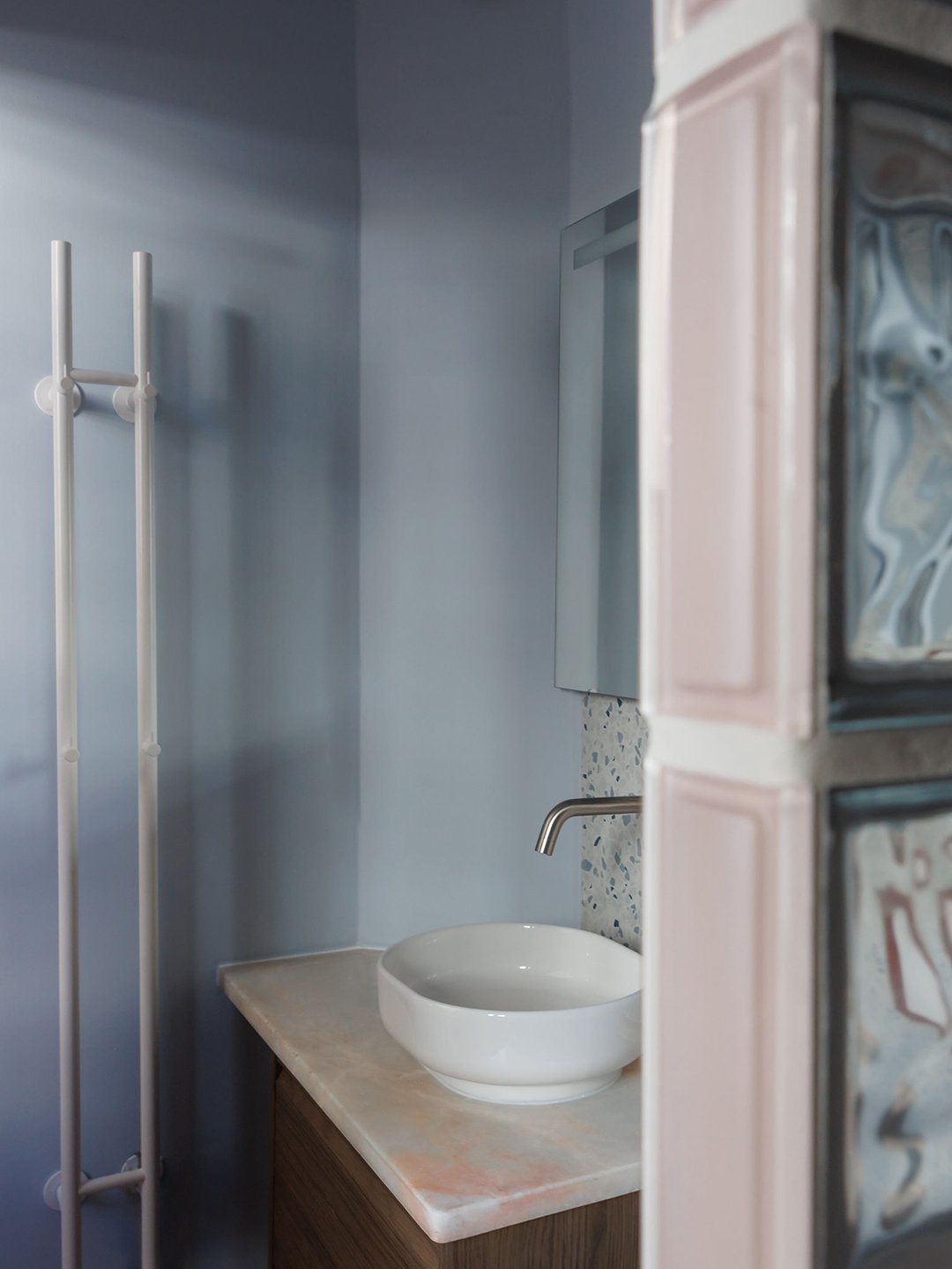
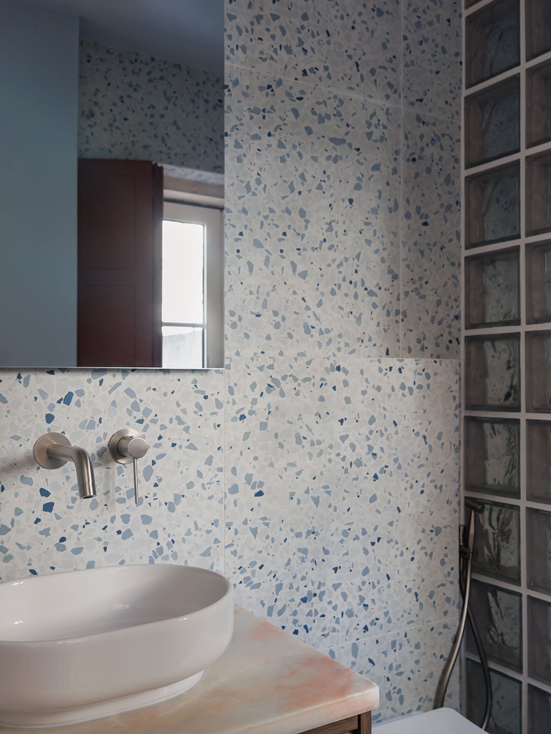
The bathroom presented a different set of problems with its awkward footprint and low ceiling. Vakhtina skipped a tub in favor of a built-in shower and used glass blocks as a divider, allowing light to travel through the space while picking up on the apartment’s subtle ’70s references. During demolition, a piece of the kitchen’s old stone countertop was set aside instead of tossed. It eventually became part of the vanity, paired with an IKEA sink and cabinet. This move, and restored terracotta shutters, connects the cool blue bathroom back to the rest of the light-filled home.