This 2020 Addition Looks Nothing Like the Original Tudor, Except for One Detail
Here’s how the designer subtly tied them together.
Published Dec 11, 2022 1:00 AM
We may earn revenue from the products available on this page and participate in affiliate programs.
When Brynne Flowers was hired to help with a couple’s stately Tudor in Salt Lake City’s Yalecrest neighborhood, the top-to-bottom restoration had already wrapped up. The owner of design studio John Martine came on board for a different reason: to imagine the interiors of a brand-new modern addition.
Her clients—a stylist and real-estate investor with three children ages 11, 8, and 6—had spent years returning the original structure to its former glory. “The wife actually grew up two houses down,” says Flowers. “They were living in Los Angeles when this home came up for sale. It was not in great condition, but she convinced her husband to buy it.” Ultimately, though, there were certain things the choppy 100-year-old floor plan simply could not provide—chiefly an open kitchen and indoor-outdoor space for hosting guests. “There was a tiny, closed-off room of a kitchen at the back of the house, and none of the rooms opened to the backyard,” Flowers recalls. Enter the two-story extension, a collaboration between Flowers and Lloyd Architects.
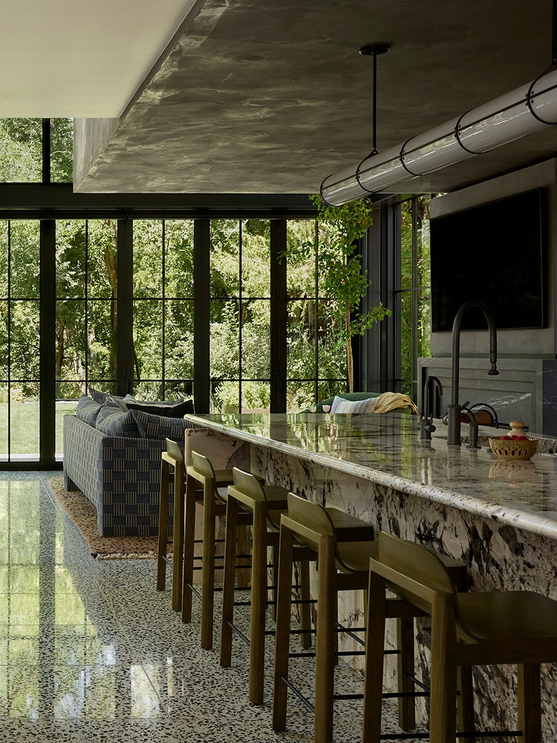
Its first floor now functions as a great room, combining an informal dining nook, sleek kitchen, and TV room, which connects to a pool. On the second floor, they added two bedrooms and a shared bath, the domain of the couple’s sons. Here, Flowers breaks down how it all came together.
Consider Foot Traffic Before Sourcing Floors
The green-, black-, and brown-flecked terrazzo, a jumping-off point for the whole design, was the clients’ idea. Once sealed properly, the material is practically indestructible (it’s water- and stain-resistant) aka perfect for indoor-outdoor living. “The kids are watching TV, then they’re jumping in the pool, then they’re on the trampoline,” says Flowers. Now the homeowners can open the floor-to-ceiling accordion windows without stressing out about guests—or, more likely, their kids—tracking mud inside. Bonus: Sealants can also make the surface less slippery, which is key when your floors are pool adjacent.
No One Can Ever Have Enough Closed Storage
With three kids, the clients wanted to get control of the inevitable clutter. In the kitchen, Flowers took their request for closed cabinetry one step further with cupboards all the way to the ceiling (yes, that soffit above the white oak upper cabinets is actually more storage!), an integrated cooktop, and flush panel fridge. As for the matte black fronts? “We loved how the color makes the cabinetry recede,” Flowers explains. “It helps hide everything away.”
Avoid a Kiddie Kids’ Bathroom
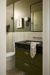
It bears repeating: Your children are going to grow up one day. And unlike the purple paint you let them pick for their bedroom walls, the tile in their bathroom is not a simple swap. In the boys’ bath on the second floor of the addition, Flowers created a playful but still sophisticated stripe using two different sizes of cement tiles. “This doesn’t necessarily have to be a kid’s bathroom,” she points out.
Capitalize on Cool Architecture
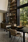
The architects lined most of the soaring addition’s perimeter with double-height windows to match. But there was a strip of wall next to the dining area that wasn’t encased in glass. Flowers and her clients seized the opportunity to turn the blank space into a two-story bookshelf complete with a library ladder. In other words, a stylist’s dream spot. “She is eclectic and has a lot of tchotchkes, which makes the shelf so much fun,” the designer says. Below, Flowers designed a hutch from the same white oak as the upper cabinets to store entertaining essentials that don’t have a home in the formal dining room.
Don’t Get Hung Up on Reinventing History
Instead of clinging to a classic Tudor sensibility, the couple wanted the new addition to feel, well, new. “Their approach was not to make the addition fit with the rest of the house, because they were like, ‘It’s never gonna fit with the rest of the house!’” Flowers explains. This gave the designer room to play with modern, rounded silhouettes for everything from the counter stools to the dining table and chairs.
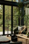
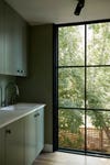
The palette was another way to experiment. In the lounge area, it’s all about tones from nature. Florals were incorporated via a mix of patterns, from the stripy denim blue sofa to the speckled tan and navy wool rug. One trick the designer used to bring the home’s past and present together: choosing a unifying hue. The wife’s favorite color, green, was already sprinkled throughout the original house, so it felt just right in a space next to the lush backyard.
