
We may earn revenue from the products available on this page and participate in affiliate programs.
Despite having majored in painting in college, Fariha Nasir was stumped when she went to paint the powder bathroom in her Houston, Texas home. Everything she’d learned about fine art didn’t seem to translate to interiors. On top of that, DIY was a foreign concept to Nasir. In Pakistan, where she grew up, the norm was to hire a professional. It wasn’t until she moved to the U.S. seven years ago that she decided to tackle a room herself. “It was the week after we moved in and I was like you know what, I can do this,” she says. Nasir asked a slightly more experienced friend to come over and guide her through the process, but she quickly learned the tricks of the trade, like saving flat finishes (0 to 3 percent sheen) for low-traffic areas and using a ¾-inch-thick roller on textured ceilings.
Fast forward, Nasir doesn’t just know her way around the paint aisle—she’s adept with a pry bar and is a whiz with a miter saw. She’s built a dedicated following through her blog Pennies for a Fortune, where she documents her latest projects, and has helped others reimagine their spaces as host on Magnolia Network’s Problem Spaces. You can also get caught up to speed in her new book, Home, Improved. In its pages, Nasir offers readers the tips and tools to execute transformations on their own. If you’re like circa-2016 Nasir and simply want to paint your powder room, she’s got you. No, she’s really got you. In the book, she reveals her all-time favorite paint colors—a “cheat sheet” to picking hues, if you will. Ahead, we asked the serial renovator to break down the 18 swatches that made her cut.
Blue Dusk by Benjamin Moore
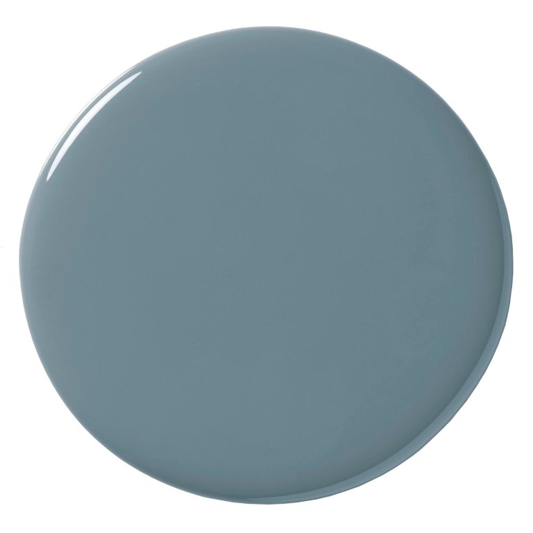
Blue Dusk is one of those colors that’s really warm and inviting. I used it on Problem Spaces in a turret that had a desk. I color-drenched the space, and it’s so moody. It’s a mid-tone blue but doesn’t make the room too dark.
Providence Blue by Benjamin Moore
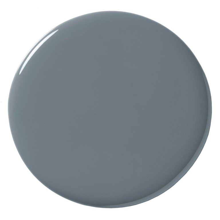
This is in my laundry room. I had a fun time pairing it with my William & Morris floral wallpaper. It doesn’t match exactly—it’s a little lighter, which I love. It has a lot of black in it, so it’s fun for a small space where you want to embrace the size, not fight it.
Stiffkey Blue by Farrow & Ball
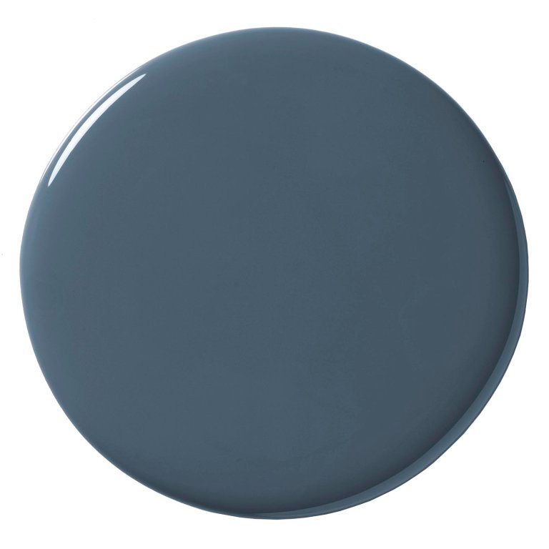
I personally have not used this blue but it’s one of my favorites and I’m waiting for the perfect room to use it in.
Alabaster by Sherwin-Williams
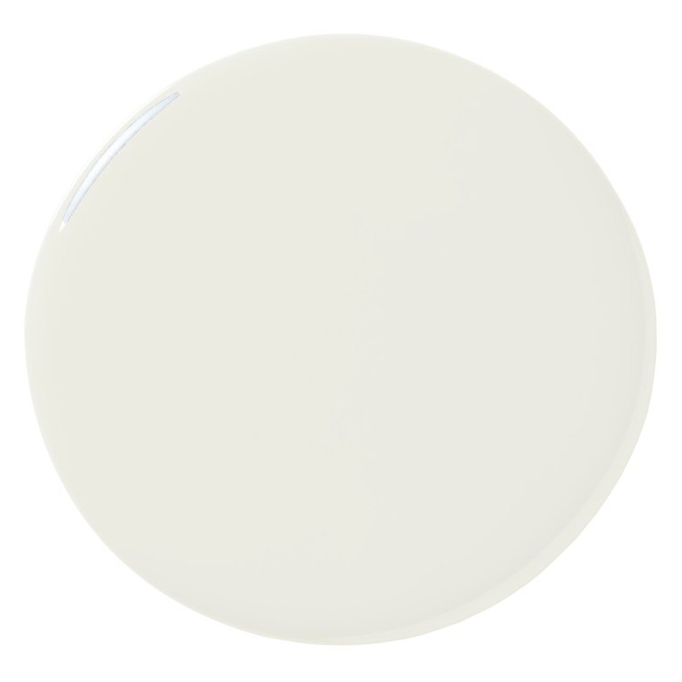
One of my top recommended colors is Alabaster. It’s a go-to for clients who are painting their whole house and exterior and they are set on a white or a creamy-white.
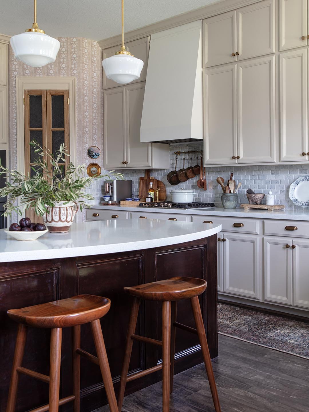
Natural Tan by Sherwin-Williams
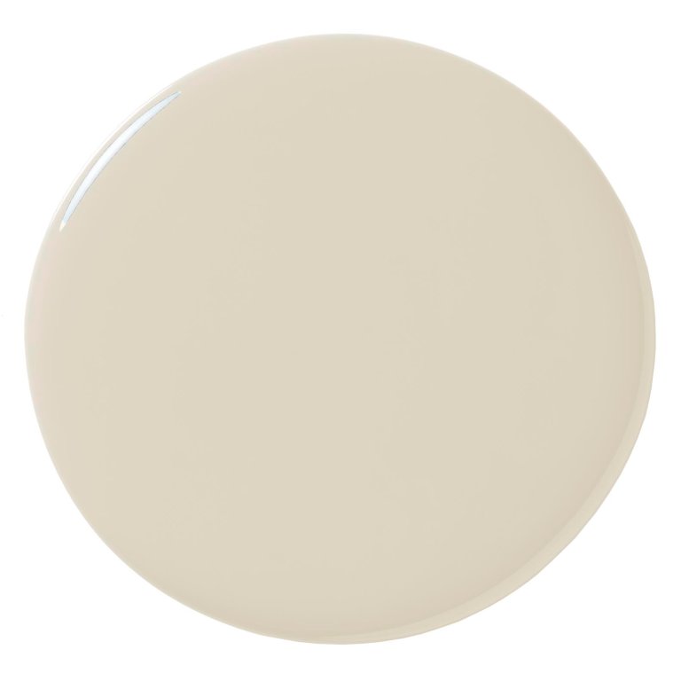
I used this on my kitchen cabinetry. It pairs really well with Agreeable Gray, which is on my walls. I wanted something that was creamy with a little yellow undertone.
Alpaca by Sherwin-Williams
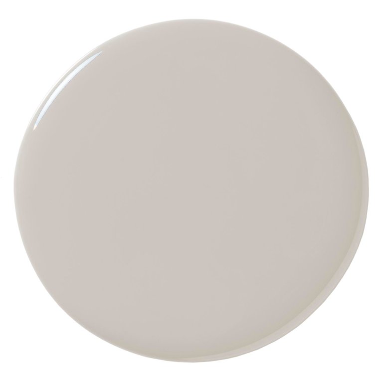
I did this on a client’s dining room built-ins. She had light, white walls and wanted something that was still neutral. Alpaca has a soft mink-gray undertone, but it doesn’t read like a cool color.
Chantilly Lace by Benjamin Moore

I have not personally used Chantilly Lace in my house, but I’ve used it in clients’ spaces as a “whole house” color.
Agreeable Gray by Sherwin-Williams
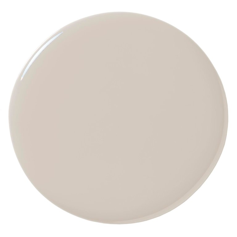
A lot of clients already have this color in their homes because builders like this paint color. There is a way to make it look better and not just builder-grade! Paired with the right accent colors, it can be beautiful.
Wild Truffle by Behr
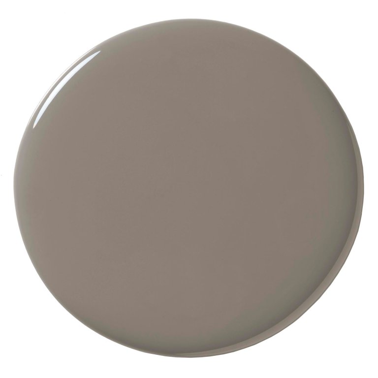
We renovated a rental property in the Berkshires and I paired this deep mushroom color with navy as an accent.
French Gray by Farrow & Ball
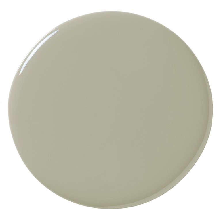
There’s nothing gray about this color! I have it in my home office and it’s the prettiest sage green. It’s really calming and a nice color for cabinets as well.
Lichen by Farrow & Ball
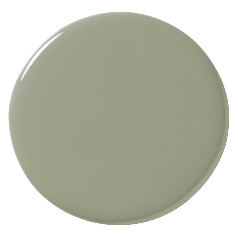
This is more of a true light green, although it has a lot of gray in it. I have it in my dining room, and it fares well with the blue and green in my Haveli block print wallpaper.
Current Mood by Clare Paint
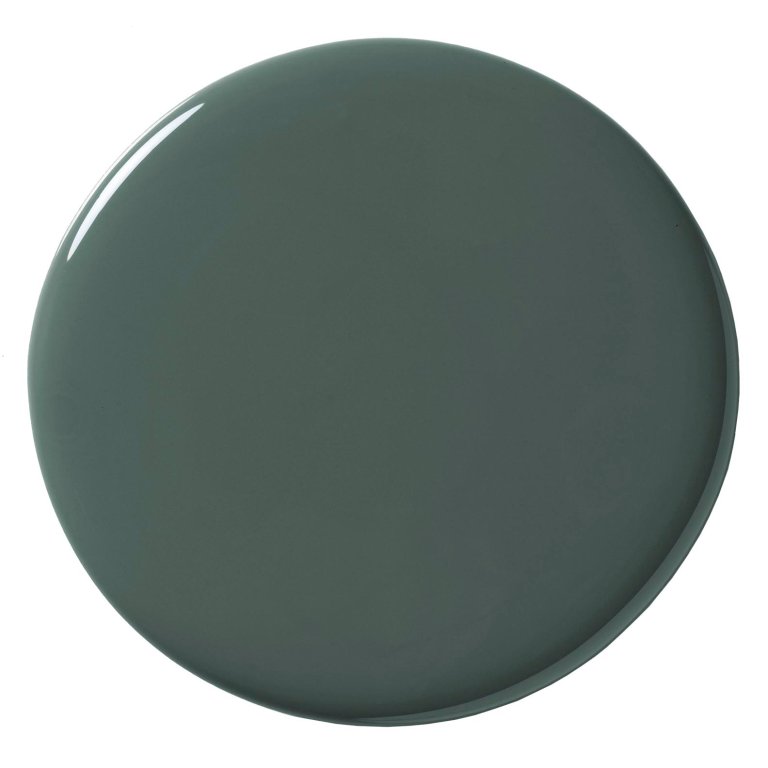
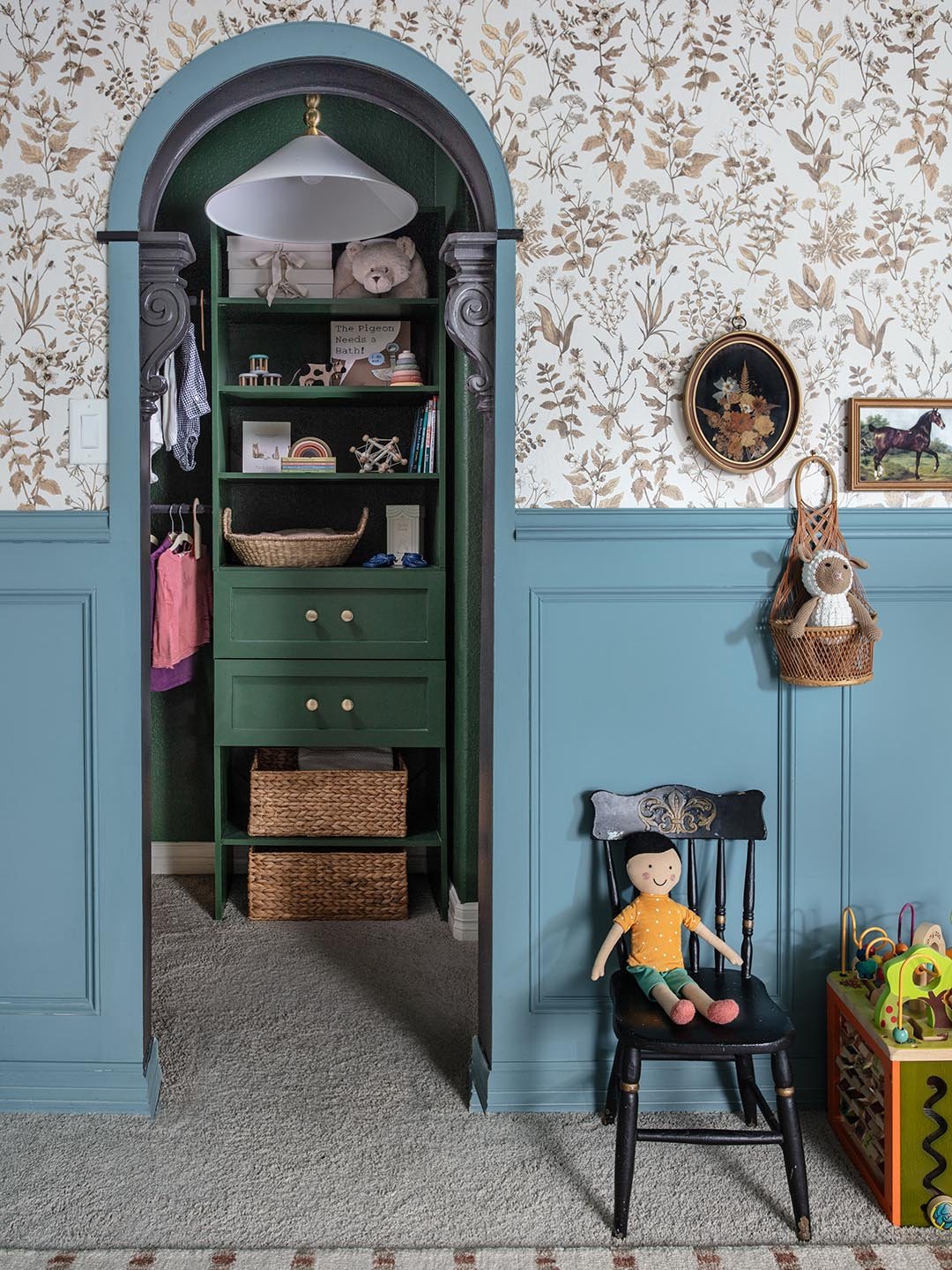
Current Mood was the old paint color in my playroom. I think it’s very timeless and could make for a beautiful home office or a library.
Backwoods by Benjamin Moore
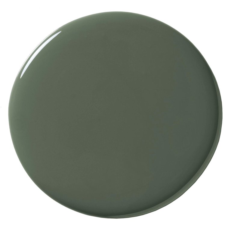
We did this on client’s house on the TV show: she had an open room with no doors and we sectioned off the area with this paint color. It made for a nice focal point. It’d be really pretty in a media room or a space that doesn’t get a lot of natural light.
Duck Green by Farrow & Ball
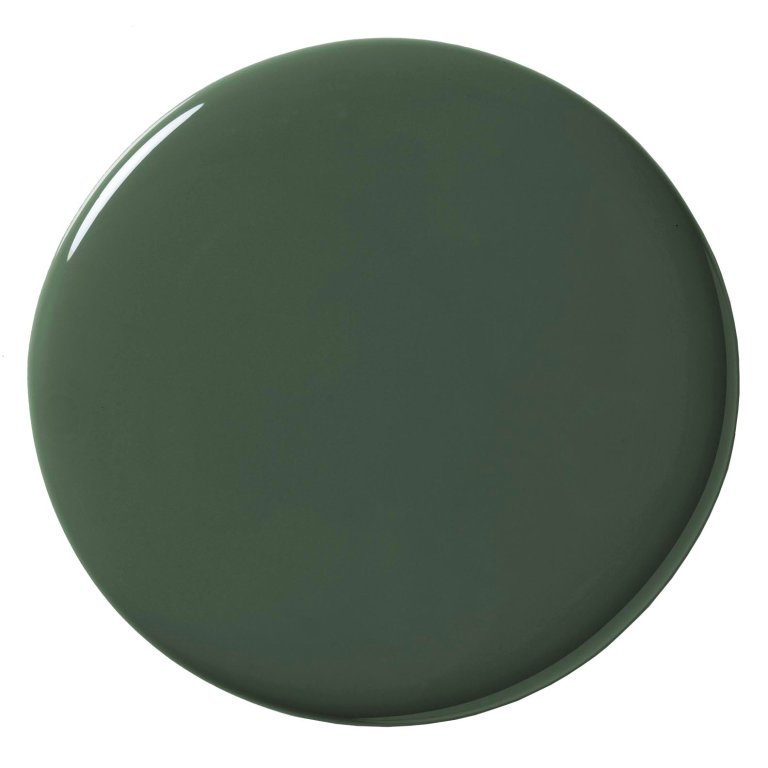
I used Duck Green on a bedroom ceiling. I think most people rush to paint their ceilings before covering things up. Take your time in prepping everything, like covering up furniture, making sure there’s enough room for you to move around the ladder. And don’t forget your roller extension because your neck is going to thank you!

Sulking Room Pink by Farrow & Ball
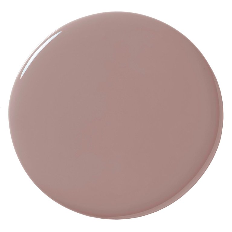
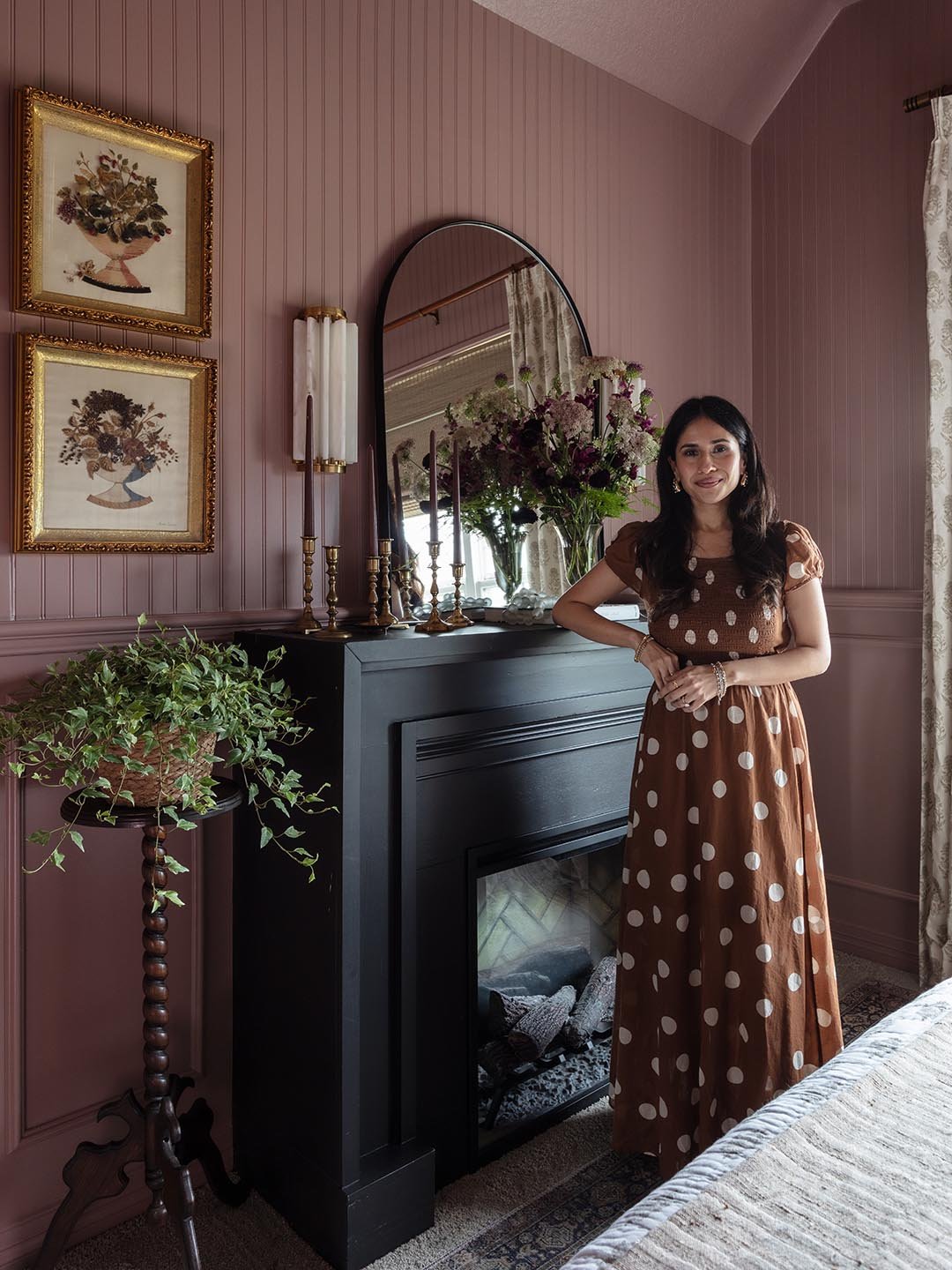
My guest bedroom is one of my favorite pink colors in the house. I had this vision of a beautiful boutique hotel. It looks great with a black chest of drawers and a black fireplace. That was such an exhilarating experience, putting pink paint on the walls.
Deep Reddish Brown by Farrow & Ball
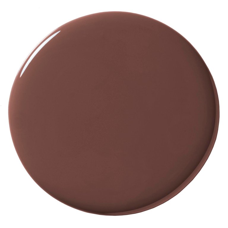
This one is so luxe and rich-looking. I have it on my banquette in the breakfast nook. It was my first time using high-gloss paint, which I learned is not easy. I highly recommend experimenting first. Warming it up helps it go on smoother!
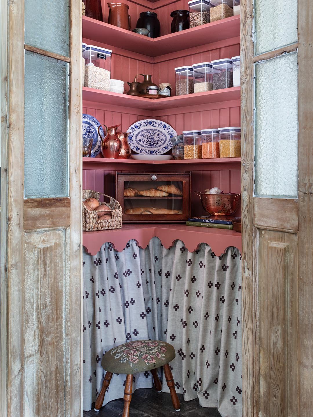
Rojo Dust by Sherwin-Williams
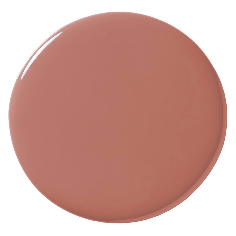
This one is in my pantry. It has a lot of terracotta in it but is definitely more vibrant and playful and cheerful than Sulking Room Pink.
Royal Garnet by Valspar
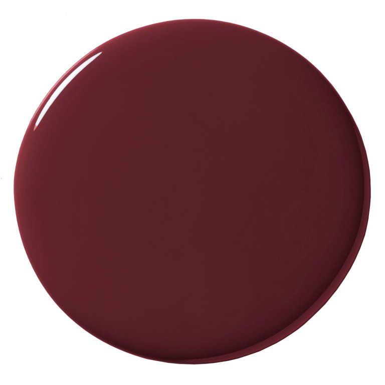
One of my clients found this color for her kitchen island. I’d never used Valspar’s colors before. It’s a ruby red and it’s so fun and bright.