
We may earn revenue from the products available on this page and participate in affiliate programs.
Only two existing design features made the cut after designer Olivia Snow’s first walkthrough of her client’s ’80s-era condo in Park City, Utah: the plaid wallpaper in what would be the son’s room and the wood-clad ceilings in the living area. Everything else—the bathroom vanities located in the bedrooms, the closets that wrecked the flow of the 1,800-square-foot space—had to go.
Technically, Snow, founder of Mother’s Daughter Design, was embarking on a pied-à-terre renovation, but not in the usual sense. Snow’s client, who works at a non-profit based in Kenya, had moved her family of four there for a few years. In the meantime, they’d decided to rent their larger home (which Snow had previously helped style) and purchase this condo downtown. This way, when the family visited during ski season, they’d have easy access to the action. The historic ski town ended up influencing the design direction, too; Snow and her client leaned into the area’s innate quirkiness with a colorful, cozy aesthetic absent of the usual mountain cabin design tropes. Below, we asked Snow to share all the nitty-gritty details.
What inspired the moody-meets-muted color palette?
Two things came together at the very beginning of the project that set the tone for everything: my client purchased a really fun piece of art that we wanted to design this space around and she told me, “This isn’t my primary home, so I’m ready to be more adventurous than I might be in a space I live in every day, when it comes to color and creativity.”
How exactly did the art inform your design vision?
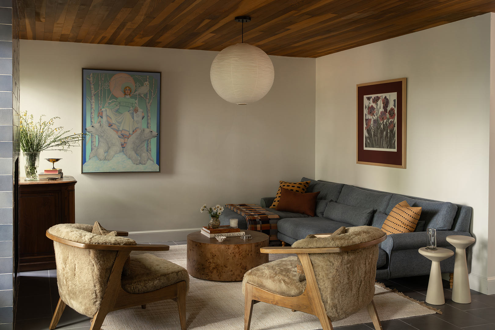
Obviously, it’s a really fun pastel palette, and you’ve got this snow king vibe with polar bears. It felt really out of the box, but this is a ski condo. We did want it to feel like a place where it makes sense that there are boots and snow and all of that happening here, but we also wanted it to be unique and playful.
What was the most exciting material to use?
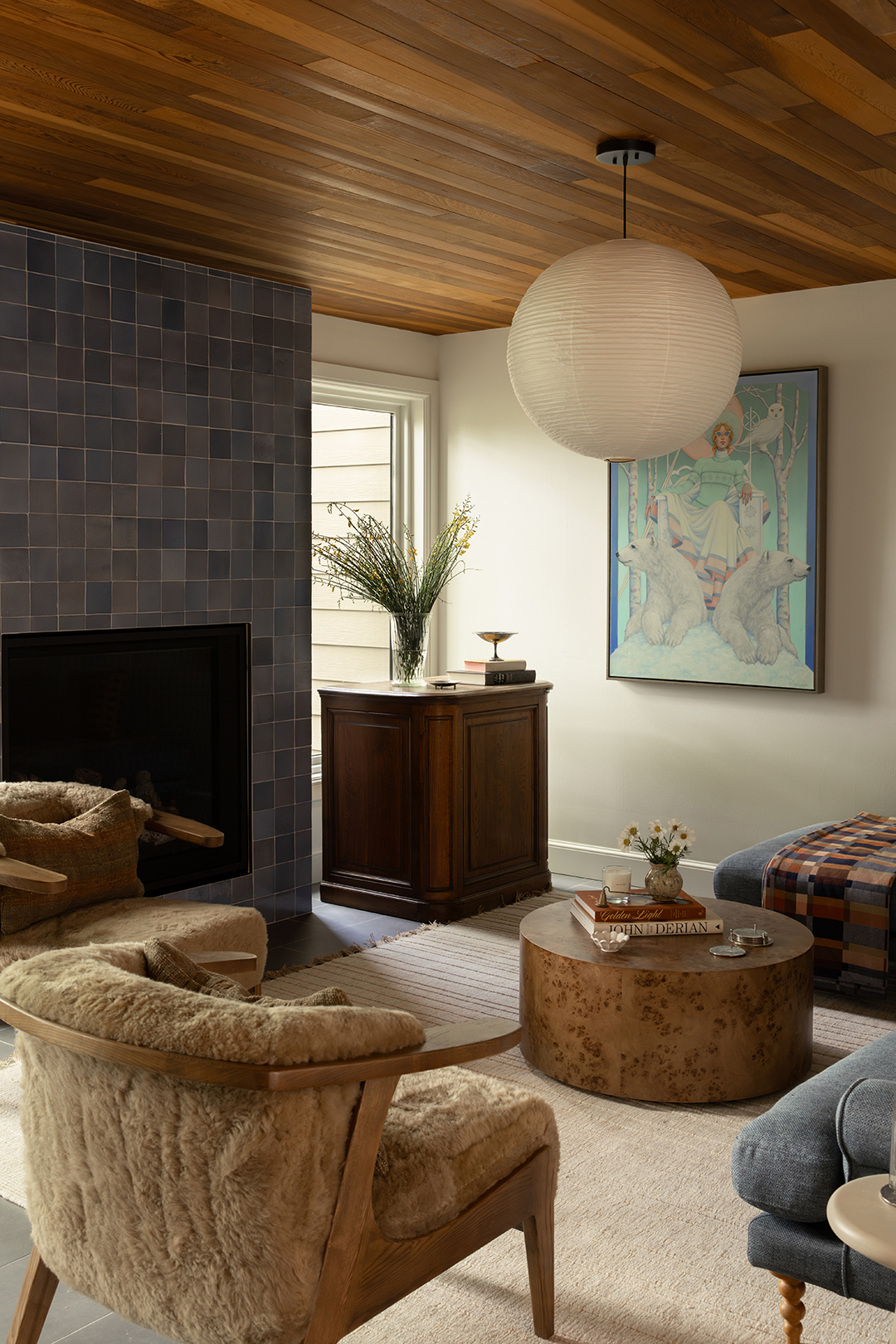
The fireplace tile in the main living room—it is just so beautiful in person. It’s not a zellige, it’s more of a varied ceramic, so it has a little bit more of a flat surface. The variation in the color looked amazing with the sectional and the piece of art.
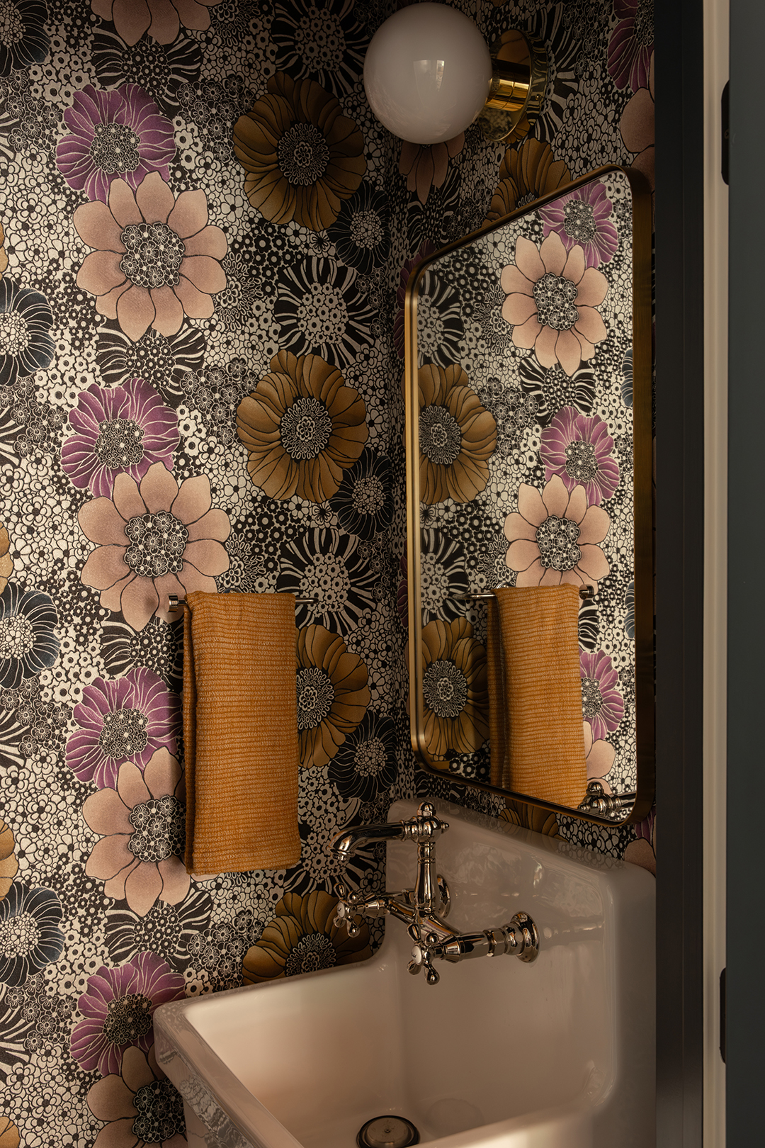
Is there a small design detail that had an outsized impact?
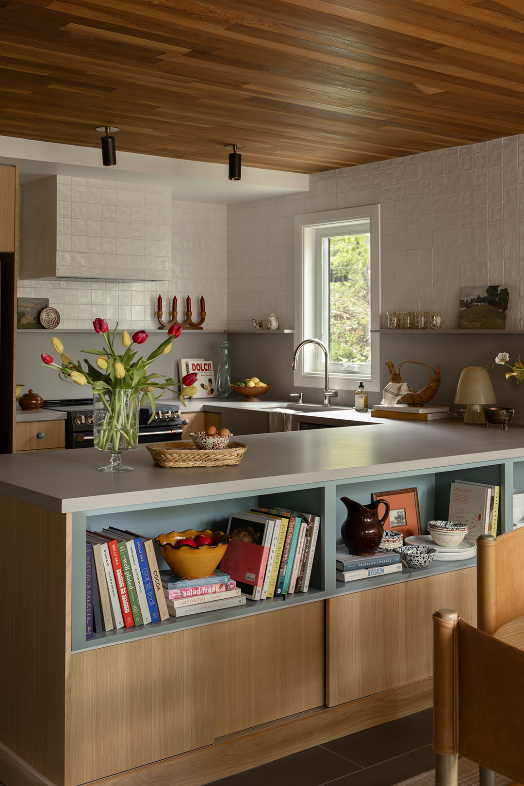
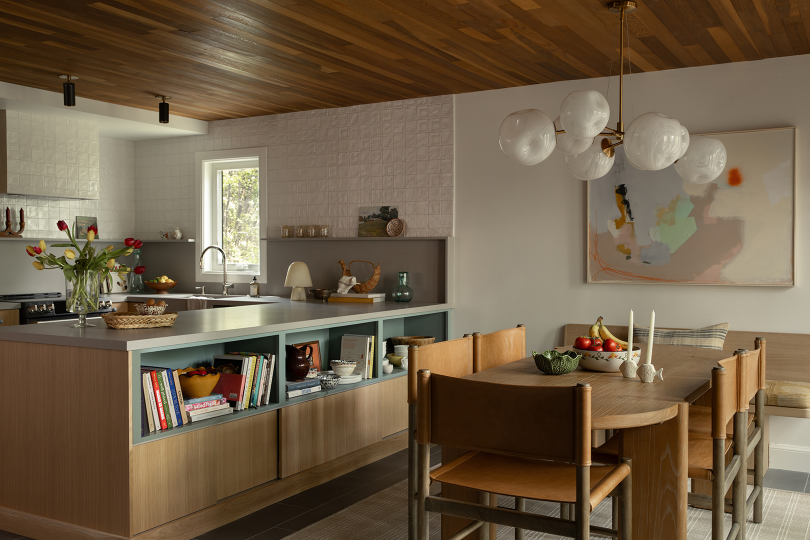
In the kitchen, we wanted to have fun with stain versus paint, so we did inverse color on the cabinetry. The majority of the cabinetry is rift oak and then we have the open shelves in teal. On the backside of the island, we painted the knobs that same color. There wasn’t a great shot of it, but there’s a small pantry area opposite the kitchen where the cabinetry is the teal color and the knobs are stained wood.
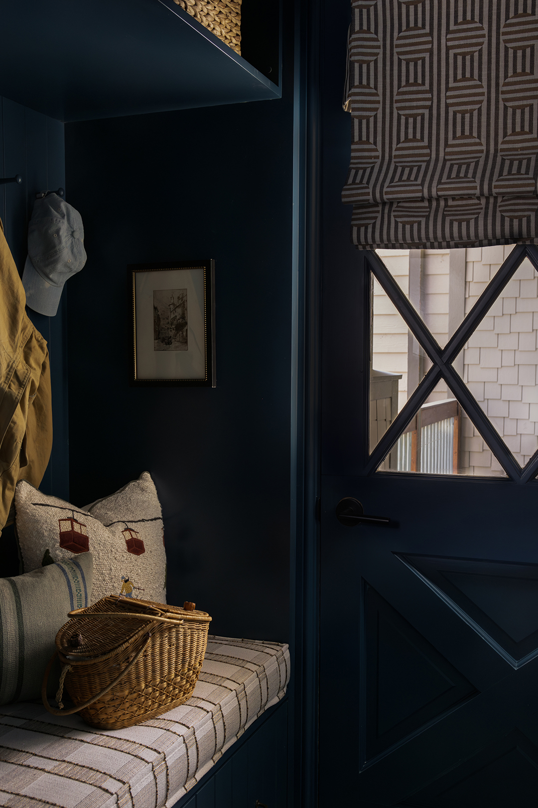
How did you add more function during the renovation?
All of the rooms originally had weird closets that took up a lot of space with sliding doors. So we actually removed the closets in the daughter’s bedroom and in the primary bedroom because they really ate into the footprint of those spaces. This is kind of counterintuitive, but it made the rooms feel more efficient.
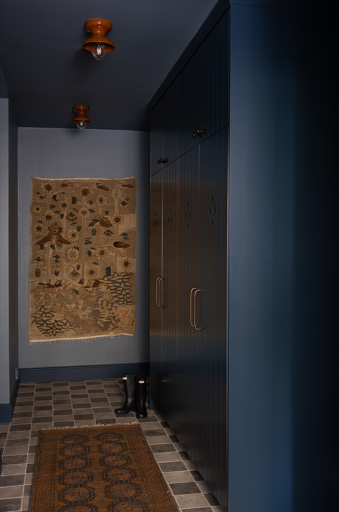
If there are no closets, where’s the storage?
The mudroom hallway was broken up in a lot of weird ways before, but we blew it out to create a really great moment for lockers and ski storage.
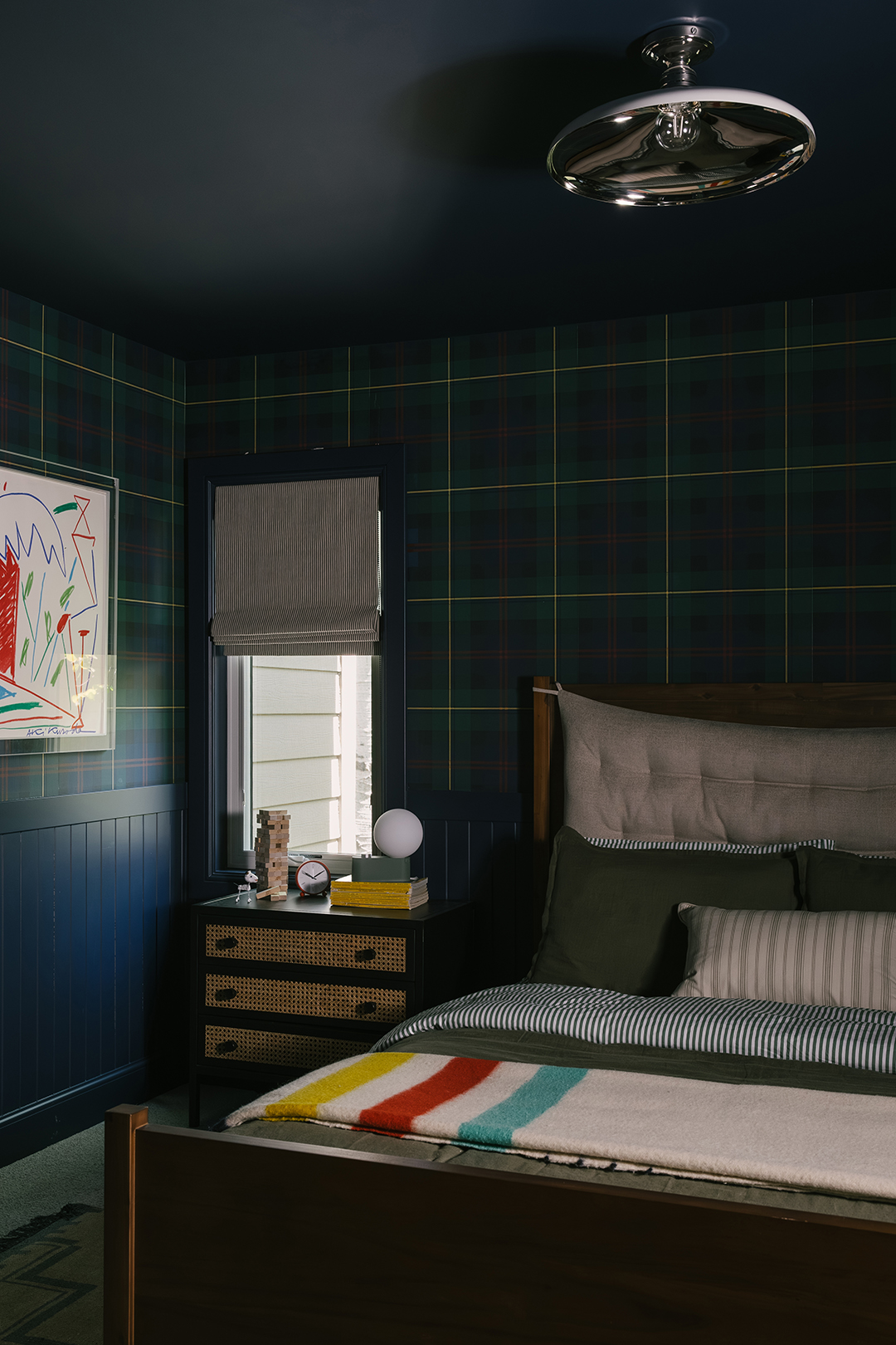
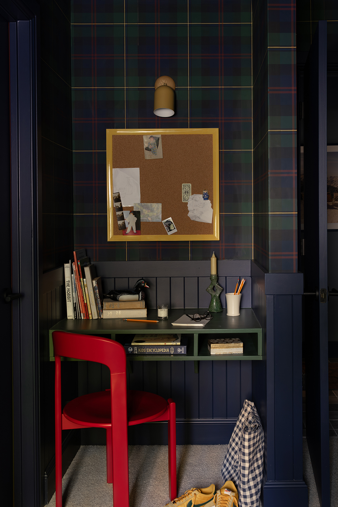
How did you incorporate the original plaid wallpaper?
It was a total salvage job. There was radiant heat along the baseboards throughout the condo and we wanted to update the HVAC. That created a huge gap in the wallpaper, so the wainscotting was added. Then, I have a great friend who’s a mural artist and lives here in Salt Lake City; I tap her whenever I have any sort of mural or wallpaper touchup that needs to happen. She spent about a week color-matching all of the colors from the wallpaper, then repainting any areas that were overly damaged. She did a really good job of bringing it back to life. It was a fun thing to be able to keep.
It sounds like you have a fun working relationship with this homeowner. What’s your favorite part about collaborating with your clients?
I’m very open-minded. For example, this client brought me that wallpaper in the little powder bathroom. She said, “I ordered this 10 years ago, I have no clue where I want to use it. Can we find a home for it?” If a client has an outside-the-box idea, I’m more inclined to take on the challenge of finding a spot for it to reflect their wants in their home.
What design decision felt like the biggest risk?
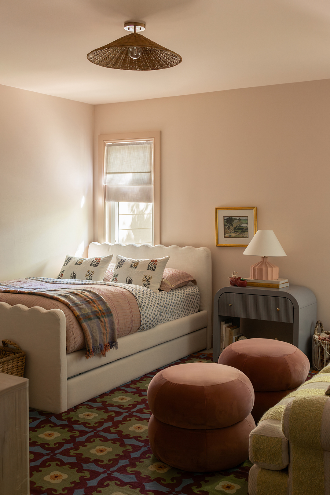
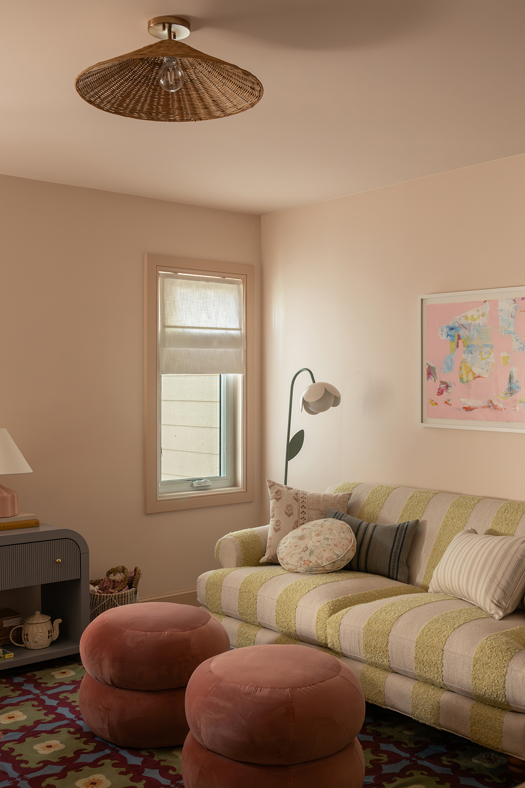
As she was packing up her old house, the client said, “Oh my gosh, I have this tapestry sitting in my basement. Do you think there’s anywhere it would work?” She had this photo of it where it looked like the wrong choice for anywhere in the house. I went to their storage unit and rolled it out. I was like, “I think it’s going to work in your daughter’s room.” It’s technically a rug, but it’s really just threads sewn into a canvas. So it’s this three-dimensional, really cool piece that even until the moment we rolled it out, the client was really nervous thinking it wasn’t going to work. But I knew it would round out the room in a really great way.
What was the project’s biggest splurge?
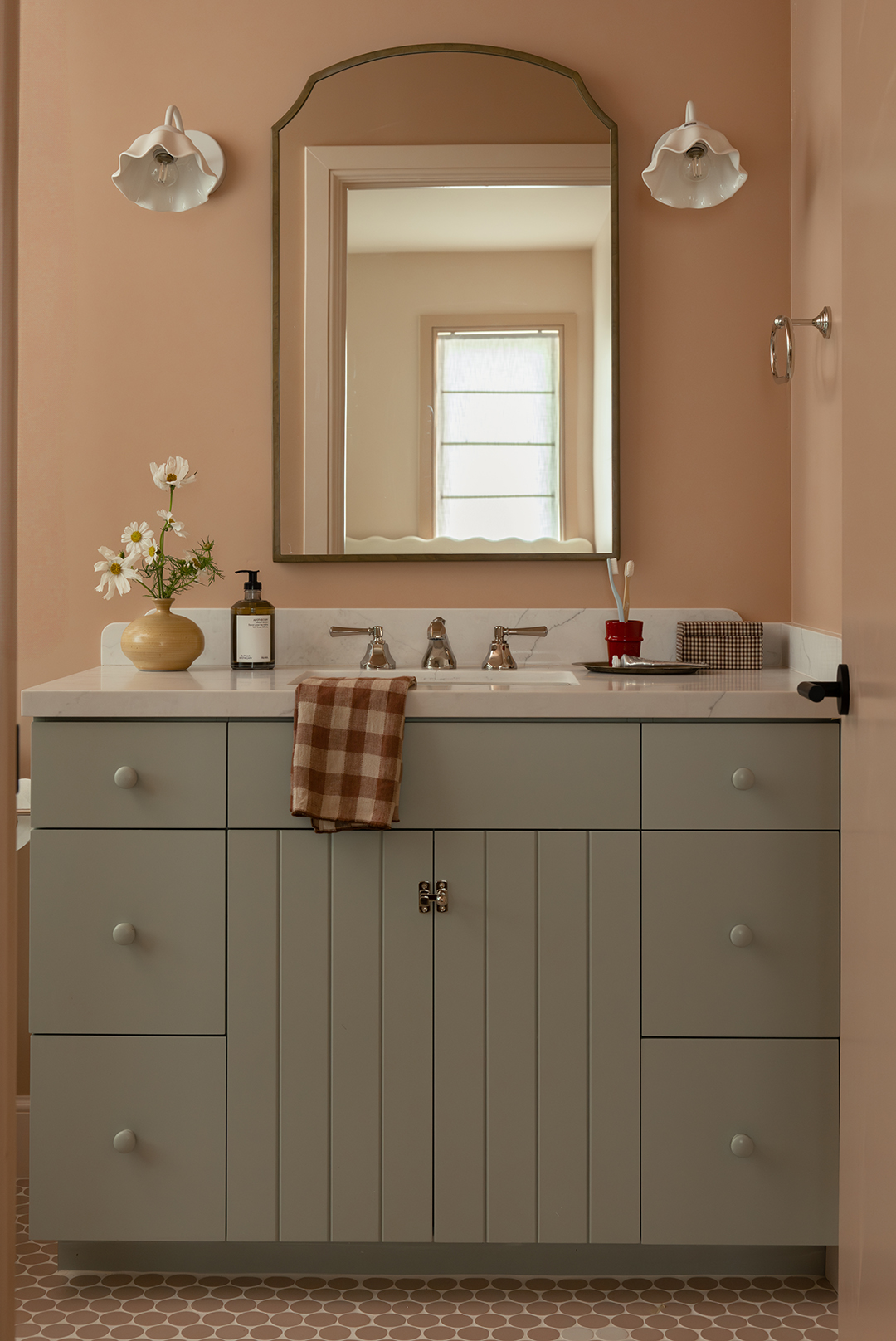
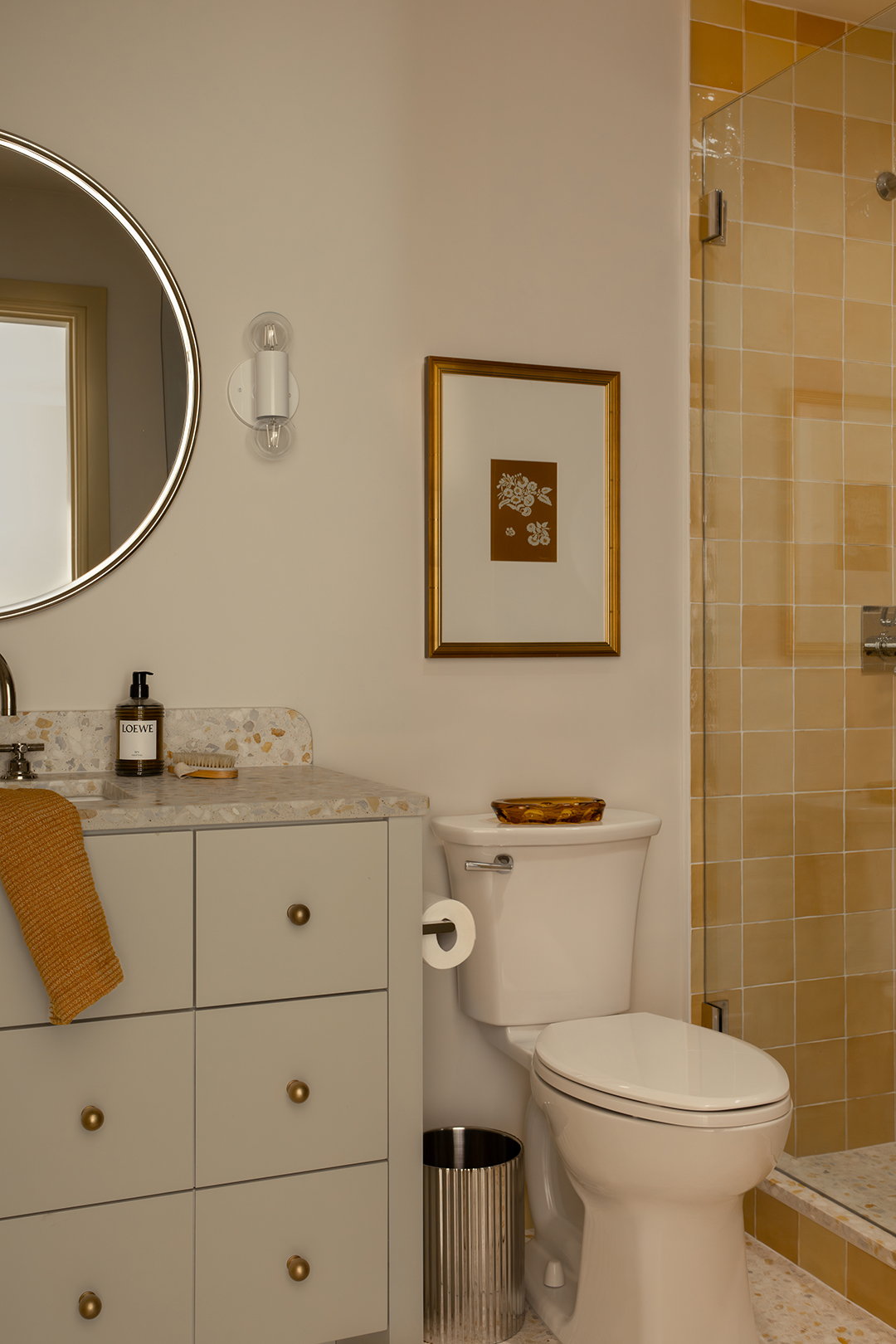
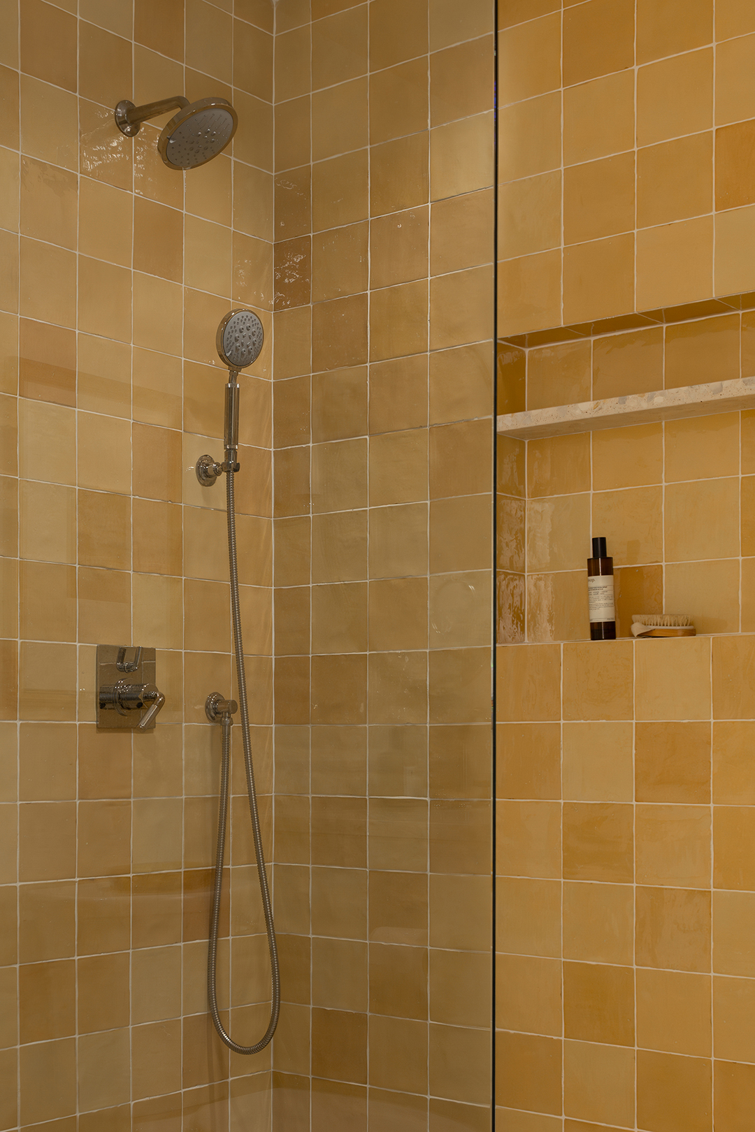
We opted for really, really nice tile. Like the terrazzo in the primary bathroom—it’s the same tile on the floor as it is on the countertop. That was something we custom-ordered out of California.
What about a place you saved?
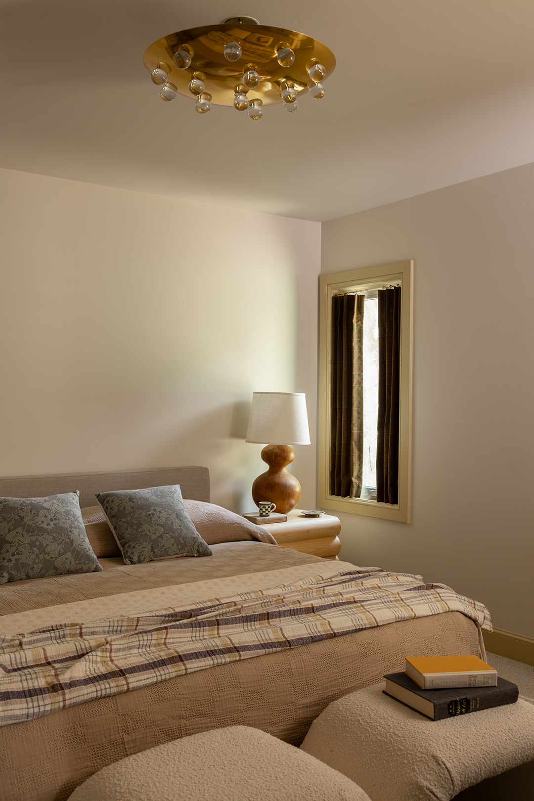
None of the lighting in the home was insanely expensive. The light that went into the primary bedroom was something the client had already—and that one is really special. We didn’t have the intention of looking for budget-friendly lighting, but the stuff that we were drawn towards just didn’t need to be expensive. So why make it expensive, you know?