
We may earn revenue from the products available on this page and participate in affiliate programs.
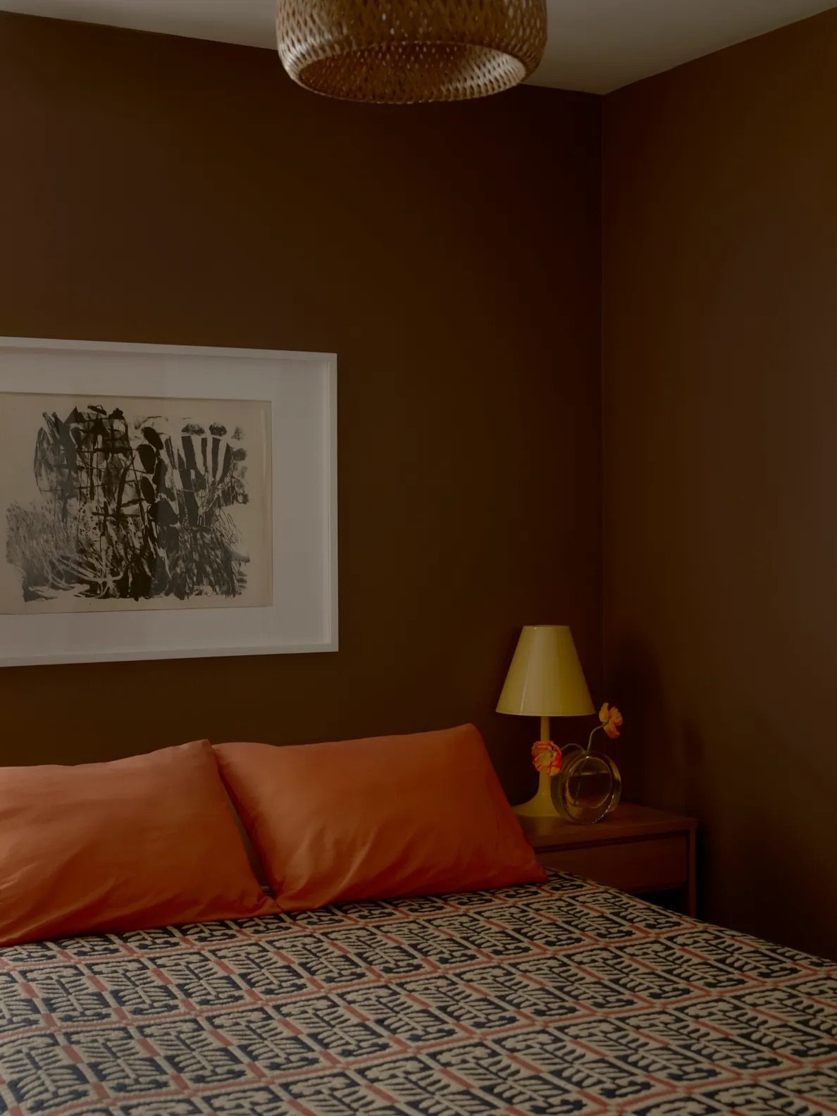
For a while, picking a neutral paint mostly meant deciding between white, beige, and some version of gray. But the latest data suggests our collective color wheel is warming up. According to Samplize’s 2026 American Paint Color Report, warm tones now account for 69.4 percent of the paint colors Americans are sampling, while earth tones are the fastest-growing color family. Browns in particular are on the rise, appearing on 13.4 percent of paint shortlists compared with just 9.2 percent two years ago.
Before you picture the muddy brown walls of decades past, the new class of earthy neutrals is a little more nuanced. Think mushroomy taupes, weathered stone, and deep brown shades that can almost pass for charcoal. These four swatches, which top Samplize’s order samples, are proof that brown might just be your new favorite go-to hue.
London Clay by Farrow & Ball
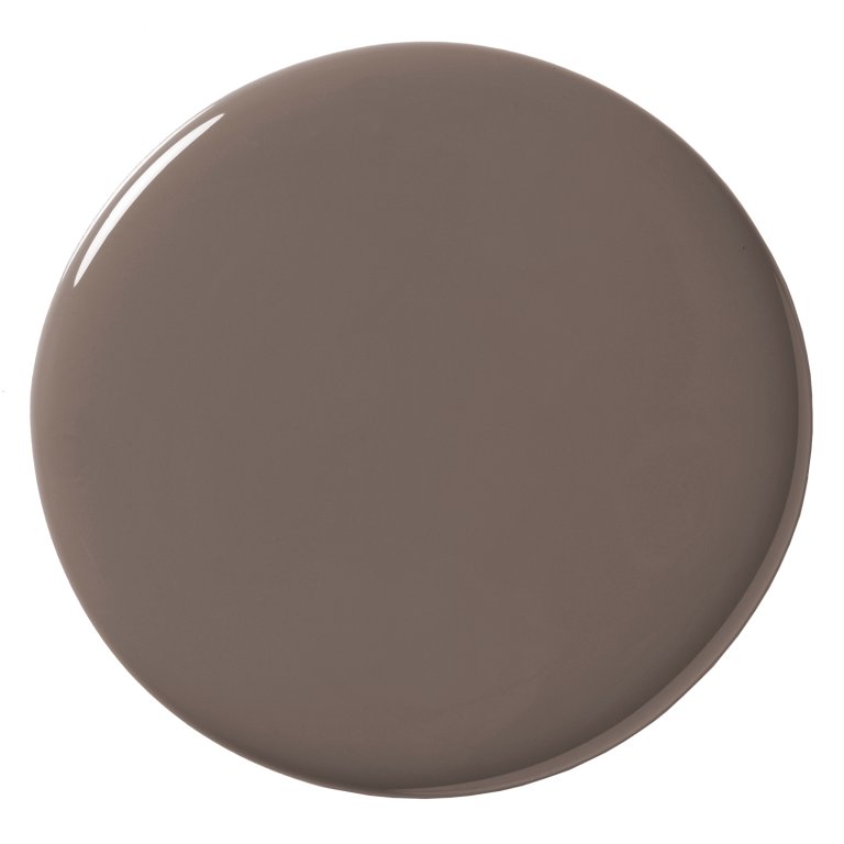
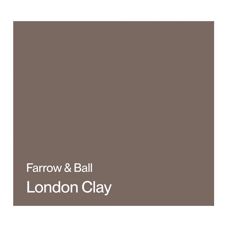
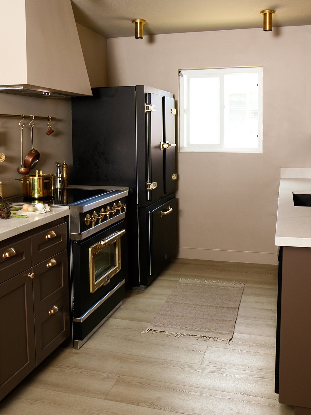
London Clay is brown with a little something extra: Farrow & Ball describes the shade as having underlying magenta tones, which gives it a richness that can shift from chocolate to plum depending on the light. Professional recipe developer and food stylist Diana Yen used the warm brown on the lower cabinets of her small, naturally dark galley kitchen, leaning into the room’s inherent moodiness rather than trying to brighten it up. We could easily see it jumping from millwork to the walls here.
Urbane Bronze by Sherwin-Williams
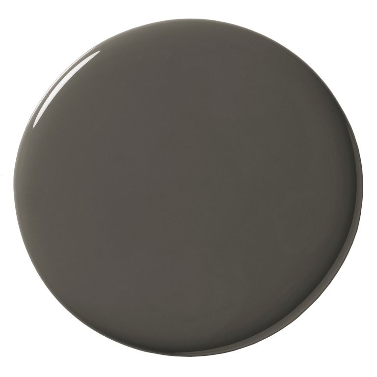

The darkest of the bunch, Urbane Bronze, which was the brand’s 2021 Color of the Year, lives in that magical territory between brown, charcoal, and bronze. Rather than treating it like an accent color, consider going all in on walls and trim for an enveloping room, or use it on cabinetry and pair it with pale wood, creamy stone, and brass for contrast. When we asked designers how they’d put their own spin on the color back in 2021, Sally Breer said she would pair the hue with rich jewel-tone accessories to amp up the drama.
Tony Taupe by Sherwin-Williams
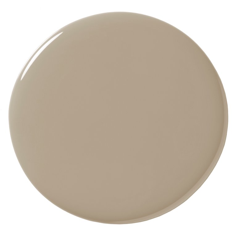
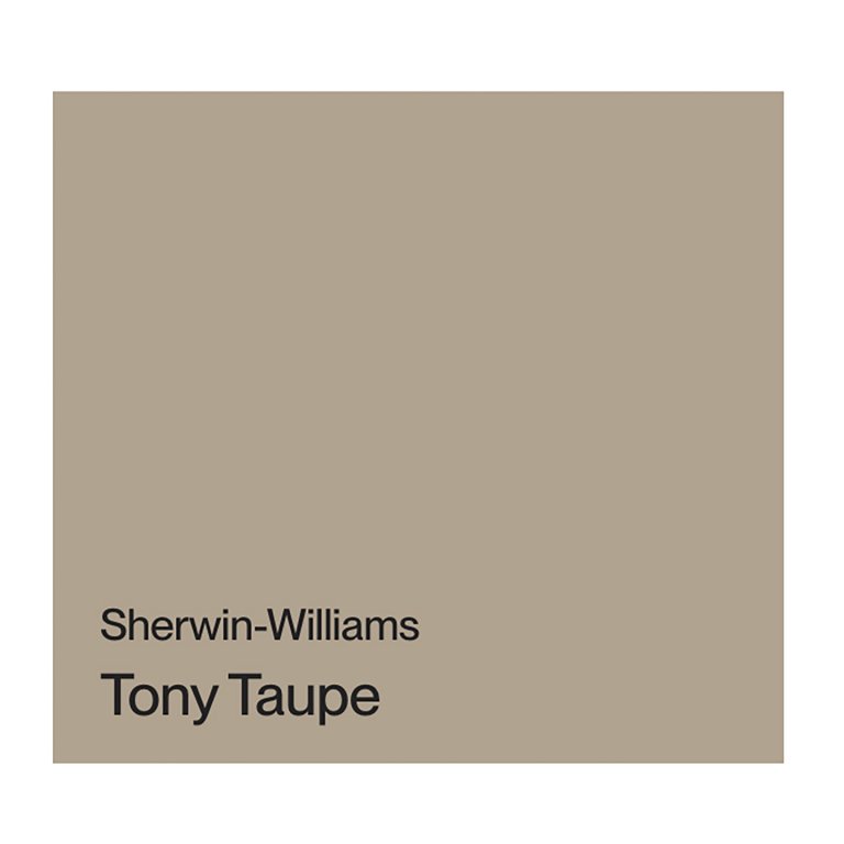
If you’re not quite ready to call yourself a brown-paint person, Tony Taupe is an easy entry point. The mid-tone neutral sits somewhere between beige, taupe, and brown, making it subtle enough to use across all four walls and the ceiling without sacrificing the warmth that’s drawing people away from cooler grays. We recently saw a pantry reno by interior designer and content creator Becky George, and it was the perfect hue to ground the space.
Warm Stone by Sherwin-Williams
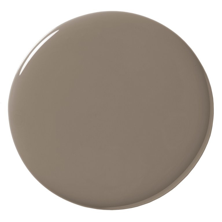
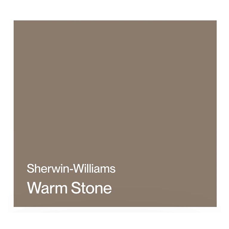
Warm Stone is deeper and earthier, with the muddiness of an actual river rock rather than a traditional beige. Try it on kitchen cabinetry or built-ins, where its brown undertones can add depth alongside natural wood, stone, and creamy whites without going as dramatic as a near-black. We also saw a TikTok creator paint her dining room the moody shade and it added a much needed comfort to the room.