We may earn revenue from the products available on this page and participate in affiliate programs.
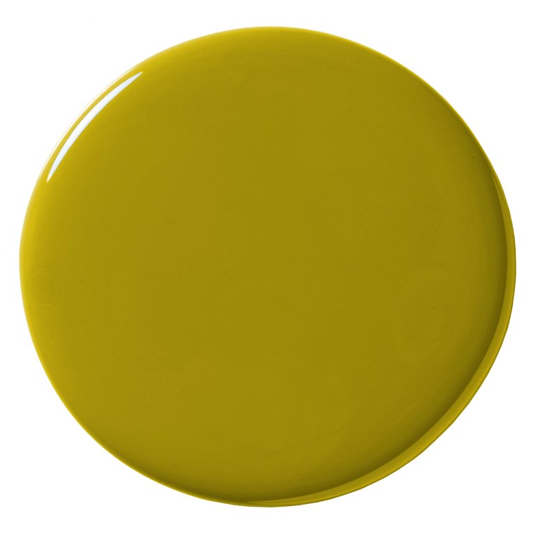
The acid tone of tennis balls, those first leaves in spring, a glass of Chartreuse liqueur—I’m drawn to all the misfit shades of green out there. Whether it skews lime-y, like the best pair of sneakers I ever owned, or it fancies itself a sallow green-yellow, there’s something about a hue that’s a little out there that I love.
But that’s not everyone’s cup of tea. In fact, it’s not most. Since 2024, Sherwin-Williams has made an effort to elevate some of their least popular colors, in part to highlight unique hues like this and show people how to incorporate them in their houses. A vivacious gold and soft lavender have gotten time in the spotlight over the past two years, and now, it’s Offbeat Green’s turn. The bright, naturalistic green might look like a challenging color to use, but it pairs well with cream, pink, pale blue, and rich wood grain.

How do I know? I’ve seen dozens of homeowners use unconventional greens like this one, from low-commitment applications like a floor covering to all-out coverage across walls, bookshelves, and kitchen backsplashes. It can read light-hearted in some instances and highly sophisticated in others, depending on the room. Below, eight ways the pros have infused spaces with the funkiest verdant shades.
Put It On Display In the Entry

Lindy McDonough and Conor MacKean’s Pawtucket, Rhode Island home was already unique when they bought it. The 140-year-old former voting hall was full of lovable quirks (worn brick walls, little privacy) and jaw-dropping original features like heart pine floors and soaring ceilings. To create a transition between the front door and main living/dining area, the co-founders of Lindquist Object decided to swath the entryway in Farrow & Ball’s Churlish Green.
Keep It For Yourself in the Closet

To carve out a new primary suite closet in Helen Toomer and Eric Romano’s 1770s stone Dutch colonial, Karley Brown-Sgandurra and Joe Sgandurra of The Eden Co. had to get creative. Together, they created this nook to store Toomer’s ebullient clothing collection. The paint color, inspired by adjacent Divine Savages wallpaper, creates a joyful backdrop. This won’t be the last time you see Benjamin Moore’s Split Pea in this story. (The powder blue floor pairing? Perfection.)
Give Your Bookshelves Character

When designer Phoebe Hollond took on this Sussex, England, home for a young family of four, she had to navigate the couple’s very different tastes (she, a little bohemian; he, more of a minimalist). With a philosophy of “there are no rules,” Hollond likes to push the envelope, especially with pattern and color. In this project, she used Paint & Papers’s Scallion on the bookshelves. “We knocked it back to 60 percent for the husband so [it] wasn’t so intense,” she says. “It has a warmth to it and brings me a lot of joy.”
Make It a Backsplash Moment

Stylist Merisa Libbey is a self-proclaimed chartreuse lover, and she references this backsplash, tiled in ochre Heath pieces, in a Los Angeles project by Studio Zimmermann as a standout example (it’s also good evidence of the hue mixing well with white oak).
Add A Hit Around the Windows

When Sophie Donelson, former editor-in-chief of House Beautiful, remade her Montreal kitchen and breakfast room, she brought in all the color. Oxblood red cabinets, rosy walls, and to punch up some deep window insets, a zesty—or, rather, vegetal tone. You guessed it: Benjamin Moore’s Split Pea.
Cover The Kitchen Cabinets

When a paint color is called Pretty Ugly, you know it takes some confidence to use it. TikTok star Victoria Paris splashed the Backdrop hue on her kitchen cabinets, wanting her apartment to embody the maximalism of the Nickelodeon show iCarly.
Lay It Down on the Floor

If paint colors and tile are a bit too committal for you, I’ve noticed off-kilter green rugs at all kinds of brands, including Nordic Knots (seen here in the Brownstone Boys’ Brooklyn brownstone), Beni, and Cold Picnic.
Splash It on the Bed


Or why not reference the sheets in this Lauren Carlucci-designed Hamptons getaway, or the waffle coverlet in artist Maps Rasmussen’s Los Angeles home? Either way, you’ll get a taste without much effort.