We may earn revenue from the products available on this page and participate in affiliate programs.

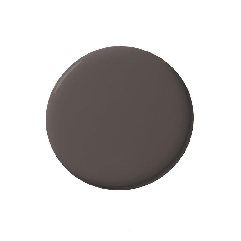
It’s no secret that brown has become the new beige of interiors. As in, the color is everywhere: shower tiles, kitchen cabinets, plush velvet sofas, and even Christmas ornaments. The team behind Benjamin Moore’s annual trend predictions noted this and decided to raise the stakes with its highly anticipated Color of Year announcement. Today, the paint brand announced that Silhouette, a rich espresso with subtle notes of charcoal, is its pick to lead interiors in 2026.
Silhouette by Benjamin Moore
Silhouette is easily the most dramatic 2026 Color of the Year yet when you compare it to Sherwin-Williams’s Universal Khaki, Behr’s blue-green Hidden Gem, Valspar’s Warm Eucalyptus, and C2’s buttery yellow Epernay. In addition to selecting Silhouette as its top choice, Benjamin Moore pinpointed seven other hues they expect to thrive alongside the deep brown. One favorite: The brand’s ever-popular Swiss Coffee. Hannah Yeo, senior manager of color marketing at Benjamin Moore, calls it “an essential white that delivers crisp contrast against Silhouette.” Batik and Sherwood Tan are two more standouts.

Is Silhouette actually brown, or is it closer to black? We’re calling it an even split. Regardless, here are a few ways we’ve seen similar shades play out in real homes.
Double Down on the Drama

A brown-black is begging to live on equally striking molding, whether that’s wainscoting on the walls or intricate trim on a bathroom vanity, like in this Upper West Side bathroom designed by Sugarhouse.
Keep It Contained

“If you’re hesitant to incorporate darker colors into your design, try introducing them in small doses or in enclosed areas such as powder rooms or transitional spaces,” suggests Yeo. The mudroom is one such spot. As you can see in this space by DIYer Carli Alves, swathing the walls (and even the ceiling) in a hue like Silhouette has the added benefit of making the drop zone feel a smidge more sophisticated.
Create Contrast

A dusky color screams cozy, which it makes it a no-brainer for a library. Pair it with white floorboards, like interior designer Nicola Harding did in her Cotswolds home, and the space will still feel warm and bright.