
We may earn revenue from the products available on this page and participate in affiliate programs.
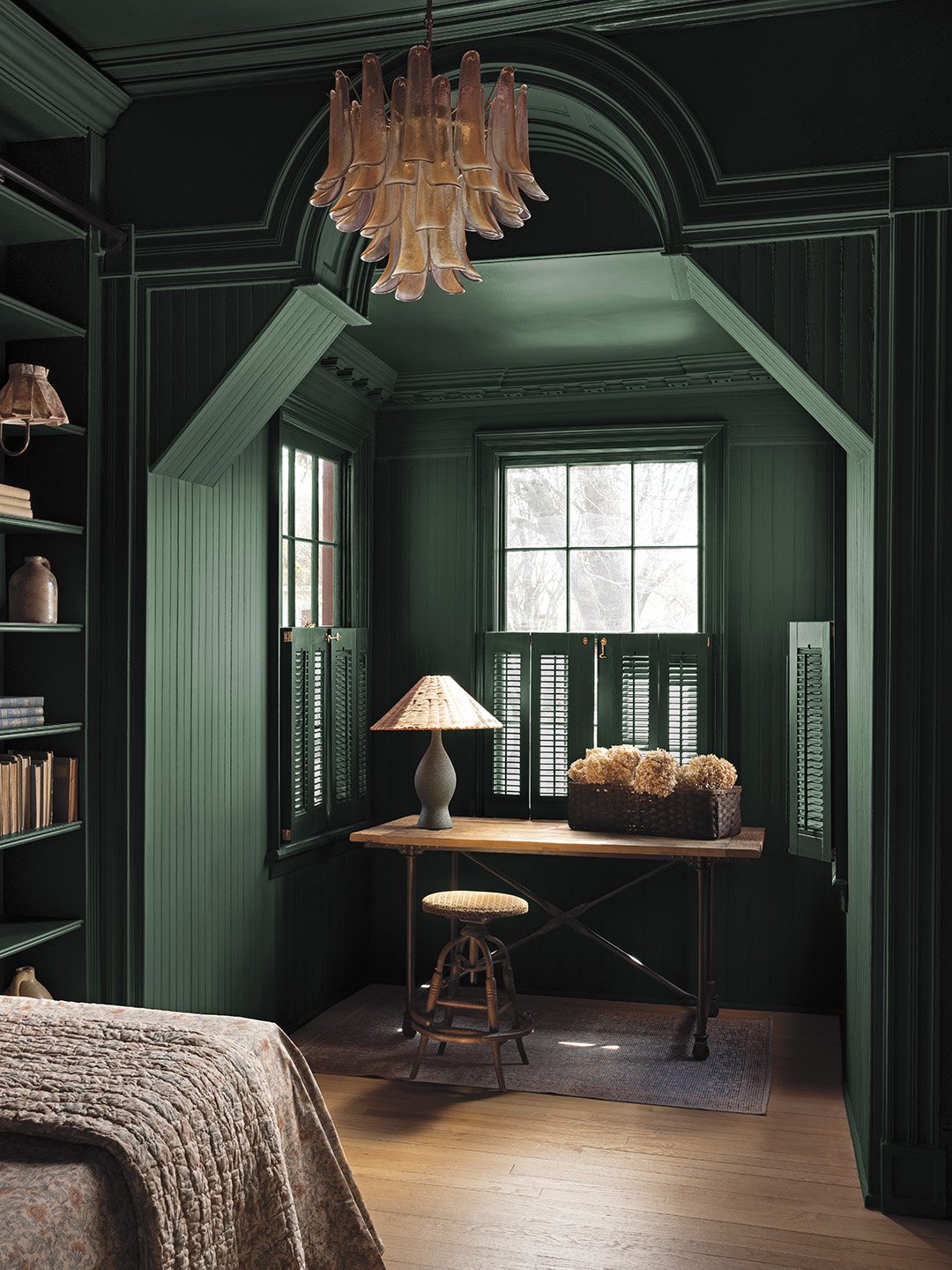
In my nine years as a Domino editor, I’ve covered the comings and goings of green countless times. Don’t get me wrong, the color has always had a place in homes, but certain shades fall in and out of style. In my early days, sage couldn’t have had a stronger grip on interiors, especially on kitchen cabinets. Then things took a darker turn to olive, and for a brief moment lime appeared to be on the rise. Now, Benjamin Moore is putting an end to the “green is a trend” debate by choosing a quintessential shade as its 2027 color of the year.
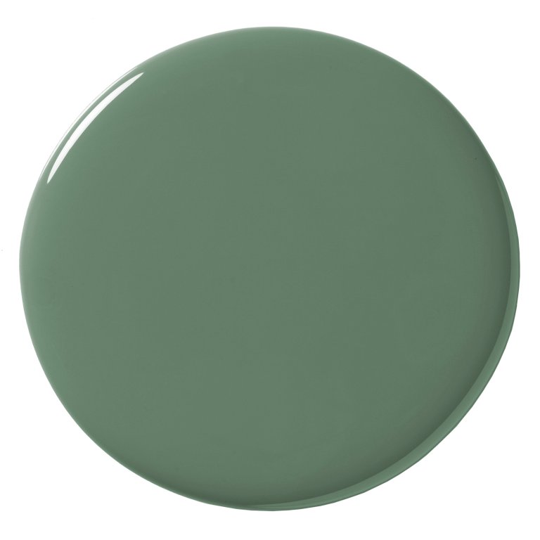
If someone asked you to close your eyes and picture the color green, you’d probably envision the winner: Webster Green. The swatch doesn’t have any obvious undertones; it’s not too light or too dark. It’s as classic as it gets. “We knew we wanted to focus on green, but we didn’t want to pick one that felt like, ‘Oh, the 1920s are back,’ or “The ’60s are back,’” says Arianna Barone, the color marketing manager at Benjamin Moore. “We really wanted to pick a color that felt right and fresh for today.” Here’s what to know about the hue that’ll never go out of style.
Webster Green by Benjamin Moore
Where to Use It
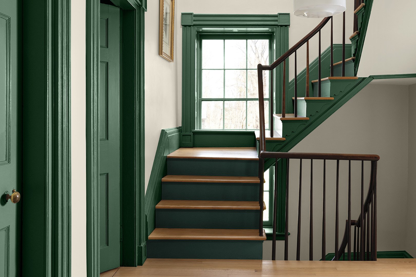
Webster Green isn’t a shade Benjamin Moore created in response to current trends—it’s an established color from its Historic Color Collection. So, unsurprisingly, it looks really good in spaces with a lot of character: living rooms with beefy fireplace mantels, bathrooms with wainscoting, bedrooms with ceiling medallions. “We love the idea of flipping the script and using it on trim and then having off-white walls,” says Barone. “We tend to recommend this if the trim is more ornate, it’s going to guide your eye around the space.”
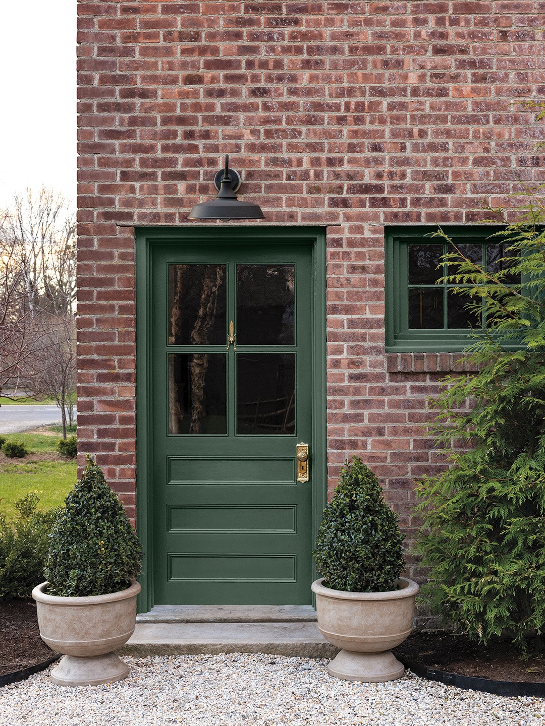
If you have a brick house, you’re in luck: Webster Green is a refreshing choice for door and window trim against that facade. “It goes back to that complementary combination of red and green,” notes Barone.
What Colors to Pair with It
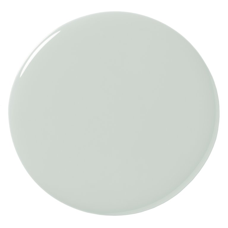
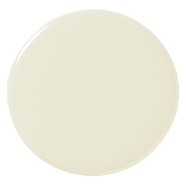
Benjamin Moore’s complete 2027 palette is a solid place to start when thinking about other paint colors to use in combination with Webster Green. Like the winning shade, “there’s nothing dated,” says Barone. You certainly won’t tire of White Down, an off-white that balances out Webster Green’s saturation and has a good amount of cream in it. Want to paint your dark green living room ceiling something that’s not white? Consider Nelson Blue, a pale blue that also looks good with warm woods and terracotta tones like Antique Copper.
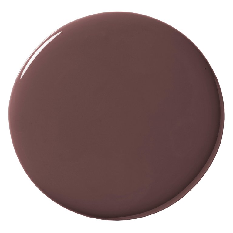
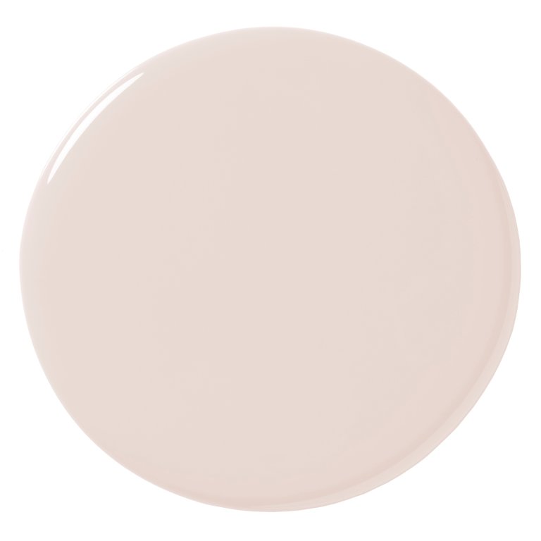
Warm things up with Shakespeare Tan, a golden neutral that can skew amber or olive, depending on the lighting in the space. Stay neutral with the barely-there pink Wild Aster, “a fan favorite among the color team at Benjamin Moore,” Barone continues. Cast brown tones in a space by pairing Webster Green walls with Durango millwork (and scratch an olive itch while you’re at it). Finally, circle back to the Historic Collection for Townsend Harbor Brown, a grounded burgundy.
Other Ways to Try Webster Green
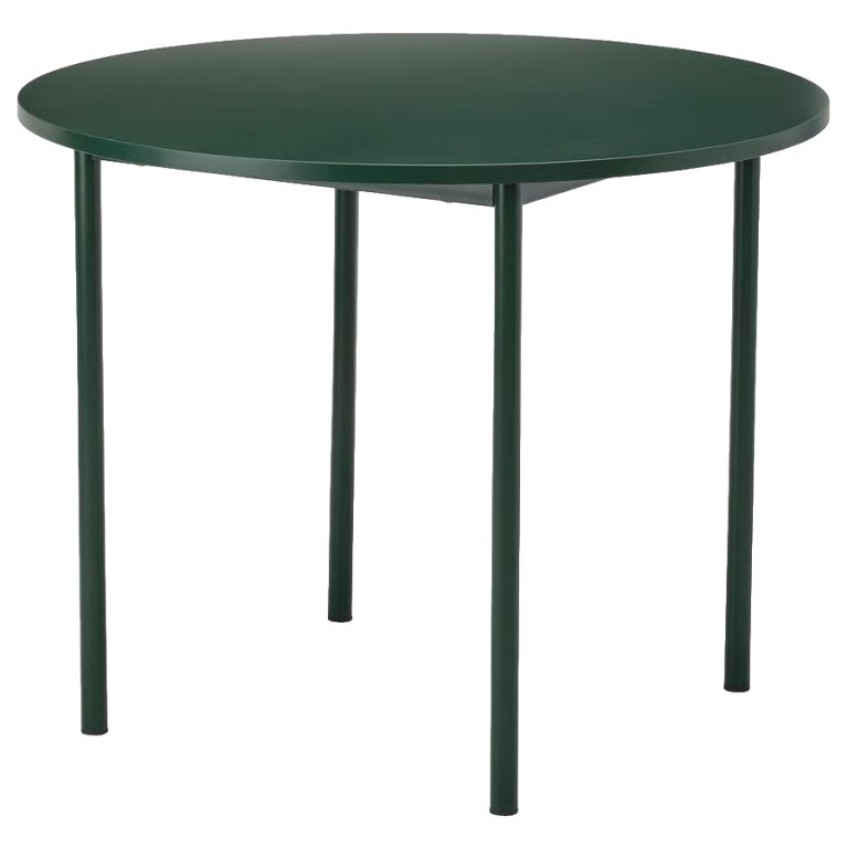
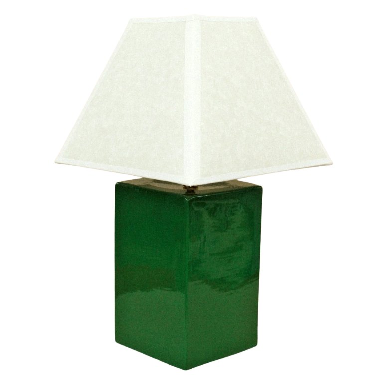
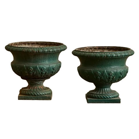
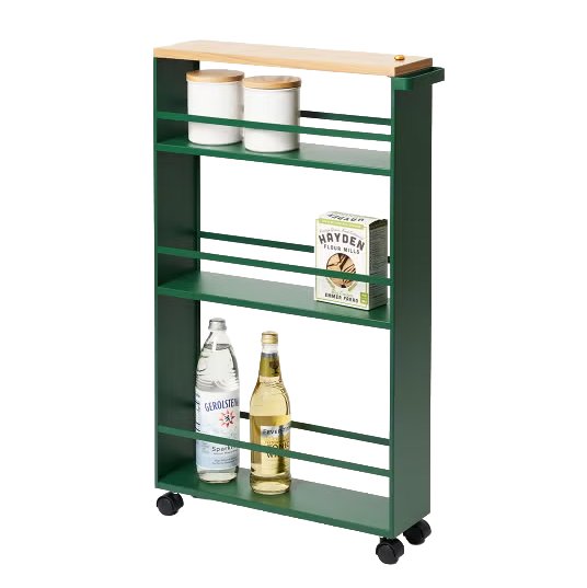
Despite being a quintessential green, it’s not so easy finding furniture and decor in this dark shade; most retailers are embracing trendier moss, sage, and chartreuse. With a little persistence, we unearthed a sleek round table from IKEA’s PS 2026 collection, ceramic table lamps with towering rectangular bases (psst: Crate & Barrel’s version is on sale for $145), 18th century urns that are inspiring us to take on a DIY with a can of Webster Green, striped Roman shades, and a slim rolling cart that makes us smile.