
We may earn revenue from the products available on this page and participate in affiliate programs.
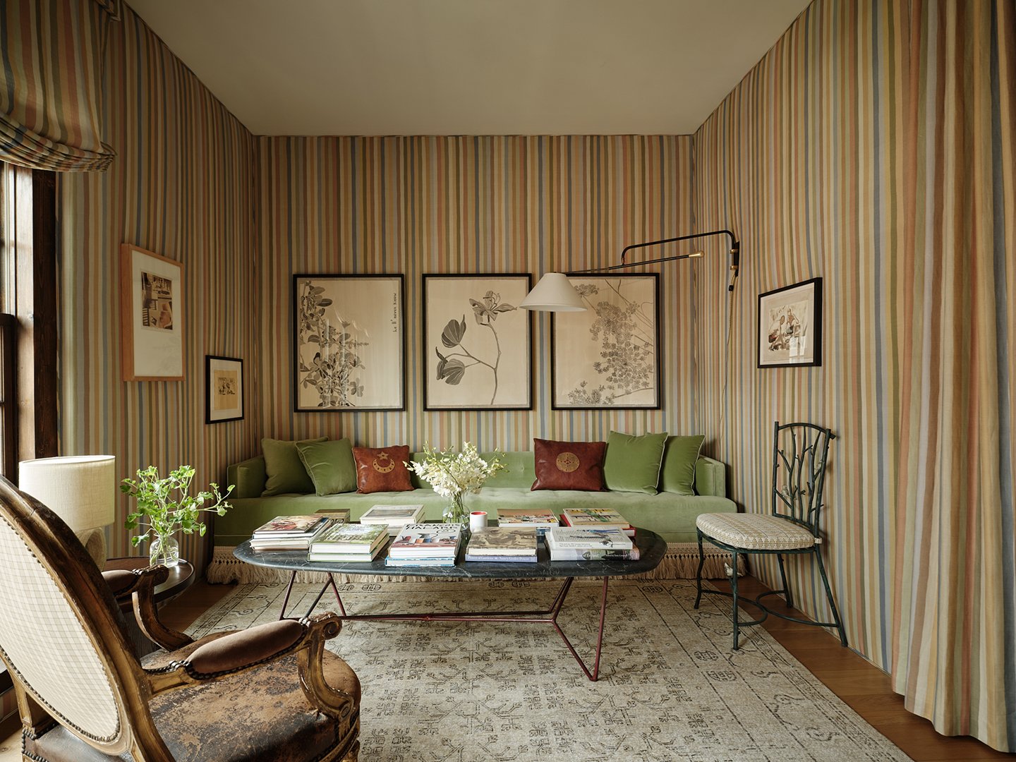
Designing a room for a decorator showhouse is a unique task. There’s no client with needs and desires that must be met, but there’s also not much time: A typical showhouse room is designed in a matter of weeks. It’s also an opportunity to “show” your work to a new audience, which can often result in bold, even over-the-top rooms designed to spark conversation. Interior designer Peter Dunham chose a different path for his Kips Bay Decorator Show House room in New York this year: He designed the room he desired. “It was a very selfish room,” says Dunham. “It’s the pied a terre that I would like to have in that very location for me in New York. It was very personal.”
Dunham also wanted to tie the room to the building’s architecture and the neighborhood, Greenwich Village, at large. “I wanted something that felt airy but was somewhat atmospheric—that connected me to the house and to the street outside,” he says of his color choices, which pick up the greens of the trees and the rusty hues of the brick. The layers of art, textiles, materials, and furniture eras make it feel as if the space was decorated over decades, not days. We called on Dunhan to break down what made this room so inviting and how he pulled it off on a tight timeline.
Employ the 75/25 Rule
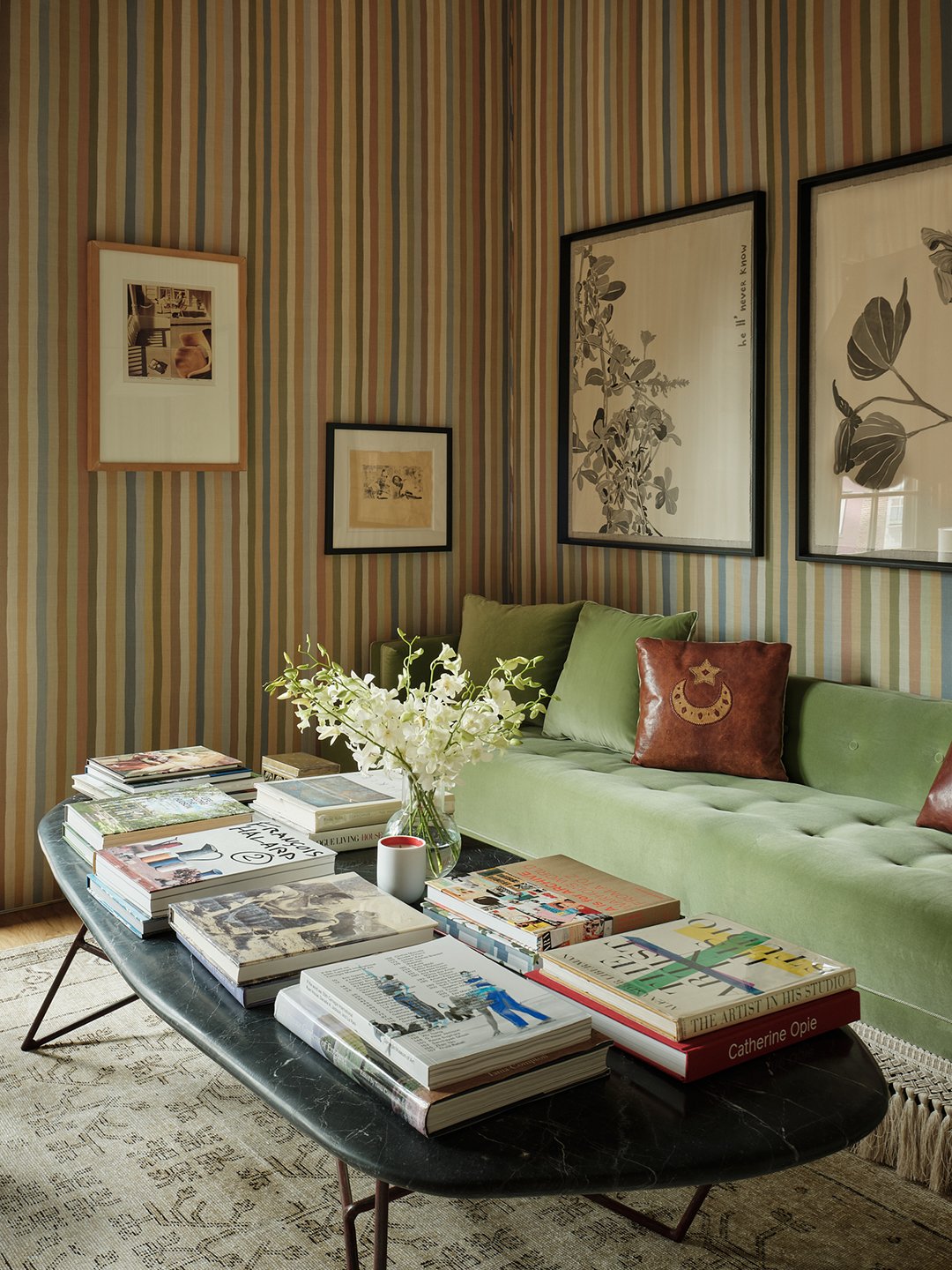
The 75/25 rule says that a maximum of 75% of the things in a room should be new and a minimum of 25% are things that are found/vintage. Here, Dunham met and likely exceeded the 25% minimum with pieces, including a vintage sofa (reupholstered in green velvet from Kravet and trimmed in Samuel & Sons fringe), a Louis XVI armchair, and a modern French black marble table top. “The mix gives the room an eclectic vibe intended to bridge the distinguished, landmarked exterior and the modern interior architecture,” Dunham adds.
Combine Thick and Thin
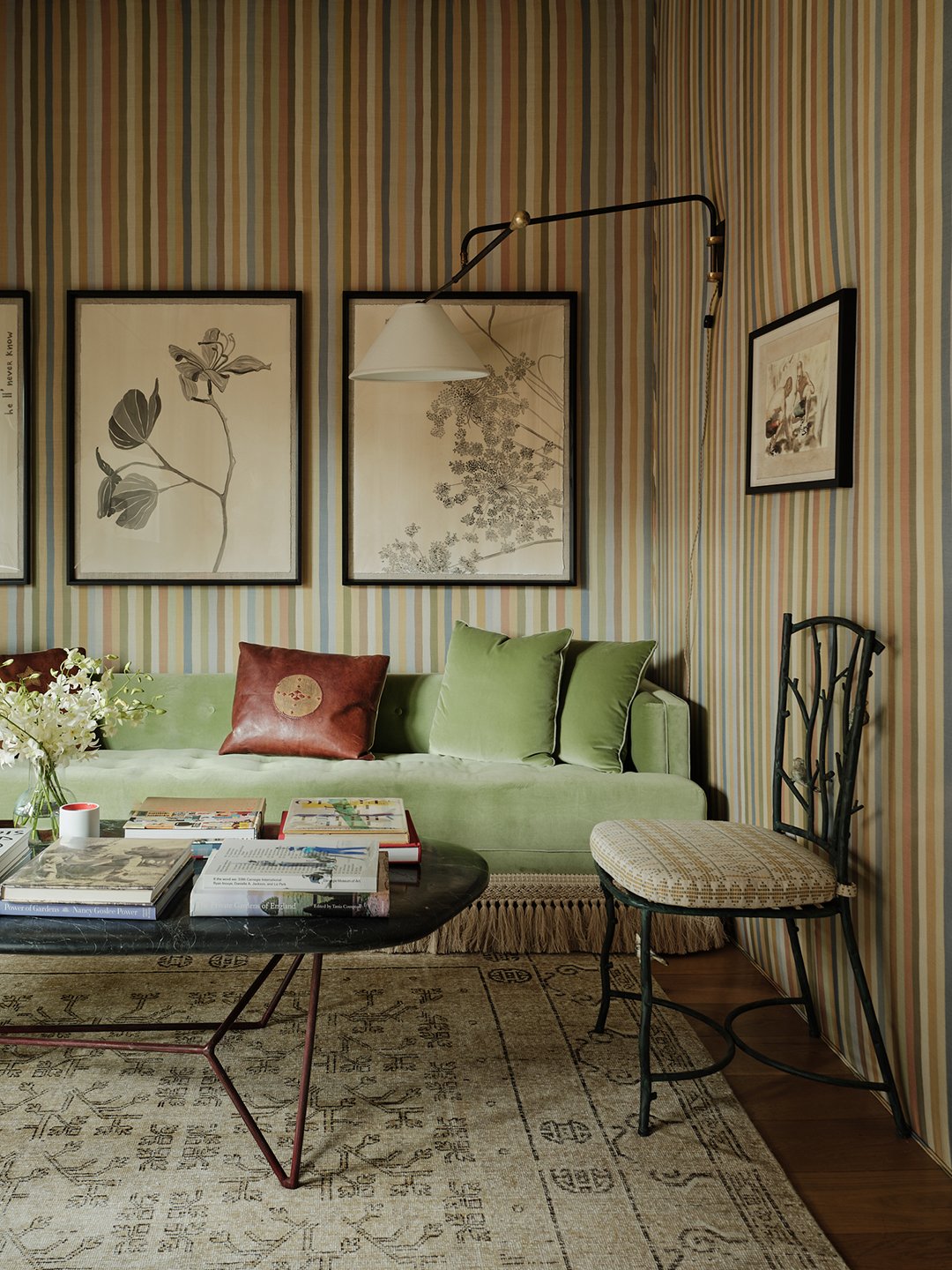
Dunham believes rooms need to blend what he calls “the pudding-y and bony.” The “pudding” are the big, upholstered or sculptural pieces, like the green velvet sofa here. The “bony” are the thinner and wiry pieces, like the vintage twig chair and the wall-mounted light. “It’s very important to have enough of the pudding-y and not too much bony, otherwise every shape is complicated and competes a little bit.”
Lay Down One Giant Rug

People will often try to create zones within a large room using different floor coverings, but Dunham says, “I wanted one big rug because two rugs would have shrunk the room a bit.” He opted for an early Khotan carpet from Marc Phillips. “Having the one piece unifies everything,” he adds.
Save Precious Inches With Roman Shades
When choosing a treatment for the house’s original windows, Dunham wanted something tailored but functional (the room is just 10 1/2 feet wide). He opted for three Roman shades for their precise control, but also because he didn’t want to lose inches of the floor space to fabric. “Drapery takes up an extra six to eight inches of depth,” he notes.
Try a Grand Bed in a Tiny Room
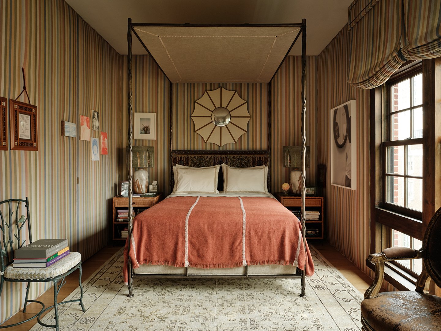
“I think the smaller the room, the more of a case you have to make for a canopy bed,” says Dunham of his bed choice. This was a lesson the designer learned first-hand when he lived in an apartment with a tiny bedroom and put a chunky Georgian four-poster in it. “It transformed the room from being basically a maid’s room in a New York City apartment to being this interesting room,” he says. So, don’t be afraid to go big.
Use Fabric Instead of Wallpaper
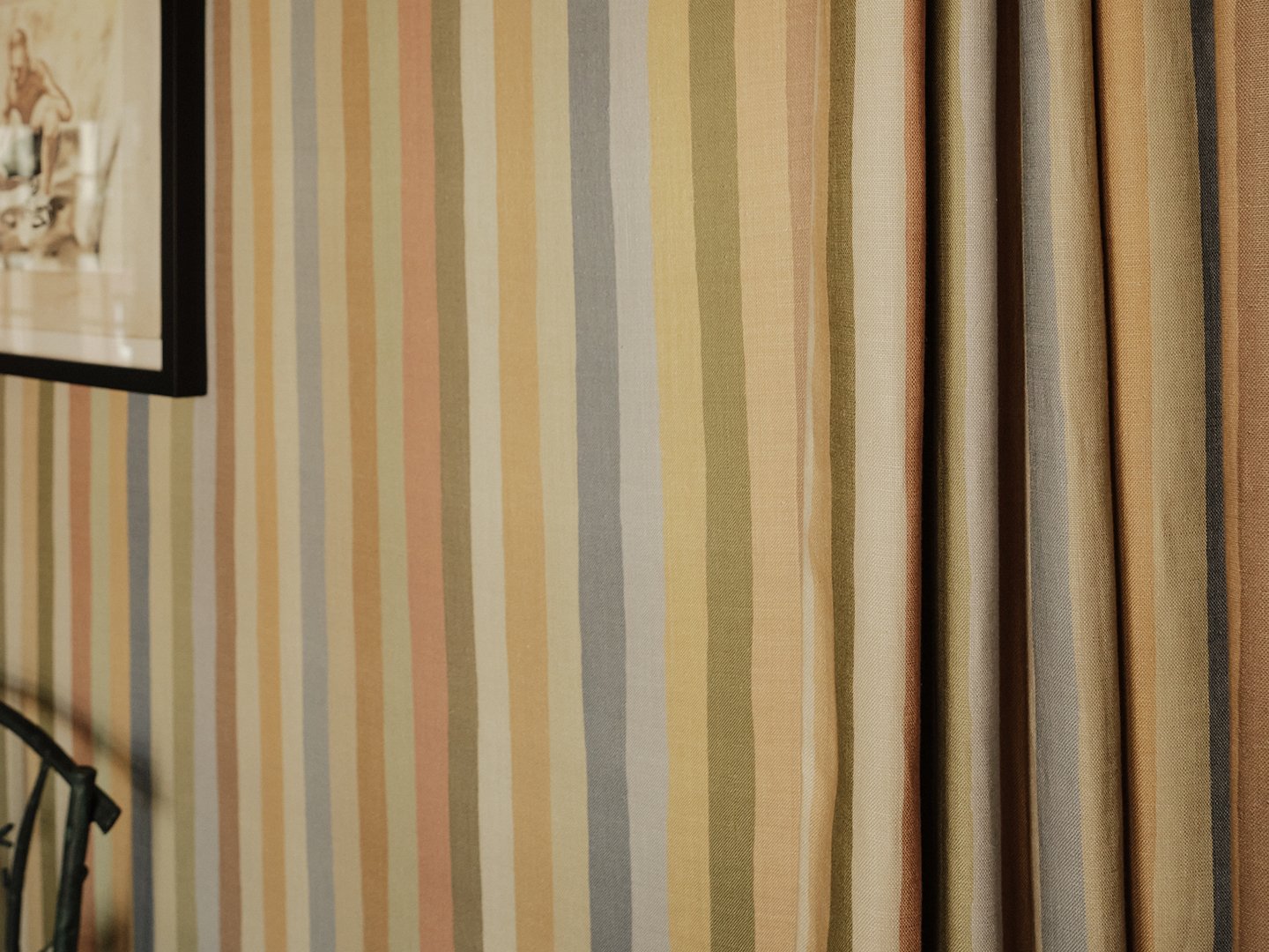
“I love to do upholstered walls in New York because it absorbs sound and gives that extra layer of coziness,” says Dunham, who covered these in his newest linen print, a multicolor called Jacob’s Stripe. He also designed contiguous window treatments and doorway drapes (made by The Shade Store) for a 360-degree effect. “People think it’s too much, if you do the window treatments and the walls the same, but if you do something else–something contrasting–it actually makes the wall pattern stronger,” says Dunahm. “If you want to have a very encompassing, almost soothing feel, do it all the same.”
Don’t Forget The Art
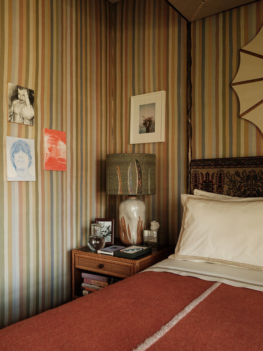
When Dunham’s team installed the room, they did everything but the art. He recalls, “I thought ‘The room’s okay, maybe a bit dull,’ but then I came back and the art had been hung. It lifted everything. Everything popped. Everything was in conversation with each other. It made the room literally come alive.” Duhman chose pieces from only Los Angeles artists, including James Cherry, David Hockney, Paul Mpagi Sepuya, Joey Strella, Konstantin Kakanias, and Catherine Opie. He notes that framing is also important, saying, “You don’t want every frame to be the same, and then you don’t want them to be too freaky together.”
Add Some Intrigue With Custom Touches
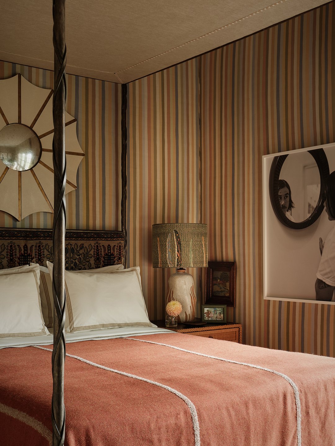
Dunham created the impressive bed from a vintage frame, an English antique textile for the headboard, and a new upholstered panel at the top. Likewise, he crafted custom shades from a vintage Japanese obi for the Natan Moss lamps. “To create atmosphere in a room and to be able to really personalize it, you need things that you can’t just go out there and buy from a big retailer,” he says. “You need things that stop you in your tracks and say, ‘Oh, that’s cool. Where did that come from?’”
Upholster Your Box Spring
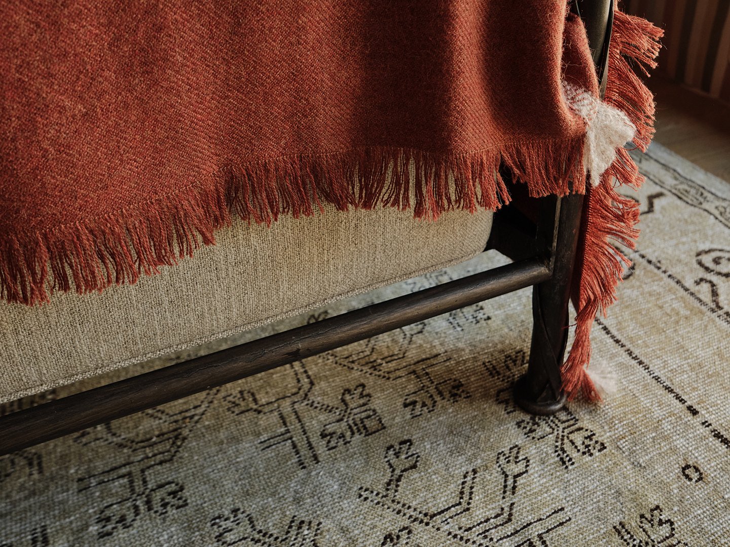
As we wrapped up our interview, Dunham made sure to point out a detail we’d missed while touring the space: he’d had the bed’s Saatva box spring upholstered. “When you see the box spring, I always like to upholster it,” Dunham says. “We did the same fabric for the underneath of the canopy as we did for the box spring for kind of a tailored, consistent look.”