We may earn revenue from the products available on this page and participate in affiliate programs.

Shea McGee first met her friend Ashley in college—so when she got the chance to renovate her home all these years later, she jumped at the chance. “It had been through a few bad updates, but it had so much potential,” explains McGee, who runs design firm Studio McGee with her husband, Syd. “We wanted to give every inch a major facelift, all while honoring the charm of the home.”
Given that the house was built in the 1930s, this was no small feat. Add to that a wish list that ran the gamut from “clean and modern” to “rustic and eclectic” and the fact that it was a tinier space…suffice to say McGee had her work cut out for her.

She made the most of limited square footage by honing in on a few select areas and going all out. “The home might be small, but the design choices are big!” says McGee. Take, for example, the graphic black and white tiles in one bathroom, or the dining room whose geometric light fixture mirrors the square paneling on the walls. What we have here is the chicest hodgepodge of styles we’ve ever seen—here’s how McGee got it done:
On Choosing the Right Kitchen Storage
The open shelving was all about keeping with the existing color palette: white, green, gray, and wood tones. The emerald cabinets are so stunning that we didn’t want anything to compete with them. Although most of the accessories are new, the vintage painting really pulled everything together and made the shelves feel collected.

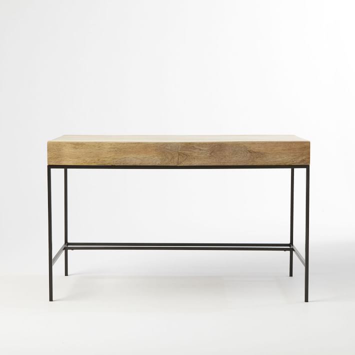
On Faking a Foyer
The square footage of the home didn’t allow for a separate office or entryway, so we carved out space for them in the living room. An entry can be as simple as a console and mirror, but a designated spot really helps welcome people in. The desk placement is great here, because that chair can be turned around and used as additional seating in the living area.

On Dealing With a Cramped Bedroom
The space is so small that we opted for sconces instead of lamps to allow for more surface to put phones and accessories. When we first started the design process, we pulled a white paint, but it just felt a little too bland for a room that didn’t have the space for a lot of layering (and that’s coming from someone who loves white walls!). We decided to paint them Newburg Green by Benjamin Moore instead, and I’m so glad we did; it really allows the bedding and window casings to pop.


Keep scrolling to shop our picks of furniture and decor to bring McGee’s farmhouse-fresh look home.


See more homes we love: From a Fruit Chandelier to Fornasetti, Sierra Tishgart’s Home Has It All Vivid Green Walls Gave This Builder-Grade Apartment a Jolt of Life The Couple Behind Brooklyn’s Insta-Famous Vintage Store Never Stops Decorating