We may earn revenue from the products available on this page and participate in affiliate programs.
Some homes announce themselves with a grand foyer. This 50-year-old Mumbai apartment had…a corridor. Bad enough on its own, but worse still because it swallowed up precious square footage—and hid the home’s best feature: a lush terrace garden, practically mythical in a city like Mumbai.
The 1,200-square-foot home belonged to a fashion designer and her two daughters and served as both their primary residence and, occasionally, a workspace for fittings and client meetings. But it had all the classic signs of an older apartment: a warren of compartmentalized rooms, walls that had seen better days, and a layout that felt more frustrating than functional.
The brief was clear: create a home that could host lively gatherings without sacrificing the intimacy of everyday life. The existing version was not it.
So when architects Zoish Contractor and Shahram Randeria stepped in, their first move was obvious—give the good views top billing. The pair completely rethought how the apartment moved, looked, and lived, transforming it into a contemporary two-bedroom home layered with texture, color, and just enough clever disguise to keep things interesting.
Delete the Hallway, Keep the Drama


The first casualty? The corridor. “In the original layout, the entrance to the bedrooms and garden was through a long corridor tucked away at the back of the house,” says Contractor. “Its only purpose was to provide access to the rooms.” Translation: it was dead space—more obstacle than opportunity. By dissolving that hallway, the designers expanded the living zone into an open-plan sequence of lounge, dining, and TV areas that now feel connected rather than politely avoiding each other. The payoff was immediate: better light, better flow, and a home that finally breathes. It also solved the biggest design crime of all—burying the terrace.
Make the Terrace the Main Character


In dense-city living, a green outdoor terrace isn’t just a bonus—it’s the headline. To make sure no one missed it, the team moved the terrace entry closer to the front of the house and installed fluted glass doors that let sunlight stream into the living spaces while preserving privacy. Now, from the moment you walk in, your eye lands on greenery instead of drywall. “Eliminating the visual barriers made the terrace no longer peripheral, but integrated into the home’s daily experience,” says Randeria. Honestly, if your apartment has a terrace and people aren’t gasping when they walk in, are you even using it correctly?
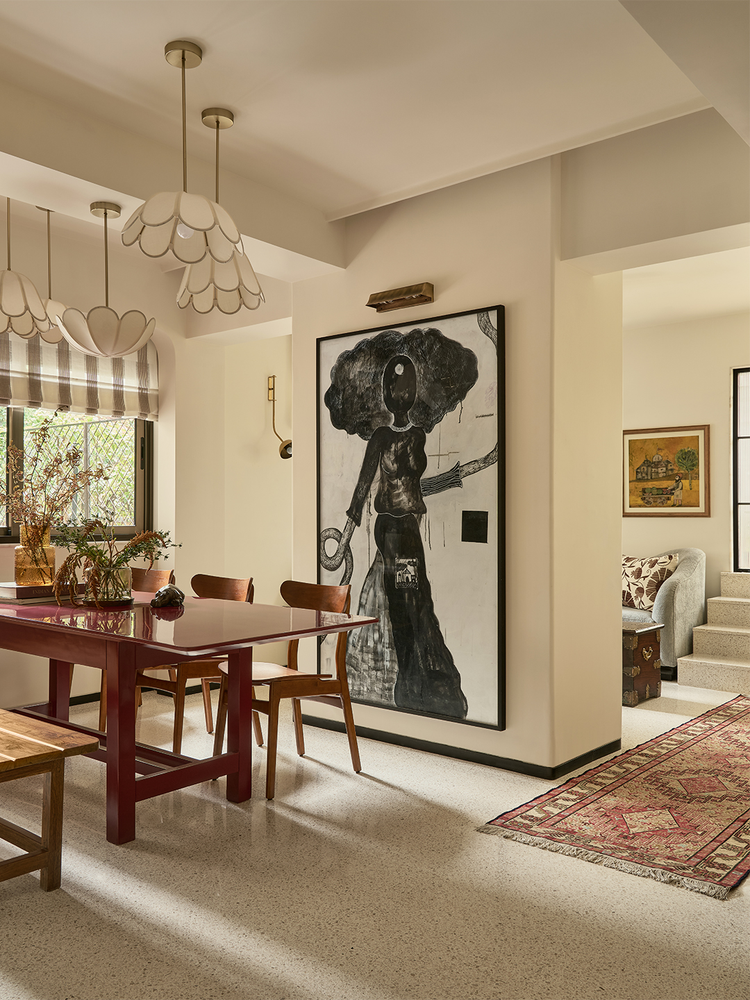
Let Mirrors Work Overtime


Because the owner is a fashion designer, the living room occasionally moonlights as a fitting studio. Instead of forcing a separate work zone into the plan, the designers made storage pull double duty. Full-length mirrored wardrobes allow clients to try on outfits while also making the room feel larger and brighter. The mirrors bounce reflections off a terracotta wall lined with paintings and a blue rattan-textured bar unit, creating layers of color and unexpected sightlines. It’s functional, yes—but also a little theatrical, which feels exactly right. Proof that mirrors can be as much room as reflection.
Hide the Doors, Calm the Room


Bedroom doors opening directly into living spaces can easily create visual clutter, so Contractor and Randeria chose to make them disappear instead. Concealed within light-toned timber paneling, the bedroom entrances become one of those quiet design flexes—the kind you only notice after someone points it out. Contractor calls it an “if you know, you know” detail, and it works. By reducing visual interruptions, the living area feels calmer, cleaner, and far more cohesive.
Keep the Good Stuff—Just Make It Better

Not everything needed replacing. The original dark terrazzo flooring couldn’t be preserved because of the layout overhaul, but its spirit stayed. In its place: an eggshell-white cement terrazzo with white and pale pink marble chips that brightens the apartment and nods to its past without feeling stuck there. Several furniture pieces also got a second life, including family trunks passed down from the client’s mother and a dining bench that had been part of family gatherings for more than 50 years. Dark paint was stripped back to reveal beautiful wood grain, armchairs were reupholstered, the dining table was extended, and old consoles got fresh hardware. It was sustainable, cost-effective, and far more personal than buying everything new.
Which is really the whole point of this home: not reinvention for the sake of it, but making space for the life already happening there—just with better light, smarter flow, and significantly fewer unnecessary hallways.
