We may earn revenue from the products available on this page and participate in affiliate programs.
Mary Posatko and David Butler had scored a renter’s dream. After living in their South Pasadena home for a decade with their two teenage sons, their landlord presented them with the opportunity to buy it. The couple had grown accustomed to the tree-lined neighborhood’s historic Craftsmans and Jazz Age–era bungalows, and their own address had a few of those quaint yet complicated details, too. So when the family officially got the deed in 2019, they knew exactly how to turn their home’s pitfalls into charms.
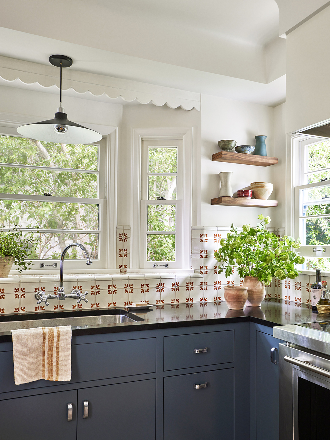
“The house had minimal prior renovations done to it, so there were lots of original materials still intact,” recalls the couple’s architect, Jen Dunbar, the principal of her namesake firm. The kitchen was the problem area: It felt dark and cramped, and its finishes were dingy. “Additionally, there were pain points in the flow—it was hard for two or more people to be in there together,” adds Dunbar.
Because Butler loves to cook, Posatko is fond of making bread, and teenage boys are generally known as eating machines, the couple leaned into their newfound ownership by undertaking a kitchen and mudroom renovation. They wanted the side-by-side spaces to come across as “casual and comfortable,” while showcasing a style that seemed like it was one with the rest of the neighborhood.
Don’t Automatically Knock Down Walls


After interviewing architects who wanted to transform the kitchen by knocking down walls, the couple hired Dunbar, who promised not to touch a sledgehammer. With Butler’s penchant for cooking and Posatko’s affinity for baking in mind, she set about creating a floor plan where they could accomplish these tasks simultaneously. “Providing enough storage while making the space feel more open was another issue,” she explains.

She kept the 120-square-foot kitchen in between the dining room and mudroom, and lined its walls with cabinets that followed the room’s curves. Adding archways between these different rooms allows for clear yet cozy sight lines, and the white paint throughout makes it all look cohesive.
Reuse and Reinvigorate


Dunbar and the couple worked alongside Casa Bonita Builders to do minimal construction that would preserve the past but bring in the present. They kept the bay window above the sink and agreed to place new tile in an existing format, which covers the ledge at the base of the panes and sprouts up between them. “The original faucet was not as functional for washing or filling pots, and we all loved the idea of having a wall-mounted one to complement the backsplash,” Dunbar says.
The original upper cabinets were reinstalled under a small soffit with a rounded edge, while the new ones—alongside the updated range and hood—would have the same proportions. The team also reused many light fixtures, moving one from above the kitchen sink and into the mudroom, and tucked the door that once separated the two areas into a pocket that provided occasional privacy.
Dunbar even kept the existing knobs and pulls in the kitchen, and the owners cleaned them with Simple Green. “There was so much chrome-plated hardware intact that it was an easy way to continue using some of the original materials and not have to purchase new hardware,” Dunbar says.
Hide Potential Eyesores With Old-School Scallops


Dunbar and the owners wanted to hold onto the original scallop accent above the kitchen sink, a detail that is “very characteristic of houses from the 1920s and 1930s,” she notes. But she didn’t stop there: The architect mimicked the silhouette in the mudroom as a wavy link between them. The best part? It isn’t purely decorative (the scallops hide a drying rack)!
“We originally toyed with the idea of enclosing the laundry behind cabinetry, but the additional cost to conceal everything didn’t make sense with the functionality of the mudroom,” Dunbar says. “By creating this soffit over the laundry counter, we could install a drying rack that could be tucked away when it wasn’t in use.”
Complement With Classic Features


After ripping up the existing linoleum flooring, they discovered a major win: Douglas fir. “We were all so excited, and there was no doubt in anyone’s mind that we would keep it,” Dunbar remembers. Only a few areas needed some small replacement pieces.
Selecting the backsplash tile was more of a treasure hunt, given Dunbar and the owners aimed for a classic pattern as a nod to the home’s Spanish Revival exterior. Once they saw the hand-painted Talavera tile from Mission Tile West, the search was over.


“The rest of the color scheme was based off of the terracotta red in the backsplash,” Dunbar says. “We painted the base cabinets in Dunn-Edwards‘s Iron Creek to help ground the room and provide a pretty contrast to the tile. And by painting the upper cabinets in Diamond, also from Dunn-Edwards, we kept the room from feeling too crowded.” Finally, the mudroom’s cabinets were swathed in the paint brand’s Prairie Clay to bring the kitchen’s earthy red to that area, uniting it all in a timeless palette.