
We may earn revenue from the products available on this page and participate in affiliate programs.
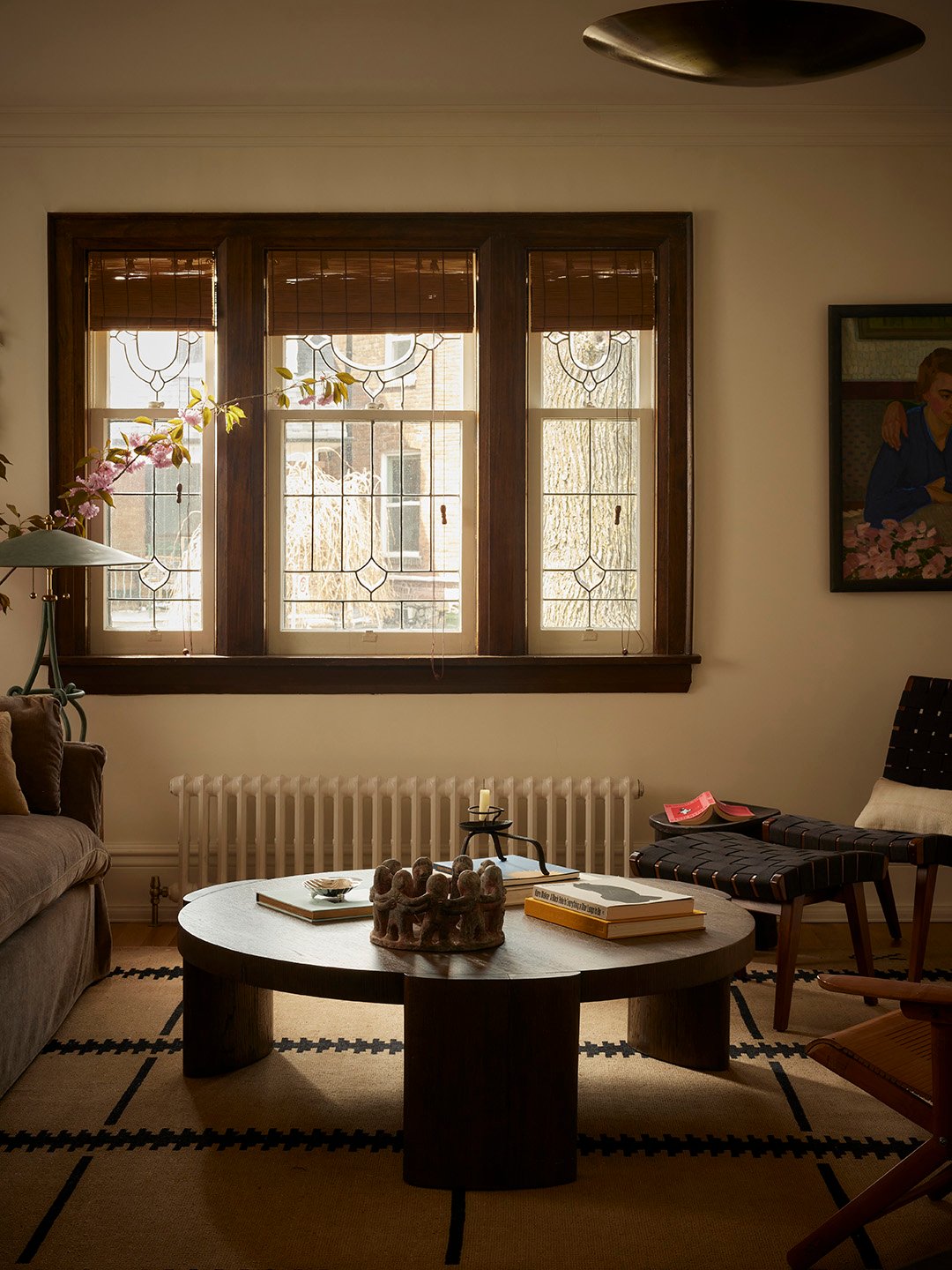
Sarah Mack Wiley wasn’t planning to part with the swirly, verdigris floor lamp she’d scored on Facebook Marketplace in rural Quebec; it was one of the interior designer’s favorite pieces in her collection. But when she brought it over to a couple’s Toronto home as a styling prop for a photoshoot and they asked if they could buy it, she couldn’t turn them down. They weren’t just any clients: Wiley has been friends with the husband since she was in high school. Plus, even she could admit the light fixture looked right at home in their cozy living room. “It brought this Old World feeling that grounded the new sofa and coffee table,” says the designer. “That lamp had a fun lifespan.”
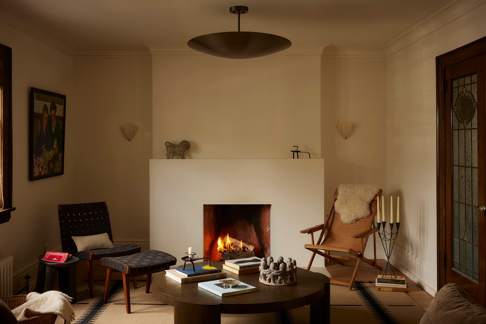
From the beginning, Wiley went above and beyond for her friends. When the wife reached out asking if she’d help them renovate their new home in the Palmerston-Little Italy neighborhood, Wiley had been considering taking some time off. But once she heard what they had in mind for their space, she couldn’t refuse. “I knew that if I saw any other designer work on a home with so much potential, with clients who have such expansive and experimental ideas, I would regret not taking it on,” she shares. The now-completed house became her eponymous studio’s debut project.
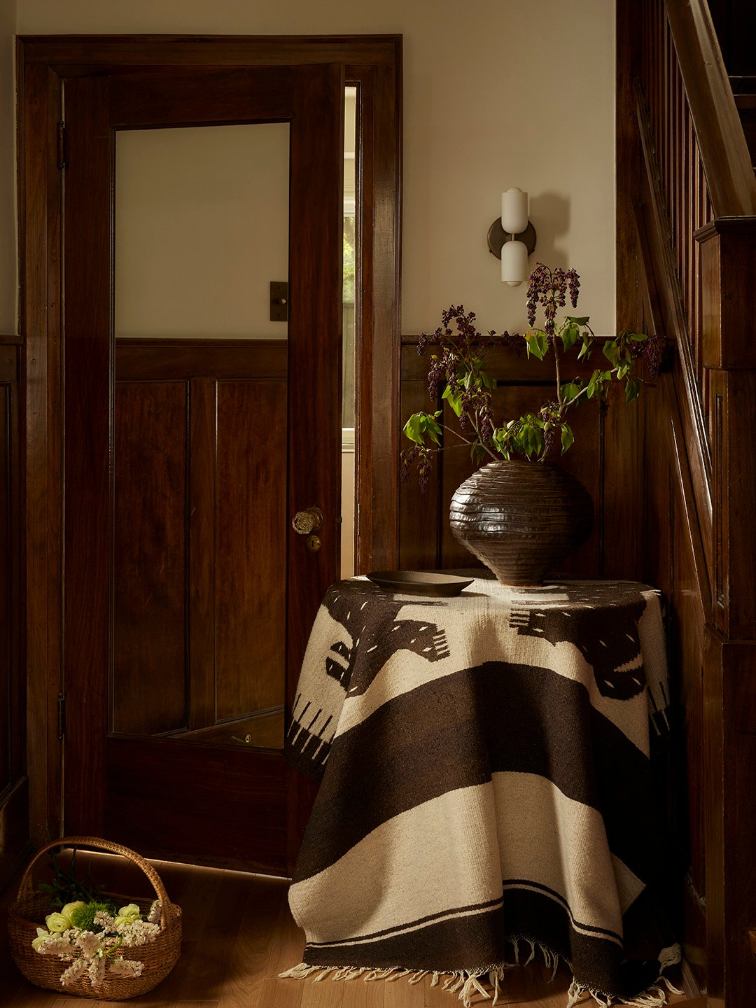
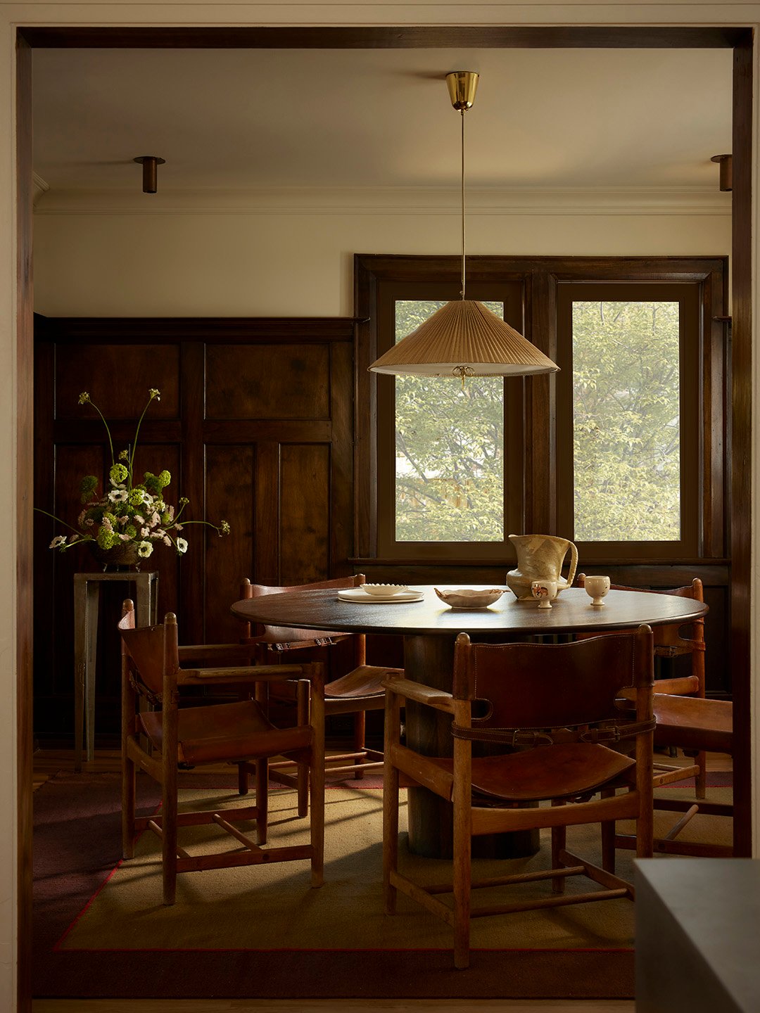
It was clear to Wiley that the home had undergone a few early 2000s renovations. High-gloss honey oak floors, speckled white granite countertops, and contemporary brushed nickel fixtures had muddied its charm. But she clocked the old wainscoting and dark trim as she toured the house for the first time and got to work. “We did quite a 360,” says Wiley.
Unlike other clients who might not be able to put their style into words, Wiley’s friends gave her a super-clear brief. They knew from the get-go that they wanted a stainless steel kitchen and a cedar-wrapped bathroom. For Wiley, who often pulls cues from the architecture and works backward from there, it sparked a new way of designing. “I had to make it make sense in my brain, then on paper, and then eventually in person, how to wrap these really specific elements into the home with its age and character,” she explains.
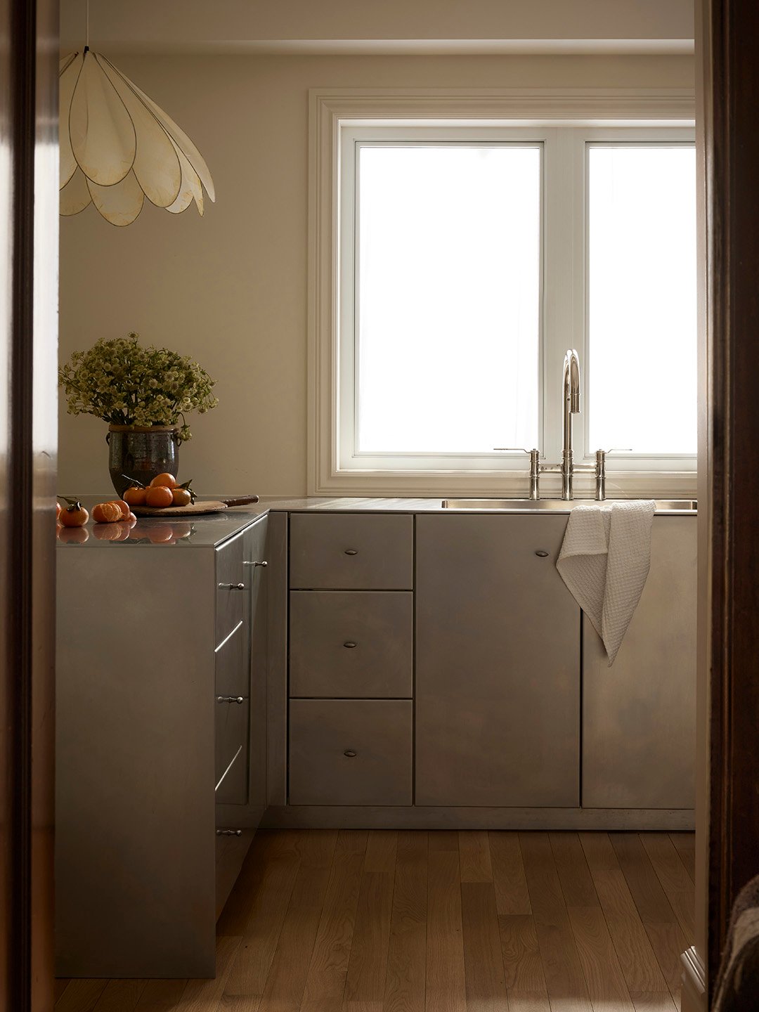
Most of Wiley’s designer friends in Toronto were jealous when they found out her clients were game for a stainless steel kitchen given the material is high-maintenance and will patina over time. “[The homeowners] thought the risk was worth the reward of having a space that’s visually striking,” says Wiley.
Through the millworker, who was operating as the liaison with the stainless steel company, they got the brushed finish on the cabinets just right–not too matte and not too polished. The steel is a quarter-inch-thick, so it’s solid, but her clients have had to learn to live with smudges and teeny nicks. “Those first few weeks, I was furiously cleaning fingerprints, thinking ‘How am I going to do this forever?’” says the homeowner. “But I found as the months have gone by, I relaxed into it. As we cook, we can just put the pan on the countertop. I’m not too bothered about it being perfect all the time.”
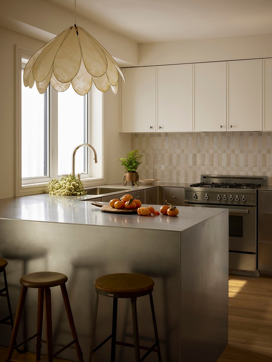
The backsplash tile proved to be more finicky: The square and rectangular zellige tiles they selected came from two different batches with slightly different thicknesses. One variation alone would have thrown off the pattern she had in mind. As a solution, the contractor (who happens to be a talented tile setter) painstakingly shaved the backs of nearly half the tiles to make everything level. “I don’t think he was thrilled but in the end, seeing the actual tiles installed, he fell in love,” shares Wiley.
To further warm up the kitchen, the designer introduced painted cabinets over the range with a thin Shaker-inspired paneling, a chunky bridge faucet, and a handmade paper pendant. “I had to introduce some traditional elements to offset what could end up being an abrasive stainless kitchen,” says Wiley. She added a cabinet above the range rather than a statement vent hood so her friends still have usable storage around the concealed duct.
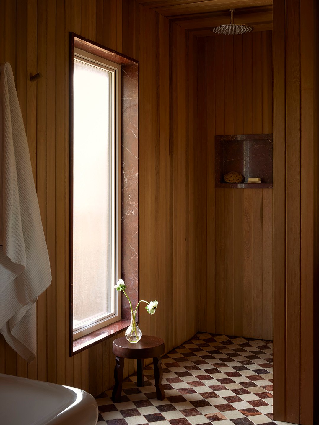
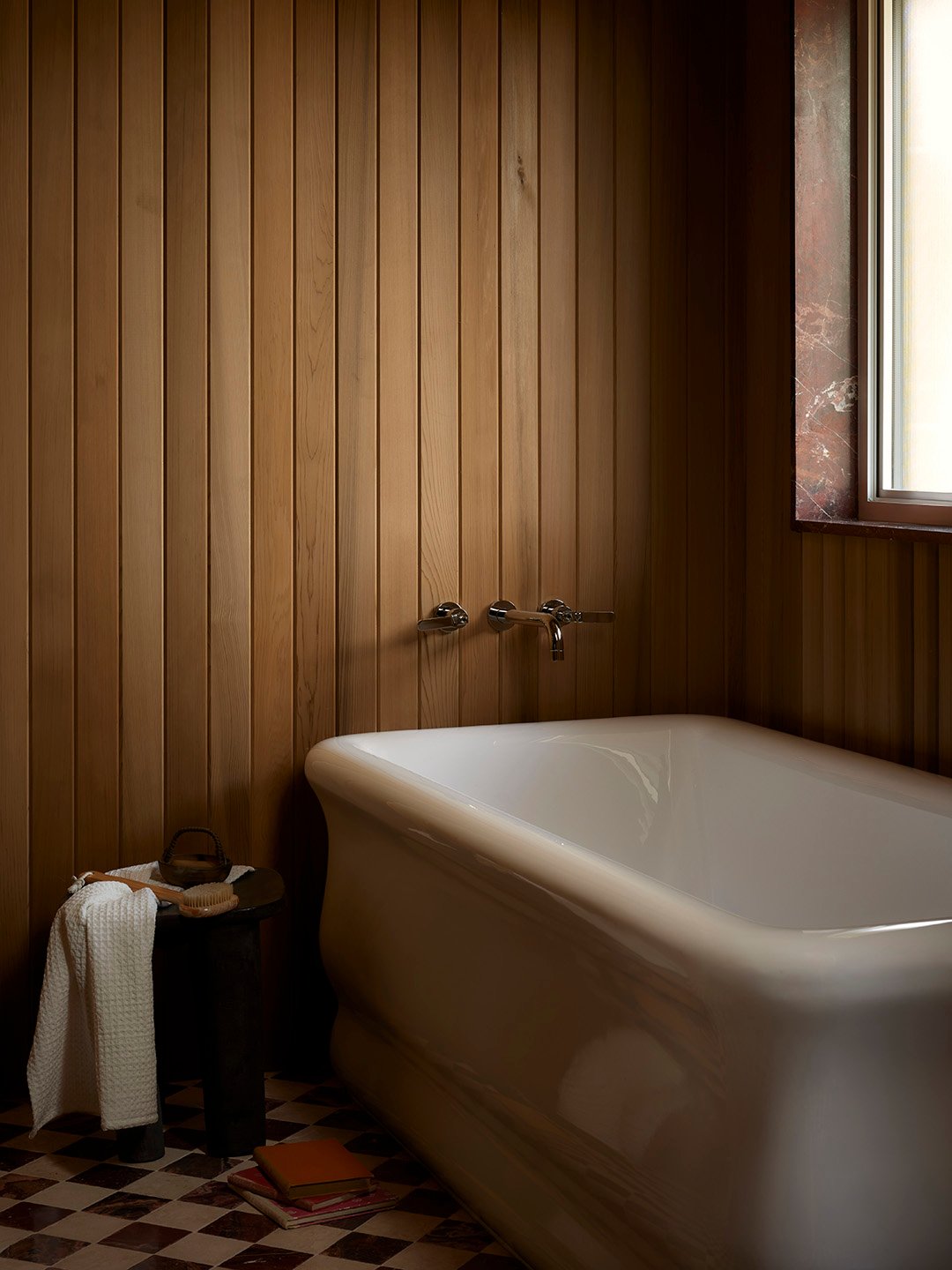
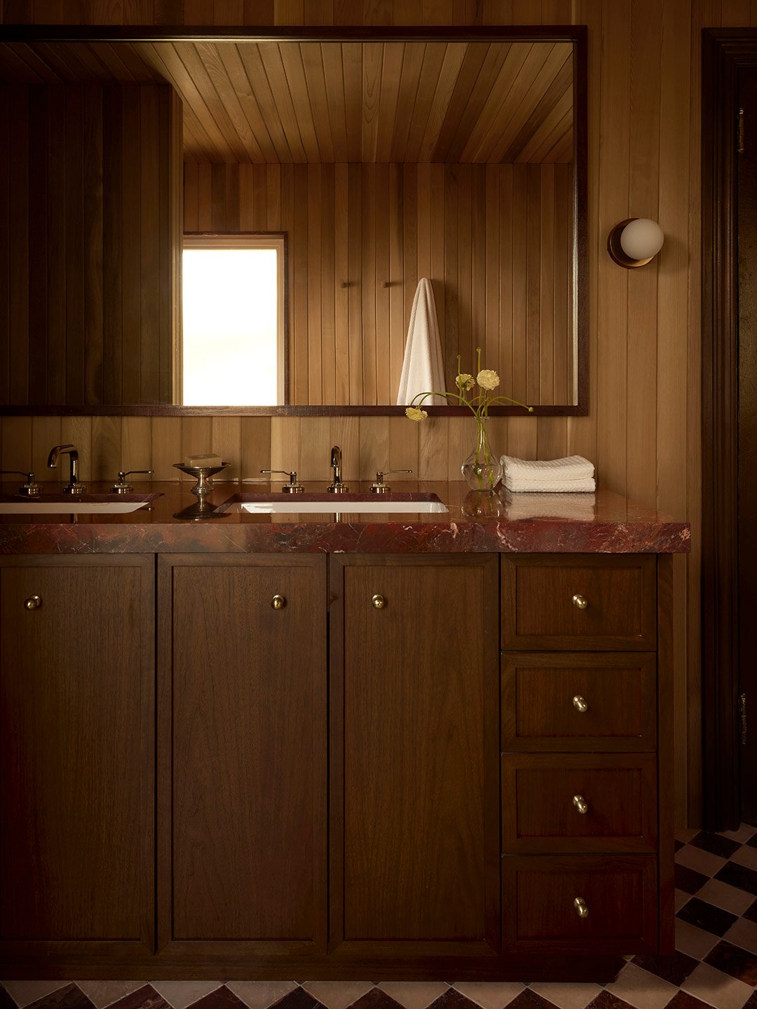
In the middle of the design process, the husband turned to Wiley and asked: “Why do we need a shower door?” He didn’t want anything superfluous, and a glass partition seemed unnecessary. So, the designer leaned fully into the open energy of a sauna-like space. “It was one of those fun collaborative moments where a client’s instinct pushed the design somewhere better than I’d originally planned,” she says.
The result is a bathroom that feels truly like a retreat with cedar-wrapped walls. Sure, they have to be resealed every two years and the shower area should ideally be wiped down after every use, but Wiley’s clients are prepared for the extra upkeep. The decision to line the windows in red onyx was a functional one: it protects the drywall return from the rain shower.
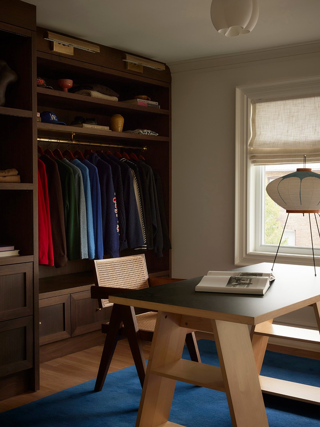
If the husband’s office-slash-closet looks like it belongs in a cool men’s clothing store, it’s because that was kind of the point. The goal was for him to clearly see all his things at once. Wiley achieved a retail-worthy experience by mixing in ceramics alongside his wardrobe and upgrading the finishes. “A lot of MDF veneers don’t read as luxurious,” says Wiley. She added LED strips to the interior of the shelves so no sweaters get lost in the back. While sitting at his vintage IKEA desk, it’s not a bad backdrop for a video call.