
We may earn revenue from the products available on this page and participate in affiliate programs.
Nestled between pine groves, juniper shrubs, and wildflowers, the Experimental Group’s new 43-room hotel on Menorca, one of Spain’s Balearic Islands, is exactly where you’d want to be during a creative block. It’s only fitting that French designer Dorothée Meilichzon transformed the 19th-century agricultural estate into a vibrant respite with an imaginary artist in mind (Mirò, Dalí, and Picasso often sought refuge off, and along, the coast of Spain).
Life on the island was the jumping-off point for the color palette. “In Menorca, the typical colors are very dark green, a dark yellow, and a bordeaux,” says Meilichzon. “The idea was to twist those hues into terracotta red, pale pink, pale yellow, and khaki green.”
The designer’s vision played out in unexpected pairings (black with reddish brown, Yves Klein Blue with buttery yellow, olive green with scorched orange). But it isn’t just her eye for color that drew us in. It’s how she uses it. Here, we spotlight three artful moments we’re stealing for our next DIY project.
Mark Your Entrance

Arches were an important visual motif for Meilichzon. Using the post-and-lintel architecture in the area as her point of reference, the designer framed the pointed doorways and vanities with semicircular swaths of color. “The round, flattened shape illustrates the sunset,” she shares. It’s a clever way to incorporate bold shades without going to the trouble of covering all four walls. Take a page out of this room’s book and combine two rich tones from nature, like olive green and burnt red.
Let Your Doors Shine
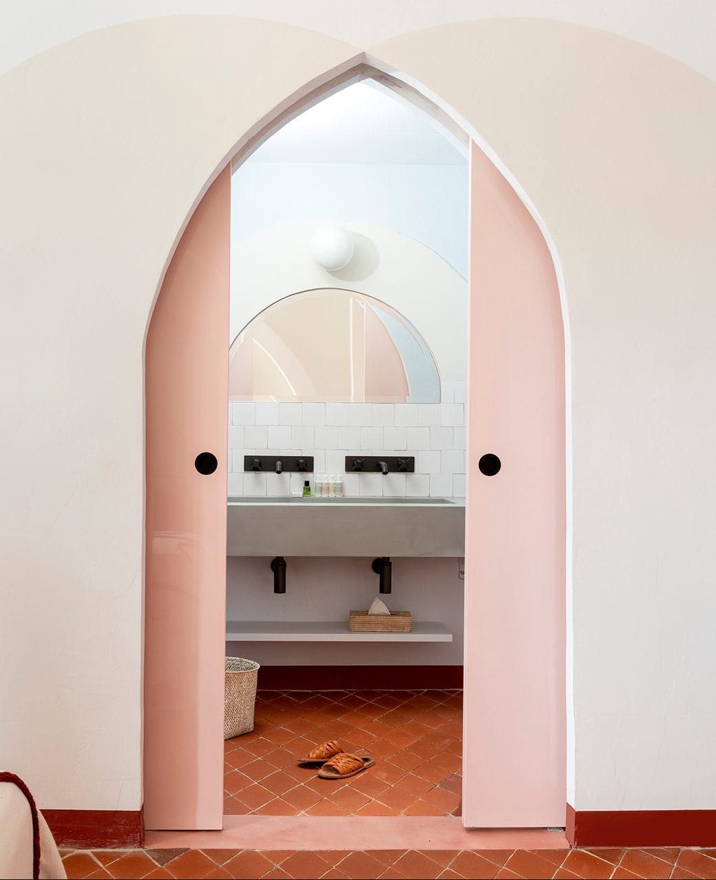
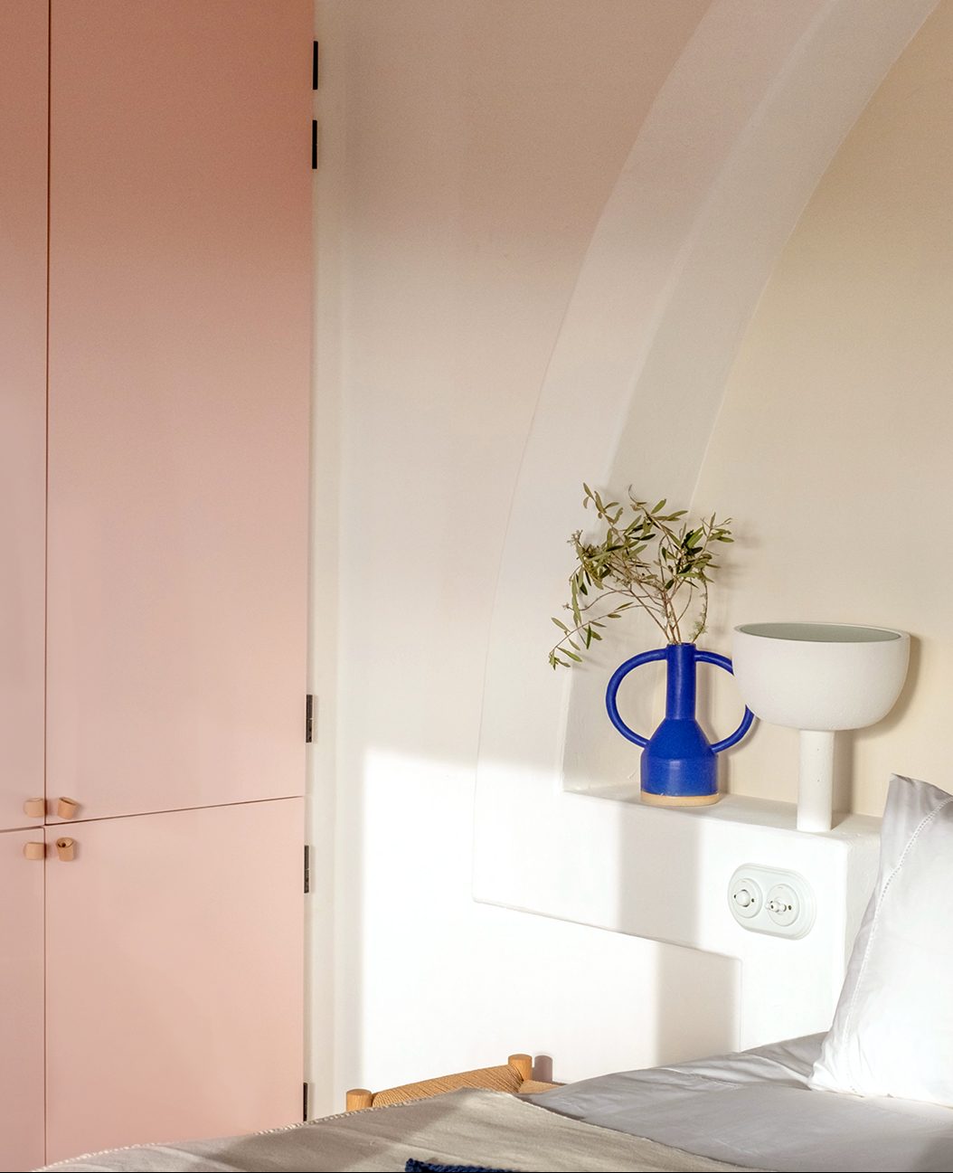
Sheen can be just as important as color. For the pocket doors and built-in cabinets, Meilichzon opted for a high-gloss finish to contrast with the matte white walls. When applied over warm pink or creamy beige, the lacquered surfaces read elegant rather than flashy.
Create Unexpected Contrast

Forget everything you thought you knew about earthy hues blending into the background. Meilichzon placed a two-tone, terracotta-colored headboard against a jet-black alcove—and you can’t miss it. “It’s an easy color to combine with dark hues,” says the designer. To top it all off, she tasked Marrakech-based textile and ceramics brand LRNCE with creating coordinating blankets for each of the suite’s beds.
See more stories like this: 3 Colorful Lessons We Learned From L.A.’s Buzziest New Hotel We’re Crushing Hard on This Pink Front Door DIY The Case for Painting Your Doorframe…Yes, Just Your Doorframe