We may earn revenue from the products available on this page and participate in affiliate programs.
Wall-to-wall shag carpet. Brown linoleum flooring. Retro green paint. When you think of mid-century charm, these features may not be the first things that spring to mind—but when designer Lisa Staton was tasked with updating a 1950s home in Seattle’s Seward Park neighborhood, they were the main cast of characters. “The carpet had to go,” she says.
Fast-forward nine months, and the sunny, 1,500-square-foot space is now a curious hybrid: It feels as breezy and modern as a new build, but hasn’t sacrificed the charming details that drew Staton’s clients (a young couple who just had their first child) to it in the first place. The stonework and wood beams are intact, as is the original speaker system. “It doesn’t work anymore, but it’s a cool touch,” says Staton. She credits a lot of the heavy lifting to the home’s first resident, a Boeing engineer with an eye for quality. “We actually discovered hand-drawn blueprints drafted by the original owner himself!” she says. “It was definitely very forward-thinking for its time.”
Because of this, she started with the architecture. “After World War II, there was a West Coast movement that emphasized indoor-outdoor living, and that’s really present in this house in terms of the way it connects to nature,” explains Staton. With every update she made—ripping out the original kitchen, knocking down walls to open the floor plan, refinishing the orange trim—she used that idea as a reference point, always making sure to incorporate natural light. The rest of the transformation came down to a series of clever small touches that maintain the balance of old and new.


Choose Your Highlighter Carefully
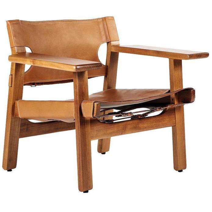
“People think black is too dark, but it can actually be clean and crisp,” says Staton. She used the neutral as the grounding force in this project, and it peeks through in every single room: It frames all the replaced windows, can be found on most of the pendant lights, and even pops up in the furniture, modernizing the property’s mid-century roots in a way that doesn’t overpower. “I always say it’s better to have 10 things each do 10 percent versus having one thing do 100 percent,” she continues. “That formula creates a rhythm and cohesiveness and gives your eye a place to rest.”


Think Back to Geometry Class
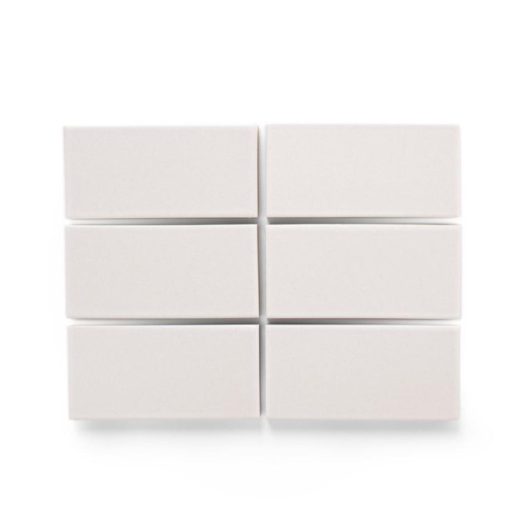
The design of this decade may be characterized by clean lines, but that doesn’t mean you have to be obvious about it. Staton paid homage to them in the tilework—but not how you might think. In the kitchen, thin steel floating shelves are set into the grout of the Heath Ceramics backsplash. In the guest bathroom, she placed a custom mirror inset with the blue Popham Design tile’s lines. “It looks like a small detail when it’s done, but if the mirror were sitting on top of the tile, it might distract from it,” she explains.


Use Bright Shades Sparingly
While scrolling through Pinterest, Staton and her clients discovered a shared love for Brazilian mid-century homes. “There was a happiness and freshness to them, and they layered color in a really mindful way,” she remembers. “We may just have the algorithm to thank for it, but those spaces became our jumping-off point.” Staton stuck to warm neutrals and natural materials to build out her palette. Splashes of vivid hues, like the aqua bathroom backsplash or the pastel kitchen stools, only make minor appearances.


Treat Your Light Fixtures Like Furniture
“People think about layering color, but layering texture is a really important part of our work—that’s where lighting comes in,” says the designer. In this home, a lamp plays just as crucial a role as a sofa. The handmade woven pendant over the dining room stands up to the bold stonework, while the lantern that hangs low over the master bed bridges the gap between the furniture and the tall vaulted ceiling. “We use more sculptural pieces, and less of them,” says Staton. “It’s a yin-yang toward the other items in any given room.” In a house that’s all about navigating the tightrope between retro and contemporary, it’s this attention to detail that makes a world of difference.