We may earn revenue from the products available on this page and participate in affiliate programs.
Ryia Jose’s approach to redesigning her Houston home was mostly made up of IKEA hacks and fanciful paint jobs rather than demolition and construction. However, the content creator’s beige-tiled powder room, with walls and a dated vanity to match, wasn’t a space that bold wallpaper could fix. “It was my first gut reno,” she says. “I needed a blank slate.” Nostalgic for the vibrant colors that she grew up with in southern India, Jose (known to her followers as Kin and Kasa) set out to transform the dull room into a spot both guests and her family would enjoy using—starting with tearing out the bathtub.
Move It to the Right


Because the home already had two additional bathtubs, Jose wanted to make a change that would enable her parents to use this one more easily (the original step-in tub was too high). Plus it was taking up valuable square footage. In swapping the dated fixture for a safer shower stall, Jose was presented with an opportunity to add a bit of architecture. By moving the toilet a mere 4 inches to the right, she had just enough room to carve out an arched opening. “We didn’t have to redo any of the plumbing,” she explains.
The new shower is covered in marble subway tile all the way up to the nearly 10-foot-tall ceiling, with two rows of black trim to help orient the eye. But that wasn’t the original plan. After tiling nearly a quarter of the way up the wall in a white and beige diamond check pattern, Jose realized she hated it. By switching to a less fussy design, “somehow the worst bathing area feels so much bigger than before,” she says. Even with a standard shower curtain (A floral block print sourced from India? Of course), the marble helps reflect light and makes the enclosed area feel like a room of its own.
Customize, Don’t Compromise

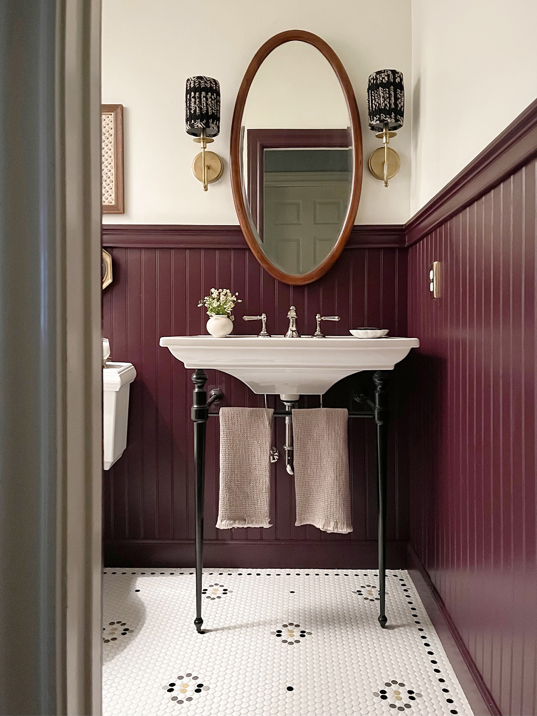
After installing the whole expanse of white penny tile on the floors, Jose had a change of heart: It felt too simple for the elevated space. “I found this 50-year-old design catalog, but I couldn’t find a similar look anywhere,” she says of her newfound flooring inspiration, another nod to her love of block prints. This time, rather than totally pivot her plans, she took the tile pattern into her own hands. She mocked up the design on paper, then painstakingly peeled up the corresponding white pennies with a wide flat-head screwdriver and replaced them with black and yellow circles from a Home Depot sample sheet.
Bolder Can Feel Bigger


Most of her home is dappled with greens and neutrals, but for this spot, Jose opted for a bold eggplant shade (she color-matched Brinjal by Farrow & Ball) on the chair-rail molding. “I wanted the color to reflect who we are and our heritage,” she explains. “The white walls weren’t doing that.” At first, she was worried the dark hue would contradict all of her hard work to make the tight, windowless space feel larger, but in reality it added depth. Choosing a light-reflecting, high-gloss finish didn’t hurt either. Now the bathroom isn’t just more functional—it’s a tangible interpretation of Jose’s childhood.