We may earn revenue from the products available on this page and participate in affiliate programs.
Scene setting, mood altering, energy shifting—the right shade can completely transform your outlook with the stroke of a paint brush. This month, we’re dipping into that chromatic magic with our series Color Your World.
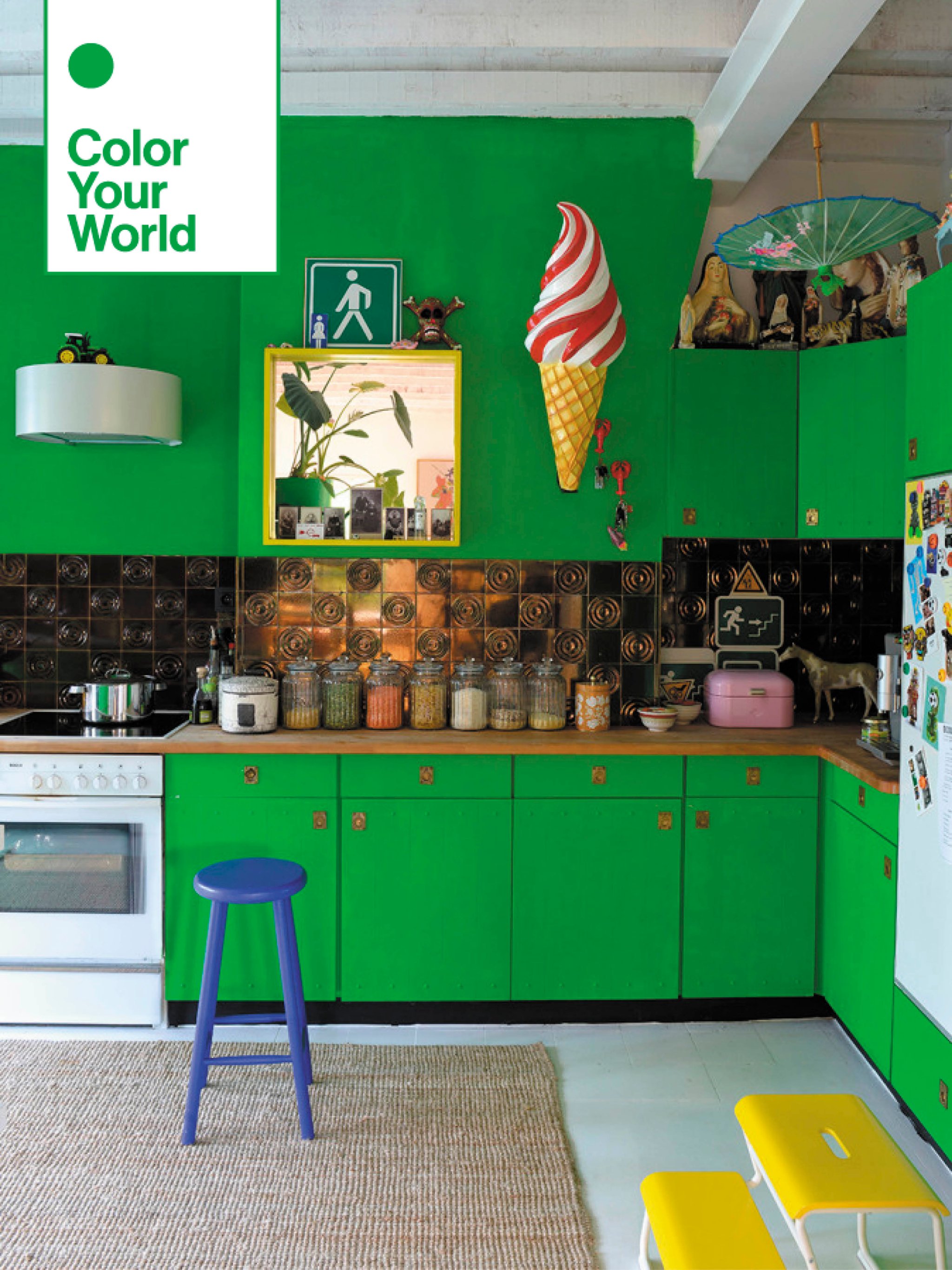
“Our idea was to get a bit outside Brussels,” says ceramist Sofi Van Saltbommel of the home she shares with her husband, Jean François Van Assche, on the city’s outskirts. After living downtown for years, they moved out of the bustling capital to a serene, suburban property they could make their own. “We saw a picture of this little house at the bottom of a street and knew it was ours,” she recalls. For the couple, the white walls inside were just a blank canvas for bold color.
So unsurprisingly, they broke out the paint cans right away. Original bronze tiles in the kitchen were worth preserving, but the colors felt out of place against a white background, so they decked out the cabinetry in a custom-mixed neon green hue that runs all the way up to the ceiling. “We don’t spend lots of time mulling over color,” explains Van Assche. “Instead we spontaneously chose this green.”
Ample floor space and high ceilings stop the room from overwhelming the eye, despite a slew of artful additions, like the mounted ice cream cone, upturned parasol, and goldenrod yellow step stool, picked up locally at a closing ice cream parlor. “Our process is seeing something in a shop and thinking it’s beautiful,” says Van Saltbommel. “Then we just decide to go with it.”

Another such find: a box of orange traffic cones at a nearby hobby shop. Taking the set to the garage-turned-studio, Van Saltbommel was able to fashion them together using epoxy, turning the cones into a chandelier that casts a warm orange glow over the living room. The coffee table was also scooped up at a nearby market, before being brought back and painted powder blue. The couple doesn’t get too hung up on any one color, though—it’s become common practice for them to take a piece of furniture aside for a fresh coat. “We’re really looking to do more pink,” says Van Assche, an optician.

Not everything in the home needed a makeover. The dining room table has been around for years. “Sometimes, when you have a piece that’s a really nice, natural wood, you just want to leave it be,” she says. Surrounding the table, yellow chairs (their original finish) bring a sunny note to the otherwise neutral space.

The color—chosen to extend the glow of the natural light—continues up the stairs. Ahead of moving in, the couple had the attic removed, leaving the vaulted ceiling exposed on the top floor and giving the upstairs an open, airy feel. A trio of baby blue pots (painted, of course) act as a makeshift wall between the bedrooms and the stairwell.

“We don’t like doors,” says Van Assche. Even pre-pandemic, when friends or family would stay over for a night or two, the only real barriers between bedrooms were natural walls formed by lush green plants or colorful streamers.

For the open-plan bathroom, the tub was built around a section of tile to not only seal out water but look like a rug. “I didn’t want the cold effect of the tiles,” Van Saltbommel says. The sink was another vintage addition—a bureau that dates back to 1920 (the modern sink basin is run through a hole in the top). “We’ll probably paint it soon,” she says. Mostly likely pink. “We’ve got to see our color mixer again about getting the right shade.”
We’re regulars at: The IKEA bargain section; it’s where we got the fabric shade lamps.
Go-to source for plant supplies: We go to Groendekor a lot. It’s huge and there are options for all tastes.
Paint store we can’t live without: Everything gets mixed at Miniox. Whenever we have a color in mind, they’re very professional.
Our Winter Renovation issue is here! Subscribe now to step inside Leanne Ford’s latest project—her own historic Pennsylvania home. Plus discover our new rules of reno.