We may earn revenue from the products available on this page and participate in affiliate programs.
When you don’t want to play it safe with an all-white room but can’t fathom painting the walls a rosy pink or sage green either, there’s gray. “I’m a big fan,” says Layne Kula, the designer and creative consultant behind Penny Layne. “The right shade has a chameleon-like ability to change just about any space.”
While the hue has long been regarded as a safe choice, settling on the right swatch is no simple feat. Go too dark and it might read as charcoal; too light and it will look like a lackluster shade of white. There’s a lot of talk over brands, finishes, and undertones when it comes to choosing the best gray paint colors. To get to the bottom of the debate, we asked the pros which ones they stand by. These seven picks never fail.
A Few Things to Keep in Mind
Finish: Can’t choose between a glass-level gloss or flat finish? Don’t overcomplicate the decision, says Nicole Gibbons, founder and CEO of paint company Clare. “If you ask any designer, nine out of 10 are going with an eggshell finish and treating the trim in semigloss or satin,” she adds. “Most people don’t want to live with über-glossy walls because it reflects everything—not only artificial light but every scratch, smudge, and greasy fingerprint.” The most popular paint finishes—semigloss, satin, eggshell, and flat—range from ultra-shiny to ultra-matte in that order. But eggshell, Gibbons suggests, is your safest bet: It provides just enough sheen to be water resistant (you can wipe it clean without worry), but isn’t too shiny to be a distraction.
Undertones: Understanding undertones can be daunting; that’s because most paints, aside from a select few (primaries like red, yellow, and blue) are a mixture of different pigments. And the subsidiary color, or the undertone, can impact the look of an overall hue. This is especially true when it comes to gray, which can change appearance in response to light—everything from sunset to a colorful sofa to the LED lightbulb being cast from a nearby floor lamp. Choose a blue-gray shade for a cooler, relaxed vibe, or red-gray for a lively, inviting breakfast nook.
Our Top Picks
For Classic Charm: Stonington Gray, Benjamin Moore
New York–based interior designer Maggie Burns is a huge fan of this hue in Benjamin Moore’s Historic Color collection. “I recently used it for the baseboards and doors throughout an entire apartment, and it instantly added character to the white walls,” she says.
For Colorful Living Rooms: Cornforth White, Farrow & Ball
Considered to be Farrow & Ball’s “understated gray,” designer Hannah Crowell’s go-to sits right between the paint purveyor’s popular Ammonite and Purbeck Stone. “It doesn’t reflect blue or green hues like many grays do,” she explains.
For Small Spaces: Cloud, Dunn-Edwards
When Katie Gebhardt, founder of Solstice Interiors, wants to add depth to a space, she uses Dunn-Edwards’s Cloud. “I love contrasting it against white trim and baseboards,” she shares. Before committing to a color, the designer recommends testing out a small swatch on the wall and living with it for a few days. Observe how the color changes as light moves around the room. After all, you want to love what you end up choosing, from dusk till dawn.
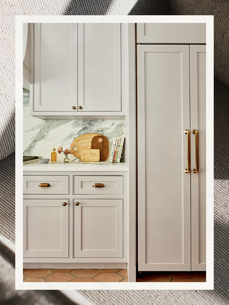
For Cozy Corners: Wolf Gray, Benjamin Moore
“Sophisticated and moody” is how designer Whitney Durham sums up her foolproof shade: “I love it in high gloss for a library or study and on kitchen cabinets for an unexpected surprise.” The paint’s blue undertones make it perfect for a smaller room or nook in need of some coziness.
For Bathroom Vanities: Ammonite, Farrow & Ball
Tania Cassill of Huit Laguna recently used the zen hue on cabinets in the master bathroom of this sunny Emerald Bay project. The fan favorite has 100 reviews on the company’s site and a nearly 5-star rating. You’ll find it in Farrow & Ball’s Easy Neutrals collection, for obvious reasons.
For Shiny Surroundings: Cool Gray, Pantone
“When it comes to pulling paints, I always opt for a matte option with cool undertones, because I think it catches the light perfectly,” says Kula. In addition to Loft Space by Behr, this milkier pick is one of her favorites.
For Low Ceilings: Classic Gray, Benjamin Moore
Berkeley Minkhorst, who co-owns House of Nomad with fellow designer Kelly Lentini, loves this option so much she used it all over her home. “I suggest it for rooms with ceilings that are 9 feet high or lower. It will really brighten them up,” she says.
For Every Room: Cashmere Gray, Restoration Hardware
This hue might have been designed with a nursery in mind, but “it looks really sophisticated in dining rooms, powder rooms, or studies,” says designer Keri Peterson, who likes to spice it up with brass and chrome accents. “It truly does feel like cashmere: warm, soft, and unbelievably luxurious.” Confirmed: This once-boring color is anything but.