We may earn revenue from the products available on this page and participate in affiliate programs.
It all started with the kitchen.
Originally designed in a French country style, the homeowners purchased this Tulsa space in 1999, and 20 years later, it was certainly time for a modern change.


“They entertain a lot and wanted to change the kitchen so that they could have a long island with bar seating, which could also serve as a buffet piece,” explains designer Bailey Austin of the room that inspired the entire home’s renovation. “[The client] also has a large china, silver, and crystal collection that needed to have storage that was both beautiful and functional.”


The ensuing light, bright kitchen definitely achieves that aim. After a few renovation headaches—the design team had to reengineer the kitchen floor and add a structural support beam—the room is elegant and welcoming at the same time. Cabinets painted in Sherwin-Williams’ Alpaca provide an element of depth against the stark white backdrop, the citron-hued banquette is prime for casual get-togethers, and a mix of open shelving and glass-door cabinets allows for the homeowners’ dinnerware collection to shine.

Though despite the clean simplicity of the kitchen, the rest of the home is full of surprises. Austin redid most of the home, imbuing it with unexpected wallpaper moments and bold color choices. “[The client] wanted some pops of bright colors, which included the citrine leather on the banquette in the kitchen and the fun art piece by Sara Westover,” says the designer.
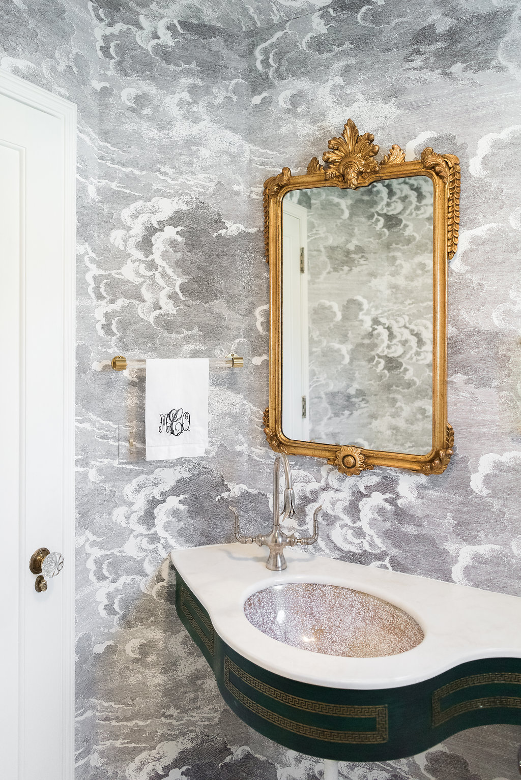
Other parts of the house, like the bathroom with cloud wallpaper and the master suite, were done by Austin’s former business partner, designer Mel Bean. With artwork by Sara Bost Fisher and some serious heavy lifting done by the entire design team (they had to re-engineer the floor under the kitchen), the entire home was a collaborative effort.


Keep reading to learn more about what went into giving this home an entirely new look.

How did you choose the wallpaper in the home?
We looked at a lot of options; we started with the ever-traditional grass cloth and got more adventurous from there. I love the entry—the client wanted some drama and texture there.

Do you have a favorite print from all the wallpaper?
I love the marbled texture of the bar wallpaper. It’s so subtle and complements the space without screaming “look at me.”

While there is the odd pop of color, a lot of the home is fairly neutral; what are your tips for maintaining a pared-back space that still feels multifaceted and interesting?
Layering textures is a great way to make a neutral house feel layered. For instance, in the kitchen, we had acrylic, marble, painted cabinets, stained wood, stainless steel, leather, linen, and the weathered wood in the light fixture. I love a little eclecticism, and it keeps a space from feeling too formal.

What’s the story behind the bold wall color in the matte black powder room?
It’s a tiny bathroom, and we wanted to maximize the experience. It’s shocking to walk through the white house and open the door into the black bathroom; it’s so fun.
How did you make such a big design statement work in such a small space?
Contrast and scale are really important. There was a lot of white to break up the black in the white toilet, white sink basin, and white sconces. The high contrast between the black walls and white accents made the room feel larger.


See more homes we love: This Museum-Like Home Puts Our Vintage Collections to Shame How an Artist Perfected the Desert Vibe in Less Than 800 Square Feet This Blogger Essentially DIY’ed Her Entire Home