We may earn revenue from the products available on this page and participate in affiliate programs.
Joy Strom loves a galley kitchen. Hear her out: “Depending on the space, it can be incredibly functional for actually cooking,” says the Baltimore–based designer. Her key to designing a galley kitchen that doesn’t feel dungeonlike is striking a balance between doing enough and not doing too much. Exhibit A: This townhouse renovation.
When a newly engaged couple came to Strom wanting their 100-square-foot builder-basic kitchen to feel cheerful and fitting with the rest of the 1915 architecture, the designer went funky on the floor, old school with the cabinets, simple with the counters, and practical with the appliances. “You could strip all the uppers away and put amazing artwork on the wall, but at the end of the day you need to maximize storage,” says Strom. Working alongside construction firm Montgomery Property Solutions, here’s how she transformed the narrow space.
Clear the Way for a Seamless Prep Space


If you thought there’s no way to make a galley layout feel bigger without blowing out walls, think again. Simply rearranging the appliances can change the entire flow of a room. In this case, Strom saw an opportunity to flip the sink and the range, that way the basin would be situated within the long stretch of countertop, making meal prep a breeze. Not to mention, relegating the cooktop and vent hood to the other side of the room would make her plan for seamless millwork possible. “I wanted to have an uninterrupted line of cabinets above the sink as our main focal point,” says the designer.
Let Your Vent Hood Shine

Fun fact: Strom hasn’t installed a gas range in a project in over two years. Everything’s moving toward induction and electric. “Honestly, the technology has gotten so sophisticated, my clients all end up loving their induction cooktops and ranges,” says Strom. While plenty of designers would have covered the vent hood with a drywall box, she let it be, as it allows more light to stream in from the window. Plus her clients simply don’t mind looking at the metal box. “They were like, we want the fridge to be the fridge and the range can be the range,” Strom adds.
Ask Your Backsplash to Work Hard, Too
Whenever the designer can find an opportunity to clear countertops of clutter, she takes it. That’s why she tacked on a small ledge to the Caesarstone backsplash—it’s a convenient spot to plop olive oil bottles and salt and pepper shakers. On the prep side of the kitchen, Strom opted for simple white square tile that reminded her of a utilitarian 1950s kitchen. “Not everything needs to have a voice,” she notes.
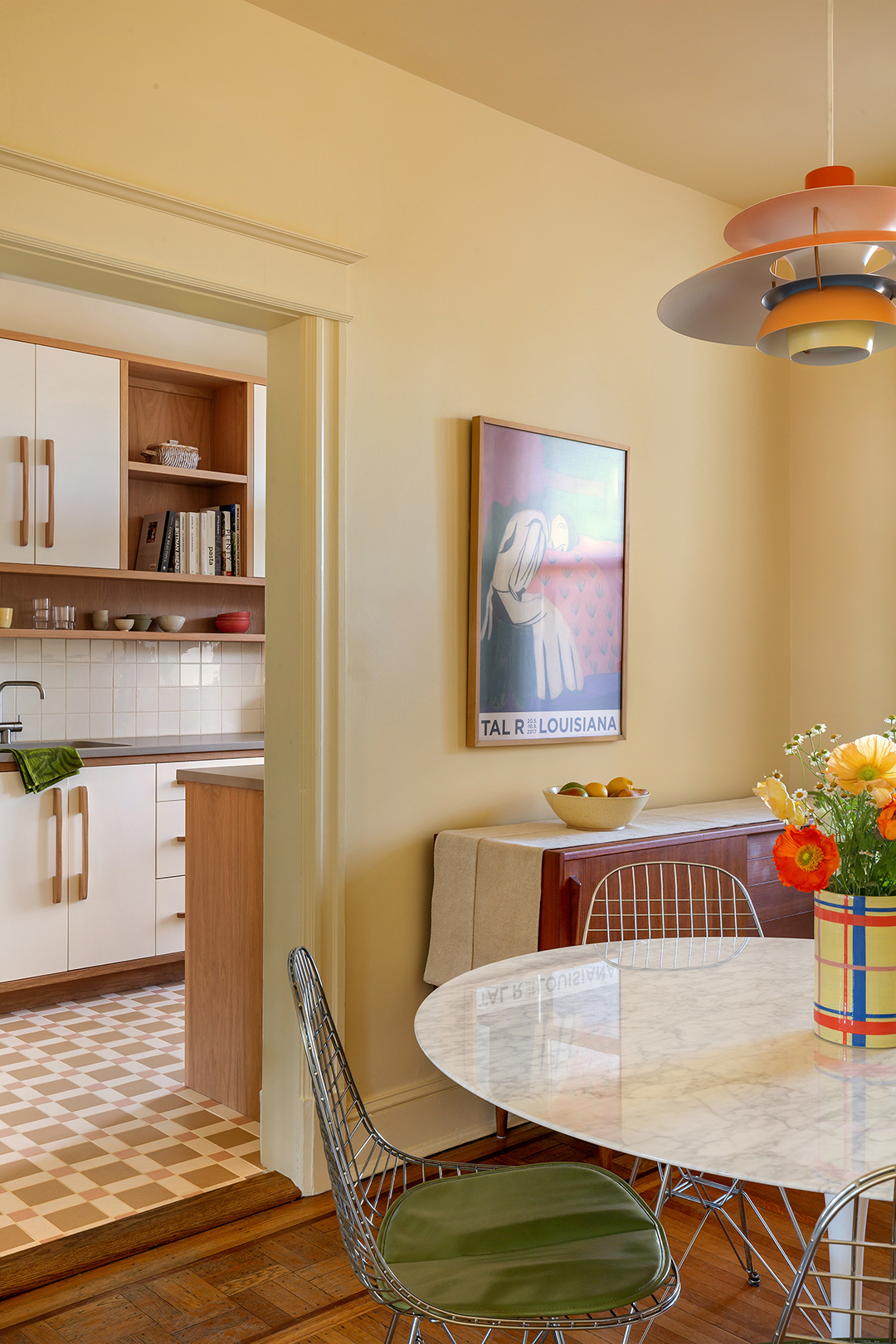
Tie Bold Colors Together With Butter Yellow


In the adjacent dining area, the designer used the couple’s existing PH5 pendant light as a jumping-off point for the room’s palette. Previously the walls were a light white-gray, which made the bright orange piece look out of place. “I think a lot of people, when they are overwhelmed with picking colors, will automatically pick a bright white and build color around it. But in that space, it felt stark, and I wanted it to feel glowy and warm,” says the designer. She tied it all together by dousing the walls in Mood Lighting by Backdrop.
Find Flooring That’s Fun and Historical


The heavy, dark granite tile that was in the kitchen before was the furthest thing from the rest of the home’s original wood inlay floors. Strom wanted to create a more natural transition. She landed on a mix of tiles by Original Style Tile, laid out in a Victorian-inspired design. “I like blending vintage elements and making them new again, so that you can’t really tell which era things have come from,” says Strom.
Have a Furniture Designer Weigh In on Your Cabinetry
To ensure the cabinets were full of personality, Strom went custom. “I think it’s one of the best investments you can consider for your kitchen and is especially key with tricky (smaller or awkward) spaces,” she shares. Crafted by Willard Kauffman, the slab doors were painted in Farrow & Ball’s Pointing, a creamy hue that is reminiscent of laminate from the ’60s and ’70s, and wrapped in oak siding. Not pictured: clever two-tier cutlery inserts, a cutting board–slash–cookie sheet pullout, spice drawer inserts, and trash and recycling pullouts.
When it came to adding the hardware, Strom switched up her craftspeople and called on furniture design/fine woodworking company Petr Studio to make elongated wood handles. “They were an important piece of that kitchen; they gave those cabinets so much personality,” says the designer. “Once they went on, it felt like the space really came together.”