We may earn revenue from the products available on this page and participate in affiliate programs.
What would you give up to change your status from renter to homeowner? For one Long Beach, California–based couple with a baby on the way, the answer was easy: a sports car. Over the five or so years they had been renting their 1960s home, they had fallen in love with it. So when an opportunity arose to purchase the place, the husband traded in his sweet ride for a down payment, and then they called up interior designer Natalie Myers, founder of Veneer Designs, to help them make all the renovations they’d been dreaming about but weren’t able to tackle until the ink was dry. The first task on their long-awaited to-do list? Update the kitchen.
“I’m sure when they built it, it was the bee’s knees, but it just felt tired,” Myers recalls of her first impression of the space, adding that “it was very mid-century and a little bit folksy.” The designer quickly realized she would be confined by the galley layout (there was no space to push forward or backward), so she tried to brighten the place up as much as she could. Luckily for her clients, keeping all of the cabinets and most of the appliances in the same locations was a win for the budget. Ahead, Myers reveals the biggest updates they made.
Tuxedo Cabinets, But Make Them Cool


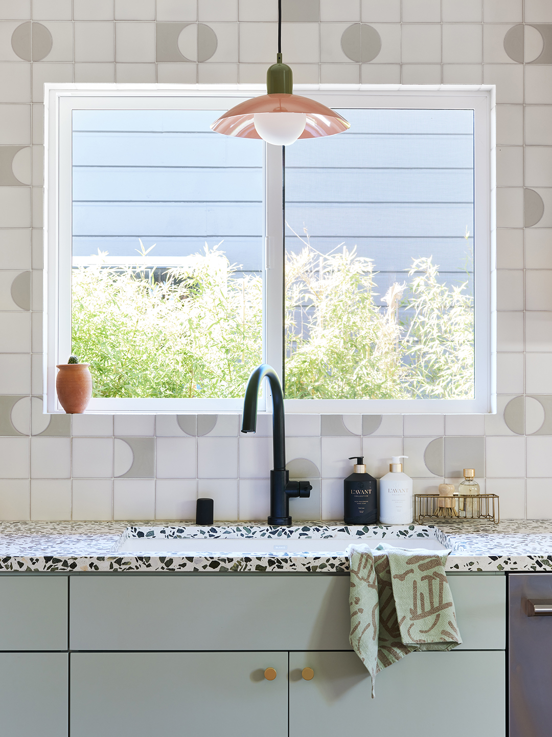
Like the name suggests, tuxedo cabinets are traditionally defined by white uppers and black lowers. The color-blocking strategy has two benefits: It makes a space more visually interesting and the contrast creates the illusion of higher ceilings. Myers wanted all the perks of this arrangement, but she also needed it to reflect her clients’ creative personalities. For her own spin, she went with ash-wood cupboards up top and grayish sage doors below that closely match the backsplash tile. She carried the paint color onto the pocket door that now separates the home office from the kitchen.
Not Just a Chunk of Terrazzo


While it’s more common to see terrazzo in tile form, either on a floor or a wall, Myers is a fan of slab countertops—and that doesn’t just go for the prep side of the kitchen. The designer wrapped the peninsula in the same Alabaster Verde product from Concrete Collaborative because it just so happened that the company had remnant pieces left over from when it custom-fabricated the counters. From the dining area, the structure looks like just another surface to place food on, but there’s an opening with a stool on the other side as well as more cabinets. “The husband’s mom lives with them, so we wanted to make sure there was a spot for her to sit and still be involved,” says Myers.
Ground Control


Opting for hardwood flooring over tile was a big budget save (it’s much cheaper to put in). “The material is around $10 per square foot and $5 per square foot to install, whereas tile is $15 per square foot for material and $40 per square foot to install,” Myers points out. The wide-plank boards she sourced from DTC brand Stuga are finished with an ultra-matte sheen that makes them look devoid of any sealant while still providing all of the protection against daily life with a baby.
Appliance Tetris

The only major shift that happened during the demolition was relocating the dishwasher to the other side of the sink. It not only made room for a tucked-away microwave, but it makes post-dinner cleanup easier. “I also personally love having the dishwasher to the right of the sink if you’re right-handed,” notes Myers. The two-drawer appliance from Fisher & Paykel allows the couple to run smaller loads more frequently—an especially handy feature when you’re flying through baby bottles.
Tile by Numbers

Selecting a combination of Fireclay’s Dot Dash 7 tile and Field tile for the backsplash was an easy decision. Figuring out how to lay it out was the challenge: The 4-by-4-inch squares can be laid out a million different ways. One iteration Myers whipped together in AutoCAD showed how the wall could be covered halfway in polka dots, but the wife (who is an artistic director and naturally has an eye for graphics) wanted more movement throughout—including around the range hood. Eventually, they landed on a drawing that consisted of half-circles and pill-like shapes to which Myers had her subcontractor follow to a T. “It was a mentally-taxing exercise but totally worth it,” she says. The homeowners feel the same about giving up the car.