We may earn revenue from the products available on this page and participate in affiliate programs.
When Joelle Kutner and Jesse Rudolph, cofounders of design studio Ome Dezin, bought a Los Angeles home in order to flip it, they knew their biggest hurdle would be finding a thread through time. Nestled in a historic enclave of the city, between the famed Hollywood Bowl and Runyon Canyon, the neighborhood was developed in the 1920s as a hideaway for movie stars and everyone who helped them shimmer. But this particular property was first renovated sometime in the 1980s, and a lot of its original charm was complicated by that decade’s style.

“As a Spanish home with a focus on indoor-outdoor living, the structure of the property looks much like it did in the 1920s,” Kutner says. “But besides the roof and verandas, it didn’t feel very Spanish or Mediterranean; it just felt confused.” Kutner and Rudolph aimed to re-center the home’s layout so that it felt tied to its storied past, without losing a handful of those totally tubular ’80s accents that have reappeared in today’s trends. And within all of that time traveling, the duo also sought to make the home’s next owners feel like they were on an endless vacation. It is L.A., after all.
“We spent time in the summer of 2018 traveling from Paris to Barcelona by car, and then taking a short flight to Porto, Portugal, and driving to Lisbon,” Kutner continues. “A lot of the homes we stayed in had a fun blend of checkered floors, subtle-to-vibrant colors, and interesting shapes. If you walk through the home, you’ll start to notice details throughout.” Ahead, Kutner and Rudolph discuss how they created cohesion without stripping away character.
Give the Illusion of History

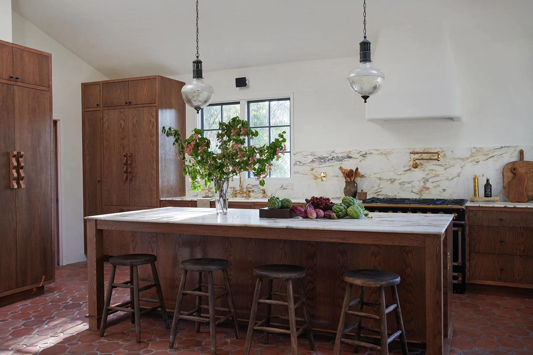
They researched traditional Spanish homes, including ones in this particular coastal city, to determine which aspects could either be reintroduced or highlighted within the interiors. One can’t-miss item? Terracotta. “We wanted to make someone believe that when they walk into the home, some of the elements had been there for many decades,” Rudolph says. The majority of the flooring on the top level and main living spaces is now swathed in terracotta tiles from Arto.


Typically, haciendas are painted white to help the interior spaces stay cool, so Rudolph and Kutner followed suit by swathing the walls in Steam by Benjamin Moore as a nod to that tradition of intentional airiness. And on the exterior, the house was entirely replastered with smooth stucco in a crisp white color.
Pair Up Checkerboard and Marble
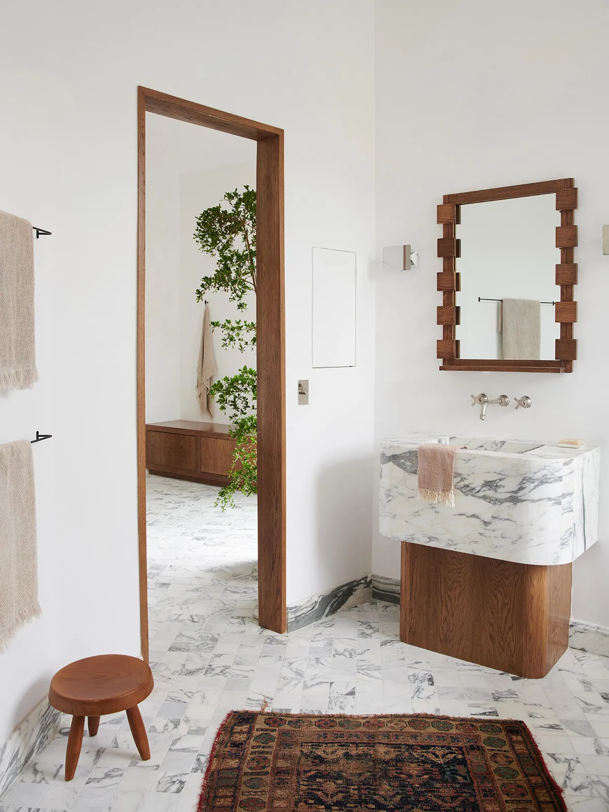
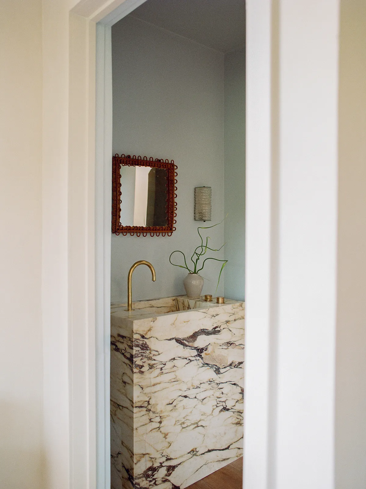
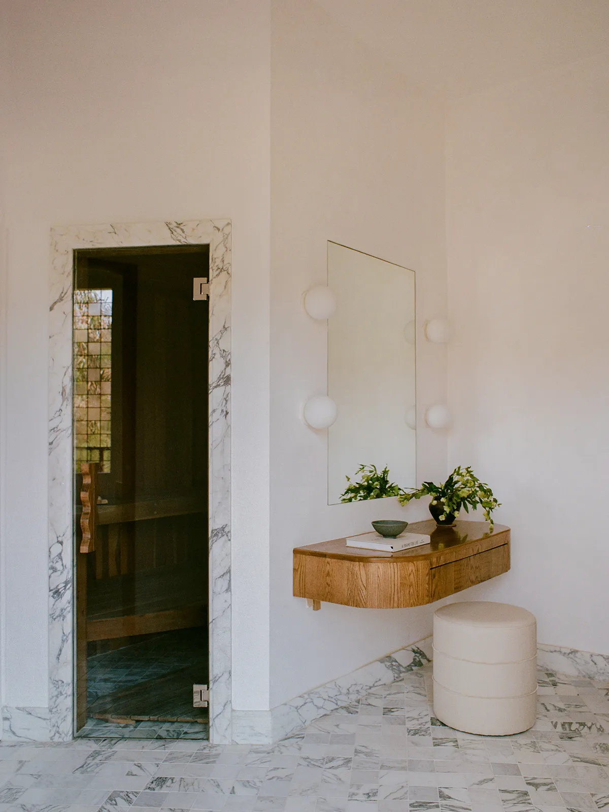
The home’s palette was also pulled from the prominent Calacatta marble slabs they chose for the kitchen, and it’s a material that reappears in the powder room in the form of a solid pedestal sink. Elsewhere, in the showers and on the frames of doorways, they used Arabescato marble. “We believe it has created the right balance of quiet luxury with character,” Rudolph says.
In the primary bathroom, they cut 12-by-12 marble rectangles from L.A. Tile and Stone down to smaller squares and laid them so that the veining didn’t perfectly line up, resulting in a graphic, checkerboard-like pattern. “We stood there for a couple of days and laid everything out, adding and taking away, trusting our gut as to what looked best,” shares Kutner. Although the pattern exists in a more traditional form in the other spaces. “The guest [areas] gave us the sense of being in a local pizzeria,” she adds.
Work With What You’ve Got


There are a lot of archways and angles in this home, if you haven’t noticed. Soft curves enclose the private outdoor space and divide bathroom vanities from showers. Harder lines cut into the kitchen and make a jigsaw of a sunken living space. Rudolph and Kutner could’ve erased them all, but because of budget and time constraints, they decided to make most of them work. In the kitchen, for instance, they connected the lower cabinetry to an awkward beam, creating more storage and counter space as well as cocooning the breakfast nook.
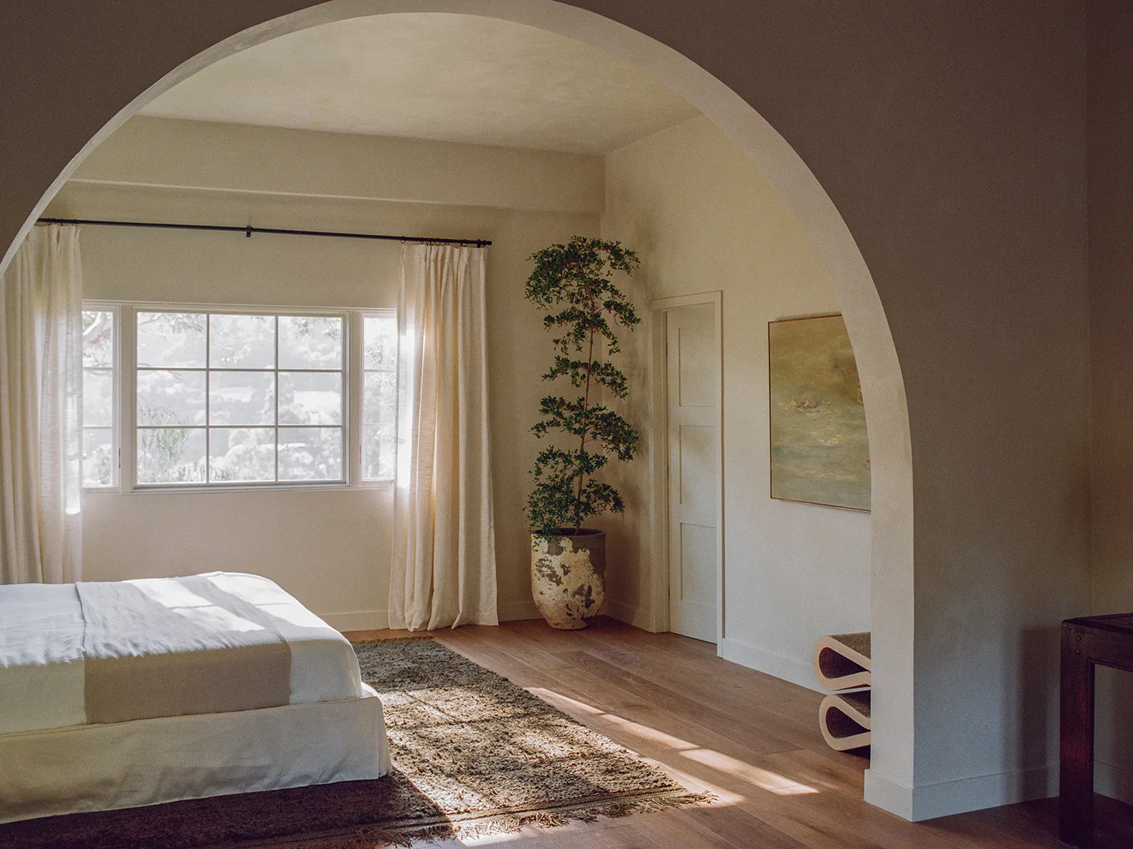
The primary suite as is was way too large, so they added an archway in the middle, leaving them with a semi-separate den and a bedroom. They also kept an existing archway between the living, dining, and kitchen areas (a risk in the open-concept era!) so that it felt more intimate. Finally, given all of those swoops and dashes, the pair thought it was only fair to incorporate some squiggles in the form of the wrought-iron railings, too.
Ensure Time Spent Outdoors
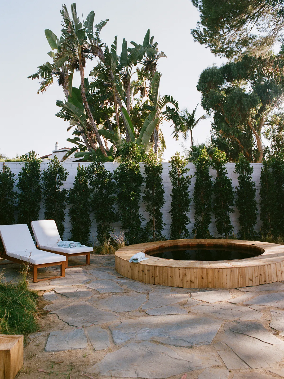
The house overlooks a canyon and rolling mountains covered in trees, and Kutner and Rudolph knew the home’s future residents would want a space to enjoy the view. That’s why they installed a cedar soaking hot tub in the backyard: for property value, of course, but to also help people connect with the place.
“The scent alone transports you to a spa,” Rudolph says. “We wanted to make sure the owners had a calming environment that fosters wellness and a deeper connection with nature.”