We may earn revenue from the products available on this page and participate in affiliate programs.
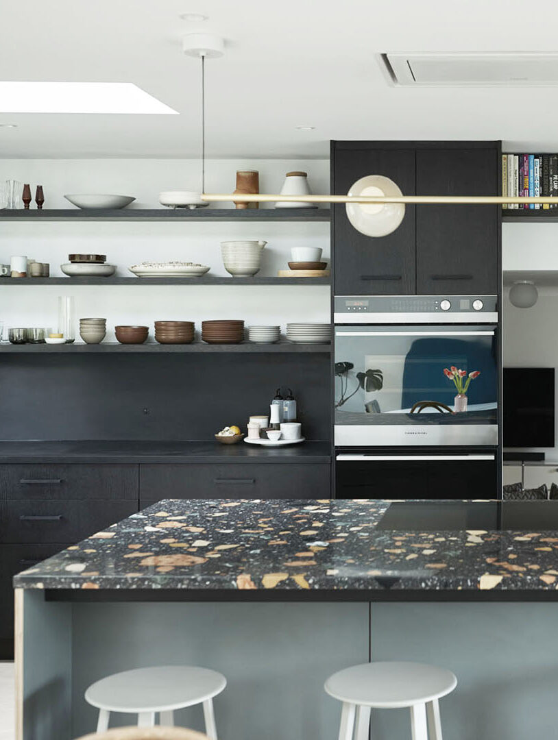
Interior designer Hillary Rielly, co-owner of Inform, had big plans for the Max Lamb–designed terrazzo she spotted at Salone del Mobile in 2014. Not quite as big as the two slabs she was required to purchase, though. She knew she wanted to use one piece for a wet bar she had added to the family room of her home in Seattle’s Normandy Park neighborhood, but it took a few years to figure out what to do with the second. When the time came to turn her attention to the kitchen—the last project in her gut reno—the extra piece found a landing place on top of the island.

The centerpiece sparked the rest of the room’s design, and it became the reasoning behind the black oak cabinets, a pressed paper backsplash, and the green-gray cupboards under the speckled stone worktop. But it was the layout surrounding that feature that really set the transformation in motion.
Make Room for Visitors and Views


The original floor plan was not ideal for a couple who loves to cook and entertain. Rielly explains there couldn’t be more than two people in there at a time. “It was so tight,” she says. “My husband and I would have people over, and then have to throw them out of the kitchen because they’d be in our way.” Counter space was another pain point. That little stretch between the sink and the stove? Practically useless.
Although their need for change initially focused on creating a more functional space, the view of Puget Sound from the living room was reason enough to knock down a wall. That vision informed the addition of an induction stove to the island. “If you stood in the dining room doorway, you could see that view, and I was like, ‘This is what I want,’” Rielly says. The removal of two walls and the addition of the island played a crucial role in creating an open layout—and also completely shifted the home chefs’ perspectives.
Don’t Fear the Dark Side


In the initial stages, Rielly was apprehensive about adopting a darker aesthetic. “I was really scared of doing these black cabinets,” she says of the black oak finish she chose. Memories of the previous space haunted her—cramped, closed off, surrounded by mahogany, and topped with a countertop that played tricks on them. “With that brown granite, you couldn’t tell if it was a crumb or if it was a fleck of the stone,” says Rielly.
She almost went with a pink laminate for the counters, but by opening the space to the living room and swapping uppers for open shelving, the place maintained an airy feel and boosted her confidence in the charcoal-colored oak she chose for the surface. Plus she always planned on keeping the skylights for a boost of natural lighting. “They’re fantastic,” Rielly says. “Everyone should have them!” She also decided to supplement the sun’s glow with can lighting to brighten up the black-on-black Space Theory cabinetry and Richlite backsplash.
Design With Hidden Elements in Mind

Although they removed two walls, the couple soaked up square footage with the island and the double ovens (a wish-list luxury because she bakes a lot), so smart storage was essential. Working with Space Theory, the sister brand to Henrybuilt and a company recognized for its modularity, gave the family more flexibility with what went behind the cupboard doors and drawers. What you don’t see from the outside are the metal bins, woodblocks for spices, knife holders, and dividers for pots and pans and lids. “There’s all this stuff that’s hidden, and that’s really sealed the deal for me,” Rielly says. “You open a drawer and it’s so satisfying.”

What the Rielly family didn’t gain in space, they made up for in function. “This half of the house went unused for so long, and now it has so many layers,” Rielly says. It’s a hub for homework, family dinners, entertaining friends, and obviously enjoying the view: “Every day I use this kitchen, I say a mini prayer of gratitude.”