
We may earn revenue from the products available on this page and participate in affiliate programs.
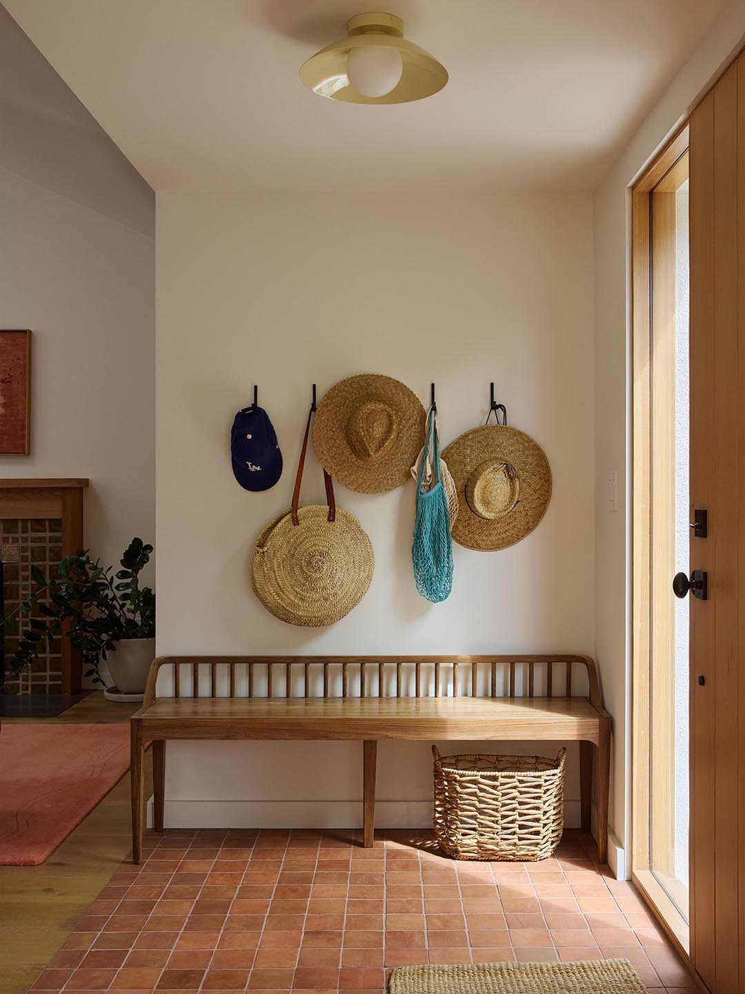
When Rachel Bullock and Molly Purnell of Laun were tapped to transform a family home in Los Angeles’s Highland Park neighborhood, the designers were on a mission to restore the property to its former glory. Though the Craftsman-style house was built in the 1920s, it had been renovated into oblivion—trading in its time-honored charm for a more sterile setting. “It was exactly what you would imagine if somebody said, ‘I watched HGTV and now I’m going to flip a house,’” Purnell quips.
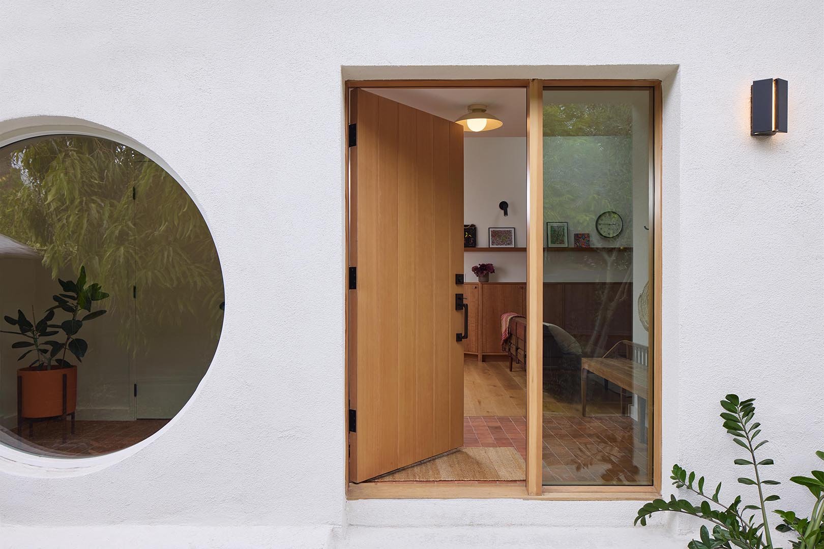
The client—who shares the space with her two children, ages four and eight—got acquainted with the place during the Covid-19 pandemic, and that’s when the home’s pain points became more apparent. “All of the sudden, these little things started to add up,” she explains. “None of the grout was sealed, something flooded, and the kitchen was falling apart in a very small amount of time.”
Bullock and Purnell sought to erase the shopworn touches, starting with an open floor plan the client called “a long chunk of space.” The reconfigured layout (and lots of millwork) makes the 1,846-square-foot space feel more spacious—and improves the flow. “It just feels so much more connected,” the client says. “I don’t have to hear them from another room [yelling], ‘Mom, what are you doing? Mom, stop!'”
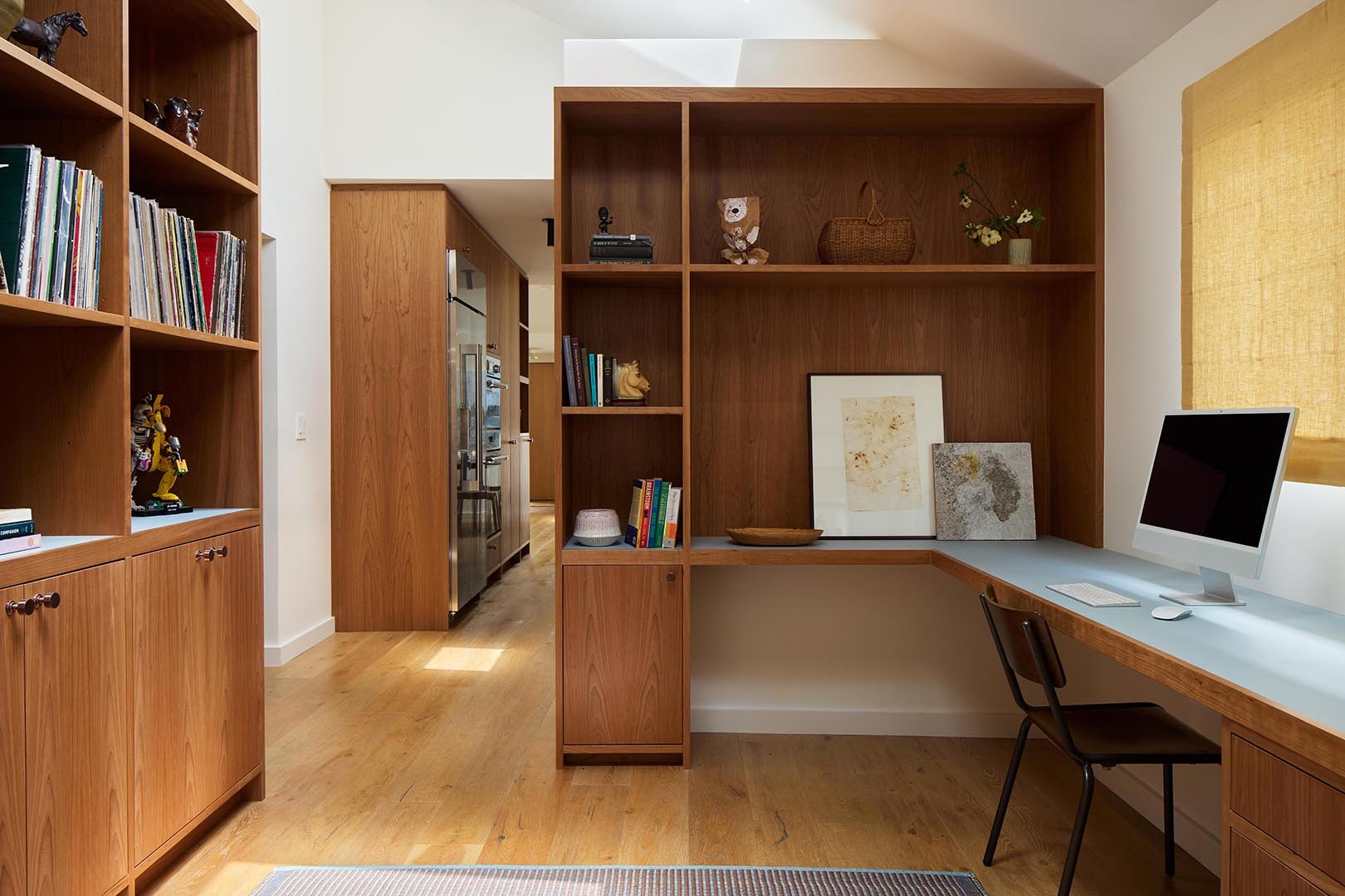
The designers moved the kitchen from the area that occupies the office to a more central location so it was easily accessible from the living and dining zones. “It’s made life so much easier,” the client says. “When people come over, everyone just naturally knows where to sit.”
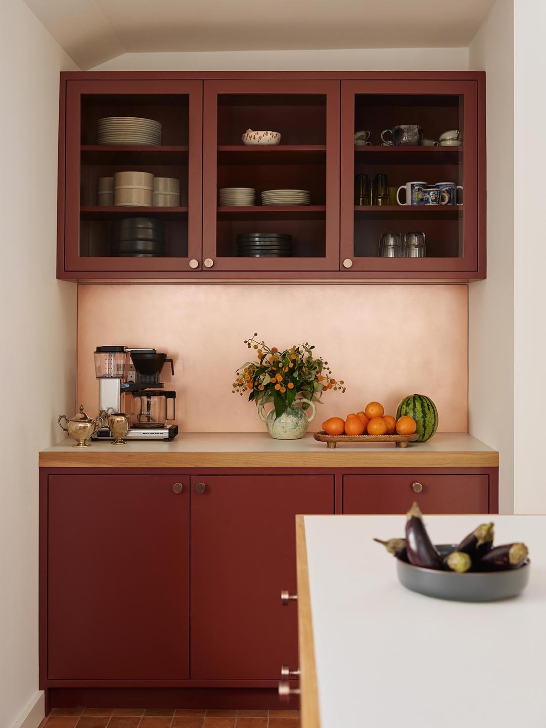
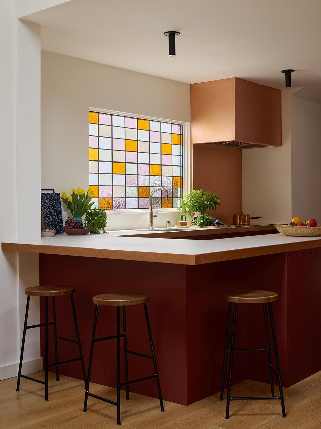
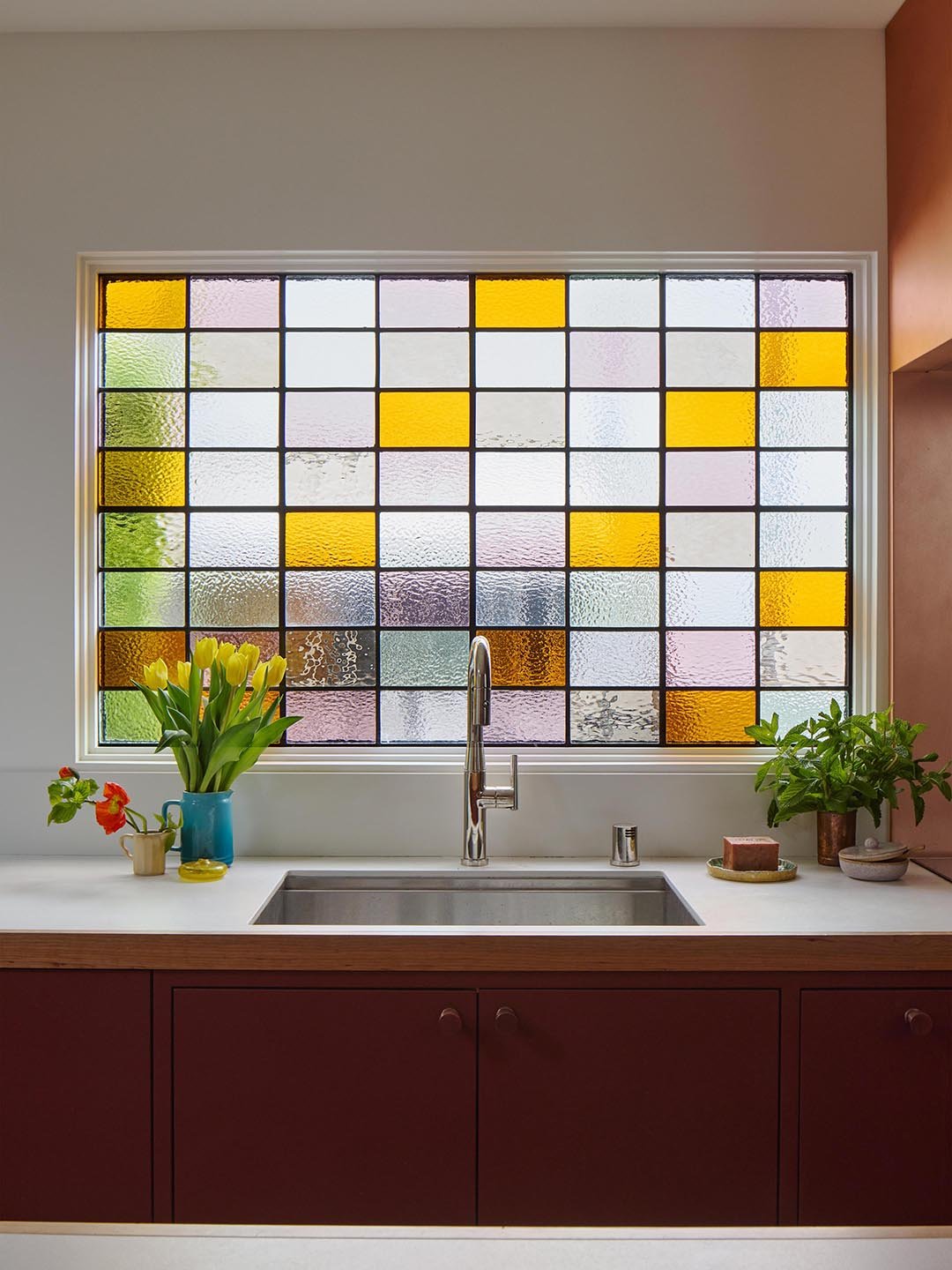
Because the crowd gravitates to the kitchen, it has to be sensible and stylish. Bullock says the boxy copper range hood “turns the creature into a feature,” while a custom stained glass window from artist Debbie Bean keeps the client from peering into her neighbor’s (very close) house whenever she washes dishes. “Depending on the time of the day, the colors change,” the client says of the window. “It’s such a dynamic piece.”
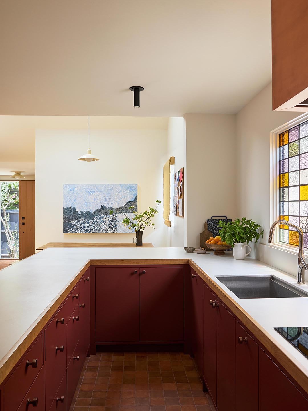
While the kitchen is where “people come and gather,” more intimate areas give the family more privacy. The client enjoys reading in the library, while her kids have a designated craft nook to paint or build LEGO sculptures. In fact, her son’s many works are proudly displayed, making the house his first gallery.
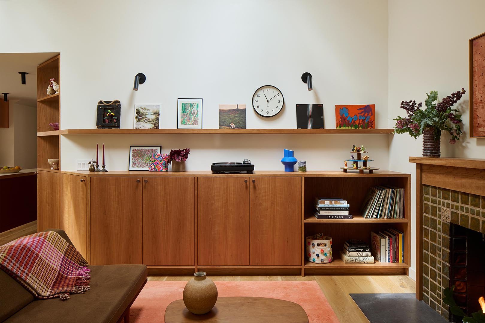
Though Bullock and Purnell wanted to bring the charm back to the home, they had to be “honest about its evolution. “We wanted to acknowledge the roots of the home, but acknowledge all the true Craftsman elements are gone,” Bullock says. So it was nothing short of a miracle when the designers unearthed original Batchelder tile around the fireplace during demolition.
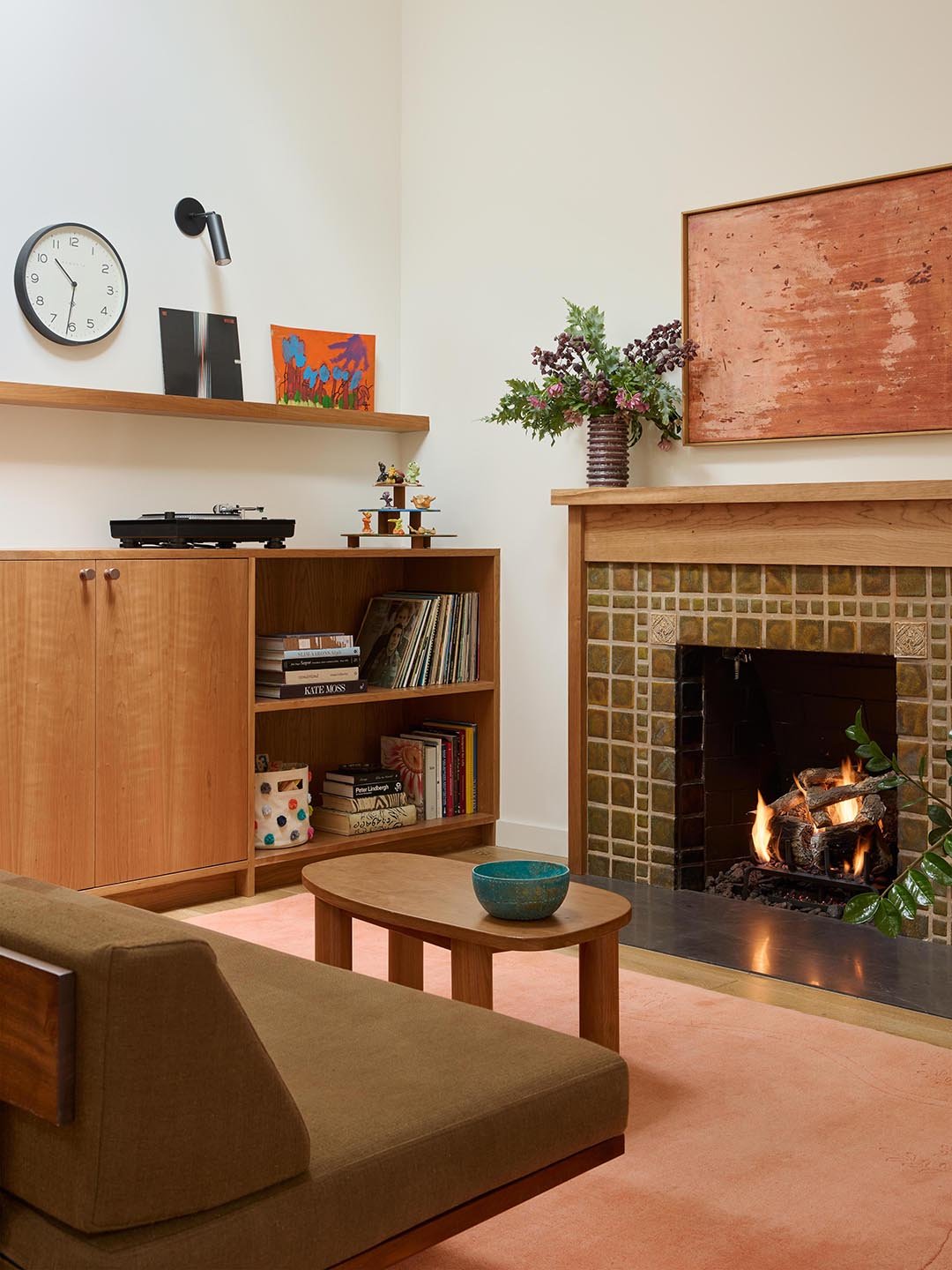
“I hated the fireplace before,” the client confesses. “I’m so grateful [the previous owners] didn’t demolish it.” Now, the hearth warms up the living space, offering a beautiful focal point that invites the family to curl up with books or listen to vinyl records.
The discovery inspired the designers to match the residence’s millwork to the newly-built cherry mantle, but otherwise? The old-school fireplace only reaffirmed their direction. “We chose a palette that brought warmth back to this house,” Bullock says. “Turns out, it’s what it wanted. It was here under this drywall all along.”
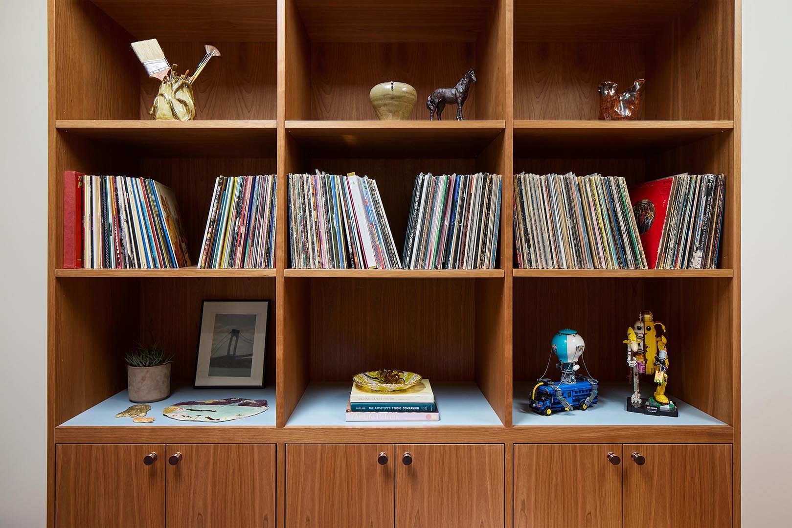
Speaking of color palette, Laun employed controlled pops of red, blue, and chartreuse to create a “happy medium.” “They’re all creative people, and a white box did not feel like [the family’s] personality,” Bullock explains. “They wanted something that could reflect their fun nature, but could act as a backdrop without being overwhelming.”
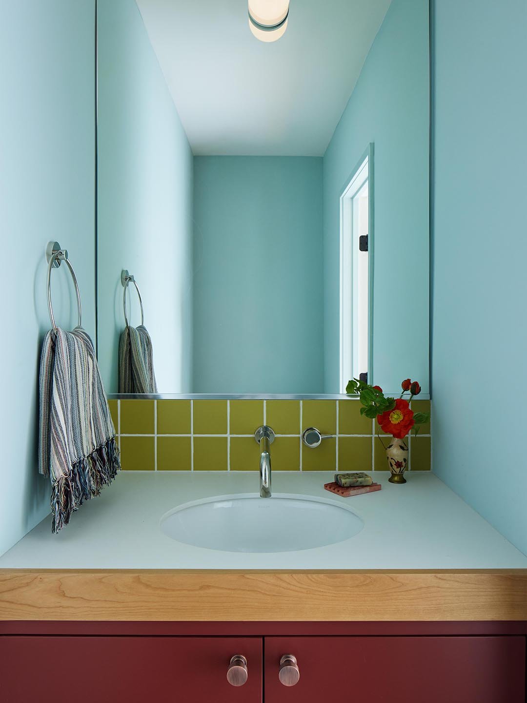
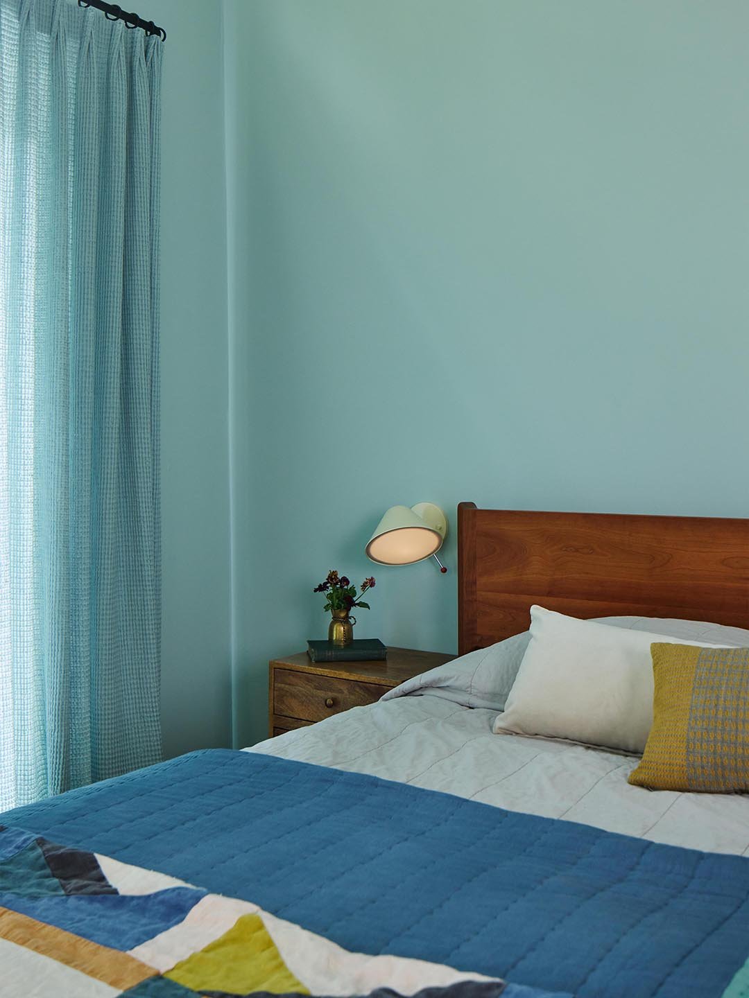
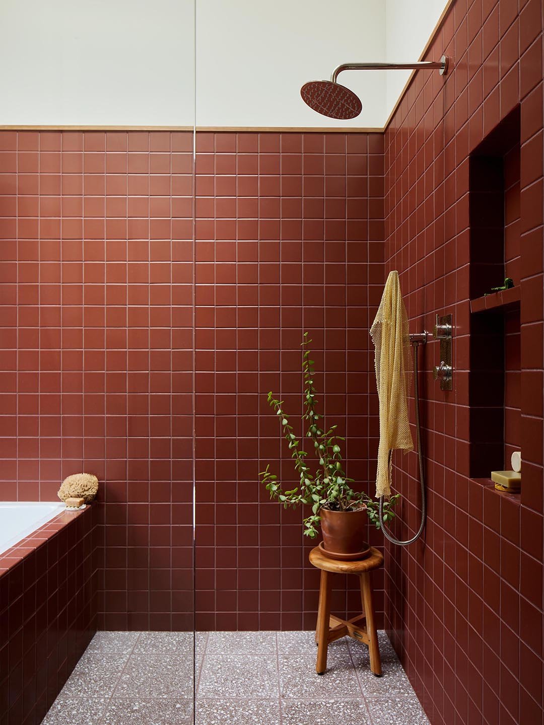
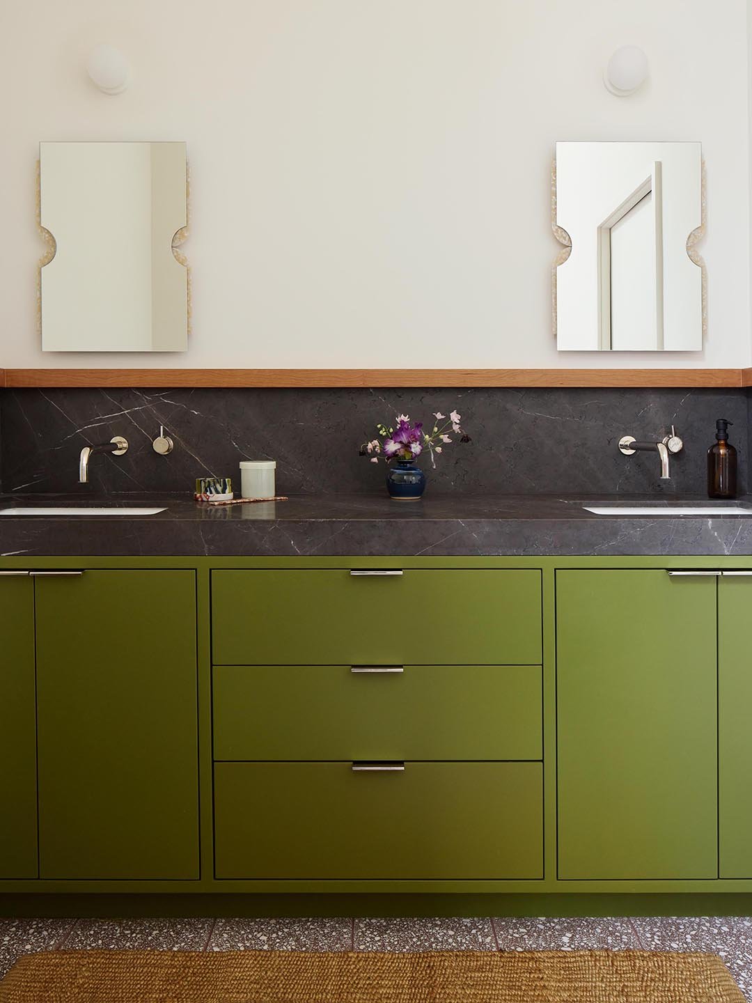
The primary bedroom feels “calming” drenched in Benjamin Moore’s Palladian Blue. “It’s so subtle once you’re in there that you kind of forget you’re in this color,” the client says. Meanwhile, the en-suite bathroom offers a modern take on spa-like serenity with a red Fireclay Tile shower backsplash and vanity swathed in Benjamin Moore’s Timson Green.
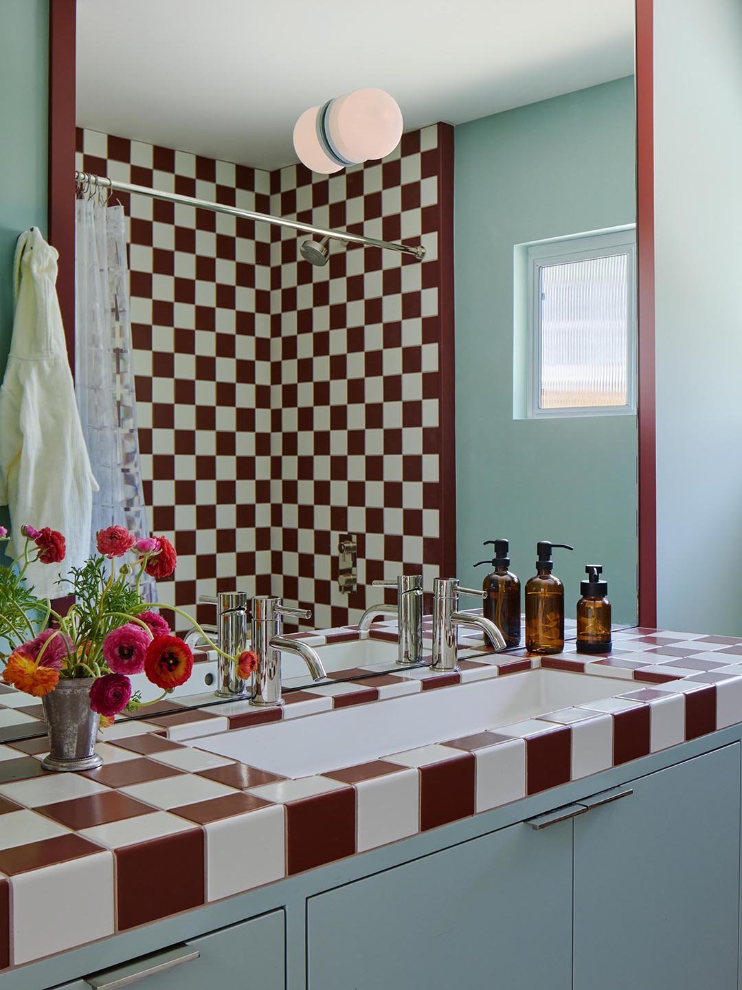
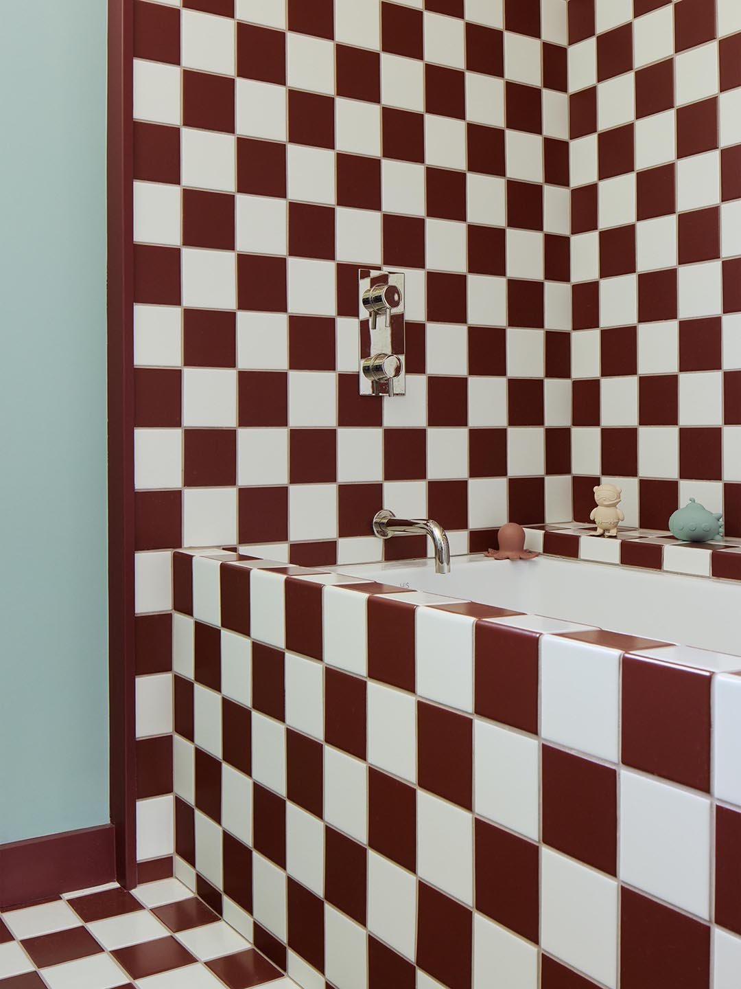
The children’s bathroom is equally joyful with Benjamin Moore’s Wythe Blue on the walls and a swipe of Brick Red for the trim. But the room’s pièce de résistance? A punchy Fireclay Tile floor, a specific ask from the client’s son. “He wanted a checkered pattern so that he could in theory play chess on the bathroom floor,” Bullock says. “He wanted to make sure that there was enough contrast between the two tile colors that it would read strongly.”
Whether they’re crafting or awaiting a highly-anticipated chess match, the revamped home gives this family a space to live authentically. “The house captures us so well that I can’t even see it,” the client says. “It feels like me. It just feels like home.” An atmosphere that celebrates its past and welcomes the next chapter.