We may earn revenue from the products available on this page and participate in affiliate programs.

We are constantly in pursuit of making our homes feel like a really nice hotel. Everywhere we stay, we can’t help but ask the staff about the thread count of the sheets or the brand of the candle burning in the lobby. But for guests at the Lake House on Canandaigua, a 124-room retreat in New York’s Finger Lakes region that opened in 2020, it’s not products that pique their curiosity—it’s paint. Chris Pulito, the hotel’s general manager, estimates he gets asked “What’s the paint color in the library?” around 50 times each month. “More than once per day, on average,” Pulito clarifies.

The space (officially dubbed the Library Bar) is a dramatic departure from the rest of the Lake House’s light, white, and airy gathering areas, which is probably what gets people buzzing. “We wanted to create tucked-away spaces that guests could retreat to for a change in atmosphere and experience,” shares Lyndsay Caleo Karol, the creative director of the Brooklyn Home Company, which designed the hotel in collaboration with Post Company. When you turn the corner from the main entry, you’re greeted by a sea of blue. The walls, ceiling, shelves, and even the fireplace mantel are swathed in a rich shade that’s not quite royal but not quite navy. So what is it? It’s Benjamin Moore’s Gentleman’s Gray.
The Library Color: Gentleman’s Gray
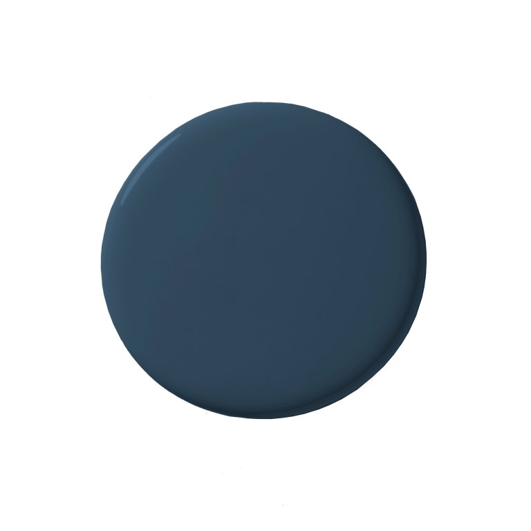
Gentleman's Gray, Benjamin Moore
Shop NowFor a room that is so clearly blue, it’s ironic that the name of the hue isn’t at all. But the designers weren’t out to pick a shade with a catchy label. Rather, they were focused on selecting a palette that references the surrounding landscape. “We were able to play with this idea throughout the various spaces—shades of blue—as a reflection of the changing light on the lake,” says Karol. By opting for a high-gloss finish, they amplified the glow not only from the large fireplace but the concave pendant lamps and sconces that dot the area. “It’s an amazing color that allows natural light during the day to brighten up the room,” says Pulito.
The Other Blues to Try: Polo Blue and Vanderberg Blue
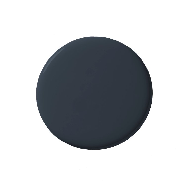
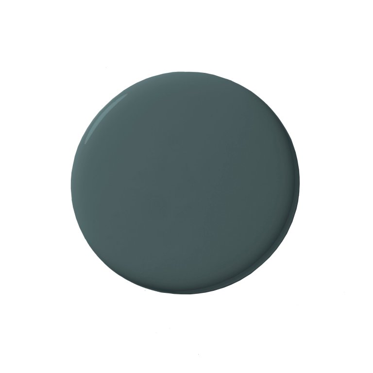
Gentleman’s Gray isn’t the only cool-blue paint color worth stealing from the Lake House. The hotel’s Rose Tavern features Polo Blue and the cozy Willow Room nearby is dressed in Vanderberg Blue. In the restaurant space, the shade was chosen to anchor the soaring white ceiling, while in the adjacent cozy lounge-slash-dining area, it reads almost black. Ensuring the surfaces remain scuff-free, the hotel has a dedicated painter on the property who works 40 hours per week touching up any imperfections. If only we could steal him for our own homes.