We may earn revenue from the products available on this page and participate in affiliate programs.
It took two and a half years, a building fire, and a flood for Denise Davies of D2 Interieurs to finish her latest project, a 4,800-square-foot apartment on New York City’s Upper East Side. “It felt like the seven plagues,” Davies says, laughing. But despite the near constant roadblocks, five separate apartments became one for a family of five.

Full of whimsical wallpaper and curvaceous custom furniture (more on that later), the space underwent a gut renovation to tear down (nearly) every existing wall. “You would enter through the main door and step into a wall,” Davies explains of the original entrance to the first apartment. Needless to say it was less than an open concept. In her own words, Davies recounts the lengthy project, starting with the surprising element she’s most proud of.

The design detail I’d do everywhere: In the city, you don’t get a lot of options when it comes to HVAC units. But the ones the building insisted on stuck out like a sore thumb against the rest of the design. So how we went about covering the always-ugly heating and cooling units was to transform them into functional pieces of furniture. Window seats were positioned over the vents in the living room and kitchen, while in the dining room, there’s a credenza that doubles as storage. It’s something that wasn’t possible in other projects due to construction limitations, but now I’ll do it everywhere.

How I never got overwhelmed: Start with “hard” materials. Millwork, tile, flooring—I always finalize my foundation first, beginning with kitchens and bathrooms. Not only do these rooms take the longest, they’re crucial for actually living in a space. Then while those are getting installed or built, the deliberation over soft goods can start.

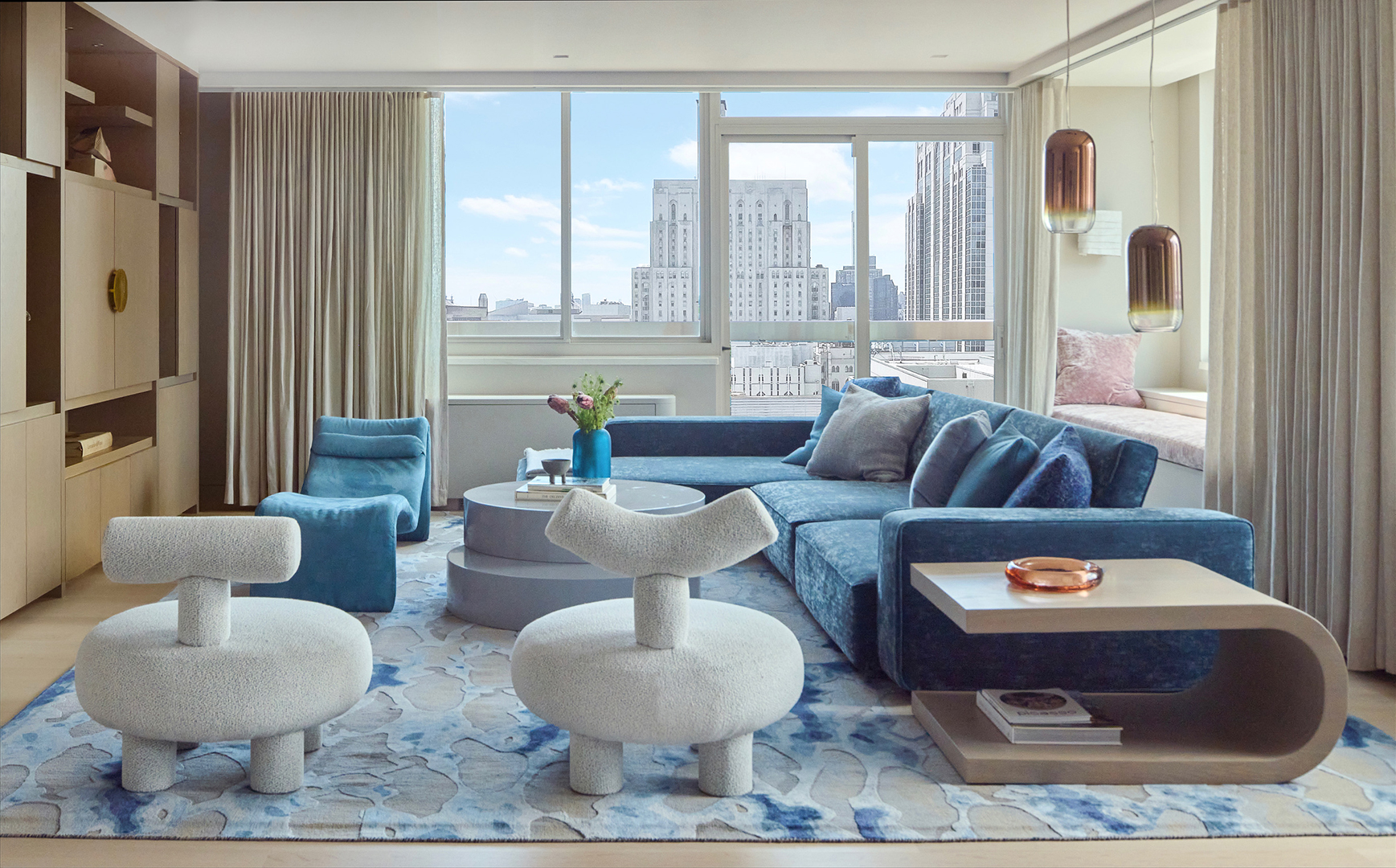
How I tied everything together: The walls in the common spaces—the living room, dining room, entryway, and kitchen—are all painted the same color (Ammonite by Farrow & Ball). I find that it helps the eye move more easily, especially in open-concept floor plans. I also took the two rugs in the family area and dining room and made them color reversals of each other. They feel like two distinct spaces, but without being choppy.


Another way to really bring a space together is to play with contrast. With this project, I looked at shapes. There are so many straight walls, because there used to be five apartments worth of boxy rooms. So I added curving shapes through the furniture, rounded corners on the island and millwork, and soft textures like velvet armchairs and high-pile rugs.

Where I snuck in secret storage: The formal entryway was part of a couple of load-bearing walls that I couldn’t move or tweak in any way. So instead, I designed a custom built-in bench, mirror, and entry table so that the family has a spot to put their keys. Behind that, there is a mudroom with huge cabinets.


The detail my client sold me on: This apartment is the third project I’ve worked on with this family, so the homeowners gave me nearly full creative control. But the one thing they asked me for was patterned curtain panels in the primary suite. I was so hesitant about them, one because they were such a contrast against the rug, but also because they might take away from the calm feeling in the space. I realized after seeing them hung that they actually ground the entire room.


Where I went overboard (and how I pivoted): Initially, I had three pendant lamps picked out to place above the kitchen island. But once all the rooms started to come together, it literally looked like a lighting store. So I cut back from the original plan to just two; I had to remind myself it was an apartment, not a large home. If you look inside the window seats, you’ll see there are also sconces in there, but they’re very neutral. The colors read back to the dining room chandelier, but they don’t compete. I had to strike a balance.