
We may earn revenue from the products available on this page and participate in affiliate programs.
Living in coastal Maine means I rarely feel the urge to vacation somewhere else. Most mornings, I step outside to wildflowers spilling into the road, cedar-shingled houses, and sailboats bobbing just offshore. It’s the kind of scenery people travel hundreds of miles to find, and I get to call it Tuesday.
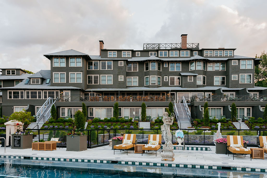
So when I checked into the newly restored Asticou Hotel in Northeast Harbor for a few days, I wasn’t seeking an escape so much as a change of scenery. What I didn’t expect was to spend half the trip mentally redecorating my own home.
The hotel’s refresh, led by the Atlantic Hospitality design team, strikes that elusive balance between polished and playful. Everywhere I looked there was a little detail worth stealing—a painted border here, a striped dresser there, a melange of patterned textiles all working in harmony. By checkout, my phone was full of photos and my weekend DIY list had grown considerably.

What makes the Asticou so easy to borrow from is that its best ideas don’t rely on having an extravagant budget. The rooms are packed with handmade touches, clever furniture upgrades, and decorating tricks that would feel at home in a small apartment or beach cottage, even. Here are the five I’m most tempted to copy.
Go Full Stripes On a Cabinet
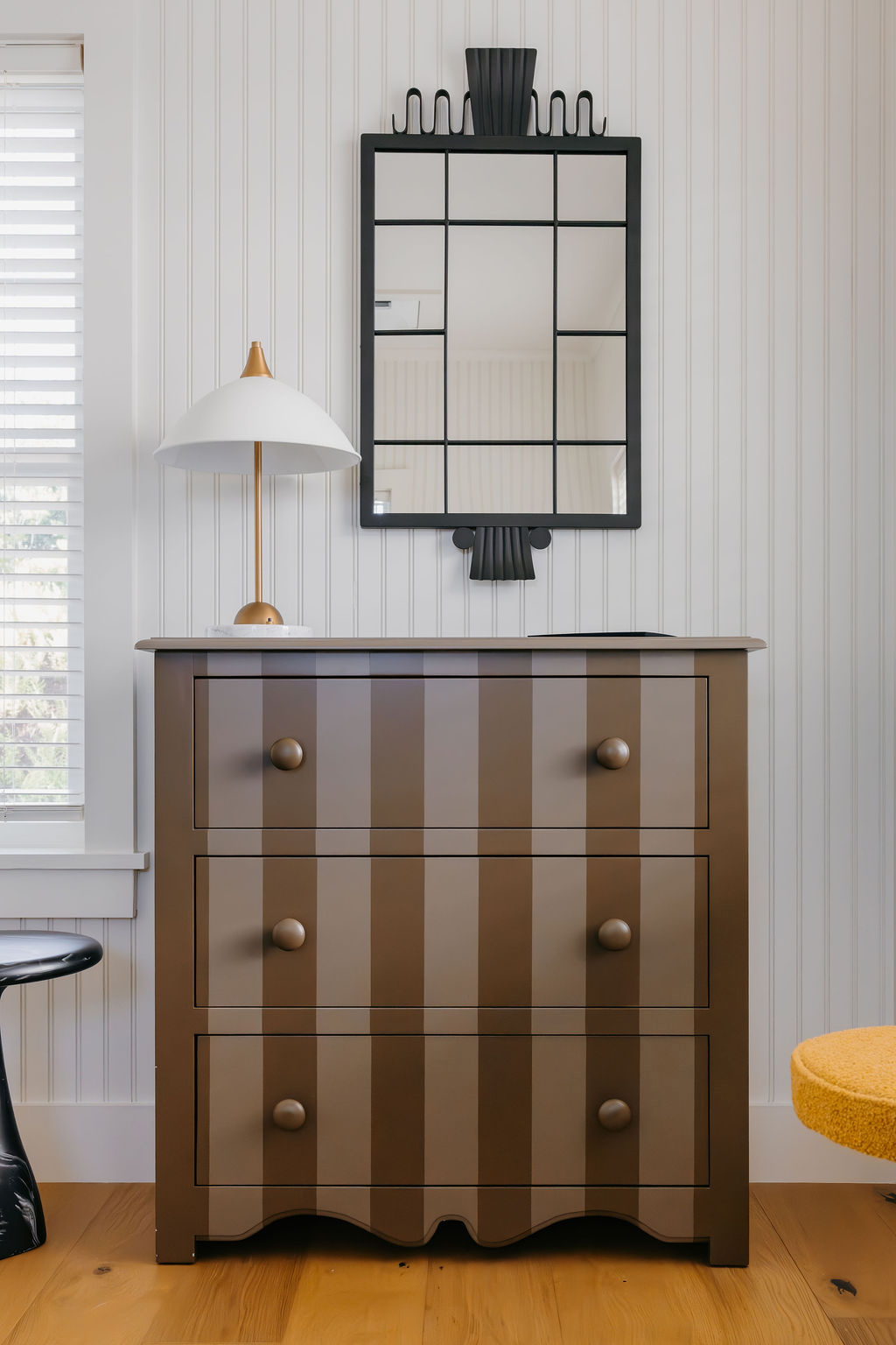
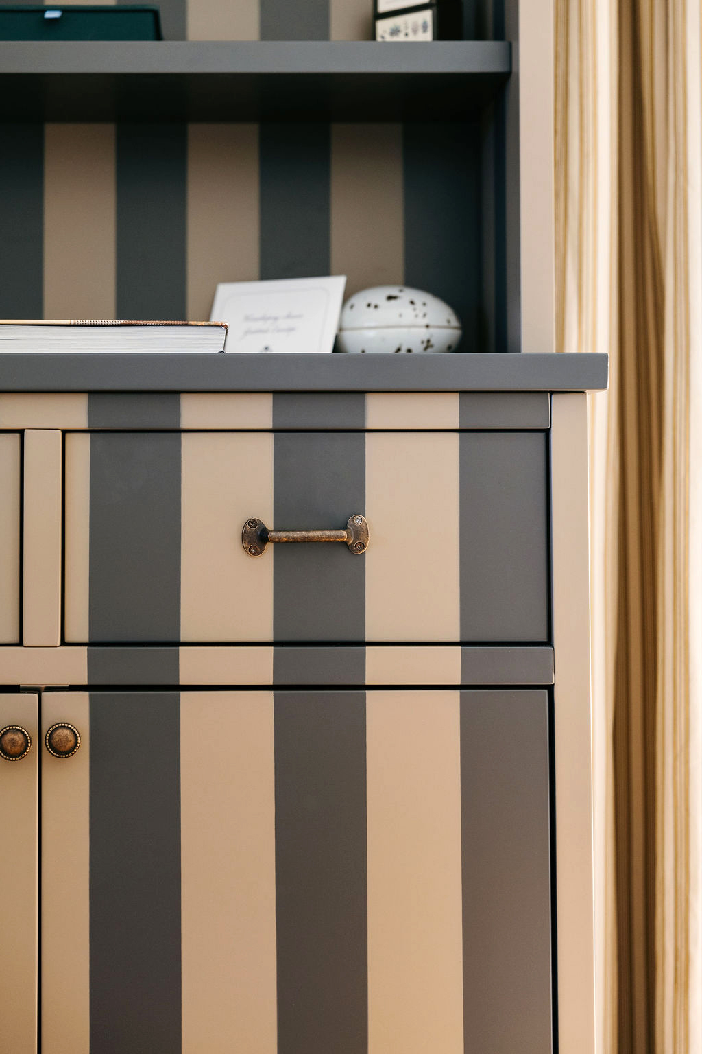
The first thing that stopped me in my tracks wasn’t some impossibly expensive antique; it was a painted hutch. Actually, several painted hutches and dressers. While many of the furnishings at the Asticou were custom made in Portugal, what caught my eye wasn’t the craftsmanship alone. It was the graphic cabana-inspired stripes wrapping around the casegoods, which instantly made these classic silhouettes feel more lighthearted.
What I loved most was how uncomplicated the idea was. Painter’s tape, a quart of paint, and an afternoon are all that really stand between a Facebook Marketplace find and something that looks straight out of a boutique hotel. The pattern also makes everything displayed on top feel more deliberate. Suddenly, a stack of paperback novels and a deck of cards becomes a styling moment.
Slick (or Stick) a Border Around the Trim
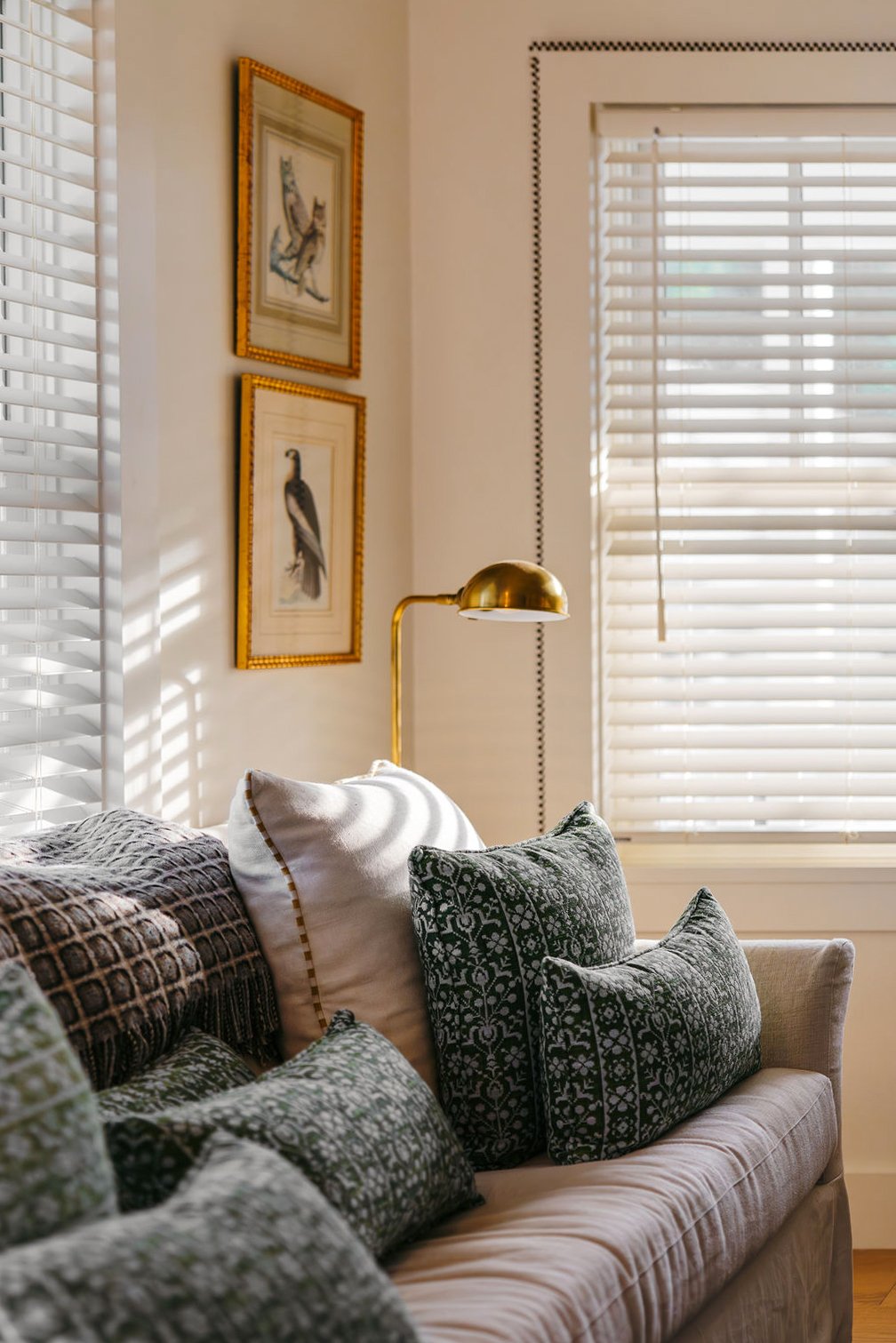
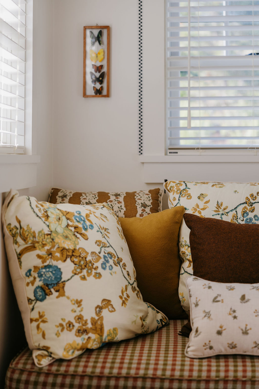
Rather than relying on elaborate millwork, many of the rooms featured crisp hand-painted or graphic checkered borders outlining the windows. (I’ve been thinking about them ever since I got home.) It’s such a small gesture, but the flourish made the architecture feel more intentional, as though the spaces were wearing eyeliner or a little bit of flair. You could borrow the same trick almost anywhere: around a doorway, for framing built-in shelves, outlining a mirror, or even tracing the interior edge of a bookcase.
Top an Antique With a Slab of Marble
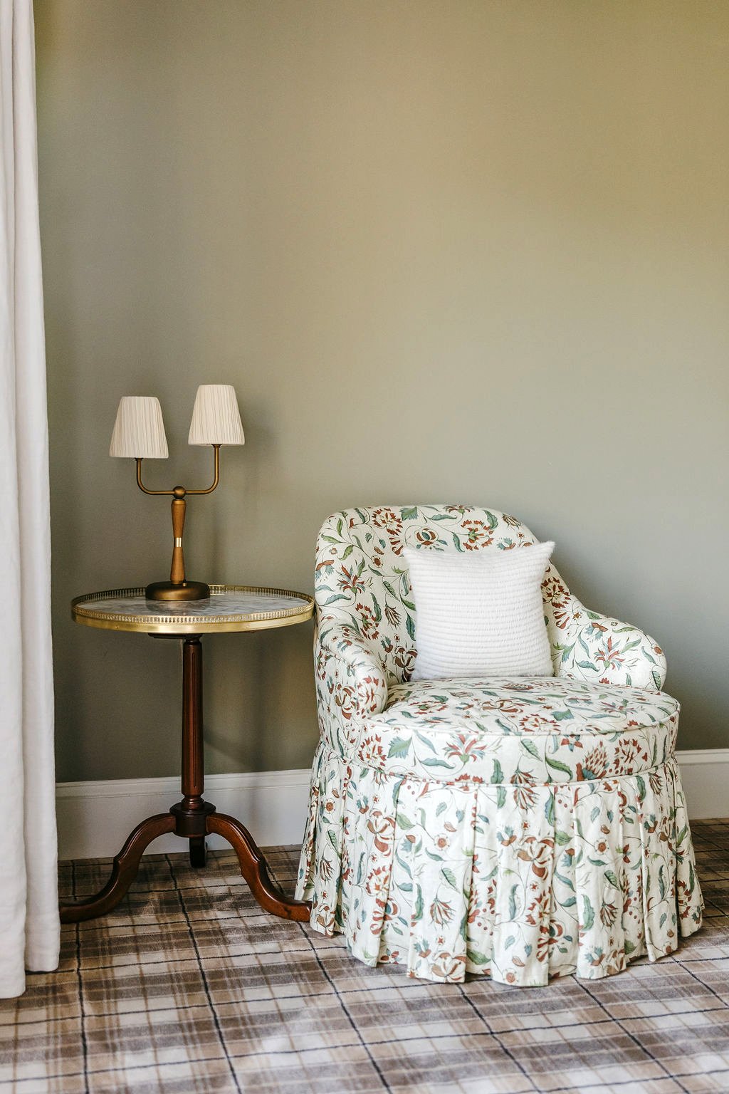
Several vintage dressers placed throughout the Asticou were finished with marble slabs—they made me realize you don’t need to splurge on a brand-new vanity or cupboard to get the look. A remnant from a local fabricator or a salvaged marble top could completely transform a thrift-store find, like the side table above. What sold me wasn’t just how elevated it looked, but how practical it is. As someone who is constantly setting down a sweating can of seltzer or scattering skincare products across every available surface, I’d happily trade delicate wood for an easy-to-wipe slab of stone.
Layer Patterns With Abandon
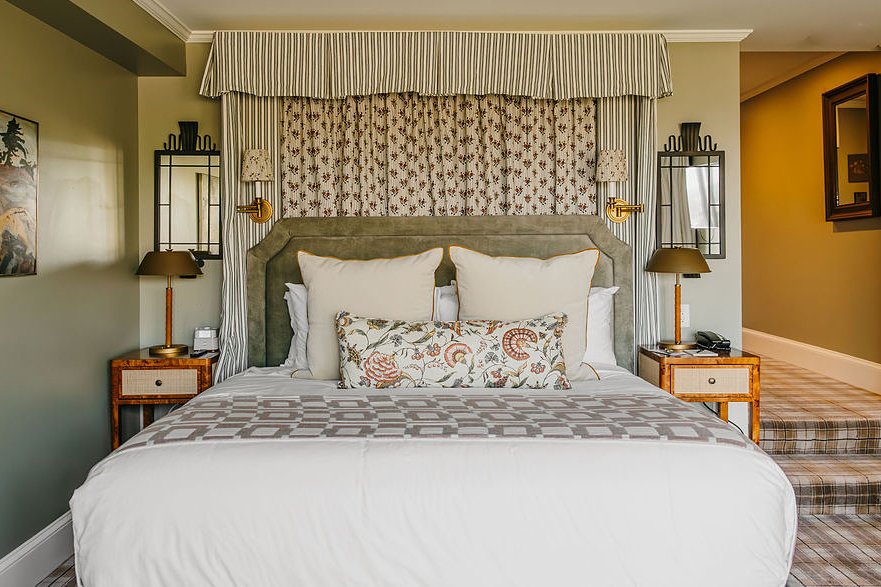
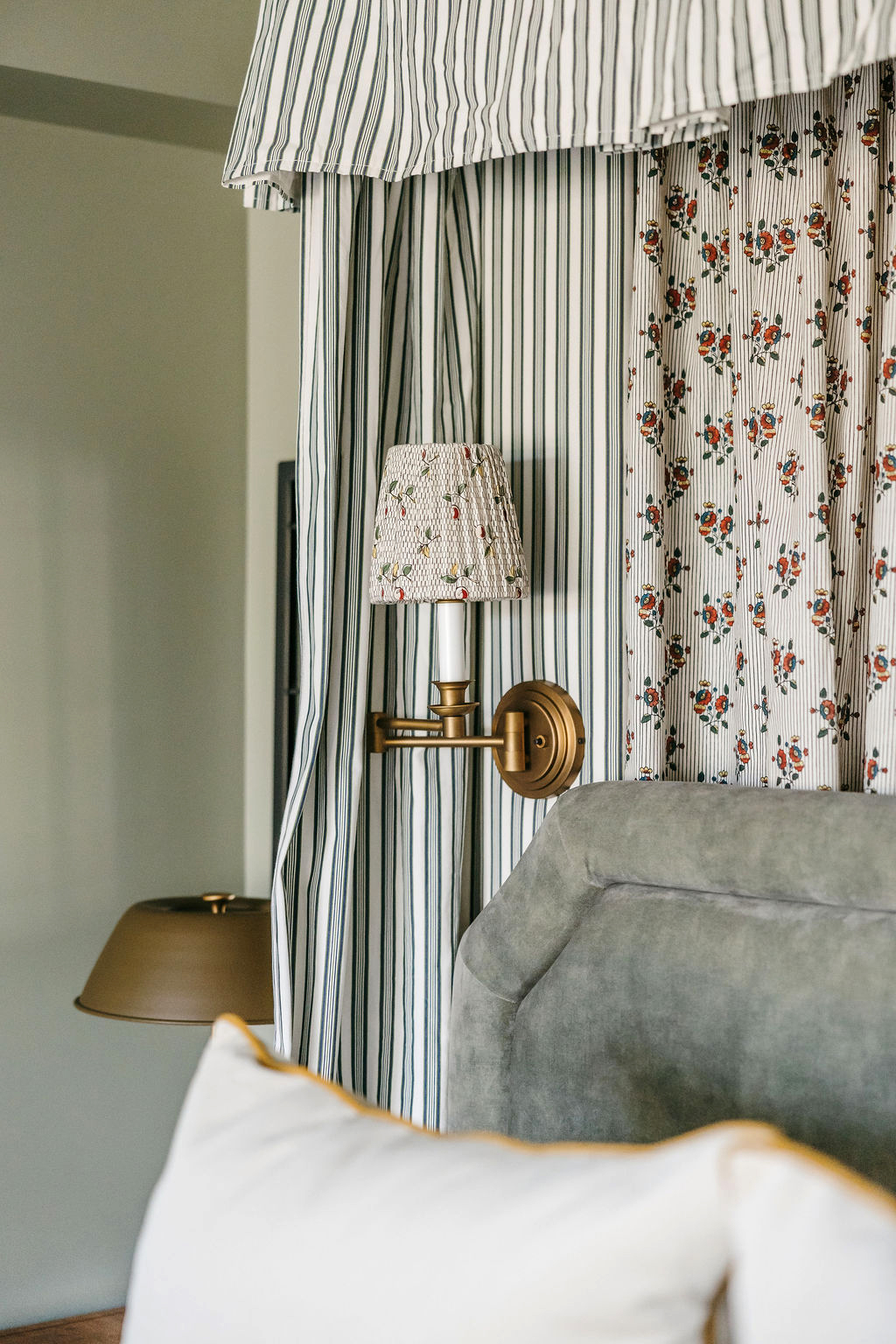
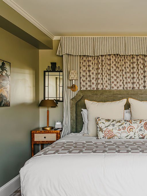
The rooms piled stripes on florals, plaids on checks, botanicals beside ticking—and somehow nothing felt chaotic. Instead, everything was collected, as though each textile was added over decades. My biggest takeaway wasn’t to buy more throw pillows. It was to stop trying so hard to make everything match. If the colors are speaking the same language, the patterns can have entirely different personalities.
Commit to a Color—But Don’t Make It a Theme
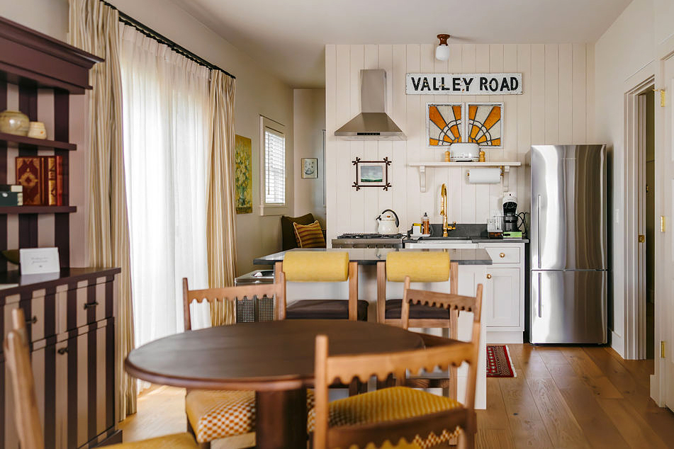
One thing I noticed again and again was how each space had its own signature color. It wasn’t loud, but one shade threaded everything together: it showed up on a bolster, reappeared on the painted trim, popped up in the piping on a lampshade, and then made one final cameo in a piece of artwork or fabric. That recurring hue—whether deep forest green, buttery yellow, dusty blue, or oxblood red—acted like a visual breadcrumb trail. It made the rooms feel cohesive but not coordinated in that “I bought the whole showroom” kind of way.