We may earn revenue from the products available on this page and participate in affiliate programs.
When London-based jewelry designer Sandra Barrio Gonzalez finished painting her Victorian home, her first-ever design project, the cleaning crew told her it reminded them of Rio de Janeiro’s annual Carnival. “That was the last thing I wanted,” she recalls, laughing. “I immediately panicked.” Pulling bright and cheerful shades that reminded Gonzalez of her Spanish heritage was always the goal, but she had never wanted the result to lean toward garish.

In fact, Gonzalez and her husband had picked colors found in nature, like sage green and pale pink, specifically to avoid the house being “too much.” So she chose not to adjust a thing. “I’m a Pisces, so I always say that I have this duality,” she says. “I change my mind a lot, but when I know, I know.”

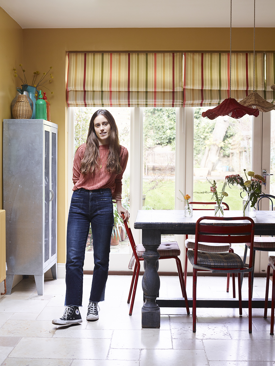
Gonzalez had grown tired of the constant gloom the U.K. weather patterns would bring. Instead of relying on cozy upholstery textures and lighting to combat the clouds, she focused on paint. Even two days before the painters were scheduled, however, she was still finalizing shades. Although she swatched upwards of 20 different yellows for the kitchen walls, for instance, some were too pale and others too orange. At the last minute, an inspiration image of an archive Farrow & Ball gold—it had just the right amount of mustard—sealed the deal. An indigo island and multicolored cabinets (coated with leftover paint from other rooms) are an ode to the family’s playful nature.


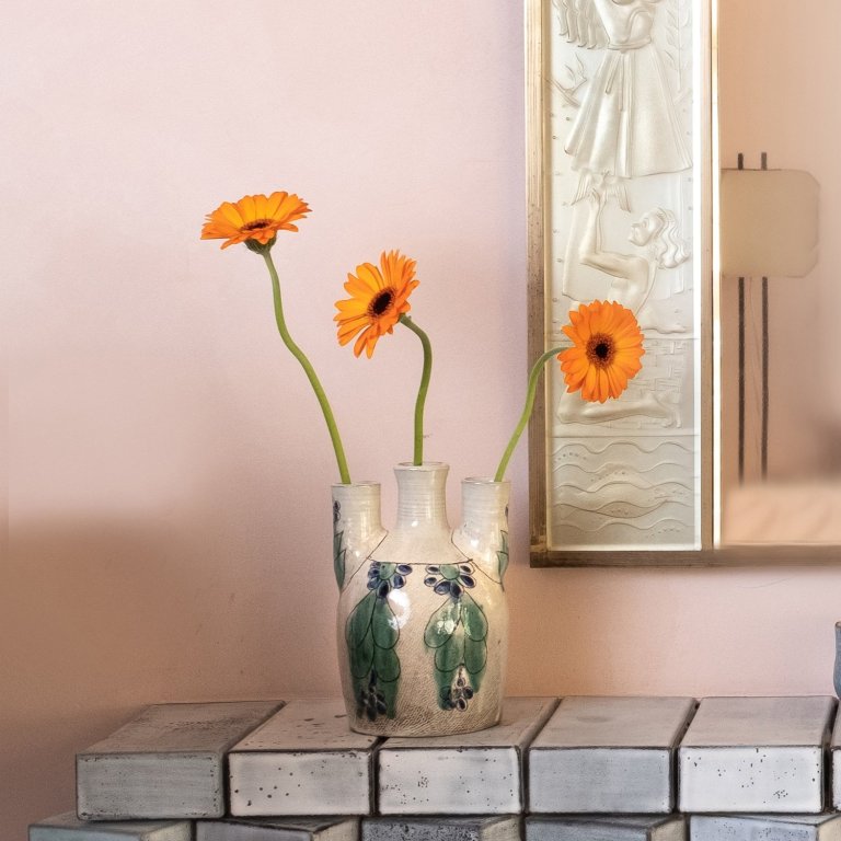
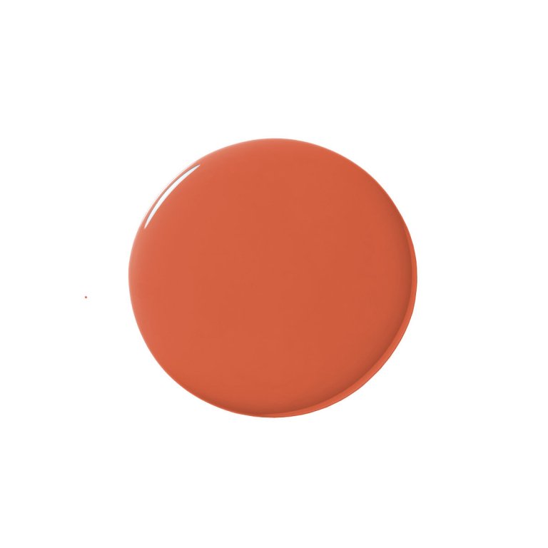
A singular palette was never going to work for Gonzalez—it would grow old too quickly. So each room is painted a different vibrant hue (with contrasting trim, of course). The guest bedroom is a burnt orange with emerald green woodwork, while the primary bedroom’s blush walls are paired with a darker mauve.


One thing Gonzalez was sure of was her knowledge of how to balance out the vibrancy—with artwork. In her studio, for one, vintage photography lives in harmony with a Basquiat print, all of which recall other hues in the home. The citrus tones of the Basquiat are reminiscent of the guest suite’s walls and bathtub; the vintage party photo connects back to the primary bedroom’s pinks.

Another common thread is Gonzalez’s love of fruit. Glass lemons, plastic apples, real bananas…even flat depictions of produce can be found in seemingly every corner, whether in bowls or on the walls. “I started making fruit earrings, because I loved the shapes, and they just kept growing on me,” she says. More than one morning has ended in disappointment when a fake avocado was mistaken for a real one.

The design process was one big learning curve. A deep hunter green made the couple’s 1-year-old daughter’s small room feel like a cave, and the fabric for the window treatments had to be swapped in order to get the pattern right. But that’s to be expected in Gonzalez’s eyes; for her the work is never finished. With so many ideas and not enough rooms to put them, the home will always be a revolving door of subtle changes. “There are things I’ve tried that I saw in a magazine that look amazing, but it doesn’t work because I’m actually living in this space,” she elaborates. “So I’m constantly changing details to what makes me happy.” No matter what anyone else may think.