We may earn revenue from the products available on this page and participate in affiliate programs.
Isabelle Dimang is no stranger to change. After leaving New York in pursuit of warmer weather and continuing a career in fashion (she’s currently a photo director for Nordstrom) seven years ago, the Arizona native settled in Los Angeles’s Hancock Park neighborhood. Her 1920s, Art Deco–style apartment boasts enough character to last several lifetimes (think: a turquoise tiled bathroom, arched windows, and original crown molding), but her living room layout is constantly evolving. Dimang moves things around every few months for a fresh dose of inspiration.
“I like rearranging because it shows you a new way to function,” says Dimang. “It helps me fall in love with my space again and reappreciate what I have.” Whenever the whim strikes, she spends a lazy afternoon creating an entirely new scene—without spending a dime. “In all honesty, I rarely redesign for function. Functionality comes second,” admits Dimang. But with the pandemic making the line between home and work blurrier than ever before, she has been forced to explore how form and function can peacefully coexist.
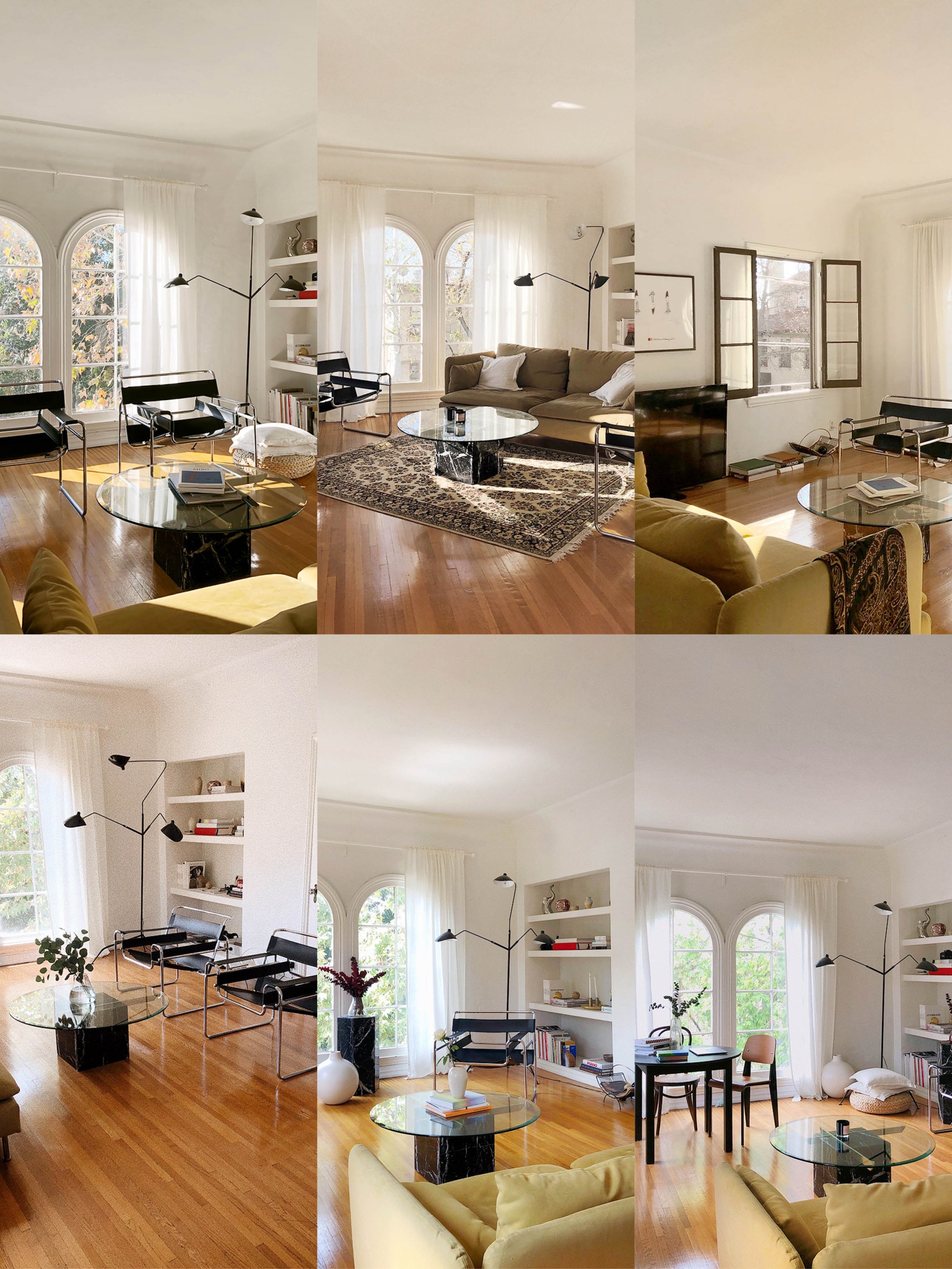
Below, Dimang walks us through six of her best (and worst!) visions.
The One With the Dreamy Light

I was playing around to see if I liked the two black chairs sitting together. I wanted to try them in front of the arched windows, kind of as partners to the bookshelf, with the sofa across the way.
What worked: I’ve always enjoyed the way the light hits that corner diagonally, and this arrangement really showcased that. There’s nothing better than being greeted by that sun in the morning. What didn’t: I love sitting in those chairs, but I hated not being able to see out of the windows at all while doing so.
The One on a Diagonal

I was seeing a lot of corner couches on Pinterest and immediately wanted to try it. I added a rug, too, because why not?
What worked: The chairs framed the couch, and they faced each other, which was great for socializing. My guests were able to see one another when they came over, which is always a positive. What didn’t: This setup felt really unbalanced to me. It blocked too much of the windows and too much of the bookshelf, and I definitely don’t want to hide either of those features.
The One That Ignored the TV

I hate that spaces so often revolve around the television. So I tried shifting mine to a different wall and centralizing the living room around the seating.
What worked: There are two windows on that left-hand wall, so the couch sat right between them, which looked beautiful. What didn’t: I couldn’t binge-watch anything! If you were to sit on any of those chairs or the couch, the neck craning made it too painful.
The One With Lots of Negative Space

That tall black marble column actually matches my coffee table. It’s a dining table base, but I don’t have a glass top for it, so right now it’s acting as a decorative moment. This time around, I put it right in between the two windows to separate the two black chairs.
What worked: The chair on the right really rounded out the bookshelf and lamp corner. Your eye goes directly there with this arrangement. What didn’t: I was not a huge fan of the negative space toward the back of the room. I was trying to make room for a desk, but I hadn’t quite figured it out yet.
The One With a WFH Setup

This was my second home office attempt. The round table (which I pulled from another room) and the two chairs acted as my working space during the day, and I added an easel for a quarantine activity.
What worked: The bookcase is the best natural Zoom background, and all the light I got from the windows while sitting at the table was to die for. What didn’t: I didn’t love the aesthetics of this setup because my space was supposed to be for relaxing and decompressing, not working! But this version was definitely more functional, which feels crucial during this time.
The One With the Greenery

Once I realized remote work was here to stay, I decided to rearrange one more time. I switched the placement of the table and the couch to separate my professional and lounge spaces.
What worked: The added greenery. Since I was spending so much more time at home, I wanted to liven it up with plants. I’ve added bundles of eucalyptus, hydrangeas, peace lilies, and a pothos hanging plant. Going to the Los Angeles Flower Market has become a Saturday morning routine, so I’ll constantly bring home flowers and create little bouquets for the space. What didn’t: I’m not obsessed with the sofa obscuring my view out the window, so stay tuned for my next vision!