We may earn revenue from the products available on this page and participate in affiliate programs.
Congratulations to Netflix’s The Queen’s Gambit for thoroughly convincing us all that we could actually pick up chess as a quarantine hobby—and be insanely good at it. (It’s…not as easy as it looks on TV.) However, there is one aspect of the show that you can succeed at in real life, and that’s stealing the look of the 1960s maximalist sets.
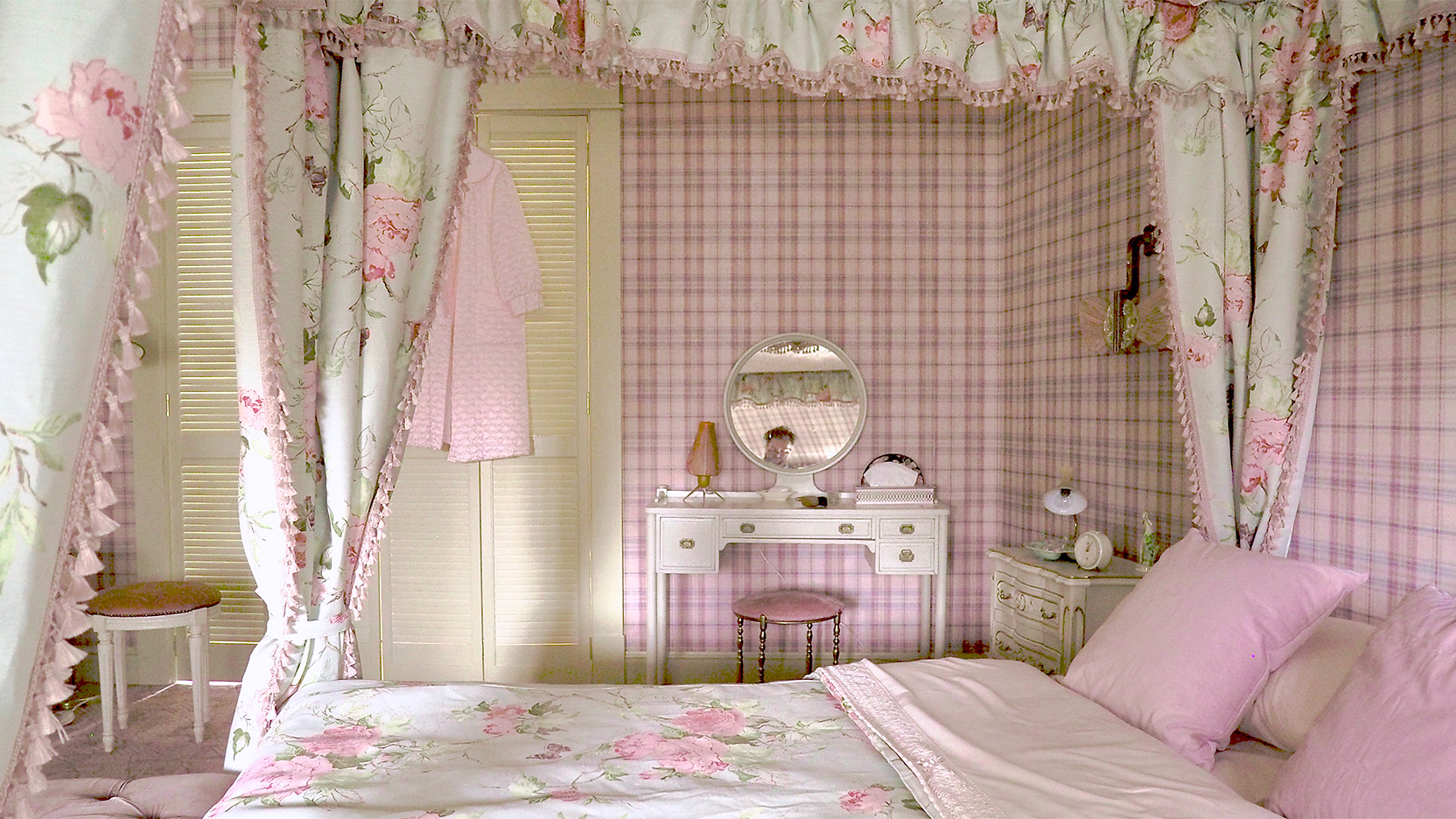
In the main character Beth’s home, a clash of stripes, florals, and plaids are somehow harmonious, thanks to the handiwork of Uli Hanisch, the show’s production designer. Throughout the series, he used the floor-to-ceiling looks, like the Voyage pink plaid wallpaper in Beth’s bedroom, to tell a story. “A strong pattern, no matter if it’s plaid or stripes, gives the room a very strong corset, almost like cell bars or a cage,” he says, nodding to the show’s plot (no spoilers!). But the palette of chalky pastels in Beth’s bed curtains sweetens the look, or as he puts it: “You can almost taste the marshmallows.”

Even though the set design team relied on vintage wall coverings and fabrics, incorporating the feel of the mid-century sets in 2020 is pretty simple, Hanisch says. Just add personal touches that tell your story. “It’s not so important to modernize a home but rather to individualize it,” he explains. “Every private room reflects its resident.” He suggests thinking about what colors speak to you and finding antique pieces into which you can breathe new life.
Or take inspiration from these contemporary rooms that gather the best parts of the show’s over-the-top style—bold patterns, matching surfaces—and make them all your own. Thankfully, getting the look is easier than learning chess.
Take One Pattern—And Run With It

Coordinate your canopy and wallpaper, as in designer Chiara de Rege’s Manhattan apartment, to create a cocooning feel. The result is a little bit old school, but in a cherry-red pattern it’s also super-fresh.
Embrace the Mix

In designer Sarah Wittenbraker’s Austin home, each room is its own visual world, much like in Beth’s parents’ house. But when viewed down a long hallway, the cacophony of colors and patterns just works, especially when the prints are two different styles: One is a dot and the other is floral.
Pick a Color as Your Anchor

As interior designer Cameron Ruppert proves, a plaid carpet and cowboy-themed wallpaper can mingle with dotted bunk bed curtains and a zigzag trim. Red is the throughline that keeps it cohesive.
Our Fall Style issue has arrived! Subscribe now to get an exclusive first look at Ayesha Curry’s Bay Area home—and discover how design can shape our world.