The Cheeky Wallpaper in This Portland Home Will Make You Look Twice
Not your typical toile.
Updated Oct 11, 2018 12:50 PM
We may earn revenue from the products available on this page and participate in affiliate programs.
We believe everyone deserves to come home to a welcoming and inviting environment—medical professionals especially. On the rare occasion that they get to spend an entire day at home, free from the pressures of their pager and patients, you can bet they relish the bliss of sinking into a sofa with a fresh batch of popcorn and a movie. This Portland, Maine, townhouse designed by Tyler Karu for a young doctor makes every moment count.
“I worked with my client to put together a scheme that’s really reflective of who she is,” says designer. “What elements does she already own that we can incorporate? How can we execute a style that’s representative of her but also respectful of the architecture?”
Drawing on her client’s New York City roots and industrial style, Karu peppered the home with subtle references to her hometown while also bringing her own eye for vintage furniture to the table. Heavy on character and color, what was once a clean slate is now brimming with unexpected nods to the past. Can you name another home where old medical books and The Notorious B.I.G peacefully coexist? Ahead, Karu walks us through this playful waterfront retreat.
Create Your Own Character With Custom Details
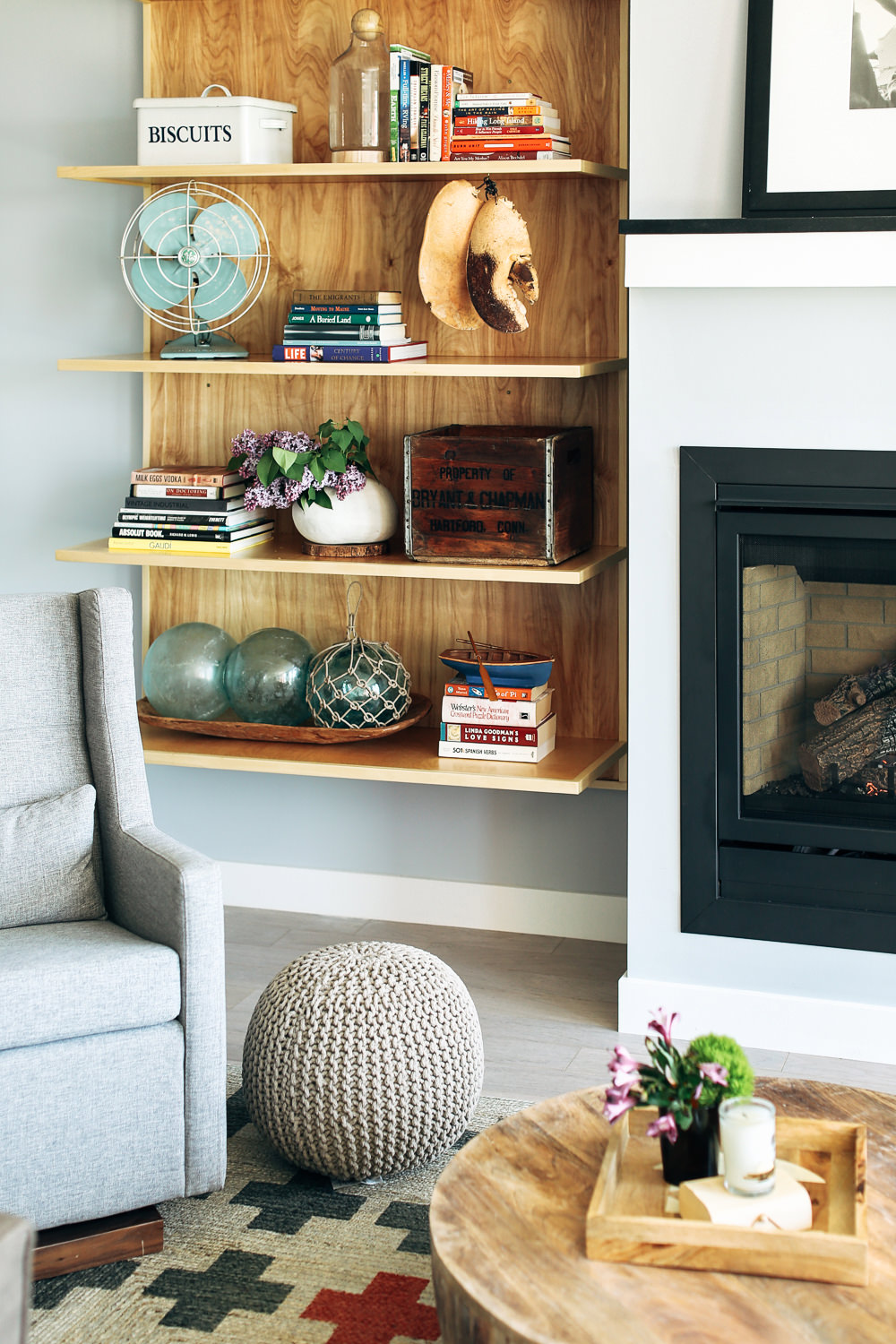
Far from cookie-cutter but nevertheless new, Karu’s first task was to introduce some charm to the contemporary townhouse. To elevate the blank slate, she kicked it off with custom birch plywood shelves that now flank both sides of the living room fireplace.
“The shelves themselves are very architectural,” says the designer, who topped each surface with a curated array of books, antiques, and smaller treasures. “It just gave us another way to showcase her books and the accessories that mattered to her. That was a jumping-off point in the living room for sure.”
Go Beyond the Standard Bookshelf
In between stacks of medical books, you’ll find antique cartons, fresh flowers, large glassware, and plenty of breathing room. “I like to play with positive and negative space, so you can actually see the details of the shelf,” explains Karu.
Instead of piling on the books, Karu carved out room for meaningful memorabilia, including a street sign from her client’s Dartmouth days and an antique fan from the Brimfield Antique Show. “I was approaching the styling situation from the idea that these shelves are architectural—it’s more of a display piece,” she adds.
Mix and Match Vintage Styles
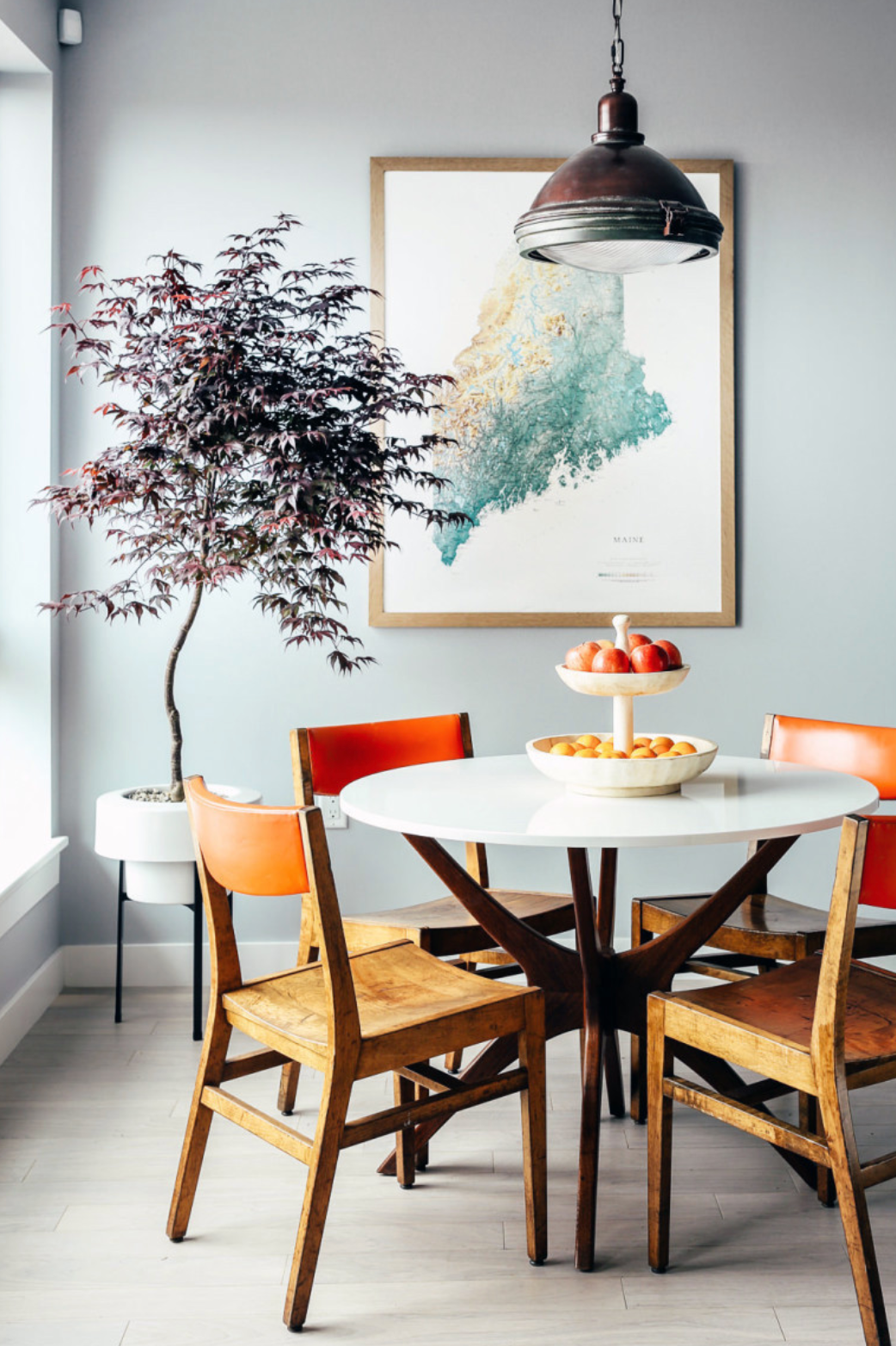
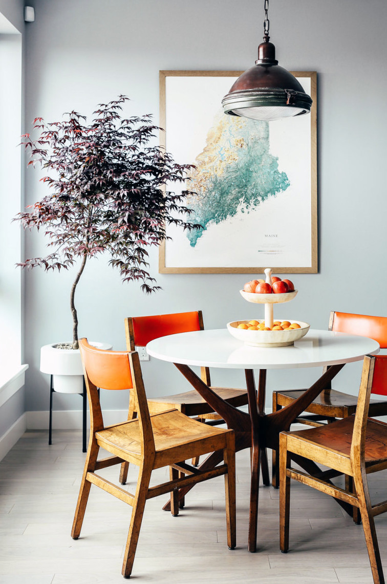
An effortless blend of new, old, and older, the dining area will change everything you thought you knew about what it means to mix eras. Convinced the dining set is new and the light fixture is vintage? Try again.
“It’s a cool mix. I found the table base at Brimfield and had a quartz top made for it. Then, we found the dining chairs at the Portland Flea-For-All. The light is from Restoration Hardware,” shares Karu.
Even the simple pairing of the mid-century-modern table base with the schoolhouse-style chairs was a daring choice. “I love the combination of the table and the chairs, given that they’re both vintage but from completely different sources,” she continues. “Those two elements aren’t the same style, but we threw them together and it worked. It’s really unexpected.”
Reminisce Through Prints
When a room makes you look twice, you know you’ve nailed it. Here, the head-turner comes in the form of a tiny-but-mighty powder room that’s swathed in a cheeky toile wallpaper from Flavor Paper.
“I’d seen this wallpaper a million places and have always really loved it,” says Karu. “When we decided to wallpaper the bathroom, she was like, ‘If we’re going to do it, let’s just go for it.’ Being that she’s from New York, we thought that the Brooklyn toile was pretty perfect.”
The designer picked up on the print’s sweet and salty energy by powder-coating the sconce in a fire-engine red.
Balance Out Heavy Furniture with a Playful Palette
Karu made another bold lighting choice in the master bedroom, but this time it wasn’t a matter of matching the walls but rather lightening the mood.
“I thought the orange-red in the lobster print would go really well with the mint green sconces from 143 and the pink throw at the foot of the bed. They all offset the heavy four-poster bed,” she explains.
Invest in Your Floor Plan
Karu’s trick for spicing up a clean slate? Nail down your floor plan before you move on to the fun stuff. “Make sure the space is planned and conducive to whatever your priorities are, whether that’s lounging around on a big couch or entertaining around a big dining table,” she suggests.
When you really want to make a new space feel like home, swapping out the lighting is also a great way to add a personal touch. However, if that’s not an option, invest in the items that have the power to ground a room. “Really good rugs can usually transition with you into another home and they just anchor a room nicely,” says Karu.
Of course, if you’re feeling extra adventurous, a kitschy-cool wallpaper print will always do the trick.
See more stories like this: Before and After: A Canadian Home Gets a Polished Scandinavian Makeover In This Breezy Melbourne Townhouse, Laid-Back Life Is Key This Is How an NYC Landscape Designer Decorates Indoors
