We may earn revenue from the products available on this page and participate in affiliate programs.
Early this morning, Pantone announced their
2018 Color of the Year, and threw us all for a loop. We were seriously gunning for Meadowlark, an untraditional citrus with subtle hints of green—after all, who doesn’t need a refreshing hue to start the new year off with? On the other hand,
Almost Mauve seemed to be the frontrunner, especially with the influx of the shade materializing in both fashion and interiors. Its resemblance to millennial pink made it an obvious choice, a natural progression for those ready to graduate from the blush that has been virtually ubiquitous in the past year or so.
Nevertheless, it was the saturated purple that took the cake. Dubbed Ultra Violet, the global authority on color depicts the enigmatic hue as one that “communicates originality, ingenuity, and visionary thinking that points us toward the future.”
While we’re sure we’ll be seeing plenty of renditions of the shade across the board—Pantone preemptively partnered with butter London to create a collection of beauty essentials that highlight the shade through a varied spectrum—we’re looking to the color with an approach that is more in line with our decor-loving hearts.
We know, we know, decorating with the color purple can be intimidating, thanks to its high intensity. Aside from running the risk of it looking outdated or over-powering the other design elements in its vicinity, the hue can be typically tricky to place with effortless ease. To help, we took a look back at the best uses of the color we’ve seen (including
this stylistically-bold revamp!) to hopefully inspire you to give it a chance in the year to come.
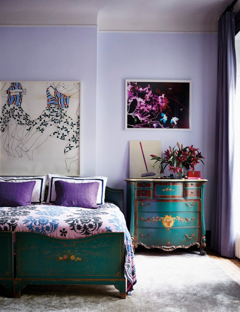
Of her
East Village apartment, designer Pamela Bell notes that she’s “not really a purple person, the bedroom just worked out that way.” One look at the elegantly intricate design of the room, and we’d be hard-pressed to see it as so. While a soft lavender sets the backdrop with an inviting element, saturated touches of the color establish a well-layered look, further defined by the touches of the vintage, blue-green furnishings. A handful of red notes are sprinkled throughout, channeling a classic pairing of the two daring hues.
Go for bold.
We’d be remise should we not include our very own phone booth in the mix—fresh off of
a stunning redesign, if we may say so ourselves. From the daring notes of purple that elevate the intricate pattern of the wallpaper to the string of tinsel hung for an added lustrous detail, there are no shortage of vibrant color moments that inspire. Sneaking the color in via a spectrum of similarly-toned shades will help offset the high-intensity of the purple, downplayed by the equally bright reds, pinks, and oranges.
Finding a complementary hue to match against a bright purple can be difficult, especially if you’re putting it to practice. On the polar opposite end of the color spectrum, yellow offers up a bright contrast to the hue—while we would be hard-pressed to put that into practice in an interior, a muted take on both could potentially work. While it’s hard to go wrong with a timeless gray (bonus points if it features a slight lilac tint) pairing it with a royal purple can help elevate a design scheme with an elegant touch. Case in point: This serene spot, found in
Pamela Bell’s East Village apartment, where a deep purple runner lends an ideal element of color and contrast to the muted details of the hallway.
If we learned anything this year, it’s that florals are more than just a last-minute decorative touch: They are statements in the making, doubling as artistic structures, especially when paired with
equally striking vessels. Think of it as the quintessential low-commitment approach to decorating with purple because, what’s more temporary than fresh flowers? Less is more with this one, and even the most
modest of arrangements will have the power to instantly captivate the eye.
Bring in an accented pop.
For the true believers of less is more, this one’s for you. This NYC-based home (which you can
book a stay in!) boasts a light-filled, whitewashed interior accentuated with a modest handful of colors—though we have our eyes on the saturated shade of the lone pendant, which perfectly encapsulates both the depth and refined qualities of the hue.
Think texturally.
Can you spot the purple? Just because it’s a trending color, doesn’t mean you have to go overboard with it. A handful of decorative accents baring the hue can go a long way. Bonus points for this being a low-commitment approach to getting in on the impending craze. Textiles are a foolproof method for experimenting with decorating with purple: think along the lines of throws, pillows, or even window treatments. We’re swooning over this clever blue-green-purple mashup, completed by an intricately wild, wallpapered backdrop.
This one certainly isn’t for the faint of heart. Found in
Hotel Saint-Marc Paris, this
colorful space designed by Dimore Studio, boasts an impressive palette, which ranges from mustard and dusty rose to deep emerald and burgundy. While we’re not suggesting a wall-to-wall purple carpet installation (but hey, if you can make it work, make it work), take the safer route by playing around with a smaller area rug instead.
Experiment with a statement seat.